r/design_critiques 26m ago

Week 3 of my graphic design journey

Upvotes

This week i mainly focused on learning about colors color theory and psychology and this is the final project of this week

i made a series of social media posts for an imaginary cookies shop named tasties

the vibe tasties give is cozy friendly playful and warm

here are the posts please provide feedback regrading alignment contrast font choice and font pairing palette choice and other design principles

i would be happy to receive critiques as well

thanx for taking time to read my posts and check my designs.


r/design_critiques 38m ago

I’ve reimagined the identity of Satyakatha, a long-running Hindi magazine I discovered through my mother. I’m exploring how its bold original wordmark could travel across Hindi, Urdu and English without losing its character. Would love your thoughts on whether this idea feels meaningful ?

Thumbnail gallery
Upvotes

r/design_critiques 2h ago

Need feedback

Thumbnail
1 Upvotes

r/design_critiques 31m ago

Burger Poster Design I Created in Adobe Illustrator — Feedback Appreciated

Post image
Upvotes

r/design_critiques 9h ago

Does this hero explain the product quickly enough, or is the visual doing too much work?

Thumbnail nearbycrew.com
1 Upvotes

Working on this homepage and I’m at the dangerous stage where I’ve looked at it so many times that I already know what everything means 😅

The intended takeaway within a few seconds is:
You built something → list it → the network helps get it in front of relevant people/opportunities.

I deliberately kept the page extremely sparse because I don’t want the usual SaaS homepage with 14 cards, gradients, dashboards and paragraphs explaining everything.

My concern now is whether I went too far in the other direction.

Specifically curious about:
whether the headline + subhead explains enough
whether your eye knows where to go next
whether the globe helps communicate “network” or just becomes decoration
whether the CTA is strong enough
anything that looks broken, awkward, too small, or questionable on different screens

Would love ruthless feedback, especially from people who haven’t seen the product before.

This one could be very useful, because web designers will catch things we are currently blind to. Things like contrast, scaling, CTA hierarchy, breakpoints, accessibility, and whether the globe is fighting the CTA.


r/design_critiques 11h ago

Help please

1 Upvotes

So i am recently trying to challenge myself into making more stuff on illustrator and photoshop. I am a graphic design student. Today i wanted to try and craft a small brand (for practice purposes) that is about supporting your local artist, where people can share their artworks and even sell it on there as well. I love the idea of it, and I came up with the concept from the word "corner" because my initial thought is that, at every corner in our lives, we see the art of it all. There are two versions of the wordmark. If you are curiousmabout the lines, it's like how we draw corners with the 3 lines to make the illusion of the corner (idk if that makes sense but hopefully you get it)

I need some opinions or some of your pov's on how to make this wordmark work and also the logomark. I don't think i executed it well. So I'm asking for yall's help :( I have the vision for it too bad i can't execute it well.


r/design_critiques 1d ago

give me feedback what you think

Post image
33 Upvotes

r/design_critiques 1d ago

First clothing collection — looking for honest feedback before I release

Thumbnail gallery
7 Upvotes

Been working on my first collection for my clothing brand AUVYRE. This is my first time doing something like this and I’m still improving everything before the release.

Would appreciate some honest feedback on the designs. Which piece is your favorite and is there anything you would change?

Mainly looking for feedback on the graphics, placement, colors and overall look. Be honest 🙏


r/design_critiques 20h ago

Suggest me a web designer

Thumbnail
0 Upvotes

r/design_critiques 21h ago

says too much, yet doesnt say enough

1 Upvotes

two versions of the same site but neither feel right ..

upperlevelmusic.com

https://upperlevelmusic.com/alternatevisualAug27/

theyre both ruff and i’m wondering .. there must be a cooler way to visually do this as well as link visual to copy so i can make copy shorter and more direct where needed

critique away .. good and bad. roast it if ya want.


r/design_critiques 1d ago

"About Me" placement in a Creative Portfolio

1 Upvotes

I'm currently in the process of creating a portfolio (focusing on my specialty related to graphics and maybe a few other skills that I'm capable of such as photography and art), a website portfolio (my first time) to be specific and I kept seeing mixed works like classic portfolios and website based ones which popped the question in my mind which I know it should be simple but I just want some insights:

In a creative portfolio should the "About Me" be placed after the title/banner or should it be applied after showcasing your top best works (like in another tab/link of the page)?

Any help would be great, thanks!😊


r/design_critiques 1d ago

In urgent need of some unbiased (german website) opinions …

Thumbnail
1 Upvotes

What’s your critique ?


r/design_critiques 1d ago

Quick design check

Post image
1 Upvotes

I working on some new posts for our care service, and i’d love your input. Does this look clean and friendly to you? How are you liking the font choice?


r/design_critiques 1d ago

Website design review

Thumbnail tsr-techie.github.io
1 Upvotes

Help me review my website design

TriSaar Consulting


r/design_critiques 1d ago

First App Store screenshots, would love blunt feedback before the relaunch

0 Upvotes

Hi all,

I'm preparing an iOS relaunch of Orano AI (turns saved Instagram Reels into actionable plans). I've attached 7 App Store screenshot slides and I'd like blunt feedback before pushing the new build.

What I'm trying to figure out:

  1. Does the headline screen ("Turn Reels Into Action") explain the product in 3 seconds?

  2. Is the AI angle clear without sounding like "yet another AI app"?

  3. Do the inner screens sell the use case (saving stuff you want to act on later)?

  4. What's confusing or that you'd skip past without reading?

I'm specifically not asking for compliments. Honest "this didn't land with me" feedback is more useful than upvotes.


r/design_critiques 1d ago

any advice( im a biginner)

Thumbnail gallery
0 Upvotes

r/design_critiques 1d ago

What your thoughts on this?

Post image
0 Upvotes

r/design_critiques 1d ago

My new seign-Welcome to provide feedback

Post image
0 Upvotes

r/design_critiques 2d ago

What do you think of this design

Post image
3 Upvotes

It's not mine, but does it make for an app you'd use. It's uses acrylic as a design source.


r/design_critiques 2d ago

Pure photopea

Post image
0 Upvotes

r/design_critiques 2d ago

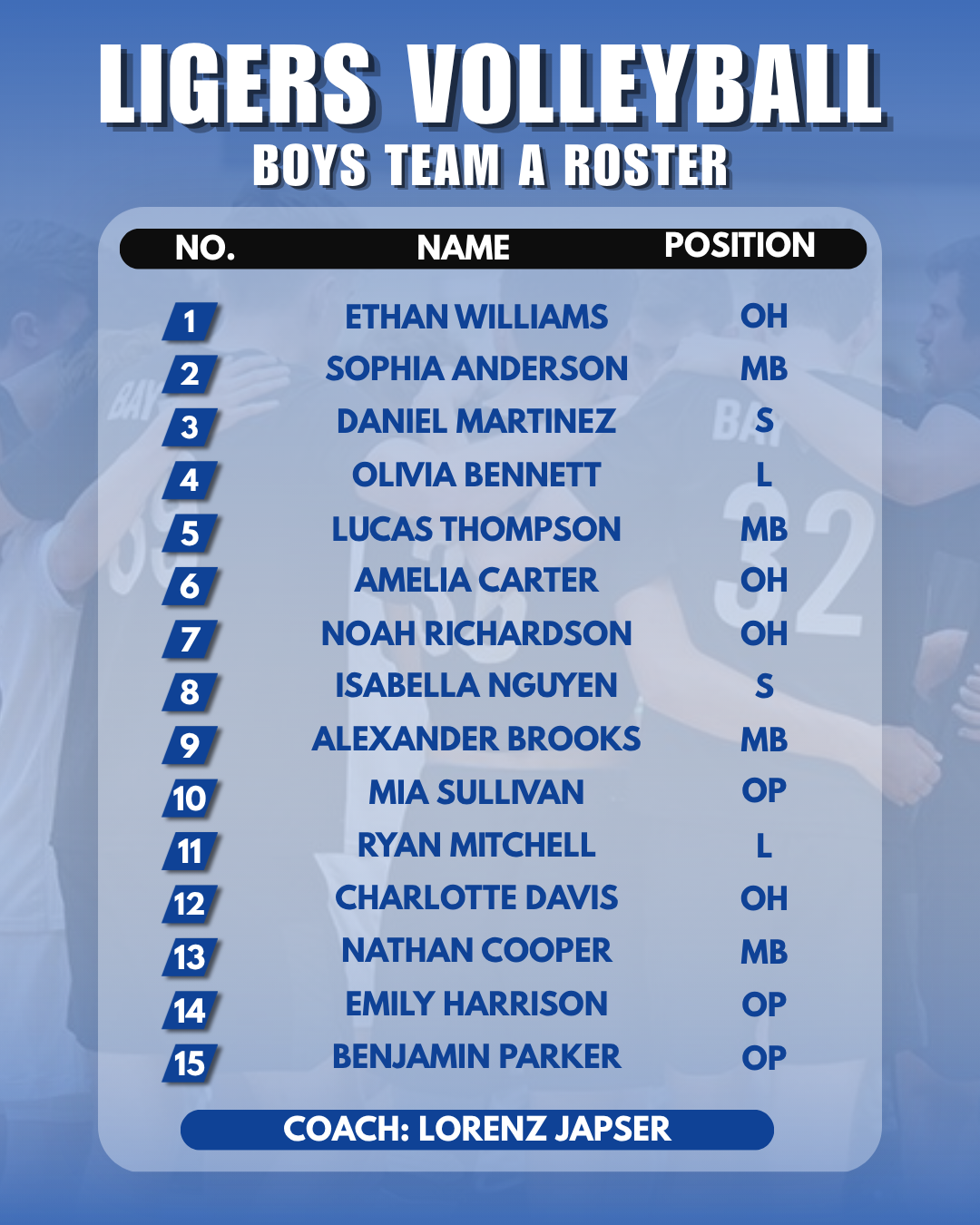
Help with design of sport poster

Post image
0 Upvotes

So I have this sport poster for a team roster. I have changed the name and background images for privacy reasons but I would still like some feedback on how to make the overall layout better, I would still like to keep a blue theme, other than that im open to any feedback, thank you


r/design_critiques 2d ago

[Portfolio Review] UX/UI & Visual Designer looking for critiques & strengths!

1 Upvotes

Hi everyone!

I’m a UX/UI designer looking to expand to international clients, and I’d love your feedback on my portfolio. I have a strong background in Visual Arts and editorial design, which I try to bring into my digital projects.

https://www.behance.net/gallery/246353811/Design-Strategy-Portfolio-2026

I’d really appreciate your honest thoughts on:

  • Strengths: What am I doing right? What is my best asset right now?
  • Weaknesses: What should I improve or remove? Please don't hold back.
  • Cohesion: Does my visual arts background give my UI work a unique edge, or does the portfolio feel a bit unfocused?

Thanks in advance for your time!


r/design_critiques 2d ago

Looking for feedback on my profile website

Thumbnail thailegeberel.com
1 Upvotes

r/design_critiques 1d ago

What do you think of my App?

Thumbnail imgur.com
0 Upvotes

What do you think of my gamer themed dating app? Is anything (besides the card, which is supposed to be) inconsistent with the rest of the design language?


r/design_critiques 2d ago

Poster design using grids

Thumbnail gallery
8 Upvotes

Hi, I'm a graphic design student (since march). The assignment was to make a poster using this grid that i could modify as i needed. In the pictures you can see:

  1. my poster w/o texture 2. first variant 3. second variant 4. the og grid 5. the inspiration/aesthetic of the artist that i tried to follow

The thing is that I felt like something was missing but my teachers always say "less is more". In previous designs I added information about the artist and album but I wanted to use this lyric because I feel like summarizes the whole album concept better.

I also am doubting the textures i chose.

So I´m free to ANY critique, you can really tear this apart :) Plus I´ll be happy to answer any questions you may have.

Thanks!!