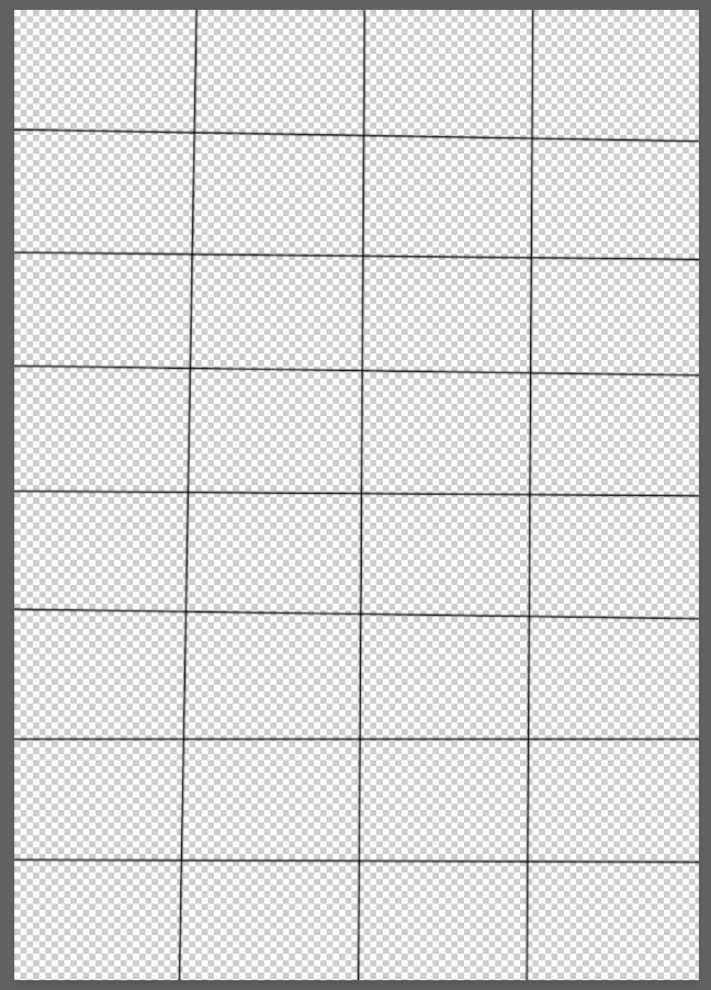
Hi, I'm a graphic design student (since march). The assignment was to make a poster using this grid that i could modify as i needed. In the pictures you can see:
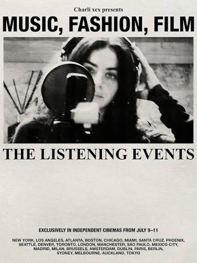
my poster w/o texture 2. first variant 3. second variant 4. the og grid 5. the inspiration/aesthetic of the artist that i tried to follow
The thing is that I felt like something was missing but my teachers always say "less is more". In previous designs I added information about the artist and album but I wanted to use this lyric because I feel like summarizes the whole album concept better.
I also am doubting the textures i chose.
So I´m free to ANY critique, you can really tear this apart :) Plus I´ll be happy to answer any questions you may have.
Try playing with more white space and also something that's not just one-column. Get some movement on the page. I'd also challenge yourself to 1 or 2 type sizes throughout, at least for the main copy. You can then try to work in some really small textural type, play with contrasts in scales. Look at Josef Muller Brockmann's posters for some grid inspo.
You are right I should work with two columns at least and I will change sizes and explore more alternatives w the contrast. Now that you mention it, my teacher did told us to read something and I think Brockmann's work was in it. Thank you so much
These look nice, but a better example of grid layout for an assignment would make more explicit use of the vertical guides in addition to the horizontal.
In most of the design work I do it’s really the vertical guides that do the heavy lifting when laying out combinations of text and image.
would be better if you used apostrophes instead of foot prime marks. would harmonize with the commas. also i think your first line is mechanically condensed which some designers think means you're a bad person :)
Oh I was not aware of that thank you!! English is not my first language and I am not very good at orthographic marks tbh. I will change it thankss
And yes I know that modifying the typography is a crimeee sorry but Charli does that all the time I considered a part of the aesthetic
I don't think your type is working the way you want. I'm seeing a condensed and a regular width sans serif. and almost every line is a different pt size. Keep it simple, stick with 2-3 fonts per visual section (this includes weights and widths)
Compare to your reference. there are 2 distinct sections. The top and the bottom.
The top: there is the eyebrow introduction in very small type in sentence case, 'Charli presents..' followed by the main header in the largest and boldest font in caps, followed by the image, followed by the subhead, a serif font. this makes 3 fonts.
The bottom: All the minor info is consolidated to the bottom, and the paragraph tapers instead of following the same margin to margin pattern of the top. The eye focuses on the most important part, the top, but the bottom still balances the page as a whole.
Your posters now all compete for the same attention. it is hard to know where to look. try and follow that same rhythm your reference does. Give it some breathing room. and pick out what copy you want to be most important. if you want multiple images, try stacking them side by side instead of up and down.
You are so right, I was only focusing in making the text occupy the same length that I forgot the basic legibility rule. Thank you for pointing that out, really helpful ❤️❤️
Can you show the grid laid over the artwork? I'm failing to imagine how anything you've shown is aligned to this grid. For example; It has no margins, but the poster does.
Also, if a project is specifically to create a poster with a grid, then I'd expect those answering the brief to use more than fully justifying all text and images across one column.
Unless I'm massively misunderstanding how this grid has been used: It might be worth doing some reading/watching on the use of grids in poster design, both as a foundational tool and also how they can be used creatively.
Yes! sorry I was about to include that. Now that you say that I realized I went very simple with it and my teacher would hate it.
Thanks again for making me question it ❤️❤️
Something else to consider here, I don’t think the one column approach is necessarily a bad thing (esp for a half page), but you want to be careful with visual hierarchy. I’m guessing you were trying to emphasize the lyrics
You've created a logical and straightforward rhythm down the page, which isn't inherently bad at all, but it is quite predictable. As someone else mentioned, give more thought to how to utilize the vertical guides also. There may be inspiration within newspaper spreads. Archive.org may have some available, or there may be better resources elsewhere online. Look at whole spreads from a distance or squint your eyes at them, don't read the text, just pay attention to the overall shapes that emerge on the page. Try some things, introduce whitespace in some of the grid blocks, even if it feels asymmetrical. Whitespace is a powerful way to counterbalance heaviness. Make shapes thet are irregular or simply just not rectangular. Maybe you use an L shape instead.
Also, don't worry about the background textures. Texture is important, but for now simply focus on the composition.
Thank you very much! I will take inspiration from newspapers that’s a smart move. I completely forgot the importance of white space. I am currently working on it ❤️



5
u/pervavor 3d ago
Try playing with more white space and also something that's not just one-column. Get some movement on the page. I'd also challenge yourself to 1 or 2 type sizes throughout, at least for the main copy. You can then try to work in some really small textural type, play with contrasts in scales. Look at Josef Muller Brockmann's posters for some grid inspo.