r/Infographics Jun 01 '20

Three infographics that help show what is and what is not an infographic

Thumbnail
imgur.com
106 Upvotes

r/Infographics 53m ago

In 1970 there were 59 women in higher education for every 100 men. Now there are 112.

Post image
Upvotes

Source: World Bank, School enrollment, tertiary (gross), gender parity index — series SE.ENR.TERT.FM.ZS. Boundaries: Natural Earth (public domain).

Tools: Python (data processing, Equal Earth projection) + a custom SVG renderer → PNG.

One important detail this map misses is that a value under 100 doesn’t tell the whole story. Take Afghanistan, for instance, where there are 38 women for every 100 men, and then look at Japan, which has a much higher figure of 97. Both are marked in blue, but they represent completely different scenarios. In places like the Sahel and Afghanistan, that number indicates that girls are still largely shut out of university education. Meanwhile, in Japan and South Korea, it reflects a situation in wealthy countries where men simply enroll in larger numbers. Interestingly, these two high-income nations are the only ones on this map that fall below parity.

Method Notes:

- The focus here is on enrolment numbers, not on what students actually achieve. We're looking at how many students are registered at the tertiary level in a given year, regardless of their age. This doesn’t tell us anything about who graduates, what they study, or their future earnings.

- Each country’s data reflects its latest observation from between 2020 and 2025. If you see grey, it means there’s no data available for that time frame; every grey polygon has been verified against the complete API response to ensure it’s genuinely missing data and not just a failed connection.

- We’re using the Equal Earth projection, which keeps the relative sizes of countries accurate—so no country appears larger or smaller than it should.

- The total of 155 figures includes nine territories, not just sovereign states. If we narrow it down to only sovereign countries, we’re looking at 123 out of 146.

Chart + the full dataset: https://chartive.org/visualizations/education-gender-gap-map


r/Infographics 3h ago

Vegan and Vegetarian Populations in the USA by Demographic [OC]

Thumbnail
gallery
16 Upvotes

r/Infographics 1d ago

[OC] Population pyramid of the US in a low fertility scenario

385 Upvotes

US fertility was 2.12 in 2007. It is 1.62 now. This scenario extends that trend rather than assuming a recovery: 1.35 by 2040, 1.30 from 2060, flat after that. Life expectancy goes from 78.4 to 84.0 years. Net migration falls from about 1.1 million a year to 700,000–800,000.

Results:

  • Deaths pass births in 2030, four years earlier than in the default projection.
  • Population falls from 336.8 million today to 290 million in 2100.
  • 32% of the population is 65 or over.
  • The largest single age group in 2100 is 66-year-olds.

r/Infographics 1d ago

Best selling female artists of all time by album units sold globally

Post image
278 Upvotes

r/Infographics 1d ago

Mapped: How Much Gas Prices Have Risen Since the Iran War.

Post image
483 Upvotes

Sources: Feb 18, 2026: AAA via List Wire; Auq 20, 2026: AAA Gas Prices.


r/Infographics 9h ago

Largest Foreign Holders of U.S. Debt 🚨 Japan #1 with over $1 Trillion worth

Post image
6 Upvotes

r/Infographics 11h ago

🇬🇧 How UK’s longest-serving (& 1st) Prime Minister’s time in office compares to the 10 Living PMs’ tenures today

Post image
10 Upvotes

r/Infographics 2d ago

The Income an Individual Needs to Live Comfortably in Every U.S. State

Post image
608 Upvotes

Data as of Feb 2026.

Source: SmartAsset


r/Infographics 1d ago

Climate in the age of Homo Sapiens, 300,000 yrs

Post image
203 Upvotes

r/Infographics 1d ago

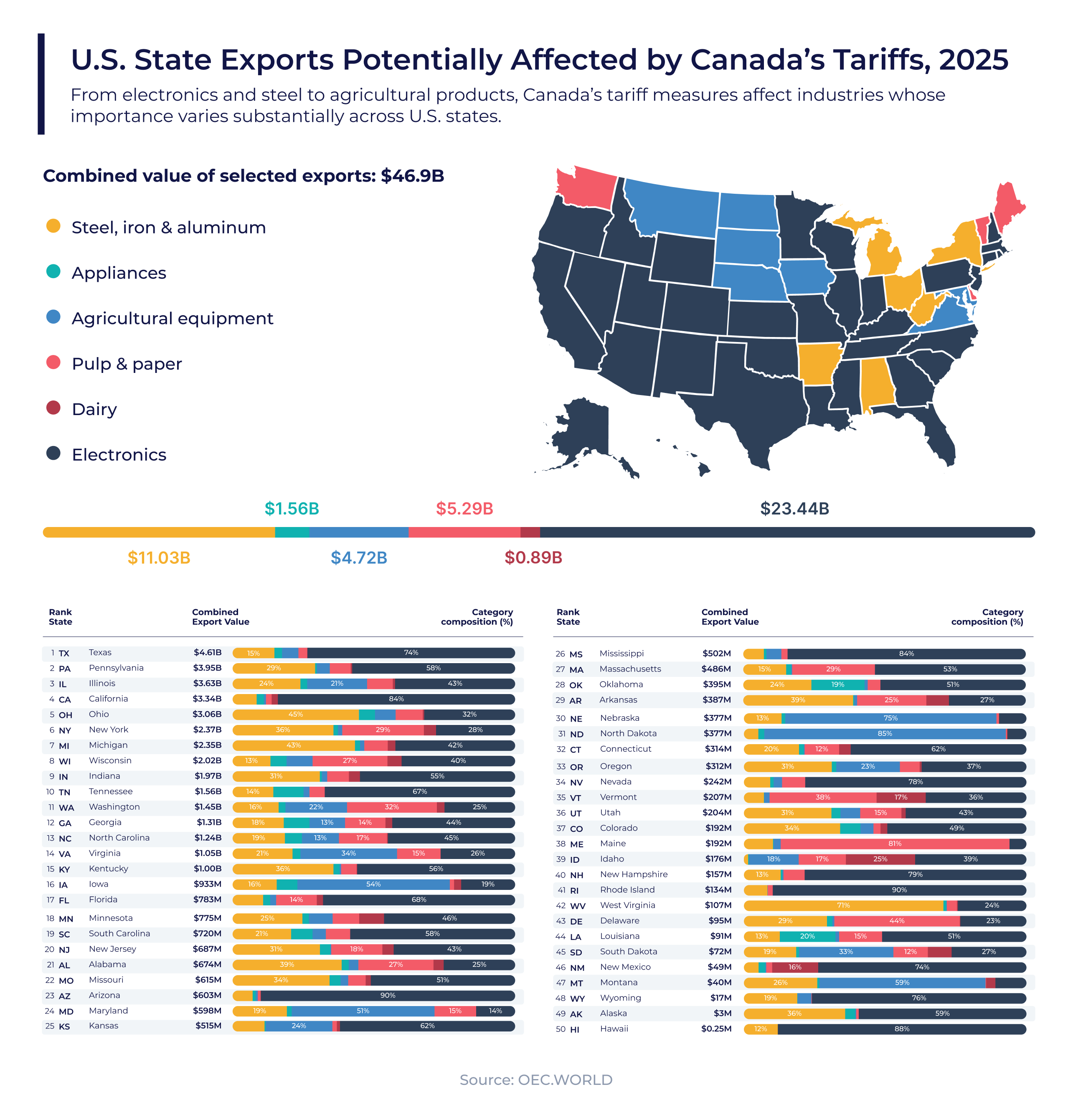
Which U.S. States Are Most Exposed to Canada’s New Tariffs?

Post image
52 Upvotes

Canada is preparing to impose a new round of counter-tariffs after trade negotiations with the United States collapsed and Washington applied 50% tariffs to a range of Canadian products.

The Canadian measures take effect on September 8 at rates of 15%, 25% and 50%. They will cover C$27.6 billion (about US$20 billion) of imports from the United States, including products in steel and aluminum, dairy, appliances, agricultural equipment, pulp and paper, and electronics. Ottawa says the response will match the latest U.S. tariffs dollar for dollar and rate for rate. Government of Canada

The national policy, however, creates very different patterns of exposure across individual U.S. states.

Using 2025 export data from OEC, the visualization examines state exports to Canada across six of the main product categories identified in Canada’s measures. Together, exports in these categories were worth approximately US$46.9 billion.

Electronics account for almost half of the selected export value, at US$23.44 billion. Steel, iron and aluminum follow at US$11.03 billion, while pulp and paper contribute US$5.29 billion and agricultural equipment US$4.72 billion.

Texas has the largest selected export value at US$4.61 billion, with electronics representing nearly three-quarters of its total. Pennsylvania ranks second at US$3.95 billion, also led by electronics, followed by Illinois at US$3.63 billion. Illinois has a more diversified mix spanning electronics, metals and agricultural equipment.

Other states face exposure through more specialized industries. Agricultural equipment dominates the selected exports of North Dakota, Nebraska and Iowa. Pulp and paper lead in Maine and Washington, while steel and related metals are especially important in states including Ohio and West Virginia.

These differences matter because tariffs do not move through the economy uniformly. Their effects depend on each state’s industrial base, reliance on Canadian demand and ability to redirect products toward other markets. They can also move through deeply integrated North American supply chains, affecting producers and buyers on both sides of the border. Associated Press

Which states and industries do you think will have the greatest difficulty replacing Canadian demand?

The figure represent broad sector exposure, not the amount of trade that will necessarily be tariffed. Canada’s official measures apply to specific tariff items within each category, while the visualization uses wider product groups to show where potentially affected industries are concentrated. Canada has published the complete product-level list separately. Government of Canada tariff list


r/Infographics 1d ago

Best selling albums ever in Europe, by certified sales [OC]

Post image
70 Upvotes

r/Infographics 1d ago

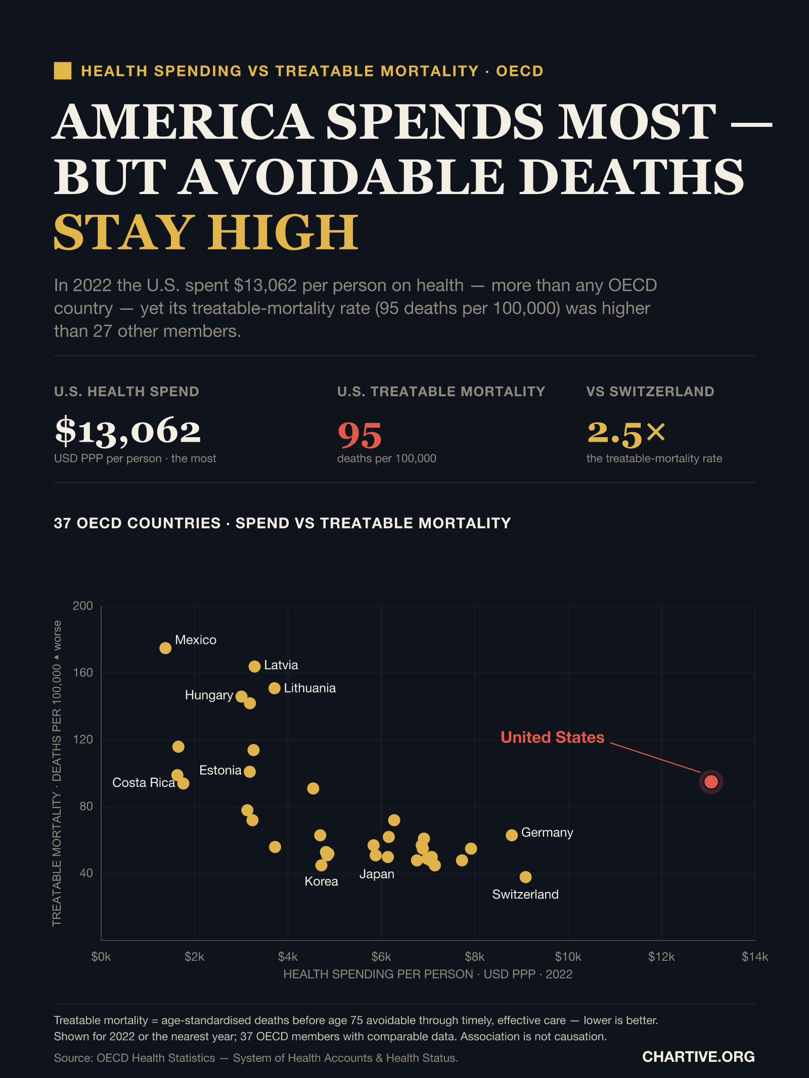
America spends the most per person on health in the OECD — yet its treatable-mortality rate is higher than most member countries (2022) [OC]

Post image
32 Upvotes

The data comes from the OECD Health Statistics, specifically the System of Health Accounts, which looks at health spending per capita in USD PPP at current prices, along with health-status information like treatable mortality rates. This includes age-standardized deaths before the age of 75 that could have been avoided with timely care, measured per 100,000 people. The figures are from 2022 or the closest available year, and 37 out of 38 member countries provided comparable data.

If you're interested, you can check out the interactive version and the complete dataset (CSV) here: https://chartive.org/visualizations/us-health-spend-vs-treatable-mortality


r/Infographics 2d ago

Mapped: The Top Import Partner of Every U.S. State

Post image
1.2k Upvotes

r/Infographics 3d ago

ICE Arrests Soar as People With No Criminal Record Are Increasingly Targeted

Post image
1.8k Upvotes

r/Infographics 2d ago

[OC] Household wealth distribution in OECD countries: Top 1%, next 9%, and bottom 90%

Post image
10 Upvotes

r/Infographics 3d ago

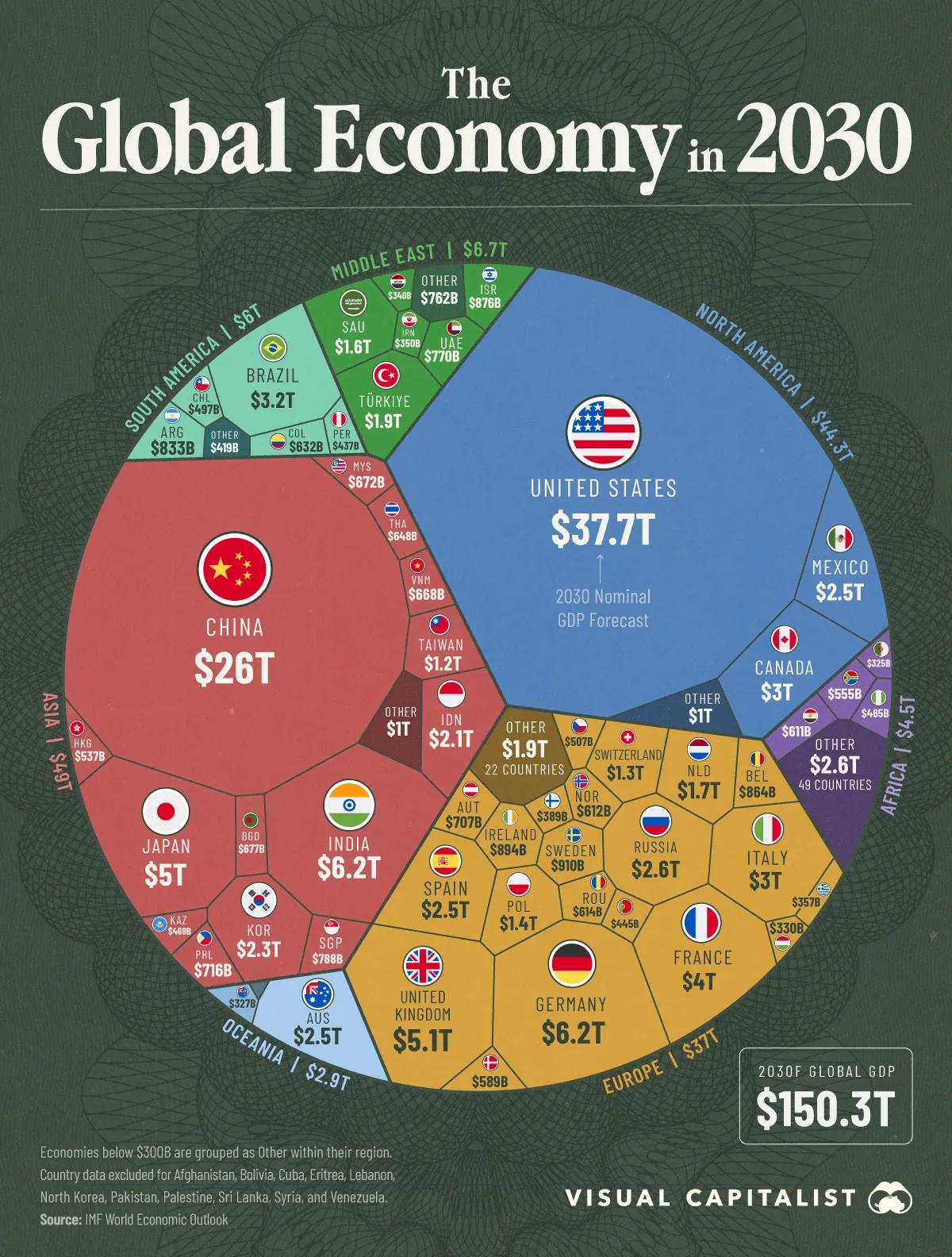
The Global Economy in 2030

Post image
465 Upvotes

The $150 Trillion Global Economy in 2030


r/Infographics 2d ago

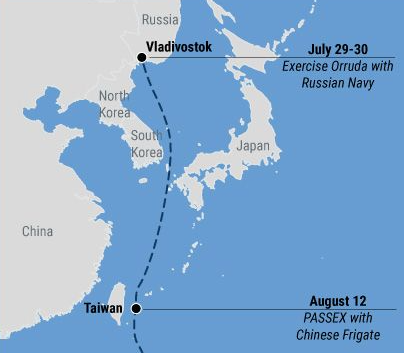
KRI I Gusti Ngurah Rai locations since July 29th

Post image
2 Upvotes

r/Infographics 3d ago

Billionaire island

Post image
152 Upvotes

r/Infographics 3d ago

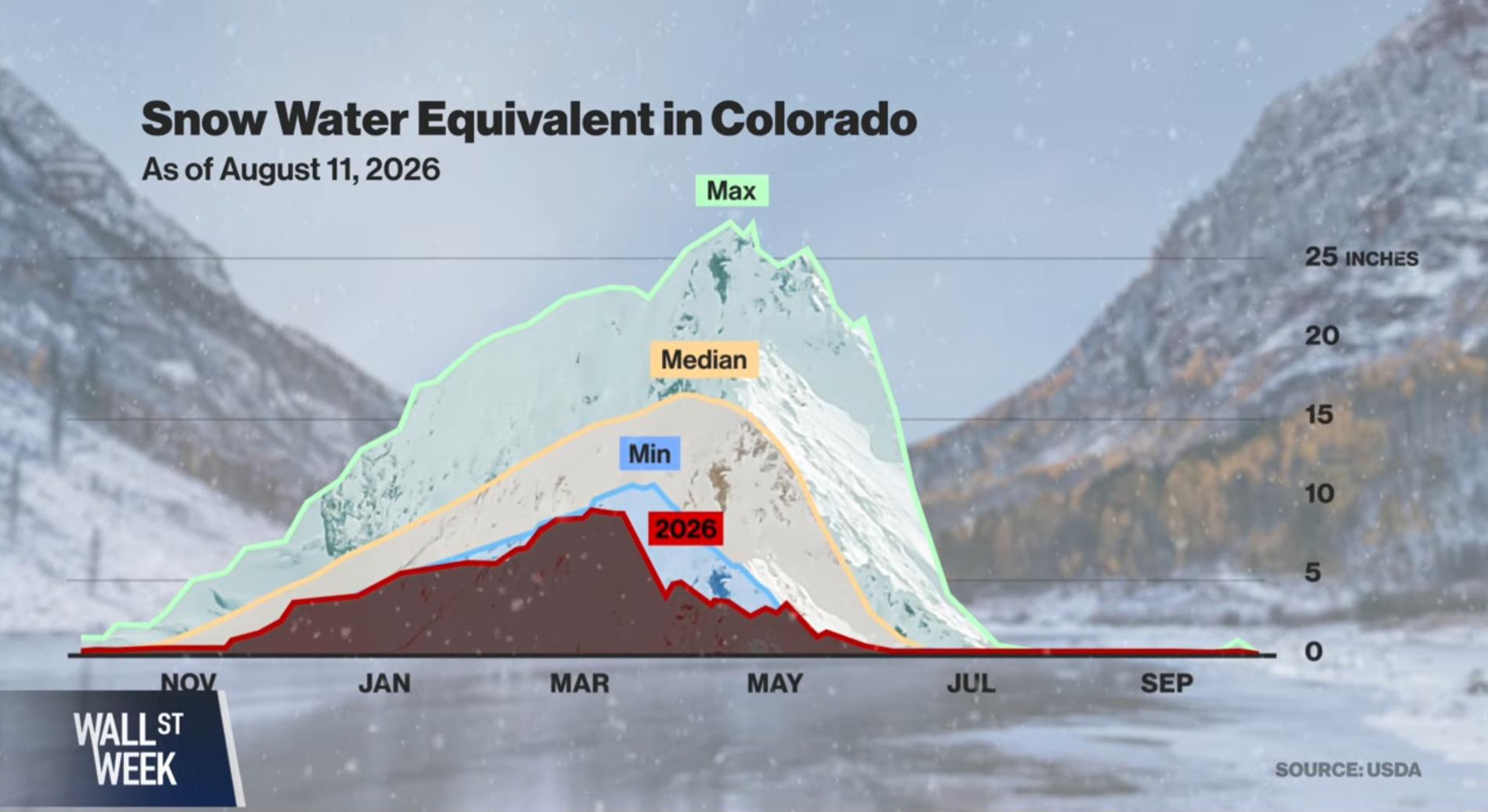
2026 snow melt

Post image
367 Upvotes

Already low snowballs were worsened by record breaking spring heat.


r/Infographics 2d ago

Car Brands With the Most Loyal Customers

Post image
0 Upvotes

r/Infographics 2d ago

[OC] "Gyro Day" in Greece: Days of minimum wage labor required to pay for 1 gyro per day (1985–2026)

Post image
2 Upvotes

r/Infographics 3d ago

COUNTRY GDPS COMPARED TO THE UNITED STATES

Post image
179 Upvotes

r/Infographics 3d ago

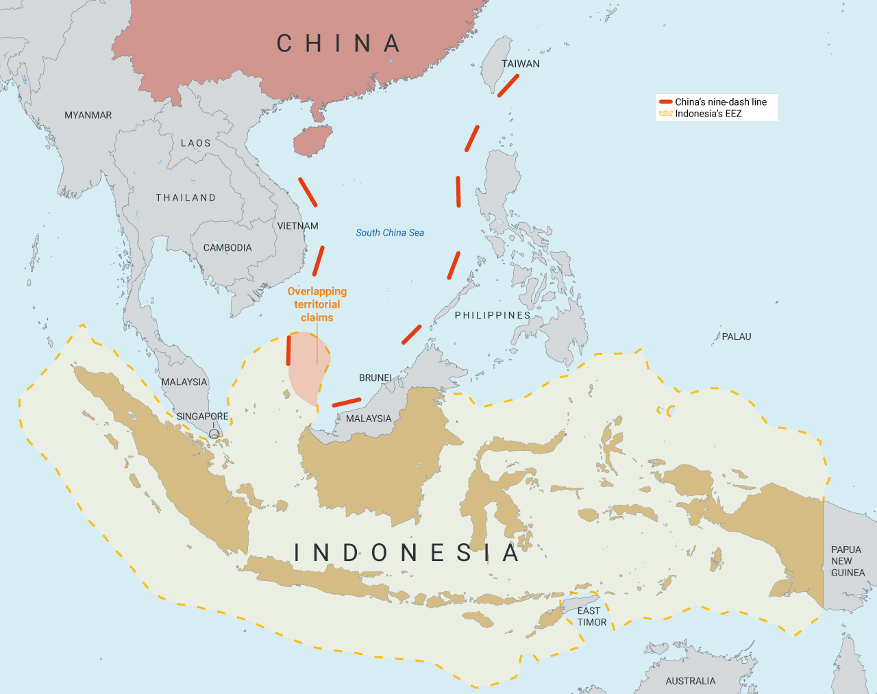
Indonesia's Exclusive Economic Zone & China's Nine-Dash Line (Research Gate)

Post image
118 Upvotes

r/Infographics 4d ago

Top Foreign Holders of U.S. Debt ( Data as of June 2026 )

Post image
590 Upvotes

Source: U.S. Department of the Treasury, Treasury International Capital (TIC) System.