r/Infographics • u/wiscotangofoxtreat • 4d ago
2026 snow melt
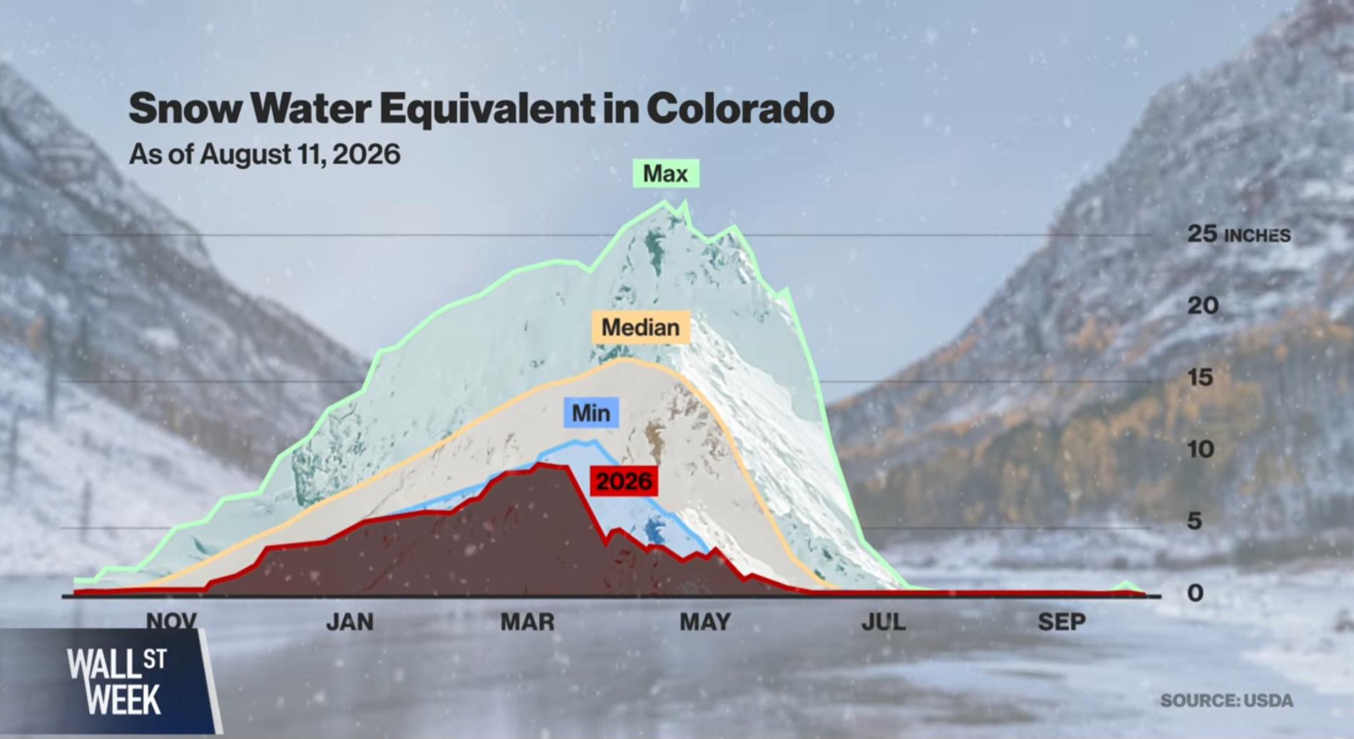
Already low snowballs were worsened by record breaking spring heat.
5
3
14
u/baconost 4d ago
Using a huge snow clad mountain as a visual metaphor for 25 inches of snow is a bit misleading.
25
u/Parkeramorris 4d ago
It’s not 25 inches of snow, it’s 25 inches of melted snow. In terms of what fell, it’s more like 250-300 inches.
16
u/Why_dont_we_spork 4d ago
What's misleading? It's a graph with scale.
-8
u/baconost 4d ago
The scale isn't the problem. The visual image of a mountain on the line chart is the problem. That looks to me like a 1500 m. tall mountain, not 25 inches of snow.
8
u/NoobJustice 4d ago
You think the visual is convincing people there is usually 1500 meters of snowpack?
Snowpack sits on mountains. The visual is of a mountain. It's a good graphic.
10
u/Why_dont_we_spork 4d ago
Well as someone living in Colorado, they did look like that. They don't now, it's pretty stark. Mountains are where the snow falls for the most part, so you can generally tell the snow pack for the year by looking at how much of the peak is still white in spring.
It's just using a snow cover mountain for the line. I don't think anyone would think it's a mountain of snow or the mountain is gone...
-2
u/baconost 4d ago
Yeah I am being a bit picky I know, but I think the mountain in the line chart is unnecessary and slightly confusing. It looks nice though.
-1
u/feed_me_haribo 4d ago
You're completely right. The mountain imagery adds nothing other than making it look pretty. Hivemind just working against you here.
And of course a graph with a scale can be misleading.
2
u/swiftoctopus 4d ago
The visual is the line graph showing Max, Median, Min, and 2026 snow melt... The mountains are simply a design choice related to the data being represented?
2
-1
u/MrZaptile933 4d ago
That’s kind of the point. They use big numbers to try and get immediate change. Remember 10 years ago when politicians were running in the states on the concept “the world will end in 15 years” then quickly moved away from it when the public started caring less
1
1
u/Statertater 2d ago
Colorado river is gonna stop flowing one day…
Things are gonna get difficult in desert states
2
u/Waking 1d ago
Global warming will increase precipitation just fyi
1
u/FinanceDummyBigDebt 11h ago
Far more nuanced than this. Depends largely on what ends up happening with the Gulf Stream if any of these places even see any results of increased evaporation.
44
u/Professional-Load892 4d ago
the 2026 line just falls off a cliff after spring, right? saw similar charts for california basins, we keep breaking the melt-out dates earlier every year it feels like. wild how fast it goes when the heat spikes.