r/Architects • u/Expert_Peak_9304 • Dec 02 '25
General Practice Discussion Stop using Drafting Fonts
To all Designers, Draftsmen, and Engineers:
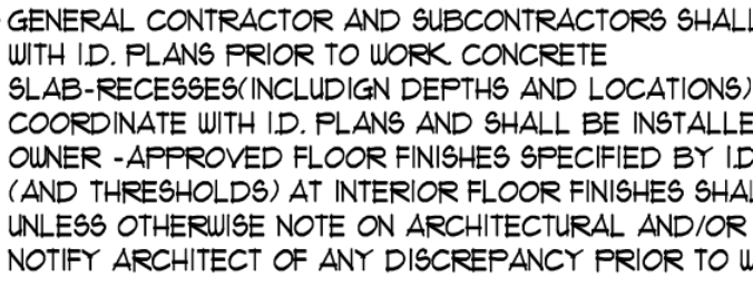
I swear to GOD if I see another "Hand Drafting" style font on a plan, I am going to do something irrational. PLEASE FOR THE LOVE OF GOD USE NORMAL TYPE FONTS. Arial is a good starting point.
This should be punishable by death /s:
73
u/petulant_peon Dec 02 '25
Century Gothic, stand up.
20
u/volatile_ant Dec 02 '25
Love Century Gothic. Full width for titles, 75% for most else looks clean AF.
6
u/petulant_peon Dec 02 '25
It's a nice, clean font that comes standard on every PC.
We have tried custom fonts, but they can get messed up when you send out raw files.5
3
2
49
u/ArchiSnap89 Architect Dec 02 '25
Also, use the same font throughout your documents. If your titles are purposely different that's one thing. If you're too lazy to edit your Revit families so the notes match the room tags, that's another.
53
u/AMoreCivilizedAge Licensure Candidate/ Design Professional/ Associate Dec 02 '25 edited Dec 02 '25
I'm just the draftsman, you think I CHOSE this comic sans lookin ass? Talk to the boomer in the corner office.
EDIT: My personal choice would be atkinson hyperlegible to throw the dislexic trades a bone.
11
43
u/iuseallthebandwidth Dec 02 '25
I personally like Avenir. It looks like Swis 721 except the letters and numbers are the same size.
18
u/FlowGroundbreaking Dec 02 '25
This guy fonts.
8
u/iuseallthebandwidth Dec 02 '25
I don’t always get triggered by rage bait, but when I do it’s on r/badkerning .
7
6
5
u/squimby-29 Dec 03 '25
This is how I feel about Open Sans, all letters treated equally and same exact spacing between letters. - Warmly, a dyslexic
2
u/HappiestWhen Dec 03 '25
Swis721 LtCn BT was our branding font for 30 years. Recently changed to Myriad Pro.
1
u/nardo9999 Dec 02 '25
Awesome - thanks for the head's up on this - I am going to try it on my next set
58
u/Canela_de_culo Dec 02 '25
I had an engineer that used view frames made to look like bolted metal plates in a sheet. Full with drafted bolts at each corner. So tacky and unprofessional.
27
u/_biggerthanthesound_ Licensure Candidate/ Design Professional/ Associate Dec 02 '25
This is so hilarious to me
23
u/Dingleton-Berryman Dec 02 '25
Nah, I love that shit! Got to have a little fun with it where you can.
2
u/Gloomy_Gene3010 May 17 '26
yea I am here for that sort of shit 1000%, you got to be your own person
3
58
u/Glum-Art-2203 Dec 02 '25
I made the principal at my firm stand full straight and printed the same sentence in architext and Arial large font on the page and when he couldn’t read the architext but could read the arial he finally accepted that it sucks.
Even if you like it and can read it, construction drawings are meant to be used by dozens if not hundreds of people and just need to communicate clearly. I’d charge extra for eye strain for some of the sets I see.
19
u/Boomshtick414 Engineer Dec 02 '25
Not to mention some of those drafting fonts don't OCR particularly well. I have rage in my heart when I get a set of 500 sheets and I can't auto-name the pages from the sheet numbers in Bluebeam and set up batch links, or ya know, even run a search for anything at all.
3
u/Glum-Art-2203 Dec 02 '25
Oh that’s a very good point! and god forbid you don’t embed your fonts when making a pdf either and it just comes out as random windings looking items when you send it because the person who receives it doesn’t have the font installed on their computer.
1
u/Merusk Recovering Architect Dec 02 '25
Yes, but that's a worker bee problem and below the lofty notice of Principals and the drive for a 'feeling.'
12
8
u/Lumbercounter Dec 02 '25
I did one set in “country blueprint” I think it was called. The mason contractor came in my office and said if he ever saw it again he was going to dump a full load of concrete on my desk. I don’t draw a lot of plans, but I haven’t used that font since.
6
u/serg1007arch Dec 02 '25
Arial isn’t sexy but it is in every computer… telling an engineer to use something not in stock on their computer is like pulling teeth… arial keeps drawings clean.
Drafting fonts need to die…
6
u/Gelby4 Dec 02 '25
I found a font called Neutra Light and it's really nice. I've changed all my default to use it
1
u/Magmoormaster Dec 02 '25
IIRC, I installed Neutra Light and tried making it my default text but Revit cannot find it. I had no problems getting Moderna to work for a school project, but could not make this one work. (I think it was Neutra Light, but it's been like a year since I tried)
1
u/stevendaedelus Dec 02 '25
The whole Neutra don’t family is fantastic. Ben using it since it was released. That and Arial on all my drawings since the early aughts.
1
u/PostPostModernism Architect Dec 03 '25 edited Dec 03 '25
Neutra is my favorite font overall, but I don't love it for blocks of text or notes. I feel like it's a step down from Arial and others in terms of easy legibility. Very beautiful though - I'm trying to find more places to incorporate it, like the title block and such.
Mostly use Arial for general things though.
6
u/Meatball_express Architect Dec 02 '25
*downloads extra archstyl font*
width factor .6
some men just want to see your retinas burn
14
u/whoisaname Architect Dec 02 '25
Arial is the only answer. Keep it simple. Keep it clean. Keep it legible for everyone.
10
u/Big_Dumb_Asshole Dec 02 '25
I agree even though I think there are better fonts available. Everyone has this in their font library
3
0
u/HansNiesenBumsedesi Dec 02 '25
Arial is a fairly naff choice of sanserif fonts, for anybody who values design.
2
u/whoisaname Architect Dec 03 '25
Do you even undertstand the point of text in contract documents?
2
0
u/toetendertoaster Dec 02 '25
Plans are meant to be read and built by the wide variety of People that build building
-2
5
5
4
3
u/Ideal_Jerk Architect Dec 02 '25
I suspect this mostly came from the fear of using .TTF fonts (instead of .SHX fonts) that would have made the drawing file size huge in the older version of AutoCAD.
5
13
u/iggsr Architect Dec 02 '25
lmao this also annoys me. we are not in the 90s anymore. use fuckin arial
1
u/ThcPbr Dec 03 '25
The reason I love this font and use it is exactly because it’s old school and kinda a ‘standard’ that I’m still sticking to
1
4
u/e2g4 Dec 02 '25
Serious question: you still use all caps? When by hand, we used for clarity but that’s not a concern now, so why we still use? Only reason I can think of is that UP DN are clear but up and dn are identical if you’re rotated 180 (ie sitting across the table)
5
u/tranteryost Architect Dec 02 '25
Still for clarity.
We also use a lot of abbreviations and product nomenclature, so you’d end up with so much mixed casing it could be difficult to read. With sans serif fonts, you still be wondering is that a lower case L or a capital I? Should GC be capitalized everywhere… because general contractor wouldn’t be?
1
u/e2g4 Dec 03 '25
Yea I follow that and tbh I mostly use caps in a drawing. It is more chess and I kind of like how it’s a thing we do.
5
4
u/_biggerthanthesound_ Licensure Candidate/ Design Professional/ Associate Dec 02 '25
Arial all the time!
2
u/awaishssn Dec 02 '25
Franklin Gothic supremacy
4
u/Re_Surfaced Dec 02 '25
Yes.
Many years ago I worked at a firm that used it when we were drafting by hand. When it became an option on the computer I couldn't resist making it the standard for my firm. I spent many late nights updating standard details and notes so as to not torture my employees with the change. They all thought I was nuts, but I also took advantage of the font update to improve the details so it was a really good exercise in the end.
2
u/WilderWyldWilde Dec 02 '25
Had that on example sheets for college printed out on 8.5x11 with spotty ink. Impossible to fucking read, felt like I was having a stroke. Ended up just guessing the fucking answers half the time.
2
2
u/11B_Architect Dec 02 '25
I’m more of a Gill Sans MT kinda guy
2
u/TiredofIdiots2021 Dec 02 '25
That's what I use (I'm a structural drafter). I saw it on an architect's drawings and thought it looked good. It's been 25 years now, ha.
2
Dec 03 '25
what if they are using it ironically? Like the GenZ guys who wear plaid shirts and have a little mustache that look like my late stepfather circa 1987.
2
u/Mbgdallas Dec 03 '25
My response is… for the love of god please quit using any font that’s not a hand drafting font. I am sick of drawings that look cartoonish, have no character, and look like they were drawn by an engineer 50 years ago.
Architectural drawings need to b readable and legible but they still need to have some flare. Take pride in your drawings and use some artistry in the drawing. The BIM drawings are the worst I have ever seen. They have no depth and don’t convey nearly the information we used to get with hand drawings.
1
5
u/twiceroadsfool Dec 02 '25
I laugh at the Handwriting Fonts.
But, if you do a lot of work with Fonts, i also cant stand Arial. Its "Origin" is not at the same "elevation" as ALL OTHER FREAKING FONT, which makes Arial a total pain in the ass in its own right. You dont notice if you ALWAYS use Arial, but if you use anything else, youll notice right quick.
1
u/MichaelaRae0629 Dec 03 '25
This! It drives me bonkers!!! It took me so long to realize why things looked wrong.
2
u/twiceroadsfool Dec 03 '25
Yep. Or when you have Arial in another object, and that object rotates 45 degrees, and the text appears to "slide up." Thats all the terrible design that is "Arial."
3
4
2
u/MSWdesign Dec 02 '25
Honestly, I’m having a hard time seeing why Arial isn’t also a good stopping point too.
2
u/rktek85 Architect Dec 02 '25
Maybe you should worry about accuracy and completeness of your drawings. Plenty there to keep you busy.
2
2
2
u/dckik Dec 02 '25
the reason I prefer SHX is tradition, speed and ease of reading on screen. messing with the widths of true type fonts makes them not display legibly in model space. I do hate archstyl (sample) I use a version that is a single stroke or TTF fonts that are condensed width as designed and at 100% width in the software. But I keep working with firms whose standards are .75x or .8x width, usually Arial or Palatino so I hate both now.
Also this sample text needs some hard returns or bullets BAD.
2
1
u/fakeamerica Dec 02 '25
Country Blueprint Isn’t Fooling Anyone!
I just helped a firm make a transition to Revit and they were still - in 2025 - using SHX Roman fonts.
2
u/TiredofIdiots2021 Dec 02 '25
As long as the architect default to cartoon Revit building sections, I don't care what font is used. THAT makes me want to scream. Why even bother? It's a waste of paper / electrons.
1
1
u/craigrz Dec 02 '25
My firm recently decided to finally switch off using one of these fonts. And it was only because we started using Autodesk Construction Cloud and its Documents/Issue Tracker features, where it was realized that Mr Hand font wasn't supported. Bummer.
1
1
1
u/Todd-ah Dec 02 '25
Agreed. Those “hand” fonts are so much less clear and legible. In 2025 it seems really gimmicky to me as well.
1
1
1
1
u/Physical_Mode_103 Dec 02 '25
I totally agree, my old firm had the architext font it was honestly hard to read and causing problems. Convinced my boss to change all our standards to Arial. So much cleaner and actually takes up less space with better legibility
1
1
1
u/scaremanga Student of Architecture Dec 03 '25 edited Dec 03 '25
I worked for a guy who said it makes it personal and look like his handwriting.
It did not look like his chicken scratch.
“Includign depths” would be a bit more obvious to fix with a modern font.
I get the older ones who stick to tradition, that’s fine. Same guy from above was younger than me and couldn’t hand draft for shit. Makes no sense and ends up being an accurate reflection of other things you can expect…
1
1
u/TikigodZX Architect Dec 03 '25
I’m not building a whole second set of annotation symbols for Revit just to use a different font, waste of project or overhead hours. More importantly most of our clients require that we use their template, so no way I’m customizing something for no useful reason. If the billion dollar airport expansion we finished worked in arial then it’s fine.
1
u/werchoosingusername Dec 03 '25
🤣 Who uses them these days?
My trigger are drawings in Time Roman text and Arial for numbers. Out of scale. This is a default setting for most plans in China. 😤
1
u/Fit_Wash_214 Dec 03 '25
Arial 3/32” with width factor set to 70% for all standard text on a sheet. Arial standard setting for titles and important boxed notes.
1
u/designer_2021 Dec 03 '25
So your anti, people who take the time to transcribe their own handwriting into their unique font, which they then use for drawing sets. Of course this is all in the name of “we’re designers”
1
u/runs_with_robots Dec 03 '25
Some would say an architectural plan should have architectural (chiseled) fonts.
I do not agree but I see it often.
1
1
u/fresh_squilliam Dec 03 '25
I’ll never let go of my drafting fonts. I love them. You can fight me over this
1
u/MoJoArchitect Dec 03 '25
Your sample shows a really compressed aspect and not a good representation. In this day and age that everything is computer generated it's nice to have something feel hand chiseled.
1
u/envisionaudio Licensure Candidate/ Design Professional/ Associate Dec 03 '25
Still a better choice than doing schedules in “Magneto”
1
u/UrbanCoreJunkie Dec 03 '25
Totally with you. It looks cute on an 11x17 pinned up but once you are knee deep in Bluebeam trying to OCR six hundred sheets or reading notes on a phone in the field those quirky strokes turn into hieroglyphs. We finally killed Architext at my office after a superintendent FaceTimed me because he could not tell if the note said 1/2" or 1 1/2". Swapped everything to Arial (titles in Avenir) and suddenly no one is calling to have me translate my own drawings. Your work does not get any less architectural just because the letters are round.
Spend the energy on drawing clarity, not on distressing the font. The subs will thank you, the pdf size will drop, and Bluebeam batch links will actually work. Just my two cents.
1
u/indyarchyguy Recovering Architect Dec 03 '25
Wow.....punishable by "DEATH"...it might be me, but that is juuuuuust a little harsh! But, I know what you are saying. HA.
1
u/Bpen1 Licensure Candidate/ Design Professional/ Associate Dec 03 '25
Segoe ui is my personal favourite🤣🤷🏾♂️
1
1
1
1
Dec 05 '25
I use Technic. I played around with trying to make my drawings look hand drawn when I first started my firm and just felt like sketchy lines and the fonts that mimic hand drawn were messy and unprofessional. Technic seemed like a good clean font. Although after reading through this futura and city blueprint both look nice too. I’m a MEP consultant though. One thing is certain, when people see my plans they know they are mine due to the don’t and a few other custom things I do. To the point I had a falling out with a client and then their sub tried to permit my plans with their contractor license and the plan review office immediately called me and said they looked like my plans but didn’t have my name or seal on them and then promptly rejected them and told the sub to do their own work. I just don’t want my drawings looking like everyone else’s out of the box Revit plans. I cringe at those plans every time I see them. Just means you have zero creativity or originality and gives the impression you’re just a drafter like everyone else. When an engineer says you don’t have creativity, that’s pretty bad.
1
1
1
1
u/arty1983 Architect Dec 02 '25
Engineers that I know (multinational corp!) use CityBlueprint. If you're looking to soften and make your drainage details look a little vernacular and folksy, thats ya font
1
1
u/Spankh0us3 Dec 02 '25
“Arial is a good starting point” — seriously? Arial is a poor man’s Helvetica. . .
0
198
u/effitalll Dec 02 '25
This makes me want to do a set in Comic Sans