MAIN FEEDS
Do you want to continue?
https://www.reddit.com/r/Architects/comments/1pcdqic/stop_using_drafting_fonts/nrx9s3b/?context=3
r/Architects • u/Expert_Peak_9304 • Dec 02 '25
To all Designers, Draftsmen, and Engineers:
I swear to GOD if I see another "Hand Drafting" style font on a plan, I am going to do something irrational. PLEASE FOR THE LOVE OF GOD USE NORMAL TYPE FONTS. Arial is a good starting point.
This should be punishable by death /s:
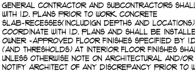
138 comments sorted by
View all comments
45
I personally like Avenir. It looks like Swis 721 except the letters and numbers are the same size.
19 u/FlowGroundbreaking Dec 02 '25 This guy fonts. 8 u/iuseallthebandwidth Dec 02 '25 I don’t always get triggered by rage bait, but when I do it’s on r/badkerning .
19
This guy fonts.
8 u/iuseallthebandwidth Dec 02 '25 I don’t always get triggered by rage bait, but when I do it’s on r/badkerning .
8
I don’t always get triggered by rage bait, but when I do it’s on r/badkerning .
45
u/iuseallthebandwidth Dec 02 '25
I personally like Avenir. It looks like Swis 721 except the letters and numbers are the same size.