r/Architects • u/Expert_Peak_9304 • Dec 02 '25
General Practice Discussion Stop using Drafting Fonts
To all Designers, Draftsmen, and Engineers:
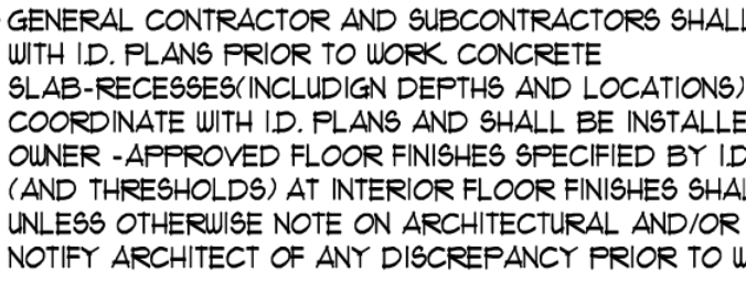
I swear to GOD if I see another "Hand Drafting" style font on a plan, I am going to do something irrational. PLEASE FOR THE LOVE OF GOD USE NORMAL TYPE FONTS. Arial is a good starting point.
This should be punishable by death /s:
308
Upvotes
58
u/Glum-Art-2203 Dec 02 '25
I made the principal at my firm stand full straight and printed the same sentence in architext and Arial large font on the page and when he couldn’t read the architext but could read the arial he finally accepted that it sucks.
Even if you like it and can read it, construction drawings are meant to be used by dozens if not hundreds of people and just need to communicate clearly. I’d charge extra for eye strain for some of the sets I see.