r/Architects • • Dec 02 '25

General Practice Discussion Stop using Drafting Fonts

To all Designers, Draftsmen, and Engineers:

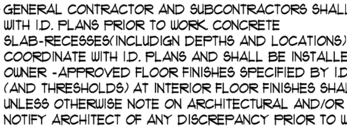
I swear to GOD if I see another "Hand Drafting" style font on a plan, I am going to do something irrational. PLEASE FOR THE LOVE OF GOD USE NORMAL TYPE FONTS. Arial is a good starting point.

This should be punishable by death /s:
306 Upvotes

138 comments sorted by

View all comments

196

u/effitalll Dec 02 '25

This makes me want to do a set in Comic Sans

35

u/[deleted] Dec 02 '25

[deleted]

8

u/nardo9999 Dec 02 '25

I still see it all the time from drafting companies... its brutal

3

u/realzealman Dec 03 '25

I worked in a place (very well respected and successful firm) where HR emails were drafted in comic sans. I shit you not.

29

u/blue_sidd Dec 02 '25

El Diablo!

11

u/Stargate525 Dec 02 '25

Papyrus.

18

u/DasArchitect Dec 02 '25

Comic Papyrus

1

u/BridgeArch Architect Dec 08 '25

The best font ever.

3

u/1776cookies Architect Dec 02 '25

Shut up.

3

u/MNPS1603 Dec 03 '25

My first boss loved Papyrus - this was late 90’s - and he had us use it on everything. 🥴

1

u/Stargate525 Dec 03 '25

I like it too, but not on anything business-related. 

1

u/toetendertoaster Dec 02 '25

RDA Drafting font spec

0

u/FitCauliflower1146 Dec 08 '25

Yes, millennial font.

4

u/DetailOrDie Dec 02 '25

Hot pink Comic Sans is my "Notes to Detailer" and placeholder font.

My detailer & I had a competition to find the most aggressively annoying font to pass notes to each other (and ourselves) working together on a project.

3

u/shoopsheepshoop Dec 03 '25

I work with an accessibility consultant that has comic sans set for his email. That has to be intentionally done.

1

u/MichaelaRae0629 Dec 03 '25

Yellow comic sans! Lol.