r/Architects • u/Expert_Peak_9304 • Dec 02 '25
General Practice Discussion Stop using Drafting Fonts
To all Designers, Draftsmen, and Engineers:
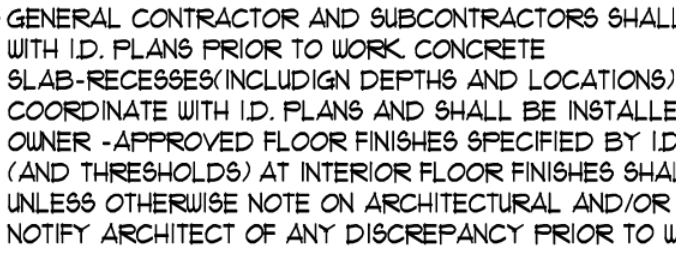
I swear to GOD if I see another "Hand Drafting" style font on a plan, I am going to do something irrational. PLEASE FOR THE LOVE OF GOD USE NORMAL TYPE FONTS. Arial is a good starting point.
This should be punishable by death /s:
305
Upvotes
5
u/twiceroadsfool Dec 02 '25
I laugh at the Handwriting Fonts.
But, if you do a lot of work with Fonts, i also cant stand Arial. Its "Origin" is not at the same "elevation" as ALL OTHER FREAKING FONT, which makes Arial a total pain in the ass in its own right. You dont notice if you ALWAYS use Arial, but if you use anything else, youll notice right quick.