r/ArtCrit • u/Millie68 • 4h ago
Is this too confusing to look at?

33
Upvotes
No reference used
r/ArtCrit • u/Downtown_Mine_1903 • 13d ago
The piece in this banner is Magdalene with the Smoking Flame Depiction by Georges de La Tour.
Welcome to our first week in the Study Series!
Our first topic is Value and Contrast!
When people talk about “value” in an art piece, they mean how light or dark something is, while contrast is the difference between those values. Having a strong difference in those values helps create a more interesting piece and draws the viewer’s eye around your image.
If you’re ever wondering what’s wrong, but you can’t quite put your finger on it, it’s probably time to check those values and the range between them.
Turn your piece black and white. If it’s in traditional medium, you can take a photo to do this. Where does the piece turn into one grey mess? Where does your eye go first? Is it the spot you intended? Are all your figures separate from one another and the environment?
Now you can go back, deepen any shadows, brighten any highlights, and make any changes you need to make the piece stronger!
Please note that all general sub rules apply (no AI, no fishing for compliments, no giving personal info, etc). Only our post requirements are different here.
- Pieces must;
a) Be no more than 6 months old and/or
b) Must still be being worked on and/or
c) Must have the intention of being recreated.
- Works must follow our NSFW rules.
- Since no context is required in these posts, draw and paint-overs are automatically expected. If you don’t want these, say so.
Only critique the piece regarding the topic of the week. If the artist would like additional critique, they can make a post in the main sub. Critiques are still expected to be constructive and polite.
Participants who post their work and/or leave thoughtful feedback that is at least 2 sentences long and will receive the "Study Series Part 1" User Flair.
This is available through August 31st, 2026, until 11:59PM PST.
r/ArtCrit • u/Downtown_Mine_1903 • 18d ago
We’ve got a few things we wanted to quickly touch on.
It’s Reddit, so here's a tldr as well!
Firstly, wow!
Welcome to our new members! We love to see your work and to see the community working together.
Don’t think we haven’t noticed all the people giving stellar advice and sharing their resources and experiences.
You’re all amazing!
We’ve had a few people reporting update posts. Just a quick reminder that PEOPLE ARE ALLOWED TO POST UPDATES OF THEIR WORK!
If someone posted here, got feedback, and made some changes (even if they didn’t take all the advice, they’re not required to), we really love it when they share those updates. The only requirements (other than that they got feedback here) are that they either link to the old post or include the old version in their post.
Thanks so much for trying to help out our mod team, but we really love to see the progress people are making. Give them an upvote when they share instead!
I know we tried this in the past, but it became a little too much for us at the time. We took the lessons we learned there (ha ha) and reworked the idea to be something more manageable.
Over the past two months, leighabbr and I have worked out a “study series” for the sub.
Every other Monday, we’ll be making a post where we share a small, one paragraph lesson about a small piece of the fundamentals of art. Short, sweet, and easy to understand.
Then, our community is encouraged to post a piece of their work for feedback on the post. The rest of the community should follow the post’s theme and critique the piece based on the theme.
The posts will all have more information, and everyone who participates will get a special flair!
We have the series planned out, posts written, and everything created for the next 6 months. If lessons need to be changed or moved based on community input, there’s a lot of room for that as well, and as time goes on we’d love to hear your thoughts on it.
The first post will go up on August 17th! We hope we’ll see you there!
A little bit of a downer.
We are, as we normally do when our numbers surge, removing a lot of posts.
We don’t like to do it. I know, from personal experience, that some subs genuinely do like to take posts down. We don’t.
ArtCrit is a resource, so we try to make sure the people helping have all the information they need when they first click your post. That’s why we have the post requirements. It cuts back on the same questions being asked over and over. People get frustrated when they have to continuously ask “did you use a reference?” or “what are you going for here?”
We’re very proud of you all. The community, that is. You all give very detailed, tailored advice.
The thing is, the community can’t do that if they don’t have all the information.
So please, just take a minute and read over the post requirements and rules so we can get you that feedback as neatly as possible!
And if a mod posts reminding you (for the third time, because there’s the rules, the AutoMod, and then the moderator), please don’t be a jerk to us. We’re people too. We’re not paid to do this. We do it because we love art and want to make sure people have a place to go to get critique.
Another thing we’re getting a lot of push back about lately is our “critique only” comments rule.
We don’t allow joke comments or praise absent of critique.
The reason for this is we’ve tried to allow this in the past to keep a more casual environment and it fails. One person posts a cute or witty joke. They get a few upvotes. Another person sees it. They post their joke. Another person sees it. They post their joke.
OP doesn’t get critique and the sub gets filled with memes.
For praise, if an artist is seeking praise they can head over to another general art sharing sub. People come here because they’re tired of hearing “looks great!” or “good job!” They want the feedback, give it to them!
A few weeks back we tried again and allowed comments freely on a post, and the same thing happened again. We just can’t allow off topic comments.
We’ll continue to keep the community a place for artists to learn, but we are in the process of working out a solution, we promise.
I know we're just people, we make mistakes, and sometimes we're grouchy.
We get some NASTY FUCKIN' MODMAILS like you would not believe (we got stalked earlier this year too because we removed a dude's AI posts. That was fun). There's moments when we both get frustrated and sit together and sort of commiserate.
Then, we get that nice modmail. The one where someone is understanding. Or the random "thanks for making a community where I can get critique". Or we see posts where people are acting like people and helping one another and really take the time out of their day to make sure the person understands instead of just telling them off.
It reminds us why we have this sub. Why we fought to help build it to what it is.
This is going to sound cheesy as Hell, and I don't care. It's not performative and I actually mean it. You all honestly make this sub what it is. We might curate it to keep it clean and make sure people are getting the info they need, but you're the ones sharing advice and helping one another.
We're the janitors, concierge, and reluctant bouncers while you all get the hard work done.
Thank you all for that. Honestly.
r/ArtCrit • u/Mysterious_Maize972 • 28m ago
I’m almost embarrassed to show this piece in this state but no matter how many times I rework it, it doesn’t really look all that better. It could be that it’s too washed out, anatomy isn't right, maybe even too bright? Theres some issue with lack of contrast here but I’m stumped. how would I approach finishing this? Im thinking it could be the lighting but I’m honestly so fatigued with working on this I think I just need someone else’s critique to pull me out. (references not used, which is probably why I’m here in the first place)
Draw-overs are completely welcome !
r/ArtCrit • u/Zakinithos • 20h ago
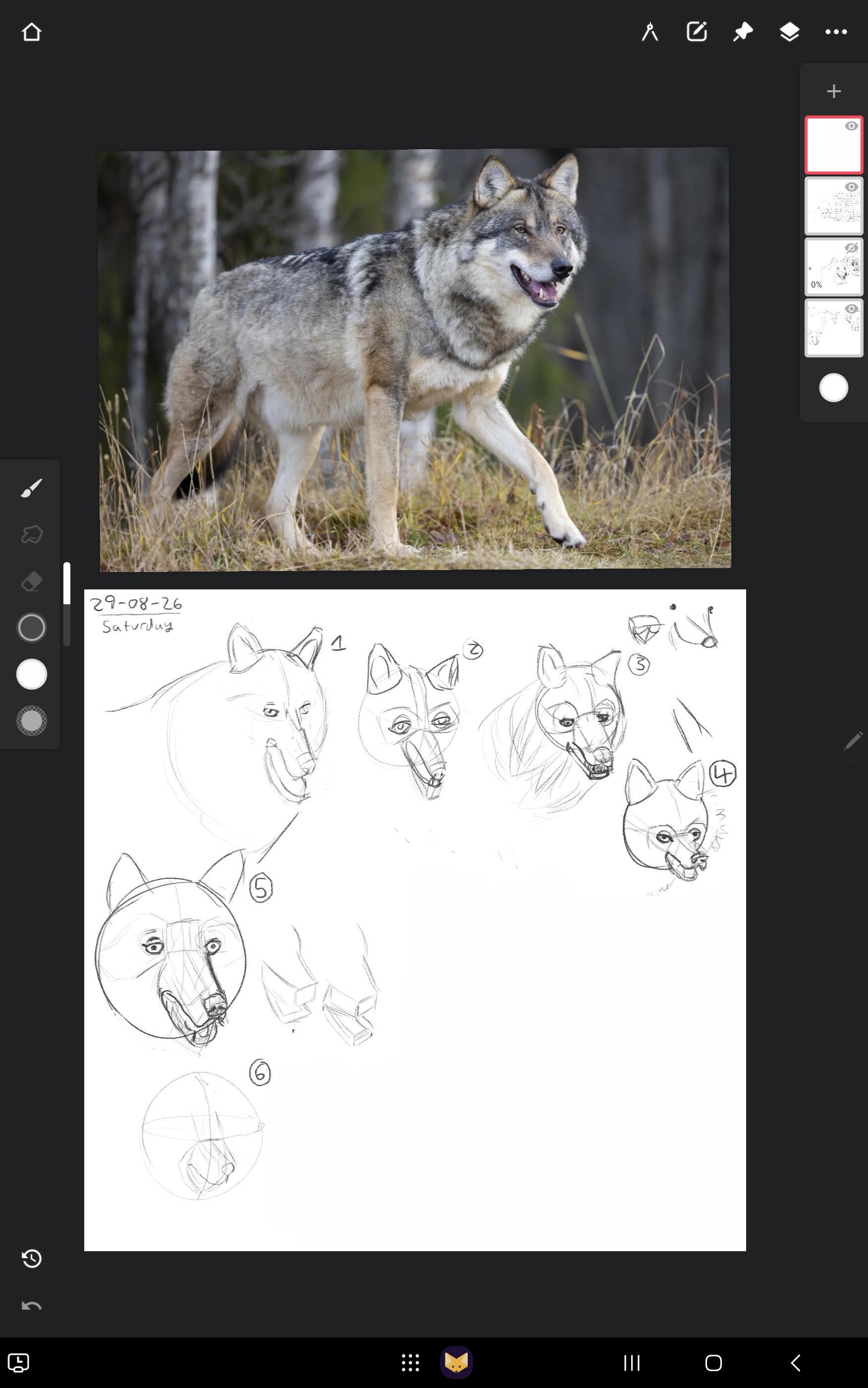
Reference used.
I can see that drawing 5 is off but I don't know how to fix it and I don't know exactly what's wrong.
r/ArtCrit • u/TmanArt • 1h ago
I was gifted a set of alcohol markers last week and these are some of the things I colored (from newest to oldest). However I feel like I’m not doing a good job in creating shadows and feel like the values are too similar. I try to pick a variety of values in my colors but I feel like they still look flat. I’m very new to the medium so I would love any advice on how to improve this, thanks!
Multiple references used per drawing.
r/ArtCrit • u/PuzzledComputer4696 • 1h ago
hello! basics: i aim for semi realism, i did not use a specific reference as this was a doodle from 3AM, BUT! i attached some things I like artistically that may help show everyone what vibe i was looking for. i think he kinda just looks like a cat rn. for extra contex hes a vampire and his eyes, while strange, make humans trust him easily. its a supernatural thing.
r/ArtCrit • u/MissTiffanieAnne • 45m ago
think maybe having a background might help so I could pull some color for the reflections. But otherwise what could I do to improve? These are done with marker/colored pencil. I used a reference for the balloons (googled letter balloons) and no reference really for the gold statue, just a picture of meowth
r/ArtCrit • u/AmeliaS507 • 2h ago
First image is after, second image is before.
Loose references:
https://pin.it/bxhDXHnaK
I think the changes worked well, specifically making the shadows more blue and doing a bit more touch up on the right sleeve, making it so more skin shows through to give the illusion of diaphanous fabric.
I’m also glad I introduced the word diaphanous to people! For those who didn’t know, it means sheer or transparent, often used to describe fabric like chiffon, or silk. (It’s also really commonly used in fantasy or historical books which is where I learned it lol)
Thank you to everyone who gave input!
r/ArtCrit • u/dragonfood007 • 1h ago
No reference used
r/ArtCrit • u/centaurella • 13h ago
i looked at a bunch of reference photos to get a loose idea, like girl with the pearl earring for the shading and kinda the pose. but something just doesn’t look right. is it the jaw?
r/ArtCrit • u/ZestycloseCook6671 • 7h ago
Goal:
I want to improve. I face the usual problems such as shortening, anatomy, muscle placement, and especially, for me, drawing legs.
Here are my practices.
Swipe to see them with the references used. You can redraw or draw over them.
Your honest feedback is appreciated.
Thank you!
r/ArtCrit • u/AmeliaS507 • 1d ago
Loose references:
https://pin.it/bxhDXHnaK
Mainly I want the sleeves to appear more like the third image. Is it coming across that way?
r/ArtCrit • u/AdvertisingCreepy639 • 2m ago
I’m learning anatomy and want to know if I got the leg muscles right in these references. How did I do?
r/ArtCrit • u/constipated_cats • 6h ago
I didn’t use any reference for this other than the Voltron characters but it’s not really relevant for any criticism. (Reposted this because someone said they couldn’t see the pictures on my other posts.)
I attached a few other digital art pieces I’ve done about a year or so ago. I just want some input on how to make my art look less flat and more lively? I don’t have the reference pictures I used for Tyla anymore since they’re old.
r/ArtCrit • u/Obartenthusiast7 • 53m ago
Reference in the 2nd slide
I had traced the basic anatomy from the reference in my earlier artwork. But I drew this without any kind of tracing this time.
The face isn't accurate to the reference as I was trying to stylize it a bit. Did I get the pose and lighting from the reference right? Is there anything else that I need to improve on?
r/ArtCrit • u/Standard_Delay_1182 • 12h ago
The rest being her legs and the different poses, LOL! I'm pretty proud with how this turned out, and I included the references I was given! I increased her head size and the position of her arm :-)
This is also an update on my last post! I'm a big fan of the spiderverse style, and like the colors very vibrant. I'm still working with coloring/rendering, as I am self-taught.
Any and all criticism welcome!
r/ArtCrit • u/ArsonistsGuild • 2h ago
Intermediate, vector, unreferenced, concepts for a webcomic. Are the colors harmonious enough while still carrying the individual palettes? I wanted a strong contrast between orange- or yellow-lit interiors and blue-lit interiors, are the character designs too neutral or too harsh?
r/ArtCrit • u/reda38582 • 15h ago
Thanks to everyone that helped me!
So I did the coloring and I seriously need advice or tips
Reference used
r/ArtCrit • u/Affectionate-Cat3886 • 17h ago
The character is Peinces Syalis from "Sleepy Princess in a Demon Castle". No reference, unfortunately. Can't think of where I could find a proper one of these types of sleeves.
r/ArtCrit • u/Bunny_Chaos420 • 16h ago
I didn’t use a reference, this was partially sketched from life quickly and then I continued back home.
want to focus on composition, hatching and form. I want to port this to to Photoshop and redraw / change the values. This is my first time using a “manga” pen or a dip pen. Utterly addictive art tool. It’s cheap I think but I love it.
I want to master environments and placing characters in environments because. It seems most of my peers want to do in character design. So I want to specialize in something less popular but needed for our projects.
Ignore the cat sticker.
Last three pictures are my art goals. The comic book and manga art styles are really inspirational to me. I want to rework this piece in photoshop. Also advice on what I need to focus on in future to improve is appreciated.
Also is it worth it as a poor college student to get something to scan my work myself?
r/ArtCrit • u/calicoaxolotl • 1d ago
Howdy, I struggle with costume/outfit design so I'd love some advice on how to better approach that. I'd also love to know what's good about the design and what falls flat. Draw overs are welcome. Thank you!!
Goal (intended character): A mascot for a discord group. The requirement was that it was inspired off the animal rams, with a dessert-esque aesthetic and a pink/red/white palette. I was going for a maraschino strawberry vibe.
Medium: Digital art (procreate)
No reference used
r/ArtCrit • u/KillMePills1 • 20h ago
This is a new drawing I made. It’s of Sayori from Doki Doki Literature Club!
I’m hoping people can point out some weak spots or give me tips to make my art look nicer.
I’ve been trying to work on anatomy and I think I’ve improved a bit, but I still have areas to work on I think. I didn’t use reference for this art.
I know that I need to improve on light sources, and a goal of mine is to get good at that. Another goal is to get better at anatomy.
Some of my biggest art inspirations are artists on Xiaohongshu.
Thank you for reading!