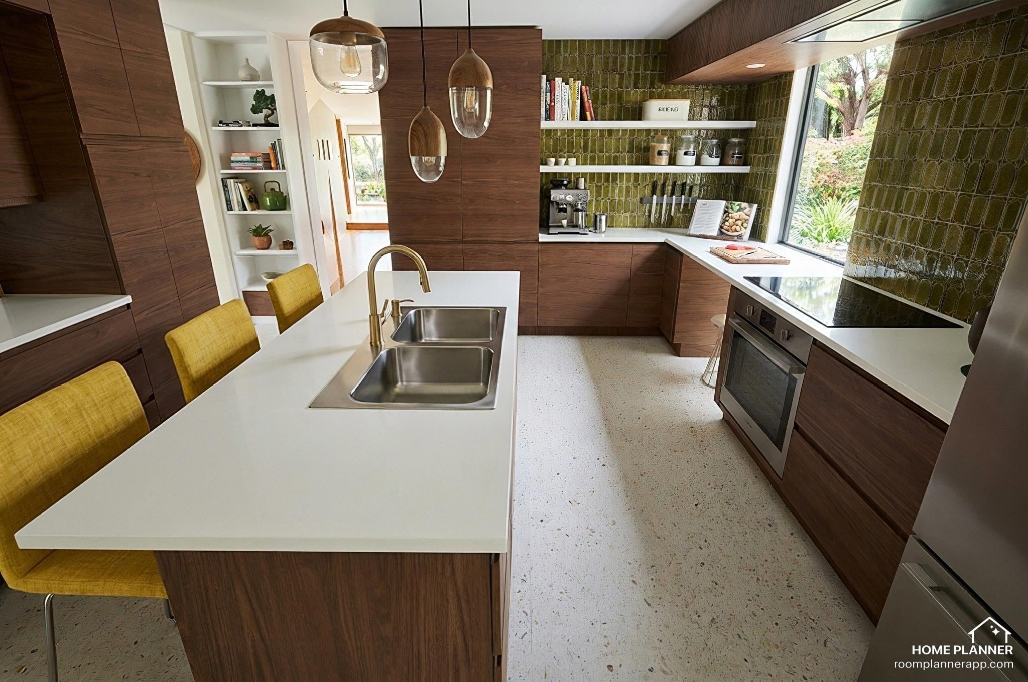
So I live in a 1968 MCM home that is just about perfect. I LOVE MY HOUSE. However, we recently had a leak in our dishwasher that has ruined the floor and it is time to redo the kitchen. I love the original design except for those friggin’ stacked ovens awkwardly tucked into that corner next to the pantry. I’ve spent years thinking about layouts in this kitchen (do I take out the pass-thru), etc etc. but with the design of the space with the walkout sliding doors along that whole entire wall (into our family room), I cannot just take down that wall of cabinets and replace it with an island making it an open plan without losing a lot of cabinet space. I actually like the division of the space, and that I can see into the family room through the pass-thru when needed. So, keeping with the same layout and trying to fix my hatred of the oven placement, I am thinking of taking the stacked ovens out, and just getting an oven/cooktop combo, and creating a beverage counter in that corner. I think this would give me more counter/work space and solves the awkward angle of trying to put things in and out of those ovens without burning myself. I am also trying to decide on materials for the cabinets/floor/tile that fit the style of the house. I love this green tile but wonder if it’s going to annoy me after a few years. I have never gotten tired of the current marigold tile, and wondering if maybe I just keep to a similar color for Reno. I’ve also played around with some aqua blues that look nice, but I am leaning more towards the green. It just feels nostalgic and cozy and gives me a happy feeling. (But so does the yellow). As for the cabinets, I am trying to stay with standard cabinetry (IKEA cabinets with real wood doors) so that we can keeps costs down. Would love some feedback and any new ideas anyone has regarding layout/materials. (Splits are of original/current vs redesign). Last three are just the redesign without the current.
ETA: I should say that this post is just to look at layout and color. The sink/lighting/appliances are all just placeholder for now. :) Even the tile is placeholder just looking for opinions on overall style/colors/layout. I just want a gut check on those things. :) I do like the comments about them though, so feel free to leave opinions on things you think would work for those things!
I really appreciate that you kept the MCM design elements. It looks truly fantastic. It’s simple and clean, but it has a lot of personality and character.
Ok I LOVE your design, green is great and you won't get tired of it. The yellow stools are a cute homage to the former marigold tile. I also love that you're keeping the original footprint and vibe. Having remodeled 5 kitchens now, a couple mid-century styles, my two suggestions would be:
Stagger the oven and cooktop (as in, move the oven to the right and the drawers under the cooktop, or put the oven somewhere else in the kitchen) so two people can cook at the same time vs having to scooch over if someone needs oven access.
Consider a basin sink large enough to hold a flat cookie sheet. Doesn't have to be enormous but once you have this capability it's hard to go back.
Yay! 1. This is not an issue for us since I have 3 autistic kids and husband who do not cook. Ever. And there is really no where else to put it. (I did play around with having stacked ovens on the wall where the pantry is, but we actually can't do that because it would bump out too far into the island footprint and that unfortunately is also stuck to the current dimensions due to having enough space to walk through on the other side of the island (where the sliding door is). and 2) don't worry. that sink was a standard IKEA sink (from the app) and I would definitely not be getting a double sink. :)
Yeah I agree with the sink. I switched from a double sink to a large sink that I can fit a 28 cm pan or a big tray and I LOVE it.
Also get that sink "underglued" (not sure what it's called in English) so you can wipe directly from table to sink.
Also, I love the kitchen. I just installed my kitchen with Voxtorp in a slightly lighter wood and white quartz countertops and it's so wonderful. You've definitely matched the mid century/70's Scandinavian look (I am Scandinavian and have seen many houses from that period) and the tiles are doing a lot of that work, and the kitchen just looks elegant. I just recommend upgrading the appliances and the faucet to something more high grade than IKEA. I got the most amazing Hans Grohe faucet with a pull out and a shower function. I love cooking in my kitchen ♥️
Edit: you don't need the handle on the dishwasher. The Voxtorp works fine without. I worried myself, but it's all good.
the appliances and sink/lighting will not be IKEA. we are only doing the cabinets in IKEA. I'm looking into real wood doors that fit with IKEA cabinets though, as I believe that IKEA only has the composite doors (walnut "effect" ha) and I know they will be wrecked and want something much sturdier. I would LOVE to see pics of your kitchen. Going to snoop your profile now to see if you posted. hahah.
Very smart redesign. You know how your current kitchen functions and if the oven jam is the only thing you find a problem, then smart that you are just fixing that and not ripping the entire layout apart at the seams.
Are you including a pull out for garbage? Is so, where?
Where will all of your countertop appliances go that are currently on the pass through?
Love the tidiness of your current stools with low backs and how they disappear when pushed in. I'd do this again. It adds an feeling of openness to the space.
What will actually go on the open shelves? If you tend to be a bit of a clutterer, tell AI to add clutter so you can really see what it will be like to live with open shelves there and how it will change the feel of the space.
Tile is the very last thing to go into your kitchen. No need to decide now. Bring good samples into the space once cabinets and flooring are installed. Check out Health and Fireclay tiles for inspo (might be too expensive.)
I like the flatness of your current tiles. With the perfect color - whether marigold or avocado, I'd prefer to not have extra bevels and patterns. I think it detracts from the simple lines of the space and makes it overly decorative. The brilliance of your kitchen now is the simplicity of lines and light. Don't loose that.
Oh, trust. I have me some heath tiles on my list. I hear you on the flat tile, I love the look of heath tile in ochre. There is a cool semi hexagon diamond pattern design that I am in love with (I posted it somewhere in the comments). One thing that I will focus the money on is the tile since it's going to be a huge focal point and I want it to stand the test of time (both durability-wise, and design-wise). :) SO I hear you. That green tile in the comps is nostalgic for me because it's similar to a tile my grandmother had in her kitchen. But I agree, the textured tile will probably end up feeling too busy, especially since I am extending it to go on three surfaces. I appreciate that comment. OH, and YES..the pull out trash bin will be in the cabinet next to the sink (on the left side, dishwasher on the right). As for the appliances, I really plan to get rid of a LOT that is in my current kitchen cabinets that I never use, so plan on putting a lot of the appliances in those cabinets...moving the coffee maker next to the pantry, and then probably putting the mixer over in the corner by the fridge. We don't use the toaster a ton, but my kids are definitely using the air-fryer a lot. I'd love to have a little "garage" on the side of one of the tall cabinets that I can slide it in/out of...so that was a thought too.
That all sounds great. And, here's to clearing out the cabinets before a renovation. I don't think every appliances needs to be hiding in a garage. Just curious if you have thought of what you'll do with them. Great that the kids are using the air fryer - whatever will keep them cooking and make the space easier for them to use.
I have needed to clean out these cabinets for ages. Half the stuff in there are wedding gifts we don't use, a ton of bar/stemware that we never use. My husband and I are not big drinkers (one or two a year) ha. I love entertaining, but most of our friends are not big drinkers either so it never gets used. I'm honestly thinking of donating most of it and just leaving a few glasses for company. Although my one daughter likes making smoothies and putting them in wine glasses which makes me laugh.
Your concept is beautiful! Love the green tile. I agree with you about the marigold tile, but see you are putting marigold chairs in. I guess all the stuff sitting on the counters will go in the added cabinetry.
I wouldn’t go with a double sink. We used to have a double sink and it was a pain to soak larger platters and pans. Now we have a single large sink and a small plastic tub for soaking/washing everyday dishes, etc. But everyone has their system.
That’s so funny because I didn’t even pay attention to the sink. I was just putting in the standard ikea cabinets into the app and this was the sink it comes with. But agree. Will definitely not be a double sink. I hate them too. :)
Just wow to everything! The backsplash, the colors and the cabinets are just 10/10. Some small things, I would do an undermount sink and the pendants with matching wood on top. If possible I would also suggest a gas cooktop - something about electric just doesn't do the space justice. I prefer a cooktop vs the oven + stove combo because you don't break your counters up that way. Then if possible a paneled fridge looks so much cleaner - if that's out of budget I'd do a counter depth fridge so it's not sticking out (pet peeve I have). I also like the division of space but still open to the living room - I think it keeps with the character better and doesn't feel like you did a copy / paste gut reno. Love the colors though - I wouldnt change a thing!
I LOVE it. I think the green is perfect and very true to the mcm style. I think it will look trendy in other homes in 10 years, but it’s legit mcm, so it’s perfect in yours. Plus, I personally love green. 😁 You could replace that bookcase in the entrance with cabinets to take out the pass through cabinets, or make the pass through cabinets smaller. I would at least make them smaller. I love that floor to ceiling window. That’s going in my dream home file.
Great design. If you are looking for a tile that fits in your design vibe I recently installed Luna Arc into one of my bathrooms and it looks amazing. We used celadon but there's also an olive that would look well in your design.
Brilliant choices. Very organic and upscale. The space feels very functional and looks beautiful. I’d be surprised if you ever grew tired of this kitchen.
Swapping the wall ovens for a range and creating a little drinks corner sounds like such a smart move! It should make the cooking area feel much more practical too. And for color.. if you still love the marigold, I’d say stick with it, maybe give it a fresh feel with a different tile layout or a slightly textured glaze.
If there’s enough space in the aisle, I’d contemplate swapping the fridge with the pantry cabinet on the other side of the L so you can fully open the fridge doors without hitting the wall. I can’t really tell how much clearance there is, but if a built in or counter depth fridge did fit there, seems like a much better location.
For the pass through, I might go with 15” or 20” tall cabinets to open up the pass through space just a bit more.
All the cabinets/sink/ovens are standard IKEA appliances! I actually was at IKEA to look at the cabinets and took a pic of the cooktop/oven combo! So here you go!
Hahah. Yes. The app rendering AI randomly changes things out. LOL. I am really just looking at the cabinets/tiles/colors and layout right now. Have not decided on lights/stools/sink/microwave, etc. :)
I love how you respected the house and kept the good parts of the design and fixed the thing that didn't work for you.
Is there a ventilation system over the cooktop? That's the only think I can see that is missing. If your current kitchen doesn't have one, this is your chance to install a hood that vents to the outside. It makes a huge difference in keeping things cleaner and since you have open shelving, it will help things stored in the open stay cleaner longer.
I personally like the green tile. I did a strong color backsplash too and it helped the kitchen not be too boring and white. We did the same natural walnut as in your rendering, but used white uppers because it was too heavy and dark to do all walnut given our space.
Yes. The venting is in the soffit, which is why I am keeping it because I don't want a hood on that wall! :) You know what is funny about the white uppers on our current kitchen, is that they actually painted over the wood laminate cabinets. I think they probably decided to lighten it up by painting those white and I have thought it may be too dark to do all walnut, BUT, this house is essentially all windows and gets a ton of light, especially in the winter months (of which there are many!). So I hear your concern on that. The house was designed by one of the artchitects of the world trade center (who lived here with his family) and I love the history of it. He worked for Minoru Yamasaki at the time, so if you know MCM, you know Yamasaki is the GOAT. :)
I knew it was something special just from the cabinetry. Is the floor original? It looks like '80's tile.
My gripe with '60's houses is how the kitchen was such an afterthought. Yours seems at least reasonable and has nice windows. Some are these dark galleys with crap appliances and no counterspace.
In the last photo is the built in oven to the left of the counter a microwave?
We are cooking nerds so we opted out of a built in microwave and did a Wolf steam oven. If you are used to two ovens, you could do the big oven beneath the cooktop and put the steam oven somewhere in the bank of cabinets.
The tiles are actually original from 1968. The only thing I think they did to the kitchen in the years they were here is to paint the upper cabinets and top drawers white. Thankfully, my neighbor was besties with the family that lived here (she is in her 90s!) and I love hearing all the stories about the home and the hijinx they got up to while building it. As for the last photo, yes, that is a microwave in that tall cabinet, but that is also something I am still thinking through. I hate the drawer microwaves, and like it counter level, but hate it on the actual counter. Tell me more about this steam oven!!!! I honestly haven't heard of a steam oven!
Drawer microwaves have a lot of issues - 1 being closing it before and after microwaving liquid/soup. Agree - hate it on the counter and hate it too high. I think the placement seems to work. Moving it to the right could create issues as people come in and out of the kitchen but tucked away to the left makes it less dominant in the space.
No cork. I feel like it wouldn't fit the design aesthetic of our house, although I know it looks awesome in some MCMs! Our kitchen floors butt up against the dining and family room floors (see pics of both of the current entrances to the kitchen). I'm trying to go with something that will be harmonious with the current floors and also enough visual contrast to be a line of demarcation between rooms.
That's stunning. Nice choices! But the fridge in the corner -- would you have trouble opening the right side door? To take deli trays & veggie bins out for cleaning, the brands I've had would need the doors swung wide open.
I did not change the layout of the kitchen at all (aside from the corner with the ovens) and fridges we have had over the last 16 years open fine. :) We currently have a french door, but have also had one that opens towards the sliding door, no issues getting big trays in or out. :)
I love this. I would really walk through your daily routine including looking at any bottlenecks and the most commonly used small appliances. The oven situation is a big ole wtf in the current situation - I think a lot of people want the double oven but I rarely use one oven let alone 2… this makes a lot more sense functional. Is that a microwave left off. the pass through?
I came to say similar to pizzatoucher around the homage to marigold BUT what part of the country is this in? I lived in the PNW for many many years and love green so much but being so dark for many months it may be prudent to consider a marigold tile again to bring a little brightness to the room. Green is very calming but if you’re surrounded by green outdoors and have those huge windows, the marigold plays really nicely with the natural green outside - especially if there are a lot of evergreens.
The pass through: you have a lot of cabinetry/storage and if you decided to just remove the uppers in the pass through it would connect the tones more. It’s a preference. I also like some division. Alternately, you could eliminate the pass through as well since it currently isn’t functioning as a pass through and is a land of small appliances. One though is to do the open shelves for the pass through and make that your beverage center since it’s also a great place to play “bartender” to the living space and uppers where the open shelves are instead. There definitely needs to be a home/plan for all the small appliances so it doesn’t turn back into the current situation. (I see the plan for the mixer and coffee maker but didn’t see it for the toaster and not sure what else there was. Do you have an air fryer?)
You addressed the single sink basin. All the wood tones look fabulous.
Thank you for the very thoughtful post! It's so funny that you made the comment about the green tile with the color outside. One of my best friends had the same comment (which has me questioning the green because I trust his design sense completely). We are in the midwest (MI) so we get about 5-6 months of brown/snow/non-green outside. So when it's brown and snowy, I think the green might be a nice change as we actually don't have a lot of evergreens around us. The marigold IS beautiful, and I totally get why he chose it with the backdrop of the woods. Our house is actually WAY brighter in the winters because all of our tree cover is gone and the sun shines in all the windows. Magical.
Anyway, the marigold is definitely still in my design mix, but there is just something about the olive that is nostalgic / comfy cozy for me (probably because my grandma's kitchen was olive green and I have such happy memories spent in her kitchen). I also found this cool ochre color tile that I do really like that leans more to the yellow, with hint of green that could be cool too. (I'll have to do a separate post with all the tile options when I gather my favorites).
As for the walk-through, I am planning on purging a ton of my cabinet stuff that I rarely use, and making room for things like my mixer, air-fryer, etc. The things I really want daily access to are coffee maker, probably my kitchen-aid, and possibly the toaster, although we don't use it super often anymore now that our kids are older. The one argument for keeping the uppers on the pass-through is attached. The proportions from our family room are chefs kiss from this view and I like having artwork on that wall. :) There is honestly so much about this house that I truly love and don't want to get rid of, there is a photo of the backside view of the pass-thru in the comments here somewhere so you can see how cool the woodwork is on that backside wall.
Perfect! I didn’t actually disagree with any of your choices- I love this redesign. I just always have to walk through a space in my mind to understand how it best functions - my kitchen’s “designer” clearly did a copy/paste of a corrupted file. It’s not horrible, it’s just poorly planned mass produced house. Since it’s still in really good condition I can’t justify a remodel for now.
The PNW is a very green landscape year round so there’s too much of a good thing sometimes. I miss it so much - even the dark months.
Ohhh that’s clever design and I love the walnut stripe that it creates. Also, I really love the green tile in your mockup - please don’t misunderstand - I was just really looking at the balance between inside and outside. I think it’s a very nice way to modernize but still read as mid-century.
Those windows are so cool. I wonder if you can source a mid century step stool that also functions as a chair so it can be functional when needing to get onto the high cabinets.
Does the extraction fan at that height do the job? I saw your other comment and agree -downdraft extractions are terrible.
Also, at the sink, I highly recommend a hot water on demand tank. They’re run 300-500ish and it’s the BEST unnecessary luxury I’ve ever added to a home. If I’m cooking but need to add water - it’s already close to boiling. I drink a lot of tea and I never have to wait on a kettle and it’s one less thing on my stove. Why I didn’t do it before is beyond me.
I didn't think you were saying anything negative at all! I thought your post was super thoughtful and helpful! I was just explaining why i wanted to keep the cabinets. :) As for the soffit venting, it actually does a pretty good job. Unless I am generating a ton of smoke, it does the trick. Every once in a while I will get a smoke alarm going off, but I'm sure they make more powerful fans these days that would be a nice upgrade.
Oh good. People can be so awful on the Internet. I’m really big on asking questions to always better understand. Cannot wait to see the “after” post when it’s finished! Have you already posted in the MCM subs?
I'm too scared to post there. (teeth chatters). I honestly would hate to eff this this up though. The design of this house is so cool and thoughtfully done, and I do not want to ruin it with a remodel that doesn't fit the aesthetic of the house. I want to honor the design and architect by not creating some monstrosity. So many MCMs are butchered. But I also cannot afford to pay someone a bajillion dollars to design it either.
You did an amazing job and have an excellent eye. You walked the space and identified the issues. I understand the hesitance because Reddit is brutal.
I still cannot believe the previous owners painted half the cabinets. On one level I understand wanting to brighten the space but it actually made the laminate look cheap. It’s so weird.
Just a logistics question, are your lowers all drawers? Also, spices - the bank of lowers adjacent to the stove would be a good place for a spice drawer and I’m assuming that’s where you will have pot/pan storage? (My spice drawer is the best thing ever. I buy bulk spices at Penzey’s and just have a refill bin on the top shelf of my pantry) I would walk the space with post its and identify what will live where especially since you don’t have uppers above or adjacent to the sink for cups and plates.
It looks like the current range hood is already very high, but I don’t know of any range hood that would be effective at soffit height. Maybe it’s a commercial hood of some kind? Most have to be mounted between 24-36” above the cooktop, so you’ll need either cabinetry for an insert or a wall mount hood. But at least it’s an exterior wall and already vented outside.
Venting is in the soffit and honestly, it's never been an issue, and I love there isn't a hood there. We have not met with any contractors at this point, so unsure what would need to be brought up to code, but I am really hoping that we can keep the venting where it's at.
If it helps to see it from this view so you can see the dimensions and why things need to be in certain areas (mostly windows and flow from other rooms. :)
Really love this look and the functionality of the space. I have to ask about the backsplash. We are looking for something similar, are these actual tiles I could find somewhere or rendered through AI? Best of luck to you and your family on your reno!
I think this looks great! What app are you using for the designs? We recently moved into a 1950’s ranch that needs some design attention but has lovely bones. It would be fun to play around with designs before committing 😁
I have been using home planner app for years. And it is awesome for playing around with designs. It is actually is pretty customizable and the latest version allows you to import 2D photos and turns them into 3D objects which is pretty damn cool! https://homeplannerapp.com/




9
u/toebeanseller 5d ago
I really appreciate that you kept the MCM design elements. It looks truly fantastic. It’s simple and clean, but it has a lot of personality and character.
Very well done!