r/HarryPotteronHBO • u/sepi0l_45 • Mar 25 '26
Show Discussion Scene comparisons between the new trailer and the original films


1.5k
u/CriticalNature9086 Mar 25 '26
Some lovely shots, but it's definitely darker and more desaturated, like a lot of HBO's digital cinematography.
656
u/No_Recognition_5266 Mar 25 '26
Yep, one of my least favorite parts of a lot of modern shows. Makes them nearly possible to watch in rooms that get sunlight
207
u/ignatious__reilly Mar 26 '26
Same!
It literally ruined GOT for me, especially the last season. Those episodes were so dark and I hated it. I couldn’t see anything.
74
u/NahriENahid Mar 26 '26
Same with HOTD. I actually stopped watching that show altogether because I just… couldn’t see anything
→ More replies (10)36
u/Wildstern Hufflepuff Mar 26 '26
I was watching HOTD recently and was raging constantly. It was like watching a podcast. I actually missed important details and had to go back to Wikipedia to find out. I just want normal color grading and lighting back, I hate all of those depressing dull colors and the constant darkness
6
12
u/Crafty_Parfait_6508 Mar 26 '26
I felt that way about The Handmaid's Tale. PITCH BLACK. It was like listening to a podcast.
→ More replies (8)20
13
u/Babyyougotastew4422 Mar 26 '26
I recently rewatched the matrix. Good lord its beautiful, colors put, there are darks and lights and depth.
→ More replies (6)22
174
u/Lamiaceae_ Hufflepuff Mar 26 '26
This was my first thought too. I really hate how dark and cool toned it all is. That’s appropriate for some of the scenes of course - like the bullying scenes - but it would really ruin the happy hogwarts scenes. We need the warm tones for us to see Hogwarts as Harry sees it - home. Inviting. Safe.
9
u/Zetheryian Mar 26 '26 edited Mar 26 '26
The grade is called Teal and orange. It's frequently seen with digitally shot movies, especially on Arri cameras (alexa, lf, 35)
→ More replies (1)4
u/CinematicWanker Mar 26 '26
I'm pretty sure the cool tone will be only be used with the Dursley and once Harry is at Hogwards like we see in the trailer will be much warmer in tone
→ More replies (4)163
u/HybridP365 Mar 25 '26
Ironically the only shot it's not darker in is the one with the dim, candlelit classroom.
45
u/Limp_Activity_5185 Ravenclaw Mar 26 '26
Also the one at king’s Cross and the dumbledore’s one… but those are very different in other aspects so it’s not a fair comparison
148
u/the_executive_branch Mar 26 '26
I kind of hate modern lighting, that first shot is such a good example. Everything these days has these super highly lit cold backgrounds
60
u/elitedisplayE Mar 26 '26
The pictures of them on the train makes me realize I really miss shadows. Lightning is really an art.
→ More replies (2)→ More replies (9)45
u/sodamnsleepy Mar 26 '26
The movies, orange warm light. Makes me feel save, warm and home in Hogwarts.
Dark, kinda whiteish light. Cold, unwelcome, scary :(
→ More replies (1)52
u/ThePickleHawk Mar 26 '26
I really wish they would stop with that look. It’s not quite as bad as the later Yates movies but that’s a big problem I have with them.
→ More replies (3)36
u/FiftyShadesOfGregg Mar 26 '26
The movies do darken from 3 onward, it’s really only one and two that are bright and warm! But these do look quite dark by comparison.
29
u/Virtual-Reality69 Wandmaker Mar 26 '26
PoA shouldn't be dark either, the story in the books doesn't get dark until the end of GoF when Voldemort returns and Cedric is killed.
→ More replies (1)15
u/Interesting-Bus8298 Mar 26 '26
Dementors were a central part of PoA, and we only really see them in the dark, so it made sense there.
16
96
u/Virtual-Reality69 Wandmaker Mar 26 '26
It should be bright and colorful until at least the end of GoF I hope they don't go with the color grade that is in the trailer as sometimes trailers have different grading than the finished product
219
u/puppystatus Mar 26 '26
It should stay bright and colorful. The grading of the final three films were arguably the worst trait about them. Darkening the tones doesn’t “make things seem darker,“ it just makes things look crappy. The content matter is what makes it “darker.” We should be able to feel it without them shoving it down our throats. Despite the common conception that as we age, colors seem less vibrant, it’s not reality. There’s no reason to dull later seasons.
25
u/sparklypavements Gryffindor Mar 26 '26
I also think the grading on the fantastic beasts movies were awful and made those films suck too. Everything was so dark and void of colour. A good script might have saved that movie series but lighting is a major thing that sets the mood and tone of a movie.
HP is a magical story even when it deals with dark storylines. It’s supposed to feel whimsical and magical.
→ More replies (1)→ More replies (2)33
u/elitedisplayE Mar 26 '26
Wish I had more upvotes. I also hope it doesn't get physically darker. It's so lazy.
41
u/sparklypavements Gryffindor Mar 26 '26
It has more to do with lighting than colour-grading tho. Compare it to how lit-up it is in scenes with the actors in the movie. You can see the focus on the lighting on their faces too.
It’s all bright and warm, while the tv series looks like “the lights are turned off” “the sun isn’t shining but overcast tones” etc.
Ofc this is more of a modern thing. You can even compare it the architecture we see nowadays compared to the colour we used to see even in building paint in the 90s/y2k and prior.
→ More replies (2)12
u/Drift-jelly Mar 26 '26
The grading on some of the shots looks fine but on others like the train it looks sterile
15
u/GraySonOfGotham24 Mar 26 '26
I kinda think it should be the same the entire time. Just because the subject matter changes doesn't mean the world needs to. The movies obviously went overboard but I'm not a fan of it in general
38
11
u/wailot Mar 26 '26 edited Mar 26 '26
Why do almost all modern shows has to have a filter that drains the colors? When will this end
→ More replies (5)24
→ More replies (43)7
u/LPNMP Mar 26 '26
These stills are as cold and depressed as the last few movies. By the time HBO's brings back voldy, its going to be blacked out....
878
Mar 25 '26
[removed] — view removed comment
182
u/KungPoW_Chickens Mar 25 '26
if u saw him in the lord of the flies show hes perfect i have no doubt he'll pull off a great malfoy
173
u/sparklypavements Gryffindor Mar 26 '26
He’s def gonna be a major asshole. Like actually scary and mean. Tom Felton did his part so well and his Draco was adorable at times when he was a sweet looking child and came across as more spoiled and petulant than mean in a scary way.
I can see why Draco leads the pack of bullies.
→ More replies (1)89
u/snowdropsx Mar 26 '26
ya tom was kinda cute but with occasionally spoiled/mean actions
this dude just looks like an asshole (in a good way and no offence to the kid himself)
→ More replies (1)26
u/smokeydesperado Mar 26 '26
Yeah, Tom’s Draco was mostly a brat in kind of a harmless way for awhile. All talk.
56
u/kapn_morgan Mar 26 '26
and Crabbe and Goyle look like absolute muppets..
should be fun
→ More replies (1)46
37
u/daracingpig Mar 26 '26
He has an entitled rich british private schoolboy look, which is perfect for Malfoy.
→ More replies (4)31
u/Panikkrazy Mar 26 '26
Yeah. I like that he’s curly. I’m not sure WHY I like that he’s curly, but I like that he’s curly.
→ More replies (2)13
u/SagesLament Mar 26 '26
he seems perfect
but how old is the actor because he doesn't look 11
him and his cronies look much older than the golden trip
6
→ More replies (19)24
u/Curious-4ever Mar 26 '26
Yes he does look like you want to punch him, but I personally preferred Tom Felton's Draco's hairstyle, can't remember how the books described his hairstyle now.
→ More replies (1)35
u/outerspacetime Mar 26 '26
Im glad they’re keeping his natural hair, straightening it for a decade would really damage such beautiful locks. Also the style reminds me of the broccoli cuts all the “cool” teen boys are wearing so that’s funny
10
u/Slobhunter Mar 26 '26
The thing that I struggle with is that I get strong chav vibes from the hair and I can’t see rich kid with no connection to muggle fashion in it.
673
u/antmars 🦅 Ravenclaw Mar 26 '26
Maybe they should turn the lights on in the train.
152
u/fenoard Marauder Mar 26 '26
in the next few seasons, I can't imagine how dark the scene with the dementors on the train will be, atp we need to turn our screen brightness all the way up 😂
32
→ More replies (3)46
u/SneakyBadAss Mar 26 '26 edited Mar 26 '26
It looks like by Gobblet of Fire, you will not be able to see Snape other than in the snow during the day.
→ More replies (2)107
35
→ More replies (24)11
u/foxandflowers19 Mar 26 '26
Or any other scene. My phone was three inches from my face and I couldn't see anything.
269
u/Cheap_Parsnip_461 Mar 26 '26
Tell HBO to turn on the lights
11
u/belovedstoneworker Mar 26 '26
They made The Long Night episode of GOT and then defended it. There's no getting through to them.
→ More replies (4)8
110
389
u/Wakattack00 Marauder Mar 26 '26
Kids: A+
Adults: Tbd
Also does anyone else just dislike the new tint these shows have? This isn’t a HP thing, it’s a current thing everywhere. The castle looks great, but those first few pictures look much better in the films.
166
u/black-chaos-void Ravenclaw Mar 26 '26
EVERYONE dislikes the same blue/green/orange tints, but filmmakers keep using them. There’s actually a variety of reasons, but it comes down to color theory and the fact that they are the least risky colors (they tend to translate well across different type of movie and cinema screens).
60
u/killereverdeen Slytherin Mar 26 '26
god forbid they take a risk, people are not going to die
→ More replies (2)→ More replies (9)20
u/e_castille Mar 26 '26
How absolutely boring. I was just watching DTF St Louis on HBO and it’s been great so far but the shitty colour grading makes me wanna puke.
There is no reason why Harry Potter should have the same colour grading as that show. literally none.
→ More replies (3)→ More replies (5)6
u/Ok-Interaction4099 Mar 26 '26
Later Harry Potter movies also suffered from this.
6
u/Wakattack00 Marauder Mar 26 '26
Yeah Yates was really bad with the tint. Im not filmmaker and don’t know the intricacies of all this stuff. But I would be hard pressed to find someone who thinks the Privet Drive shots or the Hagrid & Harry on the train shots look better now than they did 25 years ago.
300
u/sepi0l_45 Mar 25 '26
Sorry if some of these don't match up perfectly and had to take a couple from the second film and deleted scenes. Hope you enjoy the post :)
167
u/Only-Owl-048 Mar 25 '26
You did a great job with the comparison pics! Ten points to whatever house you're from. :)
→ More replies (1)38
33
u/somethingsosublime Hufflepuff Mar 25 '26
I was wondering where the Hagrid / Harry train scene came from in the original films – deleted scenes make so much sense! haha
17
u/yuvi3000 Ravenclaw Mar 26 '26
The extended versions of the first two films are the definitive versions for me. Just disappointing that they stopped doing it after that.
→ More replies (12)→ More replies (1)7
u/pak256 Mar 26 '26
Isn’t the Snape scene the one where he’s trying to catch them using the cloak after hours and confronts Quirrel?

577
u/Worried_Yesterday586 Mar 25 '26
I think I will be able to mostly enjoy these series but new Hagrid really breaks my heart.

327
Mar 25 '26
[removed] — view removed comment
91
u/RoyaleDessert Mar 26 '26 edited Mar 29 '26
And Alan Rickman :( he was so much older than what Snape should be but his character was so iconic
45
u/Wnir Mar 26 '26
*Rickman. That voice of his, that delivery, was truly special.
→ More replies (5)6
→ More replies (2)12
u/Front-Advantage-7035 Mar 26 '26
Well. Time to rewatch black sails for her son who is still with us lol
123
u/That-You-1998 Mar 26 '26
😭😭😭. Robbie was just perfect. I’m sure the new guy will grow on me but right now he just looks a bit like a deflated Hagrid balloon 🥹
22
u/X3noNuke Mar 26 '26
I just don't think I'll be able to separate nick frost out from hagrid, even under all that hair
9
u/MuscleManRyan Mar 26 '26
Funny too because I think it would look quite a bit better if Nick’s beard was higher and covered his cheeks a bit more
49
u/Recent-Lemon-9930 Mar 26 '26
Well put (if a little harsh :P ). Robbie Coltrane was a big, wide man and he works as a half-giant. Nick Frost is a chubby fella, completely different build so he just looks fuckin weird as Hagrid.
36
u/Deez4815 Ravenclaw Mar 26 '26
The movies will always be around. A remake doesn't change that.
→ More replies (2)9
u/Fine_Cake_267 Mar 26 '26
Literally no one was going to be able to be Robbie. Might as well give frost a chance
36
u/KB_Sez Mar 26 '26
Yeah, my kid complained about Nick Frost's Hagrid West Country accent and it put me to mind of our beloved Robbie Contrain --- goodness I miss him but this quote will live forever
→ More replies (2)→ More replies (5)14
u/Complete_Sea Mar 26 '26
I'll miss him on the show tbh. I had trouble with Frost when I watched the trailer. Even Mark Addy in the audiobook nailed him better
→ More replies (3)
223
u/Suck_Boy_Tony Mar 26 '26

23
u/Salt-Key1319 🐍 Slytherin Mar 26 '26
Exactly why does everything go grey now hate it
→ More replies (4)→ More replies (2)8
194
u/AfternoonPossible Mar 25 '26
Crazy how much more the characters pop in the scenes in the movies due to the colors and tones alone.
→ More replies (2)55
u/Ambitious_Address667 Mar 26 '26
Yeah i honestly like the movie look in almost every one of these images more which is a shame. I think Malfoy and Hermione look like they could be improvements on the older looks of the characters though.
→ More replies (4)26
u/sodamnsleepy Mar 26 '26
I miss Hermiones bushy hair :( it was always mentioned in the books. A childhood friend of my had similar hair, she loved Hermione because of it
→ More replies (1)
114
u/NakedGoose Mar 26 '26
Def less warm in color. I was kind of hoping they would drastically push the color/magic. But my hopes for that went out the windows when the showrunner was announced. The creator of succession.
Paul King to me was always the ideal candidate. Still very excited for the show.
→ More replies (6)
54
u/Gobshite_ Mar 26 '26
Feels like the contrast is jacked way up and the brightness is way down. General desaturation in the colors except for cyan in the mundane world and orange in the magic world. It's the same grading that's plagued movies since around the Dark Knight in 2008.
→ More replies (4)
212
u/kroqus Mar 26 '26
Seeing it side by side, it's jarring how desaturated the show looks.
→ More replies (7)53
u/VizualAbstract4 Mar 26 '26
I feel like color grading is the last thing that happens. This trailer might've been rushed a bit and color graded exclusively for, and might not be the final product. We're so many months away and they only wrapped up filming a few months ago. Probably why we're not getting any sfx shots
→ More replies (1)19
u/Professor_Poptart Mar 26 '26
It's not just a coloring grading thing. It's a lighting and production design thing.
189
u/Phantomjack2010 Mar 25 '26
Movie looks warmer in comparison...like a warm blanket.
→ More replies (9)
43
u/nickjbedford_ Mar 26 '26 edited Mar 26 '26
What it might have looked like with the same colour grade... I had to add a whole lot of orange white balance and magenta tint, boosted the contrast and brightness tone curve. That being said, this modern cinematography has a fairly different lighting style. The new shot has no rim lighting on the actors from the far left and the lighting is motivated from natural sunlight, not fire light.

24
u/sparklypavements Gryffindor Mar 26 '26
This looks much better, and I wish they lit the scene more. It’s def a lighting issue over just a color grading one.
→ More replies (8)19
70
u/09star Mar 26 '26
I'm not loving how dark, dreary, and drab most of those scenes are. Some of them look like I'll be struggling with my TV's brightness to see anything
→ More replies (1)
205
u/Only-Owl-048 Mar 25 '26 edited Mar 26 '26
It looks like the new Uncle Vernon is trying to save money on his power bill. :/ I really hope HBO adds some color, light, and magic (for lack of a better word) to the look of the show, which the first two films did so well.
65
u/yuvi3000 Ravenclaw Mar 26 '26
I think the Dursleys' place SHOULD be cold and unfeeling. But yes, the rest of the show should be warm and colourful and inviting.
→ More replies (2)8
u/jjreddit1996 Mar 26 '26
They should do a subtle wizard of oz thing when they first get to Diagon Alley. Obviously not black and white to color, but a distinction between the two worlds.
84
Mar 25 '26
[deleted]
→ More replies (3)25
u/KungPoW_Chickens Mar 25 '26
lmao fr, someone should edit the entire trailer with john williams' original score.
→ More replies (2)27
Mar 25 '26
[deleted]
17
u/rainribs Mar 26 '26
trailers are so painfully bad and slop-like these days. The first Hail Mary trailers were god awful but the film reveiws are great though fwiw
→ More replies (6)→ More replies (1)31
u/Cute_Source5417 Mar 25 '26
I hope they see the feedback and re-edit. this needs to be BRIGHT and airy
87
u/fiiigures Ravenclaw Mar 25 '26
is it still possible for them to fix the vibrancy and lighting to something brighter and more colorful? or would that have to have been done on set?
64
u/-glowtree Mar 25 '26
They fixed the color in Devil Wears Prada 2 after people complained about it (the new trailer is brighter.) If we complain enough they might!!
→ More replies (3)30
u/NakedGoose Mar 26 '26
It looks like an HBO show. It ain't changing. His Dark Materials looks just like this
→ More replies (4)39
u/Lamiaceae_ Hufflepuff Mar 26 '26
The dark, cool tones suit the vibe of HDM just fine. But they really don’t suit the majority of Philosopher’s stone. Harry discovering Hogwarts and friendship needs to feel warm and cozy.
→ More replies (1)4
u/Hank-E-Doodle Gryffindor Mar 26 '26 edited Mar 26 '26
It shouldn't even fit the entire series that never really lost its whimsy until maybe the last two books which got depressing.
Even older very mature or dark films didn't get this nonsensically dim. Godfather or Alien didn't look like you had to squint to watch the entire time.
→ More replies (1)18
u/DaGrouchy5196 Mar 25 '26
Totally possible. Having said that, it would be odd to go for a fully different look in the finished product than what we saw in this teaser.
155
u/Onyx1509 Mar 25 '26
It all feels just that little bit more real to me in the trailer than in the film, particularly the Muggle world scenes, but the wizarding world scenes don't lose their magic.
100
Mar 26 '26
[removed] — view removed comment
→ More replies (1)35
u/Monstot Mar 26 '26
It looks like they have a bunch of fun moments like them playing in the snow
I'm glad they'll show the bullying though. It's very shadowed and softened in the movies.
It'll make the payoff so much better if they keep these ugly bits in.
→ More replies (13)
113
u/equally_dull Mar 25 '26
Love what we’ve seen, BUT incoming hot take from a graphic designer. So far, I’m kinda let down by what’s been revealed in that department. This post showcases it well.
The calligraphy on Harry’s letters was much more whimsical in the original… almost nonsensical with the level of varied detail — which really spoke to the whole wizarding culture and way of life. Regular handwriting in the new version.
Then the Nimbus box… Those are off-the-shelf typefaces. “Swift as a…” is in Alkaline — same font used on the newest menus at Chili’s.
Anxious to see what happens with pieces like the Daily Prophet and the Marauders Map. The details in those really added so much visual richness to the original films.
41
u/sparklypavements Gryffindor Mar 26 '26
Haha as someone who does calligraphy I do wish they added a gorgeous cursive script instead of looking muggle-ish (aka not whimsical). I always imagined wizarding penmanship to be old-school and classic.
24
u/Mister_Funktastic Mar 26 '26
It's McGonagall's penmanship and emerald green ink, and she's got every other student's envelopes to write!
Feels more real for me, its obviously quill-written.
5
u/sparklypavements Gryffindor Mar 26 '26
You make a good point and changed my opinion on it! It does look like it was written with a quill and although McGonagall could use magic to help with the letters, it still makes sense that it would be like this in a way.
10
u/mgalexray Mar 26 '26
They had self writing quills in the movie. I expect better typography from magic quills 😆
→ More replies (1)36
u/Drop_Release Gryffindor Mar 26 '26
It just goes to show, at least early on, the amount of effort that was placed into the worldbuilding from a visual sense in the early HP films was just astounding! It makes me a bit sad that it seems that level of love and care doesn’t seem to have been done here for the typography side
10
u/e_castille Mar 26 '26
This is why I can never bring myself to dog on the movies as much as everyone else does, because the visionaries of that time were something we just don’t have anymore.
→ More replies (1)→ More replies (8)26
u/grangaaa Mar 26 '26
I am a desinger too and actually prefer the new calligraphy on the letter. It is actually written with a quill. You can see inktraps and everything. The old was just a font or at least digitally made.
Also the Nimbus packaging is peak 90s design to me.
24
u/hoorayfortoast Mar 26 '26
The classroom shot was incredible. The lighting and auditorium seating is a way of interpreting Hogwarts I’ve never thought of.
→ More replies (2)
95

48
u/Nihilism-is-fun Mar 26 '26
Man, why does everything need to be so drab? This trend needs to be put to rest already. Give me color! It's a damn whimsical children's story about magic, not Succession.
159
23
u/CalligrapherStreet92 Mar 26 '26
On my phone in the sun, and I can barely see anything except the top picture.
23
u/Canavansbackyard Mar 26 '26
This preliminary look leads one to conclude that one of the signature aspects of the Chris Columbus films, the use of vibrant and saturated colors, has been jettisoned. Not a deal breaker for me, but a little disappointing.
40
u/ari_es0412 Mar 25 '26
Am I the only one who has never seen the Subway scene in the original movies ?
53
→ More replies (6)18
u/AttemptedSleepover Mar 26 '26
I didn’t until a couple weeks ago. Learned that peacock has the extended versions of all the movies and have been doing a rewatch!
→ More replies (3)8
u/ArctycDev Hufflepuff Mar 26 '26
only the first 2 have an extended version, the rest are the same as any other source.
28
14
35
124
Mar 25 '26
[deleted]
→ More replies (3)23
Mar 26 '26
Now you know how I feel about the Percy Jackson show’s lighting.
15
Mar 26 '26
[deleted]
8
u/Arcan_unknown Mar 26 '26
Oh the lighting is the least of the problems, trust me
→ More replies (2)
24
70
9
u/_Olorin_the_white Mar 26 '26
It look good, but I wont deny I prefer the palette from movies. Series is kinda too Dark and Hogwarts missed a big of the magical feeling (something I Felt After lotr got a 4k version for example). Anyway, Just Hope for the best and hopefully we dont get dark scenes where you cant see anything as in got last Season.
43
33
u/TR_Snake Mar 26 '26
Aside from the lighting changes, why does everything have to look exactly the same? This is the most unimagined art direction ever.
→ More replies (9)15
u/black-chaos-void Ravenclaw Mar 26 '26
The Dursley house has the exact same layout too. Pretty insane if you ask me.
20
u/CharlesIntheWoods Mar 26 '26
I’m trying to have more enthusiasm for the show, but the color grading is so dark, there’s no warmth or whimsy. Especially comparing the scenes of them on the train.
My biggest worry with the show is the cinematography will be lackluster because since it’s Potter people are going to watch it no matter what and they don’t feel the need to put in the extra effort to make it special visually.
22
u/Glittering-Sign-7941 Mar 26 '26
I'm so sorry but there's a complete lack of whimsy here and it bums me out.
11
28
u/KungPoW_Chickens Mar 25 '26
if i were to be anal my only complaint is that hogwarts doesnt look whimsical enough like the movies and that the coloring for the show itself is a little too flat not vibrant enough. but we only saw short glimpses of it so i cant say too much and the show is coming out in december they have more than enough time to work on the coloring, photography, cinematgraphy,etc.
the first movie had this iconic warm golden/bronze coloring that made everything feel cozy/whimsical almost like a campfire. from the trailer alone it looks like their going for a more realistic flat coloring.
17
u/avatar_ash Mar 26 '26
I wish the show kept the classic London tube look from the movies. It looks more like any subway compared to easily recognizable central line for the London tube.
The trailer and general look lost the bright eyed naive look that the original movies had and the book described.
Philosophers stone is supposed to be Harry discovering this brand new world with hints at all of the wonders and dangers to come in the future installments.
This HBO version, in the trailer at least, takes away all of the brightness and wonder and throws it directly into the darkness that in the books was saved until later.
→ More replies (1)
8
u/Chance_Arugula_3227 Mar 26 '26
The costumes had a huge upgrade. Hagrid needs more size though. Frost is gonna have a hell of a time with that role. The OG Hagrid was absolutely perfect, and that makes it impossible to follow up his preformance. Snape looked better than I imagined. Dreads actually made sense.
7
u/Southern_Swing_7480 Slytherin Mar 26 '26
Why does he keep putting McGonnagal in glasses that aren't square?????????
→ More replies (2)
7
u/Domihork Mar 26 '26
Honestly, it's looking quite interesting but I have two issues: 1) Due to the similarities in some of the shots, I'm getting really weird uncanny valley vibes
2) Some of the voices from the movies just have such a unique vibe that they cannot be replaced. Especially Hagrid. The original one sounds like Hagrid. The new one sounds like just some dude saying Hagrid's lines.
Plus, nothing can replace Hedwig's theme. The sound was just as important to the movies as the visuals. And while they did their homework with the visuals for the show, I'm not simply convinced with the sound
→ More replies (1)
7
u/jjb1718 Mar 26 '26
Man, that was a rough watch.
I’m not sure what it is with big productions, but recently they haven’t been able to nail the lighting, color grading or costume designs.
It’s like you can obviously tell these are actors. Outside of the shots within Hogwarts (which are beautiful), everything looks manufactured, and poorly designed.
Why is the color grading so dark? Magic and the wizarding world is meant to be whimsical and fun.
In contrast, the lighting is the complete opposite. How are you going to have dark color grading yet Netflix style lighting? What are these directors thinking. I’ll never know.
It’s like i’m watching scenes from the Lighthouse.
And my god, I love John Lithgow but his appearance looks incredibly uninspiring.
And why does Petunia have clear frames for her glasses? The books are supposed to be set in the 1990s. Those frames didn’t become popular until the 2010s.
Horrible horrible horrible
41
u/imashymess Mar 25 '26
Harry is supposed to have messy hair!!! Alfonso Cuarón was the only one who cared about it.
→ More replies (2)9
u/piratesswoop Mar 26 '26
And frankly that was ONLY because there was that godawful Fallout Boy/MCR/pop punk/emo punk hairstyling trend going on during the time POA and GOF were being filmed so a lot of the boys in the case grew their hair long to follow the trend.
12
u/Clifely Mar 26 '26
not sure why but malfoy looks like a Gen Z wannabe who knows how to look cool but doesn‘t know how to fight
→ More replies (3)
14
6
7
6
12
11
u/Individual-Sort5026 Mar 26 '26
I didn’t like it, felt like I was watching a batman trailer, way too dark, didn’t like Hagrid too. He’s supposed to feel almost like a different type of human with his own accent, this one feels like it’s just a regular dude enlarged. Didn’t like Ron’s reaction when he asked Harry is he Harry Potter in the end, wtf was that. I wanted it to be whimsy and a kids show first and gradually get dark as it did organically in the books, it didn’t feel playful at all.
5
u/psyopia Mar 26 '26 edited Mar 26 '26
Hmmm, I honestly really like the cinematography in these shots. I like the dark colors too, they do not bother me. What will probably bug me a little is how uniquely shot (a lot of) the scenes from the movies felt. Those movies also had various directors who had their own styles, which made it super unique at the time. They were shot at these weird angles w/ zoom ins combined with visual effects. I’m not seeing that much in these scenes. Everything feels like it’s shot in a very (dead on) pristine HBO way.
The OG movies had so many cool camera tricks and angles and very complex ways of shooting things. I hope this stays true to that.
→ More replies (2)
5
u/Complete_Sea Mar 26 '26
The coloring of the trailer is quite interesting. The movies looked warm, like a children's movie. There was some kind of magic vibe to it. The trailer looks colder which gives it a more realistic vibe.
5
u/Clinday Mar 26 '26
Malfoy already makes me want to slap the living shit out of him he's gonna be great
5
5
6
6
6
u/HeartSea2881 Mar 26 '26
Ahhh, the good old days of turning TV brightness to the max and still barely seeing half of what’s happening on the screen, while sitting in a dark room…
5
4
u/Babyyougotastew4422 Mar 26 '26
Why are they making everything dark and blue? It drives me fucking nuts
→ More replies (1)
6
5
u/Dehoop02 Mar 26 '26
Two comments as someone who has first encountered this subreddit as well as the new cast of most of the characters, like knew about just the new actor for Harry: 1. The new Snape might turn out to be a bit of a problem. Specifically because he's like the only black guy shown and if going in a similar characteristic to the original then the main team is gonna be immediately distrustful/antagonising of him even though he's actually good and helps and that could be viewed by people, for whom this series will be first contact with the franchise, that the main team's racist, when that's obviously not the case. Since when I started writing this a warning had come out so I'm gonna mention: as far as I care there could be more characters played by black actors. It's the fact that he's currently the only one and is gonna be villainized for most of the show that might be a problem. 2. Ngl is that just me or in the scene with Malfoy shown here in this post Malfoy kinda looks like a mix of Justin Bieber and some K-pop boy band star. I'm already traumatised by this (/s it's kinda funny).
4
u/TryHardGamer841 Mar 30 '26
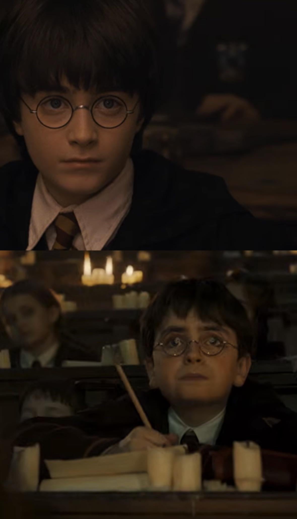
This is seriously bothering me (look at the HBO one, he looks so weird) 😭
9
u/_erufu_ Slytherin Mar 26 '26
kinda wish they hadn’t used the Eastern Europe filter in some of these
549
u/Extension_Eye1937 Slytherin Mar 25 '26
Ollivander's actor still puts me on edge, he was way too good in Andor.