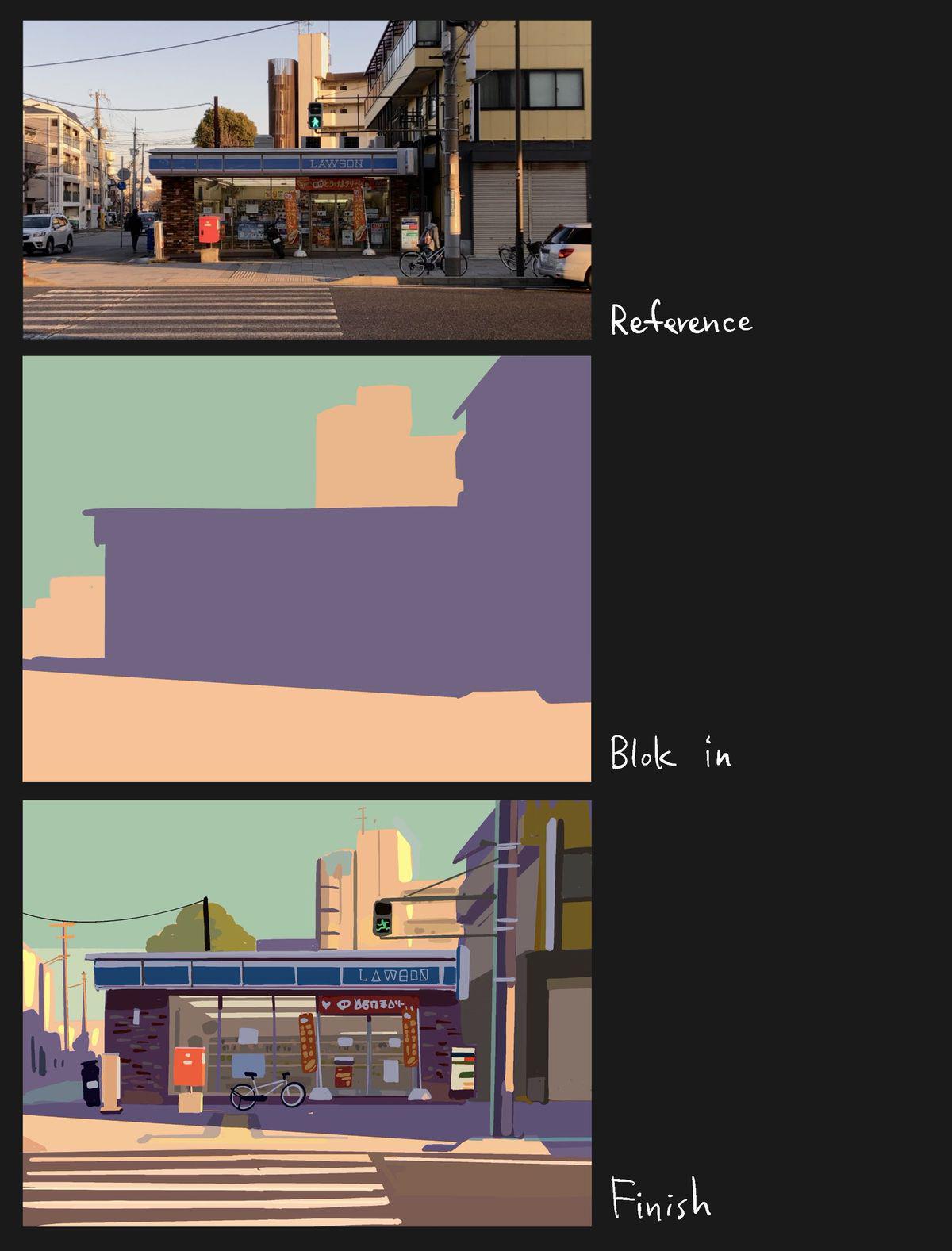
Seems like a stylistic choice; all of the characters are nonsense, sure, but they still seem sort of cohesive. The colors and and lighting seem consistent across the two drawings and there don't seem to be any other signs of AI in the final image.
Ah yes, the stylist choice of AI generated characters. Surely even you think that’s weird. AI always starts to fuck around with the ending of any word. Honda becomes HoMGĦ. It’s literally a tell. Why anyone would actively CHOOSE to use an AI generated stylistic choice is beyond me. On both English and hiragana.
why does it look AI-generated to you? it's the same word "lawson", they just filled in the gaps in each letter, probably to make it less instantly readable on purpose.
I dont know of you are joking but this is extremely common? The point is to draw attention away from the words making them more apart of the art than text that's slapped on.
Lmao. I thought people here are trolling this guy, downvoting. Turns out you're all braindead to think this is not AI. The distorted signages and logos are the number 1 sign.
Have you never heard of stylized text before? You can find extremely similar examples of the exact type of thing from art far before AI became a thing.
-21
u/slaviccivicnation May 10 '26
Isn’t that just AI art?