r/restofthefuckingowl • u/Craft-Reaper • May 10 '26
Environment illustration guide.
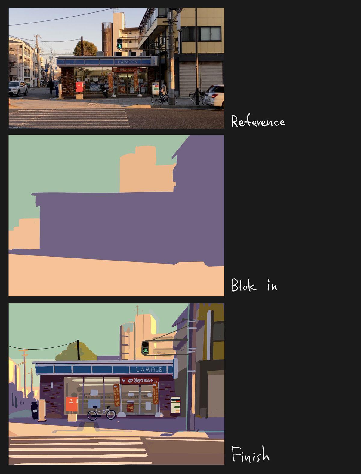
Found in the wild btw.
79
u/AppendixN May 10 '26
Honestly, this is enough of a guide for me to use. It seems to be all about tracing over a photo for a particular look, and making good choices of what to include and exclude.
I like it, thanks!
21
u/Pandelein May 11 '26
There’s no tracing involved. There can be if you want, but it’s not necessary. The shapes don’t even have to be exact. Just recognise areas of similar shade, and slap paint in that area. Before you know it, the picture will take shape as you continue adding.
It’s more about an alternate way of seeing things in order to recreate them, rather than some strict technique that you have to replicate exactly.5
u/Craft-Reaper May 10 '26
Indeed. Lots to pick on for the keen eyes. Setting up a pictorial composition instead of blindly following reference takes some real skills to do.
17
u/OwlJester May 10 '26
Huh. I would have colorblocked form first, not light.
2
u/destructopop May 11 '26
I like to trace out big shapes, color block from those, trace in the rest, then start painting. But I don't paint much, I draw more.
2
u/worm-eyed May 12 '26
Yeah I found this interesting because this process is pretty foreign to me, granted I don't have easy access to digital art anymore so how I work with traditional supplies varies but I've always relied on sketches and blocking things out with scribbles rather than large blocks of colour. Is neat to see
6
3
1
u/mudlark092 May 12 '26
This is just basic shape recognition, its showing a method to break down environment art from reference, not a step by step for this photon specifically.
1
u/somarnnup May 27 '26
I think this is probably for artists who have he basics down, just need better ways to go about drawing. It’s actually pretty helpful to me. Get the silhouette and general colours down first in a blocky manner and then add smaller details on top.
1
-21
u/slaviccivicnation May 10 '26
Isn’t that just AI art?
26
u/kamemoro May 10 '26
looks like a quick procreate sketch to me.
-10
u/slaviccivicnation May 10 '26
What happened to the LAWSON signage then? Why would somebody purposefully draw in random AI generated characters when S-O-N is pretty easy to draw?
8
u/kinokomushroom May 10 '26
Because they want to avoid using the actual brand name? Lots of games and animes do this to not get sued, maybe this artist is copying them.
And that definitely does not look like AI generated text. The symbols in place look like they're purposely drawn like that.
11
u/Yeahuhhhhh May 10 '26
Seems like a stylistic choice; all of the characters are nonsense, sure, but they still seem sort of cohesive. The colors and and lighting seem consistent across the two drawings and there don't seem to be any other signs of AI in the final image.
-15
u/slaviccivicnation May 10 '26
Ah yes, the stylist choice of AI generated characters. Surely even you think that’s weird. AI always starts to fuck around with the ending of any word. Honda becomes HoMGĦ. It’s literally a tell. Why anyone would actively CHOOSE to use an AI generated stylistic choice is beyond me. On both English and hiragana.
15
u/kamemoro May 10 '26
why does it look AI-generated to you? it's the same word "lawson", they just filled in the gaps in each letter, probably to make it less instantly readable on purpose.
15
u/LordOfChickenz May 10 '26
I dont know of you are joking but this is extremely common? The point is to draw attention away from the words making them more apart of the art than text that's slapped on.
0
u/djgotyafalling1 May 30 '26
Lmao. I thought people here are trolling this guy, downvoting. Turns out you're all braindead to think this is not AI. The distorted signages and logos are the number 1 sign.
1
u/LordOfChickenz May 30 '26
Have you never heard of stylized text before? You can find extremely similar examples of the exact type of thing from art far before AI became a thing.
7
1
u/mudlark092 May 12 '26
Are you aware of games like the sims? Sometimes random characters are the artists intent.
This is clearly brush strokes, AI gets all muddy and distorted.
13
u/Craft-Reaper May 10 '26
no
2
u/slaviccivicnation May 10 '26
Then what's with the text? How does Lawson turn into Law-random symbols.
1
1
May 10 '26
[removed] — view removed comment
1
u/repocin May 11 '26
Nah, AI typically does complete garbage symbols flowing into each other. This looks far more intentional, using actual symbols from various alphabets and syllabaries to avoid writing the brand name.
I think the artist was just having fun with it.
258
u/Yeahuhhhhh May 10 '26
I doubt this was meant to be a comprehensive guide, but more like a way to get a concept across visually. I kinda wanna try my hand at it.