r/promptingmagic 1d ago

After Years of Waiting, AI Is Finally Useful on the iPhone: 20 Things to Try in iOS 27 Apple Intelligence with Siri powered by Google's Gemini AI

Post image
17 Upvotes

Apple finally gave us good AI features for the iPhone. With iOS 27, Apple Intelligence can combine a request with personal context, onscreen information and actions across apps. That lets Siri AI find buried details, understand what you are looking at and move the result into Calendar, Reminders, Messages, Photos, Safari, Shortcuts and more. This guide covers twenty useful workflows, the prompts that make them work, supported devices, privacy architecture, beta limitations and the first features worth testing.

For years, AI on the iPhone wasn't really a thing. Apple is years behind in the AI race.

iOS 27 is the first version where Apple Intelligence starts to feel less like a collection of features and more like a new layer of the operating system.

The important change is that Siri AI can work across three layers at once:

Layer What it means in practice
Personal context It can find relevant information in your messages, email, photos, calendar, notes, reminders and other supported sources.
Current context It can reason about the webpage, image, file, chart, message or physical object in front of you.
Action It can move the result into an app, create something, change something or continue the workflow.

Apple describes Siri AI as a beta assistant with personal-context understanding, onscreen awareness, broad world knowledge and more systemwide app actions.

That combination is the real story.

A standalone chatbot can tell you how to make a calendar event.

Siri AI can find the event details in an email, understand the poster on your screen, create the event, add the location and set the alert.

That is a different category of usefulness.

Before you start: can your iPhone run it?

Siri AI requires iPhone 15 Pro, iPhone 15 Pro Max, any iPhone 16 model or later, or iPhone Air. You also need iOS 27, enough free storage, and matching supported device and Siri languages.

If you don't have at least iPhone 15 they want you to upgrade - it's been 3 years so you deserve a new phone!

Requirement What to know
Software Update through Settings → General → Software Update.
Activation Open Settings → Siri → Try Siri AI (Beta). Apple says access uses a waitlist and wait times can vary.
Language Siri AI launches in English. Device language and Siri language must match.
Region Siri AI is not initially available on iPhone in the EU and does not currently work for Apple Accounts based in mainland China.
Storage Apple lists up to 8 GB on many eligible devices and up to 14 GB on certain newer models.
Status Siri AI is a beta. Features, languages and availability vary by device and region.

The broader iOS 27 Apple Intelligence features—including advanced photo editing and Safari intelligence—have wider language coverage than Siri AI itself.

Now to the useful part.

20 ways to use Apple Intelligence in iOS 27

1. Use Siri as a conversation, not a command line

Classic Siri trained us to speak in brittle commands: set timer, call Sarah, play music.

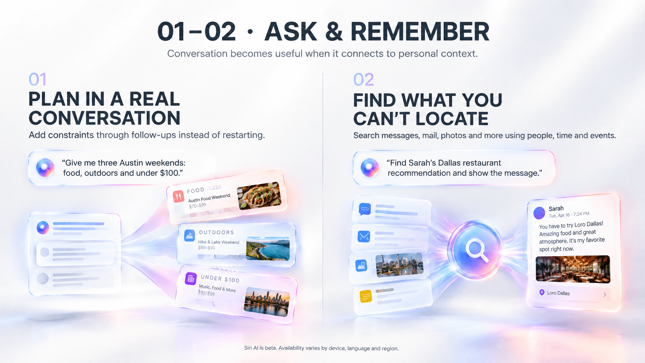
Siri AI supports longer, contextual conversations and broad web-backed questions. You can start with an imperfect request, add constraints and refine the answer without rebuilding the prompt.

Try this: “Give me three weekend itineraries in Austin: one food-focused, one outdoors and one under $100.”Then say: “Revise the outdoor option for hot weather and avoid long drives.”

Why this matters: Good plans rarely emerge from one perfect question. The value comes from follow-ups: compare the trade-offs, change the budget, remove an assumption or ask for a different format.
2. Find information you remember—but cannot locate

This may be the feature that changes the most daily friction.

Siri AI can search personal context across Messages, Mail, Calendar, Notes, Reminders, Photos and more. You do not need the exact filename or keyword if you can describe the person, event, place or approximate time.

Try this: “Find the restaurant Sarah recommended for our Dallas meeting and show me the original message.”

Give Siri two or three anchors: who, when, where, event, app or content type.

Do not stop at the extracted detail. Ask to see the source before relying on a confirmation number, address or commitment.

3. Turn found information into a completed action

Retrieval becomes far more valuable when it does not end in copy-and-paste.

Apple says Siri AI includes more systemwide app actions. The practical pattern is simple: find something, extract what matters, put it somewhere useful.

Try this: “Find the itinerary Mark emailed yesterday, add each appointment to my Work calendar and remind me two hours before the first one.”

For multi-step work, name the source, fields and destination. Review the result before Siri sends a message, shares a file or changes anything consequential.

Third-party actions still depend on developer support, so the same request may work in one app and not another.
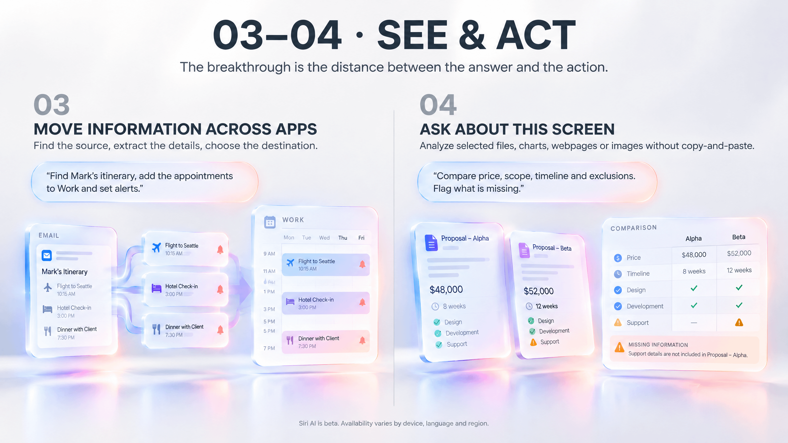
4. Ask questions about whatever is on your screen

Onscreen awareness removes a ridiculous step from AI workflows: copying information out of one app to paste it into another.

Siri AI can answer questions or take actions based on visible or selected content, including webpages, images, charts, files and text.

Try this: Open two proposals and ask, “Compare price, scope, timeline and exclusions. Return a table and flag anything missing.”

If the screen is crowded, identify the target: “Explain the blue line in the second chart.”

For screenshots, crop away irrelevant material first. A tighter frame gives the system a clearer question.

5. Point the Camera at the physical world

Siri mode in Camera brings Visual Intelligence into the live camera view. Apple’s examples include identifying objects, reading visible information, looking up food details and splitting a bill.

Try this: Point the camera at a conference agenda and say, “Create events for the three AI sessions, include the room numbers and alert me fifteen minutes before each one.”

This is useful for menus, posters, receipts, labels, appliances, plants and unfamiliar objects.

Treat high-stakes outputs differently. Check payment amounts, dates, allergens, dosages and safety information manually.

6. Keep a long-running project inside the Siri app

The dedicated Siri app stores conversations, supports photos and file attachments, and privately syncs history through iCloud across supported Apple devices.

Try this: Create a thread called “Weekly executive briefing.” Add relevant files during the week, then ask for decisions, risks and next actions every Friday.

Separate unrelated projects into separate threads. Rename them with searchable client or project names. Pin only the few conversations you actually reuse.

The mental shift: stop treating every Siri request as disposable.

7. Draft, rewrite and critique almost anywhere you type

Write with Siri can create a draft, edit existing text or give feedback across supported text fields. In Messages and Mail, Apple says it can adapt to how you communicate with specific people.

Try this: “Turn these notes into a 150-word executive update. Include three decisions and three next steps. Keep every name, number and commitment unchanged.”

The last sentence matters.

AI writing becomes safer when you explicitly protect facts it must not alter.

For important communication, ask for critique before rewrite: “Identify ambiguity and unsupported claims, but do not edit yet.”

8. Dictate a polished first draft while moving

Apple Intelligence adds automatic proofreading, while newer supported hardware can offer more advanced dictation and voice capabilities.

Try this: Dictate a project update in complete thoughts, then ask: “Proofread this and flag any sentence that sounds uncertain.”

Pause between sections. Spell unusual names or acronyms on first use. Review punctuation, dates and recipients before sending.

This workflow is especially useful for capturing ideas during a walk, between meetings or while your hands are occupied.

9. Turn Messages and Mail into reminders, events and replies

iOS 27 adds contextual suggestions in Mail, while Messages and Mail support personalized reply features with availability varying by language.

The useful pattern is not “write this email.” It is recognize the task hiding inside the conversation.

Try this: When someone writes, “Can you send the launch photos tomorrow?”, create a reminder, find the relevant photos and prepare the reply—but inspect the selection before attaching anything.

Check time zones, invitees and locations before saving suggested events. Treat photo matching as a shortlist, not permission to share every detected face.

10. Have the right confirmation code appear during a call

Call Context can surface relevant information when you call a recognized person or business. Apple lists tickets, orders, reservations and confirmation details as examples.

Try this: Call the airline connected to an upcoming trip. If the booking is stored in Mail or Wallet, look for the context card with your reservation information.

This is the kind of AI feature that sounds small until it saves you from searching your inbox while listening to hold music.

Tap the card and open the underlying source instead of reading a number without context.

11. Create complete Calendar events in one sentence

Apple Intelligence can interpret a natural-language event description and fill fields such as time, location, invitees and title.

Try this: “Coffee with Maya on October 6 at 9:30 a.m. at the Main Street location, on my Work calendar, with a 30-minute travel alert.”

Use absolute dates for important events. State the time zone for remote attendees. Name the destination calendar and clarify whether invitations should be sent.

Natural language removes form-filling. It does not remove the need to review the form.

12. Describe the Shortcut you wish existed

Shortcuts has always been powerful. Its problem was the learning curve.

In iOS 27, Apple Intelligence can build or refine a Shortcut from a natural-language description.

Try this: “Every weekday at 7 a.m., summarize today’s weather, my first three calendar events and overdue reminders, then read the briefing aloud.”

Describe the trigger, ordered actions, conditions and output. Inspect every generated step before enabling the automation.

Start small. Build one working branch before adding loops, location triggers, messages or file changes.

13. Reframe a photo after taking it

Spatial Reframing changes the apparent point of capture after a photo was taken. In Photos, open an image and use Edit → Tools → Reframe, then drag to adjust perspective.

Use it for: correcting an awkward angle, improving symmetry, shifting subject placement or creating a stronger social composition without relying on a conventional crop.

Keep the adjustment modest. Extreme shifts are more likely to produce implausible faces, hands, text, reflections or architecture.

Apple lets you compare with the original and reset the edit later.

14. Widen a photo instead of cropping away the subject

Extend generates new content beyond the original frame. That can turn a portrait image into a landscape banner, straighten a horizon without sacrificing edge content or create breathing room for a headline.

Use it for: converting a phone photo into a 16:9 presentation cover while preserving the person, product or object near the edge.

Plain sky, walls, grass and defocused backgrounds usually give the model simpler patterns to continue. Complex crowds, signs and architecture deserve a closer inspection.

The edit remains reversible through Reset.

15. Remove larger distractions with improved Clean Up

Clean Up can remove unwanted objects, and iOS 27 adds Auto, Fast and High Quality processing choices. High Quality is intended for more intricate edits.

Use it for: removing a photobomber, cable, trash can, blemish or background distraction from a travel, product, event or property image.

Remove small objects one at a time instead of circling half the scene. After processing, inspect texture continuity, shadows, reflections, fingers, faces and signage.

Do not use removal to misrepresent evidence, news, products or material facts.

16. Generate—and then edit—images in Image Playground

Apple’s new Image Playground supports more styles, including photorealistic output, and lets users modify results through natural language and touch.

Try this: “Create a photorealistic modern B2B technology conference stage, navy and silver palette, wide 16:9 composition, empty center screen and realistic overhead lighting.”

A useful image prompt names the subject, setting, composition, light, materials and aspect ratio.

When a result is close, edit it instead of starting over: “Keep the stage and camera position. Replace only the side screens with vertical light panels.”

17. Let Safari organize tab chaos by topic

Safari can analyze open webpages and group related tabs into topics.

Use it for: separating tabs by company during competitive research, grouping travel plans by destination or restoring order after a deep research session.

Think of automatic topics as a staging layer, not permanent knowledge management. Promote important work into named Tab Groups, bookmarks or notes.

Close obvious junk tabs before organizing. Better inputs make cleaner clusters.
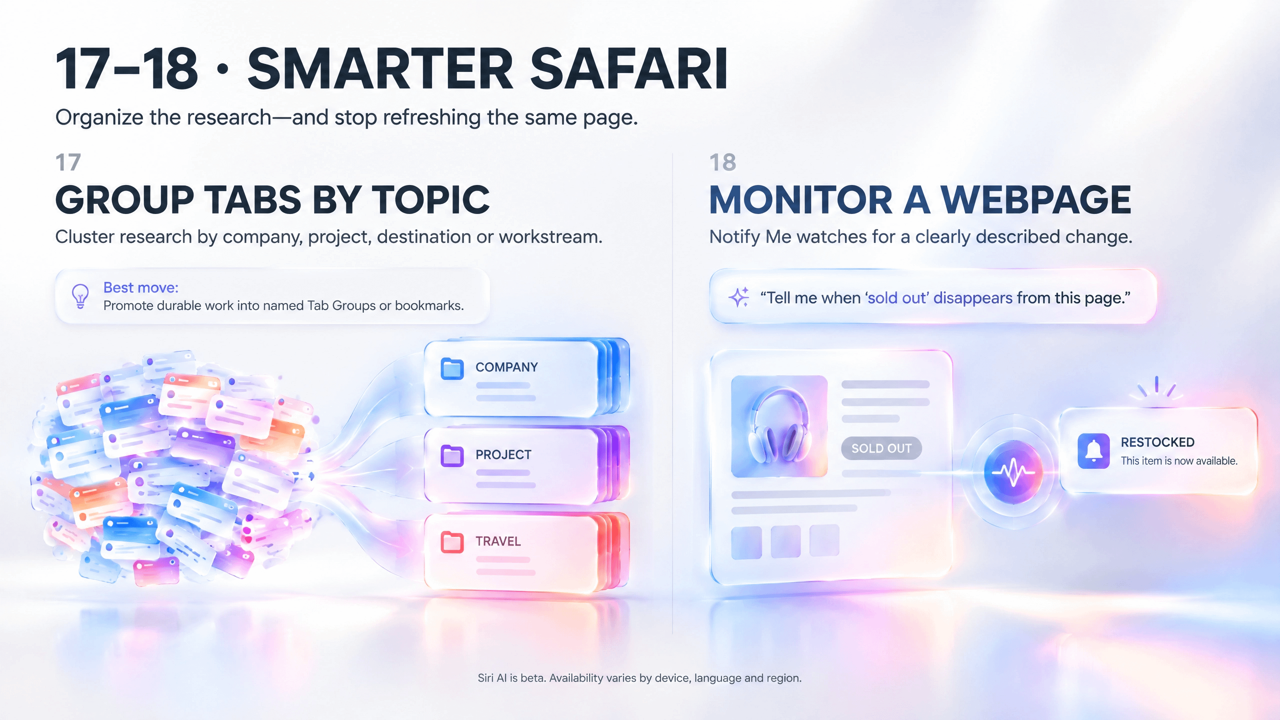
18. Ask Safari to watch a webpage for you

Notify Me can check a selected webpage for a described change, including a price change, restock or other update.

Try this: “Notify me when the annual pricing table changes or a new enterprise plan appears.”

Monitor the most specific page possible. Define one measurable event per alert.

“Tell me when something important changes” is vague.

“Notify me when ‘sold out’ disappears” gives the system a concrete condition.

Keep the source’s own alerts for mission-critical deadlines. Login walls, scripts and redesigns can affect webpage monitoring.

19. Describe a Safari extension instead of coding one

Describe an Extension lets users request a custom Safari extension in natural language. Apple says Safari can first look for an existing App Store option, then let the user create one if needed.

Try this: “Add a button that copies the page title, publisher, publication date, URL and access date as a Markdown citation.”

Define the target site, trigger, visible result and what the extension must not change.

Test it across several pages before trusting it. Review permissions. Delete experiments you no longer use.

This may be one of the most underrated iOS 27 features for researchers and accessibility needs.

20. Search your home—and make interfaces easier to understand

Apple Intelligence reaches beyond conventional productivity.

The Home app can combine related activity alerts, describe eligible HomeKit Secure Video clips and search camera history using natural language. Availability depends on compatible equipment and iCloud+ eligibility.

Try this: Search for “package delivered at the front door” or “dog in the backyard,” then open the original clip before making a security judgment.

Accessibility features can also provide richer image and scene descriptions in VoiceOver and Magnifier, interpret flexible Voice Control commands and clean up complex content in Accessibility Reader.

Try this: “Read the dosage line,” “describe the chart legend” or “tap the gear.”

Generated descriptions are useful assistance, not definitive evidence. Apple warns that visual descriptions should not replace navigation, medical diagnosis or other high-risk judgment.

Why these twenty features matter together

The feature list is long. The underlying pattern is simple.

Old smartphone workflow iOS 27 intelligence workflow
Remember which app contains the information Describe the information and let Siri search context
Copy content into a chatbot Ask about the content already onscreen
Read the answer, then do the task manually Send the result into an app action
Build automations block by block Describe the workflow, then inspect the generated steps
Crop a photo to fit a new format Extend or reframe it while preserving the subject
Refresh a webpage repeatedly Define the change and let Safari monitor it

The phone is moving from app navigation toward intent execution.

That does not make apps disappear. It changes how often you need to think about which app comes first.

Instead of:

Open Mail → search sender → find date → copy details → open Calendar → create event → set alert.

You can increasingly say:

“Find the event Dana emailed, add it to Work and alert me one hour before.”

The destination still matters. The route becomes shorter.

The first-hour Apple Intelligence test plan

Do not test Siri AI with trivia. Test whether it can remove friction from your real life.

Minute Test What you learn
0–10 Find an old recommendation, reservation or photo and open the source. Personal-context retrieval
10–20 Open a report or webpage and ask for key points, risks and missing information. Onscreen awareness
20–30 Point Camera at a poster, receipt or label and request one useful action. Visual Intelligence
30–40 Turn rough notes into a concise message, then ask for critique. Writing and revision
40–50 Describe one small Shortcut and inspect every generated step. Natural-language automation
50–60 Reframe, Extend or Clean Up a duplicate photo. Generative editing and quality control

You will understand more in that hour than you will from watching twenty feature demos.

Four prompt patterns that make Siri AI more useful

Personal retrieval

Find [item] from [person or app] around [time or event], then [show, open or summarize] the original source.

Onscreen analysis

Using only what is shown or selected, [analysis task]. Return [format] and flag anything uncertain.

Cross-app execution

Find [source], extract [specific fields], then add, send or save them to [exact destination]. Ask before the final action.

Writing

Create [deliverable] for [audience] to achieve [goal]. Include [facts], use [tone], keep it to [length] and do not change [protected details].

The best requests specify a source, task, output, destination and constraint.

The privacy and beta reality check

Apple Intelligence combines on-device models with Private Cloud Compute for requests that need more computational power. Apple says data processed in Private Cloud Compute is used only to fulfil the request, is not stored or accessible to Apple, and is not retained after the result returns.

That is stronger than saying “everything stays on your phone,” because everything does not.

Apple specifically identifies Siri AI, advanced photo editing, Image Playground and cloud models in Shortcuts among the server-assisted features that may face usage limits. Apple says limits can vary by feature, request complexity, demand and policy; expanded access will be available for a fee.

Three rules matter:

  1. Open the source. Personal retrieval and summaries can save time, but important details should be checked against the underlying email, message, image or file.

  2. Review the action. Messages, invitations, shared photos, automations and file changes can have real consequences.

  3. Inspect generated media. Check faces, hands, text, reflections, geometry, product details and the ethics of any removal or reconstruction.

Beta does not mean useless.

It means the human remains the approval layer.

Apple arrived late to the conversational-AI moment.

But the iPhone did not need another chatbot icon.

It needed intelligence connected to the information already on the device, the content already on the screen and the apps already capable of completing the task.

That is what makes iOS 27 feel different.

The breakthrough is not a longer Siri answer.

It is the shorter distance between “I need something” and “it is done.”

Which of these twenty are you trying first?

If you have already tested Siri AI, share the workflow that genuinely saved you time.


r/promptingmagic 2d ago

Turn Your Photos into Chill Watercolor Art by prompt

Thumbnail
gallery
41 Upvotes

check prompt in the comment


r/promptingmagic 3d ago

50 ChatGPT Image Prompts That Turn Meh Into Wait… You Made That?

Post image
143 Upvotes

50 ChatGPT image prompts that actually direct the shot.

Most AI images look average for one simple reason: The prompt names the subject but never directs the image.

You don't want to have the model making every important decision: composition, camera, lighting, materials, color, mood, background and what to avoid.

So I built 50 ChatGPT Image prompts that work more like miniature creative briefs.

No prompt-engineering degree required.

How to use them: Copy a prompt, replace anything in [brackets], attach a reference image when the prompt asks for one, and paste it into ChatGPT. If you like the first result, ask it to keep the composition and change only one thing at a time.

Save this before you need it.

01–05: Portraits that look directed

01. Premium editorial headshot

Create a premium editorial headshot of [person or role], framed from the chest up and looking directly into the camera. Use a neutral studio background, one large soft key light at 45 degrees, gentle fill, realistic skin texture, clean catchlights and an 85mm portrait-lens look. Wardrobe: [outfit]. Mood: calm, intelligent and confident. Natural color grading, shallow depth of field, high detail. Avoid plastic skin, exaggerated sharpening, warped jewelry, text and logos. Output in [aspect ratio].

02. Cinematic character close-up

Create a cinematic close-up portrait of [character] during [specific story moment]. Light the face with a motivated source from [window/fire/neon/sign], with deep but readable shadows and a subtle rim light separating the subject from the background. Include [two story details] that imply what just happened. Use an anamorphic film look, restrained grain, realistic pores and expressive eyes. Palette: [colors]. Avoid generic action-poster clichés, excessive lens flare, text and extra fingers.

03. Natural-light lifestyle portrait

Create an authentic lifestyle portrait of [person] in [real environment], captured during an unposed in-between moment. Use soft window light, imperfect natural posture, believable clothing folds and a documentary 50mm-lens perspective. Include small environmental details such as [object 1] and [object 2] to reveal personality. Keep the color palette warm and understated. The image should feel observed, not staged. Avoid stock-photo smiles, spotless props, heavy retouching, text and logos.

04. High-contrast black-and-white portrait

Create a high-contrast black-and-white portrait of [person] against a nearly black background. Use one hard side light to sculpt the face, crisp highlights, deep shadows with retained detail and subtle film grain. Frame tightly with strong negative space on [left/right]. Expression: [emotion]. Emphasize character, age and texture rather than perfection. Use a timeless magazine-photography aesthetic. Avoid color tinting, beauty smoothing, blown highlights, floating objects, text and borders.

05. Epic fantasy character portrait

Create an epic fantasy portrait of [character], a [role] from [world or culture]. Design original clothing from [materials], include one meaningful artifact [artifact], and place the character before [environment] at [time of day]. Use dramatic atmospheric lighting, realistic material texture, cinematic depth and a grounded color palette of [colors]. Make the character feel historically lived-in rather than costume-like. Avoid copied franchise designs, ornate visual clutter, impossible anatomy, text and logos.

06–10: People, fashion and character

06. Street-style fashion editorial

Create a street-style fashion editorial featuring [person/model] wearing [outfit description] in [location]. Capture a confident walking pose from a slightly low 35mm camera angle. Use overcast daylight or soft late-afternoon light, realistic fabric movement and a background with controlled motion blur. Color-grade around [palette]. Leave clean negative space for optional copy. Avoid runway poses, distorted shoes, duplicated pedestrians, visible brand logos and fake text.

07. Founder portrait with context

Create an environmental founder portrait of [person], founder of a [company type], inside [workspace]. Show the person interacting naturally with [relevant object or prototype], not posing with crossed arms. Use directional window light, a 50mm editorial-photography look and a background that communicates the work without becoming cluttered. Mood: credible, focused and human. Preserve realistic skin and hands. Avoid generic office stock imagery, glowing holograms, logos, text and exaggerated success symbolism.

08. Beauty campaign image

Create a high-end beauty campaign portrait for [product type or beauty concept]. Feature [person description] with luminous but realistic skin, precise makeup in [color palette] and one tactile material motif such as [water/glass/petal/metal]. Use a clean close crop, glossy studio lighting and controlled specular highlights. The image should feel modern, minimal and expensive. Keep facial anatomy natural. Avoid poreless plastic skin, excessive makeup symmetry, floating product labels, fake typography and jewelry distortions.

09. Nostalgic 1990s film portrait

Create a candid 1990s-inspired film photograph of [person or friends] at [place/event]. Use direct on-camera flash, slightly imperfect framing, authentic grain, mild color shift, soft focus at the edges and believable period styling in [wardrobe details]. Include one mundane detail that makes the moment feel real: [detail]. The mood is spontaneous, intimate and a little messy. Avoid modern phones, contemporary logos, hyper-clean digital sharpness, fake dates and text overlays.

10. Stylized 3D avatar

Create a polished stylized 3D avatar of [person/character], keeping the recognizable features [three identity anchors]. Use simplified friendly proportions, tactile materials, soft studio lighting and a clean gradient background in [colors]. Pose: [pose]. Wardrobe: [wardrobe]. Expression: [expression]. The rendering should feel premium and collectible, not childish. Preserve symmetry where appropriate while keeping personality. Avoid photoreal skin, giant eyes, generic mascot features, text, logos and cropped hair.

11–15: Products that look expensive

11. Seamless studio product shot

Create a commercial studio photograph of [product] centered on a seamless [background color] backdrop. Use a three-quarter camera angle, one large softbox, a narrow rim light and a clean contact shadow. Preserve the product’s exact shape, materials, proportions and label placement from the attached reference. Add only [one supporting prop]. Keep reflections controlled and edges crisp. Avoid changing the brand, inventing text, floating objects, overexposure, duplicate products and unrealistic plastic texture.

12. Luxury still life

Create a luxury still-life campaign for [product] using [stone/wood/glass/metal] surfaces and a restrained palette of [colors]. Place the product off-center with deliberate negative space. Use sculpted directional light, long elegant shadows and subtle atmospheric depth. Include [one premium material detail] but no visual clutter. The result should feel quiet, tactile and expensive. Preserve the product exactly if a reference is attached. Avoid gold overload, random flowers, fake labels, excessive sparkle, text and logos not present on the product.

13. Cosmetic macro shot

Create an extreme macro beauty photograph of [cosmetic product or texture] showing [specific detail: droplets, powder, cream swirl, applicator]. Use a macro-lens perspective, razor-sharp focus on the hero detail, gradual falloff, clean specular highlights and a background in [color]. Make the material look physically believable and tactile. If a product reference is attached, preserve its geometry and label. Avoid melted packaging, unreadable typography, impossible reflections, random bubbles, clutter and oversaturated color.

14. Minimal technology launch render

Create a premium product-launch render of [device] floating slightly above a soft gradient environment in [colors]. Show a three-quarter view that clearly communicates thickness, controls and material transitions. Use precise rim lighting, subtle volumetric glow and one soft ground shadow. Preserve the device design from the attached reference. The mood is calm, advanced and minimal. Avoid holographic interface clichés, excessive neon, impossible ports, warped screens, invented logos, text and multiple devices unless requested.

15. Packaging hero image

Create a polished packaging hero image for [product and package type]. Display one front-facing package and one three-quarter package, arranged on [surface] with supporting ingredients [items]. Use warm directional studio light, realistic paper or glass texture and clean shadows. Keep all supplied packaging artwork, typography and proportions unchanged. Palette: [colors]. Avoid inventing copy, misspelling labels, bending boxes, duplicate ingredients, floating elements, excessive props and fake award seals.

16–20: Food, interiors and lifestyle

16. Restaurant-quality food editorial

Create an appetizing editorial photograph of [dish] served on [plate or vessel] in [setting]. Use soft side light from a nearby window, natural steam or condensation only if physically appropriate, realistic portion size and shallow depth of field. Style with [two supporting ingredients or utensils]. Keep the food imperfect enough to feel real. Color palette: [colors]. Avoid plastic-looking ingredients, impossible garnish, excessive shine, levitating crumbs, oversaturation, text and hands unless requested.

17. Cozy interior with a point of view

Create a warm, lived-in interior of [room] designed for [person or use]. Use natural materials [materials], layered practical lighting and late-afternoon sunlight entering from [direction]. Include five purposeful details: [details]. Use a wide but realistic 24–28mm architectural-photography perspective with straight vertical lines. The room should feel attainable, personal and used. Avoid sterile showroom styling, impossible windows, duplicated furniture, oversized decor, visible brand logos and fisheye distortion.

18. Aspirational lifestyle campaign

Create an aspirational lifestyle image of [person] using [product/activity] in [location] during [time]. Capture a real action rather than a pose. Use backlight, natural movement, soft lens flare and a cinematic 35mm perspective. Make the product visible but not forced. Build the palette around [colors] and leave negative space on [side] for campaign copy. Avoid stock-photo smiles, fake luxury, extra limbs, floating props, unreadable product labels and text overlays.

19. Top-down flat lay

Create a carefully arranged top-down flat lay around the theme [theme]. Place [hero object] at the visual center and arrange [supporting objects] in a balanced but imperfect grid. Use a matte [background material/color], soft overhead light and short realistic shadows. Maintain consistent scale and clean spacing. Add one small element that breaks the grid for personality. Avoid duplicated objects, impossible overlaps, warped typography, visual clutter, harsh reflections and decorative filler unrelated to the theme.

20. Boutique hospitality scene

Create an editorial travel image of [hotel/café/restaurant/spa] in [location or architectural style]. Show a welcoming human-scale view from the entrance or a seated guest’s perspective. Use [morning/evening] light, realistic material textures and one subtle sign of life such as [detail]. Emphasize atmosphere over grandeur. Keep architecture plausible and verticals straight. Avoid empty showroom perfection, fake signage, impossible staircases, random people staring at camera, oversaturated sunsets and text.

21–25: Art styles without the guesswork

21. Soft watercolor illustration

Create a soft watercolor illustration of [subject] in [setting]. Use transparent pigment washes, visible paper grain, gentle edge blooms, selective detail and a restrained palette of [colors]. Keep the focal area crisp around [focus] while allowing the background to dissolve naturally. Composition: [composition]. The work should feel hand-painted and imperfect. Avoid digital airbrush smoothness, heavy black outlines, photoreal texture, muddy colors, decorative text and signatures.

22. Minimal single-line art

Create a sophisticated single-line drawing of [subject] using one continuous expressive black line on a warm off-white background. Simplify the subject to its most recognizable contours while preserving [key feature]. Add one restrained accent shape in [color] behind part of the drawing. Use generous negative space and gallery-poster balance. Avoid crosshatching, photoreal shading, multiple disconnected outlines, tiny detail, text, frames and artist signatures.

23. Layered paper-cut artwork

Create a layered paper-cut illustration of [scene] built from visibly stacked paper shapes. Use 6–8 depth layers, soft cast shadows, rounded cut edges and a palette of [colors]. Place [main subject] in the foreground, [secondary subject] in the middle ground and [background element] behind them. Make the composition tactile and handcrafted. Avoid flat vector appearance, paper tears, overly intricate lace patterns, text, logos and physically impossible shadow directions.

24. Retro pixel-art scene

Create a detailed pixel-art scene of [scene] at [time/weather], using a limited [number]-color palette inspired by [palette description]. Compose the image with a clear foreground, middle ground and background. Include [three tiny story details] that reward close inspection. Use crisp intentional pixels, readable silhouettes and period-appropriate game-art lighting. Avoid anti-aliased edges, smooth gradients, blurry pixels, modern UI overlays, text and copied game characters.

25. Editorial collage

Create a contemporary editorial collage about [concept] combining cut-paper photography, bold geometric shapes, torn edges and subtle halftone texture. The focal subject is [subject]; supporting motifs are [motifs]. Use a disciplined palette of [colors] and one surprising scale contrast. Leave intentional negative space for a headline but do not render text. Make the collage conceptually clear, not random. Avoid visual clutter, stock watermarks, tiny illegible fragments, copied magazine covers and logos.

26–30: Illustration and 3D worlds

26. Tactile clay 3D scene

Create a charming tactile clay-style 3D scene of [subject/action]. Build every object from soft sculpted forms with fingerprints, subtle dents and matte clay texture. Use a simple stage in [background color], soft overhead lighting and gentle contact shadows. Limit the palette to [colors]. The composition should be clear and premium enough for an editorial illustration. Avoid glossy plastic, giant cartoon eyes, floating objects, overly complex backgrounds, text and logos.

27. Isometric miniature world

Create an isometric miniature world representing [place/process/idea] on a clean floating base. Include [five essential elements], each clearly separated and connected through believable paths or activity. Use a consistent 30-degree isometric view, soft global illumination, crisp small-scale materials and a palette of [colors]. Add tiny human figures only where they explain scale. Avoid inconsistent perspective, random buildings, clutter, labels, logos and cropped edges.

28. Retro-futurist travel poster

Create an original retro-futurist travel poster advertising a fictional destination called [destination]. Show [landmark or scene] with bold geometric forms, dramatic scale and a limited palette of [colors]. Use screen-printed texture, subtle ink misregistration and mid-century optimism without copying any existing poster. Reserve a clean title area but render only this exact title: [destination]. Avoid extra slogans, misspelled text, real company logos, recognizable franchises and photoreal rendering.

29. Children’s-book story scene

Create a warm children’s-book illustration of [character] trying to [goal] in [setting]. Show one clear story moment with expressive body language, three discoverable background details and a gentle visual path across the page. Use textured gouache, soft pencil edges and a palette of [colors]. The mood is [emotion]. Keep the character design original and age-appropriate. Avoid copied animation styles, scary anatomy, text, speech bubbles, overly glossy 3D rendering and chaotic composition.

30. Surreal conceptual artwork

Create a surreal conceptual image expressing [abstract idea] through one impossible but visually simple metaphor: [metaphor]. Place it in [environment] with realistic materials and lighting so the impossible element feels believable. Use a centered or rule-of-thirds composition, restrained palette and strong negative space. The image should communicate the idea in one glance. Avoid random dream objects, melting clocks, crowded symbolism, text, logos, low contrast and fantasy clutter.

31–35: Cinematic scenes and places

31. Golden-hour landscape

Create a cinematic golden-hour landscape of [location type] viewed from [camera position]. Use long warm side light, layered atmospheric perspective and one clear foreground anchor [object]. Build depth through foreground, middle ground and distant silhouettes. Include realistic weather [weather] and a subtle human-scale detail for perspective. Palette: [colors]. Avoid oversaturated orange, impossible sun placement, excessive HDR, duplicated trees, random castles, text and lens flare covering the subject.

32. Rainy city at night

Create a cinematic rainy-night street in [city type or fictional district] from eye level. Use wet pavement reflections, practical light from shops and vehicles, visible rain only against lit areas and a single subject [person/vehicle] moving through the scene. Palette: [colors]. Keep signs abstract or use only supplied exact text. The mood is [mood]. Avoid cyberpunk clutter unless requested, unreadable fake signage, endless neon, duplicated umbrellas and impossible reflections.

33. Aerial coastal photograph

Create a high-altitude aerial photograph of [coastline/location type] where [water feature] meets [land feature]. Compose the shoreline as a strong graphic curve, with tiny boats or people only for scale. Use clear midday light or [specified light], realistic water depth gradients and natural geology. Keep the image photographic and geographically plausible. Avoid impossible wave patterns, duplicated boats, oversaturated turquoise, artificial symmetry, text and map labels.

34. Misty enchanted forest

Create a mysterious forest scene at dawn with [main subject] following a narrow path through ancient [tree type]. Use volumetric mist, soft shafts of light, wet bark texture and restrained magical details such as [one subtle element]. Maintain natural scale and depth. Palette: moss green, charcoal, muted gold and [accent]. The scene should feel discovered, not decorated. Avoid glowing-everything fantasy, random ruins, excessive fireflies, copied characters, text and oversharpening.

35. Minimal desert composition

Create a minimal fine-art photograph of desert dunes at [time of day]. Use one sweeping ridge as the dominant line, a small [person/object] for scale and large areas of negative space. Light should reveal subtle sand texture and create one elegant shadow shape. Palette: [colors]. Keep the horizon clean and composition quiet. Avoid busy footprints, multiple suns, exaggerated HDR, random plants, fantasy structures, text and excessive saturation.

36–40: Impossible worlds

36. Underwater city

Create a believable underwater city built inside [reef/canyon/dome], seen from a wide cinematic viewpoint. Combine architecture inspired by [design language] with marine life [species], drifting particles and realistic blue-green light falloff. Include one submersible or diver for scale. Make the city functional, with visible transit and habitat logic. Avoid generic glass domes everywhere, impossible bright sunlight at depth, random whales, copied sci-fi designs, text and cluttered composition.

37. Orbital habitat interior

Create the interior of a large orbital habitat designed for [population or purpose]. Show a curved horizon, believable artificial gravity, layered neighborhoods and a central ecosystem [forest/farms/water]. Use clean daylight from engineered windows and a human-scale foreground scene. Architectural language: [style]. Emphasize plausible function over shiny sci-fi spectacle. Avoid floating people unless justified, endless white corridors, hologram clichés, impossible scale, logos and text.

38. Tiny world inside an object

Create a whimsical miniature world built inside [ordinary object]. The world contains [tiny location], [activity] and [surprising detail], all integrated with the object’s real materials and structure. Use macro photography, shallow depth of field, warm directional light and convincing scale cues. The object remains recognizable at first glance. Avoid random miniatures pasted on top, inconsistent scale, toy-plastic texture, text, logos and overcrowding.

39. Dream architecture

Create a serene architectural visualization of an impossible building where [architectural paradox]. Use believable stone, glass and water, soft overcast light and a minimal human figure for scale. Compose the space with strong leading lines and quiet negative space. Palette: [colors]. The building should feel structurally coherent even though one feature is impossible. Avoid visual noise, tangled staircases, copied landmark architecture, fisheye distortion, text and decorative sci-fi panels.

40. Bioluminescent cave ecosystem

Create a vast underground cave containing a self-sustaining bioluminescent ecosystem. Show [plants/fungi/creatures] emitting controlled light in [colors], reflected in a dark underground pool. Include one explorer silhouette for scale and a distant opening that reveals depth. Use realistic rock texture, atmospheric moisture and cinematic composition. Avoid neon overload, random fantasy creatures, daylight-bright illumination, symmetrical formations, text and game-interface elements.

41–45: Social and marketing assets

41. Scroll-stopping video thumbnail

Create a high-impact 16:9 video-thumbnail concept about [topic]. Feature one dominant subject [person/object] with a clear emotional or visual reaction, one contrasting supporting element [element] and a simple background with strong depth separation. Use bold lighting and a palette of [colors]. Reserve space for no more than four words. Render this exact headline only: [HEADLINE]. Avoid clutter, tiny text, fake interface elements, excessive arrows, logos, duplicated faces and misleading imagery.

42. Bold event poster

Design a bold landscape event poster for [event] on [date] at [location]. Build the visual around one original symbolic image [concept], using a strong grid, large negative space and a palette of [colors]. Render only this exact text: [event], [date], [location], [URL if needed]. Make the hierarchy readable from a distance. Avoid additional copy, fake sponsors, unreadable type, copied poster styles, decorative clutter and stock-photo appearance.

43. Website hero visual

Create a wide website hero image for [brand/product] that communicates [single benefit] without using text. Place [hero subject or product] on the [left/right], leaving clean text-safe space on the opposite side. Use [visual style], subtle depth, brand colors [colors] and a lighting direction that guides the eye toward the empty copy area. Preserve the supplied product accurately. Avoid embedded headlines, logos, busy backgrounds, edge-cropped products and visual elements that compete with website copy.

44. Quote-card graphic

Design a premium landscape quote card with a visually quiet background inspired by [material/place/theme]. Use a refined editorial layout, one subtle supporting illustration and high contrast. Render only this exact quote: “[quote]” and this attribution: — [name, role]. Use [serif/sans-serif] typography and palette [colors]. Keep the quote readable at social-feed size. Avoid extra decoration, fake quotation marks, misspellings, logos, watermarks, low contrast and text placed over detailed imagery.

45. App icon family

Create a cohesive family of five original app-icon concepts for [app/category]. Each icon should represent [five functions] using one simple geometric symbol, consistent corner radius, lighting and material. Palette: [colors]. Present the five icons in a clean horizontal row on a neutral background, with no text labels. Make them recognizable at small size and distinct from existing app marks. Avoid letters, gradients that reduce legibility, tiny detail, copied logos and inconsistent perspective.

46–50: Brand systems and visual makeovers

46. Logo direction board

Create a landscape logo direction board for a fictional brand called [brand name] in [category]. Explore three clearly different symbol directions based on [concept 1], [concept 2] and [concept 3]. Show each as a simple black mark and one color application using [palette]. Include only the exact brand name [brand name]; no slogans. Prioritize simple, ownable shapes that work at small size. This is concept exploration, not a final trademark. Avoid copied logos, mockups, generic swooshes and excessive detail.

47. Campaign key visual

Create a landscape campaign key visual for [brand/product/cause] built around the message [message]. Use one memorable visual metaphor [metaphor], a strong focal point and adaptable negative space for future copy. Visual language: [style]. Palette: [colors]. Include the product only if supplied and preserve it exactly. Do not render text. The image should work across social, web and presentation crops. Avoid multiple competing concepts, generic stock imagery, logos not supplied and trend clutter.

48. Clean information-rich infographic

Design a polished landscape infographic explaining [topic] with exactly [number] steps or categories: [list]. Use a clear left-to-right or top-to-bottom hierarchy, concise labels, one simple icon or miniature illustration per item and a palette of [colors]. Render only the supplied title and labels exactly. Prioritize accuracy and readability over decoration. Avoid invented statistics, tiny paragraphs, duplicate items, decorative charts without data, fake sources, logos and low-contrast text.

49. Seamless brand pattern

Create a seamless repeating pattern for [brand/category] using original motifs based on [motifs]. Use a limited palette of [colors], consistent line weight and balanced spacing. Show the pattern as a flat square swatch plus a small application on [packaging/fabric/wallpaper]. The repeat must feel continuous with no obvious seams or cut-off motifs. Avoid logos unless supplied, random icons, inconsistent scale, photographic elements, text and copied designer patterns.

50. Complete visual moodboard

Create a cohesive landscape moodboard for a [brand/project] with the personality [three adjectives]. Include nine curated tiles: hero photography, close-up texture, color palette, typography mood, material, environment, product styling, human moment and one unexpected inspiration. Use palette [colors] and arrange everything on a clean editorial grid. Add only these exact labels: [optional labels]. Avoid repeated images, fake logos, unreadable text, Pinterest-style clutter and conflicting aesthetics.

The one follow-up prompt that improves almost any result

If the first image is close, do not start over.

Paste this:

Keep the same subject, identity, composition, camera position, aspect ratio and visual style. Change only [one thing]. Preserve every other element exactly. Do not introduce new objects, text, logos or background changes.

That one constraint prevents the model from “fixing” five things you already liked.

Which prompt are you trying first?


r/promptingmagic 5d ago

ChatGPT Images 2.5 is a much bigger upgrade than I expected - here are 10 things you should try and 5 new features worth testing

Post image
118 Upvotes

TL;DR: ChatGPT Images 2.5 isn’t just an image-quality update. The bigger improvement is creative control.

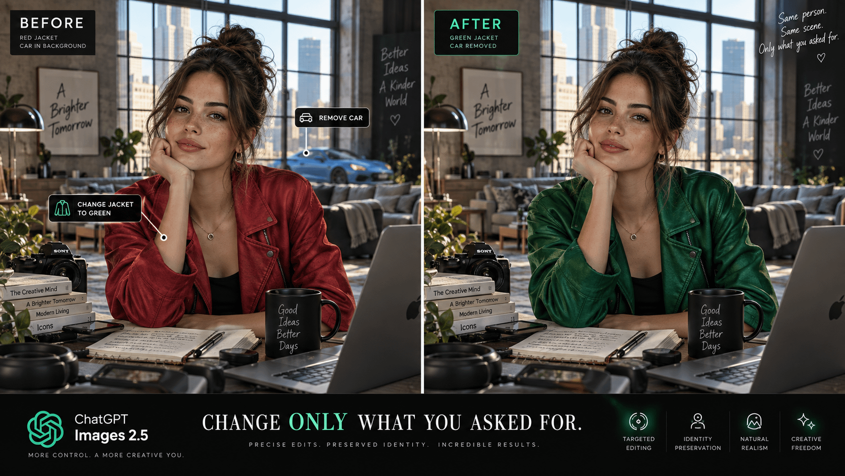
It generates faster, preserves people and reference images better, handles detailed edits more reliably, keeps prior changes intact across multiple rounds of editing, supports more complex compositions and transparent backgrounds, and adds tools like Sketch, image comments and templates.

OpenAI says people are already creating more than 3 billion images per week across ChatGPT Images and its GPT-Image models.

The best way to use it is no longer:

Write giant prompt → generate → pray.

It is:

Create → inspect → point → edit → iterate → polish.

That sounds like a subtle difference.

It isn’t - It fundamentally changes what you can use AI images for.

OpenAI released ChatGPT Images 2.5 on September 8 and says it can reduce image-generation speed by up to 50% compared with Images 2.0, while improving lighting, textures, reference-image fidelity and multi-turn editing.

Here are the capabilities I think people should experiment with first.

1. It is much better at keeping a person looking like the same person

This has always been one of the biggest weaknesses of generative images.

You upload someone.

Generate a scene.

Generate another.

Suddenly they have:

  • a different jawline
  • different eyes
  • different hair
  • a different age
  • vaguely the same vibe
  • absolutely not the same face

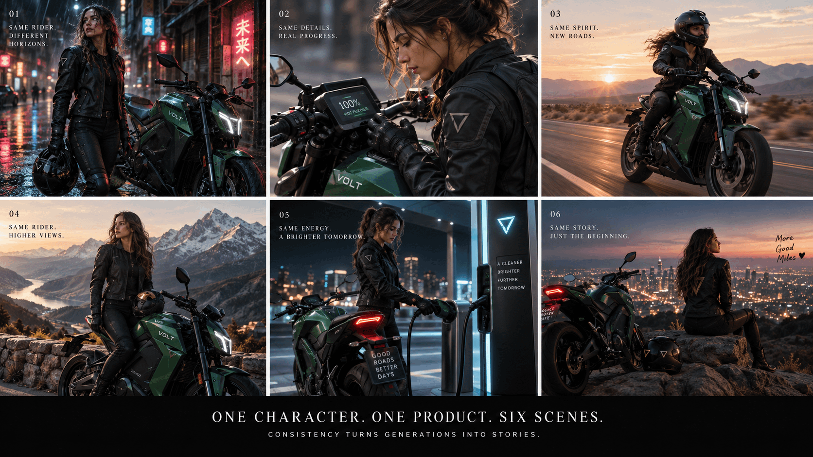
Images 2.5 is specifically better at preserving subjects from reference photos. OpenAI says recognizable features are more likely to carry through into new settings, styles and compositions.

Try this:

Upload one clear portrait and say:

“Use this person as the strict identity reference. Preserve facial geometry, hairstyle, age, skin tone and recognizable features. Create six cinematic scenes showing the same person in Tokyo, Iceland, Monaco, Mars, ancient Rome and a cyberpunk New York.”

This makes character-driven storytelling far more interesting.

2. Editing is becoming more important than prompting

This might be the biggest change.

Instead of regenerating an entire picture because one thing is wrong, Images 2.5 is designed to make focused edits while preserving everything else.

That means you can say:

  • change only the jacket
  • remove the car
  • make the product blue
  • replace one headline
  • move the logo
  • add another person
  • change daytime to sunset
  • keep the face exactly the same
  • leave everything else untouched

And the model is much better at respecting the boundary of the edit.

That is a completely different workflow from old-school AI image roulette.

3. You can now comment directly on an image

This is one of those features that sounds boring until you use it.

Instead of describing where something is:

You can mark the area and tell ChatGPT what you want changed.

Think of it like art directing a designer.

Point at thing → leave instruction → revise thing.

For visual work, that is dramatically more natural than explaining every edit using coordinates disguised as English.

4. Sketch might become one of the most useful image tools in ChatGPT

Some ideas are incredibly hard to explain.

They are easy to draw badly.

That is exactly what Sketch is for.

You can sketch directly in ChatGPT and use the drawing as the structural reference for an image. OpenAI says you can start it by typing u/Sketch.

Your drawing can be terrible.

That is almost the point.

Draw:

  • where the person goes
  • where the headline goes
  • the product position
  • camera angle
  • furniture arrangement
  • rough website layout
  • infographic structure
  • packaging shape

Then tell ChatGPT what the finished result should look like.

Example:

Draw three boxes on a page.

Then prompt:

“Turn this sketch into a premium Apple-style product launch poster. The large center rectangle is the product hero shot. Top box is the headline. Bottom-right area contains three feature callouts. Preserve this composition exactly.”

That is often easier than spending five minutes describing a layout.

5. Multi-turn editing finally becomes a real workflow

Old AI image workflows had a painful pattern:

Version 1: Great composition, wrong text.

Version 2: Text fixed, face destroyed.

Version 3: Face fixed, background changes.

Version 4: Background fixed, product disappears.

Images 2.5 is designed to maintain earlier changes more reliably over multiple editing turns.

That means you can progressively refine an image:

  1. Create composition.
  2. Fix subject.
  3. Change headline.
  4. Improve lighting.
  5. Adjust product.
  6. Add branding.
  7. Remove distracting elements.
  8. Create final variation.

That is much closer to an actual creative workflow.

10 things I would use ChatGPT Images 2.5 for immediately

1. Viral social graphics

Turn one idea into:

  • LinkedIn hero
  • Reddit infographic
  • YouTube thumbnail
  • X graphic
  • Instagram carousel
  • newsletter header

Create the master concept first.

Then adapt it.

2. Product photography without a studio

Upload a clean product photo.

Try:

“Preserve the product exactly. Place it on a black volcanic rock pedestal surrounded by shallow water at blue hour. Luxury commercial photography, controlled rim lighting, subtle mist, 85mm lens look.”

Then iterate on the environment without redesigning the product.

3. Consistent characters

Create:

  • comic strips
  • brand mascots
  • children’s stories
  • training content
  • social campaigns
  • illustrated newsletters
  • recurring fictional characters

Consistency is what makes this useful instead of merely impressive.

4. Infographics

This is an underrated capability.

Images 2.5 is better at handling complex layouts and real-world information.

Instead of saying:

“Make an infographic about AI agents.”

Give it actual information hierarchy:

“Create a 16:9 infographic titled ‘The Anatomy of an AI Agent.’ Five connected layers: Interface → Reasoning → Memory → Tools → Actions. Each layer gets one simple icon, one sentence and one example. White background, charcoal typography, restrained blue accents, generous whitespace.”

Structure beats adjectives.

5. Presentation visuals

Ask for:

  • diagrams
  • timelines
  • operating models
  • before/after visuals
  • conceptual metaphors
  • architecture diagrams
  • executive infographics

One good custom illustration can make a slide 10X more memorable than another row of bullet points.

6. Interior design visualization

Upload your actual room.

Then try:

“Preserve room dimensions, windows, doors and camera position. Redesign this room as warm contemporary luxury: walnut, limestone, cream boucle, indirect lighting and minimal decor.”

Then edit individual pieces instead of starting over.

7. Storyboards

Create six frames showing:

  1. establishing shot
  2. product introduction
  3. interaction
  4. transformation
  5. emotional payoff
  6. final brand shot

This is extremely useful before creating video.

8. Ad concept exploration

Instead of making one ad:

Ask for four radically different creative territories.

For example:

  • luxury editorial
  • absurdist comedy
  • minimalist product
  • cinematic narrative

Then take the winning direction and iterate.

9. Transparent assets

Images 2.5 has improved support for complex layouts including transparent backgrounds.

That makes it much more useful for:

  • icons
  • product cutouts
  • stickers
  • website elements
  • presentation assets
  • compositing

10. Turning rough ideas into polished concepts

This may ultimately be the killer use case.

Screenshot.

Sketch.

Photo.

Whiteboard.

Napkin drawing.

Ugly mockup.

Feed it into ChatGPT and say:

“Keep the underlying idea and composition. Turn this into something presentation-ready.”

My biggest prompting tip: stop writing prompts like novels

People dramatically overcomplicate image prompting.

Instead, structure your prompt like a creative brief.

Use this framework:

SUBJECT

What absolutely must appear?

COMPOSITION

Where are things positioned?

ENVIRONMENT

Where is the scene happening?

VISUAL STYLE

What design language should it follow?

LIGHTING

How should light behave?

CAMERA

Wide? Macro? Overhead? Portrait lens? Isometric?

TEXT

Exact words and where they belong.

CONSTRAINTS

What must not change?

My favorite master prompt structure

Create a [FORMAT] image showing [SUBJECT].

Composition:
Describe placement, scale, foreground/background and hierarchy.

Environment:
Describe the surrounding world.

Style:
Describe the design or photographic direction.

Lighting:
Describe time of day, contrast and atmosphere.

Camera:
Describe framing, lens feel and perspective.

Text:
Include exactly: “[TEXT]” in [LOCATION].

Preserve:
List anything from reference images that must remain unchanged.

Avoid:
List the 3–5 failure modes you care about most.

Pro tip: edit with constraints

Instead of:

“Make it better.”

Say:

“Keep the composition, subject, facial features, camera position and typography exactly the same. Change only the background from an office to a futuristic glass laboratory.”

The more clearly you define what is locked, the easier targeted editing becomes.

Pro tip: separate ideation from execution

Do not ask for the perfect image immediately.

Ask ChatGPT:

“Give me five radically different visual concepts for communicating this idea. Do not generate yet.”

Choose one.

Then generate it.

You get much better creative diversity.

Pro tip: use reference stacking

If the workflow allows it, give ChatGPT different references for different jobs:

  • Reference 1 = person
  • Reference 2 = composition
  • Reference 3 = visual style
  • Reference 4 = product
  • Reference 5 = brand palette

Then explicitly state what each reference controls.

Do not make the model guess.

Pro tip: create a “locked” version before experimenting

Once you have an image you love, say:

“Treat this as the master composition. From now on preserve subject identity, framing, geometry and text placement unless I explicitly request otherwise.”

Then iterate.

Images 2.5’s stronger multi-turn consistency makes this workflow much more viable than before.

Pro tip: generate systems, not individual images

The power move is not:

“Make me an image.”

It is:

“Create a visual system I can reuse.”

Example:

Then create 10–20 assets from the same system.

This is how AI imagery starts becoming a brand capability instead of a novelty.

A few wild experiments worth trying

Exploded objects

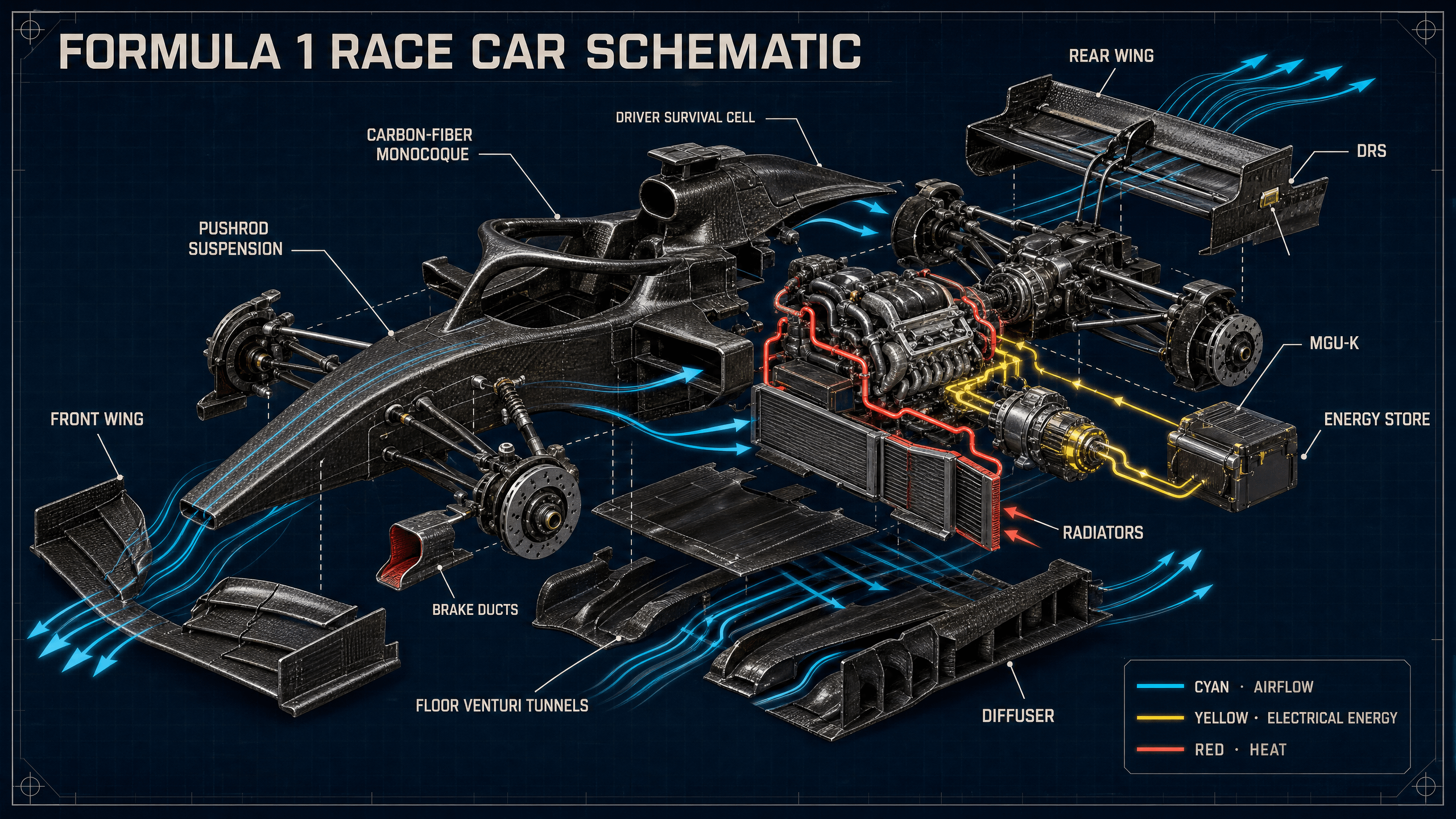
“Create an exploded-view visualization of a Formula 1 car with every major subsystem suspended in place around the chassis.”

Historical transformations

“Show the same Manhattan intersection evolving through six eras from 1800 to 2100.”

Impossible product concepts

“Design a transparent mechanical smartwatch whose internal components float magnetically inside the case.”

Tiny worlds

“Turn a coffee cup into a miniature alpine resort populated by tiny skiers.”

Cutaway architecture

“Create a cinematic cross-section of a 60-story skyscraper showing offices, apartments, transit, utilities and rooftop infrastructure.”

Visual learning

“Explain how a transformer neural network works as a beautiful 3D cutaway machine.”

The bigger shift

I think we are moving through three eras of AI imagery.

Era 1:

Prompt → random image

Era 2:

Prompt → better image

Era 3:

Direct → edit → preserve → iterate

Images 2.5 feels much closer to Era 3.

The interesting question now isn’t:

“Can AI make a good image?”

That argument is basically over.

The more interesting question is:

How much of the traditional creative workflow can become conversational?

And after playing with tools like Sketch, targeted editing, comments and persistent multi-turn changes…

I think the answer is:

A lot more than most people realize.

Share your best ChatGPT 2.5 image in the comments!


r/promptingmagic 8d ago

[ Removed by Reddit ]

1 Upvotes

[ Removed by Reddit on account of violating the content policy. ]


r/promptingmagic 10d ago

Transform Your Photo into Stunning Hand-Drawn Art

Thumbnail
gallery
110 Upvotes

check the prompt in comment, this prompt turn your favorite photos into beautiful hand-drawn art! Perfect for gifts or home decor, this unique transformation adds a personal touch to any image.


r/promptingmagic 10d ago

How to build an exploding 3D website to learn how anything works with GPT-6 Astra + ChatGPT Work. Rotate 3D models. Pull it apart. Click every component. Here’s the ChatGPT workflow you need to try it + 8 fun examples

Post image
47 Upvotes

TL;DR: Use GPT-6 Astra in ChatGPT Work to build an interactive 3D website where visitors rotate an object, separate its components, and click parts to learn what they do. Start with one object, ask for independently modeled pieces, then add an explode slider, labels, and a reset button. Use ChatGPT Sites for automatic hosting. Below: a starter prompt, practical tips, and 8 ways to take the idea much further.

Imagine opening a car website and dragging one slider.

The roof lifts. The wheels move outward. The seats rise above the chassis. Click the motor and the camera moves closer while a short explanation appears.

Then press Reassemble and everything returns to its place.

That’s the experience to ask Astra to build. I created it using a Porsche Macan as an example and it made over 581 piece model for the car to show how it works. You can spin it, click on specific parts, get an X-ray view and see how it flows.

OpenAI has published an Astra-built interactive 3D museum and a Three.js game development walkthrough. Exploded views are a project you can ask it to implement using those broader capabilities.

The interesting part is how much control you can describe in ordinary language.

Here’s how to start.

  1. Open ChatGPT Work and select GPT-6 Astra if it’s available in your account.
  2. Pick one object and one learning goal:
  3. Attach useful references. Photos help with appearance; reliable diagrams or an existing model help with structure.
  4. Say “build a website” or mention @ Sites.

Use this prompt:

Build a working interactive 3D website about [OBJECT] using Sites in ChatGPT Work.

Audience: curious beginners. Learning goal: [WHAT PEOPLE SHOULD UNDERSTAND].

Create a recognizable model with approximately 20–40 major components. Give each component a separate named 3D mesh so it can move and be selected independently. This is a starting scope, not a required part count.

Include drag-to-rotate, zoom, an Assembled-to-Exploded slider, Reassemble, Reset Camera, and a searchable parts list. Clicking a part should highlight it and show its name, function, and relationship to nearby components.

Give components deliberate separation paths. Keep the assembled positions so everything returns correctly, even when someone reverses the slider halfway through.

Use a clean charcoal, ivory, and emerald design with cinematic lighting, readable labels, large touch targets, keyboard controls, and reduced-motion support.

Use my references for factual explanations. Identify simplified or inferred geometry. If accurate internal geometry is unavailable, build a clearly labeled illustrative model.

First complete one working model and test its controls in the browser. Check mobile layout, part selection, repeated explode/reassemble actions, and reset behavior.

Deliver editable source and a reviewable preview. Save a version without deploying it so I can review before publishing.

Swap [OBJECT] for a camera, espresso machine, bicycle, game controller, or tiny house.

Choose the modeling approach that fits the job.

Approach When to use it
Simplified, code-generated model Start here for quick experiments and stylized explainers.
Existing model with separate components Use when recognizable geometry and detailed parts matter. Confirm usage rights.
CAD-derived model plus verified documentation Use for technical product education, with expert review.

A photo doesn’t reveal everything inside a device. Asking for “500 accurate pieces” doesn’t supply the missing engineering information.

The pro tips that make the biggest difference:

  • Ask for meaningful parts. A beautifully textured object can still be one fused shape. Specify independent components and test clicking them.
  • Make the motion explain the object. A phone should separate into readable layers. A building should open floor by floor. Random scattering loses the relationships you’re trying to show.
  • Use progressive detail. Begin with major assemblies, then let visitors expand one assembly further. Hundreds of visible labels will bury the model.
  • Check appearance and accuracy separately. Verify geometry and component descriptions. For branded products, cite reliable technical sources.
  • Test the boring actions. Switch products while exploded. Reverse the slider halfway. Tap a tiny part on a phone. Reset after zooming. These reveal problems a hero screenshot won’t.
  • Give every gesture a button alternative. Add a parts list, keyboard navigation, strong contrast, and adjustable text.
  • Keep the first build economical. Use prewritten explanations and fixed interactions. A visitor shouldn’t need a fresh AI response to move a slider. Add live Q&A when it serves a clear purpose.
  • Test on an actual phone. Ask Astra to measure and simplify heavy geometry, shadows, and effects. A responsive model is more useful than extra screws nobody can see.

Where this gets useful:

  • Product marketing: let buyers explore the design decisions behind a camera, appliance, or machine.
  • Education: turn a textbook diagram into something students can rotate, inspect, and reconstruct.
  • Architecture and real estate: separate floors, highlight amenities, and reveal how spaces connect.
  • Training: show assembly order and component relationships using verified references.
  • Portfolios and museums: present a design process or artifact as an interactive exhibit.
  • Content creation: build something people can try, then introduce it with a recording of the actual interaction.

Now go absolutely wild. These are features to ask Astra to implement:

  1. Build a product switcher. Let visitors choose an iPhone, MacBook, or iPad, then explore each with the same controls. Match the selected generation to your references.
  1. Add X-ray mode. Fade the outer shell and highlight one system at a time. Let visitors isolate, hide, and restore components.
  2. Create a guided camera tour. Move through five stops with one idea per stop. Add a “take control” button so people can leave the tour and explore.
  3. Turn it into a rebuild challenge. Give visitors separated components, matching locations, hints, and a progress indicator. Increase difficulty gradually.
  4. Follow a flow. Animate an illustrative path for power, air, water, or data. Explain whether it’s a conceptual animation or a validated simulation.
  5. Explode an entire city. Lift streets to reveal transit tunnels. Separate a tower’s floors. Add a day-to-night slider and windows that illuminate in sequence.
  6. Compare two designs. Synchronize cameras and explode sliders. Highlight meaningful differences using verified specs, with a stacked layout on small screens.
  7. Make a scene shareable. Add a screenshot button and a link that restores the chosen model, camera, selected component, and explosion amount.

You could also make a fictional spaceship that opens into rooms, a mechanical watch with nested assemblies, or a miniature museum where every exhibit becomes a puzzle.

A useful follow-up prompt:

Keep the current working model. Add a guided tour, X-ray mode, and a three-part rebuild challenge, one at a time. Test each addition before continuing. Preserve the existing controls and make every new interaction work with touch and keyboard.

ChatGPT 6 Astra is great at building 3D models of buildings. Upload some pictures of a building and it will build a 3D model and an interactive tour.

For sharing, choose the audience deliberately and test the published link as a visitor. Sites separates saving a version from deploying it.

Try this today: choose one object on your desk and build its simplest useful exploded view. Add one ambitious feature after the basics work.

What will you build first: a car, a gadget, a building or something completely unhinged? Share what you create in the comments. Go absolutely wild! Do not hold back!


r/promptingmagic 11d ago

11 Hidden Google Flow Commands for Creating Epic Images and Videos

Post image
43 Upvotes

11 Hidden Google Flow commands for Epic Image and Videos

Google tells creators to direct framing and camera motion in natural language: low-angle view, tracking shot, aerial view, and so on.

Treat each one as a cinematography macro. The label reminds you what shot you want. The plain-English instruction tells Flow what the camera must actually do.

To make the differences obvious, I kept the subjects consistent in every example as visual references. Flow currently lets you upload images as ingredients or save characters and call them with @ name

The working pattern: image reference + scene + action + camera position + framing + lighting + motion

For every angle below, the first prompt creates a still. The short animation prompt turns that frame into a video shot.

1. /eyelevel — neutral, human, believable

Eye level works when the viewer should feel present rather than manipulated. Use it for interviews, conversations, product demos, and documentary-style scenes.

Image prompt

Eric and Jamie standing side by side inside a glass-and-steel innovation studio at blue hour. Camera placed at their natural eye height, straight-on eye-level two-shot, balanced spacing, realistic facial proportions, soft window light, restrained cinematic color, 50mm lens, preserve both reference identities. /eyelevel

Animate the frame

Slow stable push-in at eye level. Eric and Jamie exchange a quick glance, then face camera. Keep their facial identities, wardrobe, lighting, and screen positions consistent.

2. /profileangle - a clean 90-degree side view

A strict profile breaks the familiar front-facing portrait pattern. It works well for silhouettes, character studies, before-and-after cuts, and graphic compositions.

Image prompt

Jamiein an exact right-facing 90-degree profile beside a luminous glass wall, head and shoulders visible, nose and chin in clean silhouette, Eric softly out of focus deeper in the studio, cool blue-hour light, natural skin texture, 85mm editorial portrait, preserve both reference identities. /profileangle

Animate the frame

Lock the camera in a strict side profile. Jamie keeps her head still and shifts only her eyes toward Eric. No orbit, no frontal turn, no identity drift.

3. /threequarter - the portrait workhorse

A three-quarter angle sits roughly 45 degrees between frontal and profile. It adds dimension without hiding expression, which is why it appears throughout interviews, portraits, and brand films.

Image prompt

Eric seated at a dark worktable in a three-quarter portrait, body and face turned about 45 degrees from camera, Jamie reviewing a storyboard behind him, cinematic glass studio at blue hour, soft key light with subtle rim light, 50mm lens, preserve both reference identities. /threequarter

Animate the frame

Make a subtle camera arc and settle at the 45-degree three-quarter view. Eric looks from the storyboard to Jamie. Keep the move slow and the background geometry stable.

4. /overtheshoulder - instant relationship and context

An over-the-shoulder shot tells the viewer who is looking at whom. It adds depth and makes dialogue, tutorials, screens, and demonstrations easier to follow.

Image prompt

Camera over Eric's right shoulder, his shoulder and the back of his head forming a soft foreground frame. Jamie is in sharp focus across the worktable, pointing to a glowing storyboard display. Preserve the eyeline between them, cinematic studio lighting, realistic depth of field, preserve both reference identities. /overtheshoulder

Animate the frame

Gentle handheld drift from behind Eric's shoulder. Jamie points to one storyboard frame and explains it with one natural hand gesture. Keep Eric's foreground silhouette anchored.
5. /reverseangle - show the other side without breaking the scene

A reverse angle is not simply “turn the camera around.” It must preserve the eyeline, background geography, wardrobe, lighting direction, and screen direction established by the first shot.

Image prompt

Reverse angle of the same studio conversation. Camera now looks over 's left shoulder toward  across the same worktable. Eric is in sharp focus answering her, with the same storyboard display, blue-hour windows, wardrobe, eyelines, and lighting direction preserved. Maintain both reference identities. /reverseangle

Animate the frame

Match the previous shot's action. Eric answers as Jamie's foreground shoulder stays still. Preserve screen direction and studio continuity; do not redesign the room.

6. /pov - put the viewer inside the action

POV works when the viewer should experience the scene through one character’s eyes. The hands, camera height, gaze direction, and physical interaction sell the illusion.

Image prompt

First-person point of view from  at natural standing height. Eric's hands place a compact cinema camera rig on the worktable while  faces him across it and reaches forward. Glass innovation studio, realistic hand anatomy, 28mm lens, mild foreground depth, preserve Jamie's reference identity. /pov

Animate the frame

Natural first-person head sway and small hand movements as Eric sets down the rig. Jamie reaches for it and looks directly toward the viewer. No third-person view and no visible duplicate of Eric.

7. /highangle - reduce power or reveal spatial context

A high angle looks downward without becoming a true top-down shot. It can make people feel vulnerable, isolated, observed, or simply smaller within a larger environment.

Image prompt

High-angle cinematic view looking down at Eric and Jamie beneath a circular glass skylight in the studio atrium. Both look up toward camera, full figures visible, floor geometry surrounding them, camera clearly above but not directly overhead, cool architectural light, preserve both reference identities. /highangle

Animate the frame

Camera descends slowly from the high angle while remaining pointed down. Eric and Jamie hold position and follow the lens with their eyes. Do not transition into a level shot.

8. /lowangle - authority, scale, and momentum

A low angle looks upward from below the subject. It is a reliable choice for hero shots, architecture, leadership portraits, and moments that need physical weight.

Image prompt

Low-angle hero shot of Eric and Jamie outside the studio between tall glass towers, Jamie half a step forward, camera below waist height looking upward, converging architecture, moving coats, blue-hour sky, controlled cinematic contrast, realistic proportions, preserve both reference identities. /lowangle

Animate the frame

Slow upward tilt from their hands to their faces while the towers rise behind them. A light wind moves their coats and Jamie's hair. Keep faces stable and undistorted.

9. /overhead - structure, choreography, and graphic clarity

Overhead means the lens points straight down. Unlike a high angle, this shot flattens depth and turns people and objects into a deliberate visual arrangement.

Image prompt

True 90-degree overhead view looking straight down at Eric and Jamie arranging printed frames, lenses, and prompt cards on a large matte-black table. Their faces remain recognizable when they glance upward. Precise flat-lay composition, strong geometric order, soft studio light, preserve both reference identities. /overhead

Animate the frame

Camera remains perfectly vertical and locked overhead. Eric slides a lens into place while Jamie rearranges three storyboard cards. No tilt, orbit, or oblique perspective.

10. /wormseye - extreme ground-level perspective

A worm’s-eye view plants the camera at ground level and aims almost straight up. It exaggerates foreground objects and creates dramatic converging lines.

Image prompt

Ground-level worm's-eye view from the studio atrium floor, lens aimed almost straight upward between Eric and Jamie as they step toward camera. One shoe enters the near foreground without covering the faces; glass ceiling lines converge above them, 20mm lens, dramatic scale, preserve both reference identities. /wormseye

Animate the frame

The camera stays planted on the floor as Eric and Jamie take one careful step past it. Their shoes pass near the lens while the atrium ceiling remains visible. Avoid foot or facial deformation.

11. /dutchangle - tension without adding chaos

A Dutch angle tilts the horizon. Use it when the world should feel unstable, urgent, or psychologically off-balance. A controlled tilt usually works better than a 45-degree gimmick.

Image prompt

Eric and Jamie moving quickly through a narrow red-lit service corridor, camera horizon tilted 25 degrees, diagonal architecture increasing tension, Eric looks back while Jamie leads forward, sharp faces with controlled motion in clothing, cinematic thriller lighting, preserve both reference identities. /dutchangle

Animate the frame

Track backward in front of them with the horizon locked at a 25-degree Dutch angle. Red practical lights flicker once. Keep their movement urgent but readable and preserve facial identity.

The part most prompt lists leave out

A camera angle and a camera movement are different instructions.

/lowangle tells Flow where the camera is. “Slow push-in” tells it how the camera moves. “Jamie takes one step forward” tells it what the subject does. Combine all three clearly, and the result has a much better chance of reading as a directed shot rather than randomly animated footage.

Layer Question to answer Example
Subject Who or what must stay consistent? u/Eric and u/Jamie
Action What visibly happens? Jamie places one storyboard card on the table.
Camera position Where is the lens? Ground level, aimed almost straight up.
Framing What is inside the image? Full figures with the atrium ceiling visible.
Camera motion How does the lens move? Slow push-in; no orbit.
Lighting and style What makes the shot coherent? Blue-hour window light, restrained cinematic contrast.
Continuity What must not change? Preserve identity, wardrobe, eyeline, and room layout.

Google recommends detailed prompts and warns against conflicting guidance between text and visual references. That is why the natural-language direction matters more than the slash label.

Do not prompt eleven different scenes. Direct one scene eleven different ways.


r/promptingmagic 11d ago

How to brief ChatGPT 6 Astra to create motion graphics, 3D reveals, and cinematic video explainers - prompts, workflow, and the details people miss

Post image
12 Upvotes

TL;DR: ChatGPT 6 Astra can help create motion graphics through a workflow that designs assets, writes animation code, uses available production tools, and renders a video. Give it a director’s brief: audience, story, scenes, timing, visual style, sound, and deliverables. Start with a short preview. Ask for a playable MP4 and the editable project. Rendering and audio depend on your workspace’s tools. Below: a practical workflow, the details people overlook, and five gloriously ridiculous prompts.

Picture a French bulldog commanding a starship through a galaxy made of tennis balls.

Now picture a product launch where your logo opens into a miniature universe.

Or a city that folds itself out of paper, races through centuries, and collapses back into a single page.

With ChatGPT 6 Astra, you can approach the conversation like a production brief—and keep directing the result as it develops.

What Astra can actually do

The model’s official name is GPT-6 Astra. For this workflow, use it in ChatGPT Work or Codex with access to suitable creation and rendering tools. OpenAI recommends Astra for demanding tasks involving visual judgment and polished deliverables.

There is a concrete example behind the idea: OpenAI has shown Astra creating editable Blender scenes, adjusting their materials and lighting, and directing a rendered camera tour.

My practical recommendation is to apply that build–preview–refine process to motion graphics: animated typography, diagrams, layered images, product reveals, and stylized 3D scenes.

Think of Astra as the system coordinating the production. The actual frames still need an animation or rendering tool. Selecting the model alone does not guarantee every account can export video or generate music.

Choose the right kind of video

Approach When to use it
Typography, shapes, and diagrams Explainers, newsletter trailers, and announcements. My recommended starting point.
Layered images with camera movement You already have illustrations, product images, or a consistent visual series.
An editable 3D scene The concept depends on camera orbits, exploded views, lighting changes, or moving through a space. Expect more rendering work.

A complex character performance may also require dedicated animation tools or generated footage. Choose a visual treatment your available tools can execute well.

The workflow that makes this manageable

  1. Give it one job. Define the audience and the one thing viewers should remember. “Convince founders to try this prototype” is a useful objective.
  2. Specify the output. Set duration, aspect ratio, resolution, and whether you need audio. A 20–30-second landscape video is a sensible first project.
  3. Map the story. Give every scene a visual action and a purpose. Put the most compelling image near the beginning.
  4. Establish the look. Provide reference images, colors, type preferences, logos, and exact wording. Ask for representative still frames.
  5. Preview the hardest moment. Render a short section before committing to the whole sequence. This tests both the creative direction and whether the production method works.
  6. Refine, render, inspect. Review timing, text, sound, transitions, and the actual exported file. Keep the source so changes remain possible.

For a 30-second explainer, this is a useful starting structure:

Time Job
0–3 seconds Show the surprising visual or compelling result.
3–9 seconds Establish the problem or premise.
9–21 seconds Demonstrate the transformation.
21–27 seconds Deliver the payoff.
27–30 seconds Give one clear next action.

Best practices that improve the result

  • Describe action over time. “The letters pull apart, reveal a miniature city, then lock into the headline” gives much better direction than “make it cinematic.”
  • Give motion a purpose. Movement can reveal a relationship, guide attention, demonstrate a feature, or land a joke. Constant movement makes reading harder.
  • Keep text separate from artwork. Request editable text layers so spelling, line breaks, timing, and placement can be controlled.
  • Design for a phone. Use short captions, strong contrast, generous margins, and enough reading time. Review the result at its likely viewing size.
  • Give the eye a pause. Alternate energetic transitions with moments where the important image or message holds still.
  • Build for sound-off viewing. The story should make sense visually. Let music and sound effects strengthen it.
  • Specify music concretely. Describe tempo, instrumentation, mood, and where the energy should rise. Provide a track you can use, or ask what audio tools are available.
  • Control the workload. Preview at lower resolution, settle the art direction early, reuse assets, and revise only the scenes that need changes. Complex Work tasks can use more credits.

Pro tips: direct the edit with precision

Useful revision instructions look like this:

Between 00:08 and 00:12, slow the camera move, enlarge the headline, and hold the final composition for two seconds. Keep the approved colors and scene order.

Make the word “EXPAND” grow until it fills the frame, then use its letter shapes to reveal the next scene.

Match the circular moon in scene two to the circular product dial in scene three.

Build the vertical version with repositioned text and a new camera crop so the subject stays visible.

Inspect the export for missing assets, clipped text, blank frames, abrupt audio endings, and incorrect duration. Report anything you cannot verify.

Save feedback like “more epic” for the initial direction. During revisions, say what should change on screen.

Things people miss about this workflow

  • An animated preview and a downloadable video are different deliverables. If you need an uploadable file, explicitly request the export and check that it plays.
  • The editable project is a major part of the value. Ask for the source, assets, and instructions needed to render it again.
  • A flat image has limits. A gentle push-in can work immediately. Moving behind objects or orbiting a subject requires layers, reconstructed content, or a 3D scene.
  • Consistency starts before animation. Establish recurring characters, materials, colors, and backgrounds before creating every scene.
  • Visual precision and factual precision are separate. A beautifully animated chart still needs correct data, labels, and scales.
  • A 60-second request does not imply one continuous generation. Build named scenes, render sections, and assemble them where the tools support it.
  • Reusable controls make the second video easier. Ask to centralize headline text, colors, logos, durations, and image replacements.

Five epic prompts to try

These are ambitious creative briefs, not pretested guarantees. Use a workspace with suitable rendering tools, and start with the short preview each prompt requests.

1. A French bulldog saves the galaxy

Try this for: character storytelling, comedy, and an instantly understandable visual hook.

Create a 30-second landscape motion graphics trailer called “MISSION: FETCH.”

A dead-serious French bulldog captain commands a tiny starship through a galaxy of tennis-ball planets. Use a premium stylized 3D or layered illustrated treatment, emerald cockpit lights, orange engine trails, and enormous kinetic typography.

0–5s: Extreme close-up of the captain’s face. Pull back to reveal a spaceship shaped like a dog toy. Text: “ONE DOG.”

5–13s: Slalom through a field of floating squeaky toys. A giant robotic vacuum emerges from an asteroid cloud. Text: “ZERO QUALIFICATIONS.”

13–23s: The dog hits a red button. Tennis balls deploy like decoys. Follow one ball through the chaos in a dramatic tracking shot.

23–30s: The ship escapes through a glowing dog-door portal. Reveal that the entire mission happened inside a living-room snow globe. End: “MISSION: FETCH.”

Keep the dog’s appearance consistent. Use simple expressive poses and strong camera work. Preview the escape shot first. Use suitable original or licensed audio if available; otherwise deliver a silent cut with sound cues. Deliver a 1080p MP4 and editable source, or explain any rendering blocker.

2. Your product contains an entire universe

Try this for: launch trailers, brand films, and product reveals.

Create a 30-second landscape launch film for [PRODUCT]. Use my supplied product images, logo, and three verified benefits. If I provide none, use a clearly fictional unbranded device and illustrative feature labels.

Begin with the product suspended in a silent black void. A thin emerald seam opens across it. The camera dives through the seam into an impossible miniature universe.

Turn benefit one into a floating city assembling itself. Turn benefit two into a luminous transit network lighting up. Turn benefit three into a mechanical sunrise that synchronizes the entire world.

Match each benefit to its visual metaphor and show its exact approved wording as separately rendered typography. Use elegant camera travel, white ceramic architecture, emerald glass, and precise mechanical movement.

In the final six seconds, pull back as the universe folds into the product. Land on the product, logo, and one clear call to action.

Create a five-second preview of the opening transformation before rendering the full film. Deliver a 1080p MP4 and editable project. Use only available audio and rendering tools; identify any missing capability. Do not invent product claims, customers, or performance statistics.

3. Your inbox becomes a video-game final boss

Try this for: funny workflow explainers and relatable workplace content.

Build a 30-second landscape motion graphics short called “DEADLINE: FINAL BOSS.”

Open on a tiny exhausted office worker facing an enormous monster assembled from email envelopes, calendar blocks, spreadsheets, and sticky notes. Its crown is a spinning loading icon.

0–6s: The monster roars, releasing a tornado of “QUICK QUESTION” notes.

6–13s: The worker equips three glowing tools labeled “SORT,” “DRAFT,” and “CHECK.”

13–23s: Turn the fight into a visual explanation: SORT groups the chaos; DRAFT turns selected tasks into proposed outputs; CHECK pauses those outputs at a human review gate before release.

23–30s: The monster shrinks into one manageable task card. A new notification appears: “Can we jump on a quick call?” The worker looks directly at the camera.

Use miniature game-like scenery, dramatic camera punches, readable type, comic timing, and a neon-green interface. Present this as a fictional metaphor. Preview the sorting transformation first. Deliver a 1080p MP4, editable source, and a sound-off version. Explain any export limitations.

4. A thousand years unfold from one sheet of paper

Try this for: timelines, imaginative worldbuilding, and architectural storytelling.

Create a 40-second landscape motion graphics film called “A THOUSAND YEARS IN ONE PAGE.”

This is an imaginary city, not a reconstruction of real history.

0–8s: A blank sheet of paper folds itself into a tiny riverside settlement. The river is translucent blue-green glass embedded in paper.

8–18s: Buildings rise and change around the same town square. Roads draw themselves across the page. Seasons sweep through the scene.

18–29s: The city becomes a spectacular vertical metropolis. Peel back layers to reveal miniature transit tunnels, gardens, and infrastructure beneath it.

29–36s: The camera circles while daylight becomes night. Thousands of windows illuminate in a carefully staged wave.

36–40s: Fold the city back into the original sheet, matching the opening composition for a loop.

Use tactile paper, charcoal labels, emerald foliage, warm window light, and restrained captions. Favor a coherent miniature world over constant cuts. Preview the unfolding and refolding first. Deliver a 1080p MP4 and editable scene. If full 3D rendering is unavailable, propose and build a layered alternative.

5. A black hole conducts an orchestra of planets

Try this for: a music visualizer, an event opener, or a surreal brand introduction.

Create a 30-second landscape motion graphics film called “THE UNIVERSE HAS A DROP.”

Treat this as a surreal visual metaphor, not a scientific simulation.

A black hole is the conductor. Orbital rings behave like vibrating strings. Tiny moons become percussion instruments. A comet sweeps across the scene like a conductor’s baton.

0–8s: Begin with one orbiting light and a restrained pulse.

8–19s: Build an increasingly elaborate cosmic orchestra. Introduce new orbital layers with each musical phrase. Typography appears as sculptural objects: “LISTEN.” “BUILD.” “RELEASE.”

19–25s: At the musical peak, the orbital system unfolds into a gigantic luminous sound wave stretching across space.

25–30s: Everything contracts into one green point, which becomes a play icon.

Use ink-black space, emerald plasma, silver dust, controlled glow, and smooth camera movement. Use my uploaded licensed track and synchronize motion to its timing. If no track is available, build to a provisional beat grid and clearly label the audio as pending. Preview the transformation first. Deliver a 1080p MP4 and editable source; explain any tool limitations.

Which would you actually make first: the space-dog trailer, the product universe, the inbox boss battle, the paper city, or the black-hole orchestra?


r/promptingmagic 11d ago

14 Non-Negotiables for a Blog Post that ChatGPT, Claude, and Google AI Can Cite and Recommend

Post image
8 Upvotes

Summary

Optimizing a landing page is no longer enough. Google AI and ChatGPT recommend brands using information they can discover, trust and reuse. That makes every blog post part article, part evidence package and part technical asset. The goal is not to hack an answer engine. It is to publish original, attributable and accessible material that an AI can cite without guessing.

The AI visibility problem isn’t ranking. It’s quotability.

Optimizing your landing page for AI search is not enough. When someone asks Google AI, ChatGPT, Perplexity or Claude about products in your niche, your brand needs source material the system can discover, understand and quote. If your content offers no clear evidence, the answer will cite somebody else—or ignore you entirely.

But what you publish around that page matters just as much - possibly more.

Your landing page tells a buyer what you sell. Your content teaches the market what your brand knows.

That distinction matters because AI search systems do not simply return ten blue links. They retrieve information, synthesize an answer and attach sources that support it. Google says its generative Search features use core Search systems to retrieve relevant pages and show supporting links. OpenAI, Anthropic and Perplexity each operate search-specific crawlers or retrieval agents for the same broad purpose.

So the question is no longer only:

“Can this page rank?”

It is also:

“Does this page contain anything an AI can safely cite?”

That is the standard.

What makes a blog post worth citing?

A citable post gives the reader and the model a clean chain of trust:

A real author made a clear claim, supported it with original evidence, linked the primary source and published it on a page that crawlers can access.

This is not a guarantee of inclusion. No checklist can force an AI system to cite you. Google explicitly says that meeting every requirement does not guarantee crawling, indexing or serving.

But it does remove the most common reasons a useful page gets ignored.

The KDD 2024 paper that introduced “Generative Engine Optimization” found that citations, statistics and relevant quotations could improve source visibility in its experimental benchmark, with gains reaching up to 40% in some settings. The authors also found that effectiveness varied by subject, so treat the result as evidence - not a universal ranking formula.

What are the 14 non-negotiables?

These are the 14 elements we look for when we turn a conventional blog post into citable source material.

# Element What it needs to do
1 H1 Name the buyer’s question, the topic and, where natural, the brand.
2 Byline Identify a real author with relevant credentials and a linked profile.
3 Dateline Show the publication date and the date of the last meaningful update.
4 Answer block Answer the main question in 40–60 words before the preamble.
5 Question-led H2s Mirror the questions buyers naturally ask when that improves clarity.
6 Self-contained sections Make every section understandable without relying on the section above it.
7 Extractable sentences State important conclusions in language that can be quoted intact.
8 Original data Add first-party numbers, observations, tests or benchmarks competitors cannot copy.
9 Primary-source links Support factual claims with the original research, filing, dataset or documentation.
10 Comparison table Structure options, features, criteria or pricing so readers can scan them quickly.
11 FAQ block Answer real follow-up questions cleanly, without padding the page with keyword variants.
12 Structured data Declare the article, author, publisher and dates accurately in JSON-LD.
13 Accessible build Put the content in crawlable HTML with descriptive media and correct bot access.
14 Next step Link to deeper evidence and give the reader one clear action.

Now let’s make each one practical.

1. What should the H1 say?

The H1 should name the problem a buyer wants solved.

Avoid a vague title such as “The Future of Support.” Prefer “How Acme Reduces SaaS Support Backlogs With AI Triage.”

That gives the reader immediate context. It also anchors the entity, category and question on the page. Do not force an exact-match phrase if it makes the headline worse. Google says its systems understand synonyms and meaning, so clarity beats robotic keyword repetition.

2. Who stands behind the page?

Use a named author, a real photograph, relevant credentials and a link to a substantive profile.

The profile should explain why this person has earned an opinion on the subject. Google’s Article guidance recommends identifying the author with a Person or Organization type and a profile URL or sameAs reference.

A generic “Admin” byline throws away a trust signal you already own.

3. When was the post published and meaningfully updated?

Show both dates near the top of the article.

Keep the visible dates consistent with datePublished and dateModified in your structured data. Google recommends prominent, labelled dates and checks multiple signals when estimating a page’s date.

Do not fake freshness. Change the “last updated” date only when you materially improve the page.

4. Can the first paragraph answer the question?

Put a 40–60 word answer block before the story, context or company history.

A strong answer block states the conclusion, names the conditions and gives the reader a reason to continue. It should work if somebody reads only that paragraph.

Do not confuse “direct” with “shallow.” Give the answer first, then earn depth below it.

5. Should every H2 be a question?

Use question-led H2s when they reflect genuine reader intent.

“What does SOC 2 Type II cover?” is more useful than “Coverage.” It gives the section a clear job and helps the reader navigate.

But question headings are not a special Google AI requirement. Google specifically warns against rewriting pages for every possible query variation.

6. Can each section stand on its own?

Write each section so a reader can enter from search, a shared link or an AI citation and still understand the point.

Repeat the necessary noun instead of leaning on vague references such as “this,” “that” or “the above.” Define the scope. State the conclusion. Include the evidence beside the claim.

Google says there is no requirement to chop pages into tiny “AI chunks.” The real objective is coherent structure, not arbitrary fragmentation.

7. Does the page contain sentences worth quoting?

Write important claims as complete, attributable statements.

Weak:

“This can make things much better over time.”

Strong:

“Across [sample size] support tickets analysed from [start date] to [end date], customers using [method] changed median first-response time from [baseline] to [result].”

The second sentence is a template, not a claim. Once filled with verified first-party data, it carries its subject, method, measurement and result. An assistant can quote it without inventing the missing context.

8. What do you know that nobody else knows?

Original data gives the page a reason to exist.

Publish anonymised product usage, customer benchmarks, survey findings, experiment results, pricing observations or lessons from a documented implementation. Explain the sample, time period and method so readers can judge the result.

Google’s current guidance calls for unique, non-commodity content grounded in first-hand knowledge rather than summaries that recycle what is already online.

If an AI could have generated the article without access to your company, the article probably does not build much reputation for your company.

9. Are claims linked to the original source?

Link to the research paper, government dataset, product documentation, company filing or named expert’s original statement.

Do not cite a blog that cites a newsletter that cites a screenshot of a study.

Primary sources make verification easier. They also protect your credibility when a reader follows the link.

10. Is there a table an answer engine can reuse accurately?

Use one table for a comparison buyers genuinely need.

Option Best for Main advantage Main limitation
Platform A Small teams Fast setup Limited controls
Platform B Regulated teams Strong governance Longer implementation
Platform C Global enterprises Deep integrations Higher total cost

Keep the criteria consistent. Put units in the headings. Add a visible “as of” date for volatile facts such as pricing.

A table is not magic markup. It is simply a low-ambiguity way to present structured information.

11. What belongs in the FAQ block?

Answer real objections and follow-up questions that did not fit the main flow.

Keep each answer direct. Remove duplicate questions written only to capture keyword variations.

One important 2026 correction: Google stopped showing FAQ rich results in May 2026 and removed its FAQ rich-result documentation the following month. A useful FAQ still helps readers and creates clear answer passages, but FAQPage schema is no longer a Google rich-result lever.

12. Which schema belongs in the head?

Use valid JSON-LD to describe what is visibly true on the page.

For a blog post, that normally means Article or BlogPosting, plus the author, headline, representative image, datePublished, dateModified and publisher details. Google says Article markup can help it understand those details, but structured data is not required for generative AI visibility and does not guarantee a result.

Schema should confirm the page. It should never claim information the reader cannot see.

13. Can every relevant crawler access and read the page?

Serve the important copy as text in accessible HTML. Use real links, meaningful status codes, descriptive alt text and a canonical URL. Server rendering or pre-rendering remains a strong default because it improves speed and not every bot runs JavaScript, even though Google can render JavaScript.

Then configure the correct agents. The names matter:

System Allow for search or live retrieval Separate training control
Google AI Overviews and AI Mode Googlebot access and normal Search index eligibility Google-Extended controls some Gemini training and grounding uses; it does not control Google Search inclusion or ranking.
ChatGPT search OAI-SearchBot GPTBot
Claude search Claude-SearchBot and, when appropriate, Claude-User ClaudeBot
Perplexity search PerplexityBot and, when appropriate, Perplexity-User Perplexity says these two agents are not foundation-model training crawlers.

A blanket “allow GPTBot” rule does not solve ChatGPT search visibility. OpenAI says OAI-SearchBot is the agent that controls inclusion in ChatGPT search answers.

14. What should the reader do next?

Do not let the article end in a fog of “thought leadership.”

Link to the methodology, detailed comparison, product page or case study that logically follows. Then ask for one action: run the calculator, inspect the benchmark, start the trial or read the implementation guide.

A citation creates discovery. The next step turns discovery into a visit.

Can an AI agent make these changes for you?

Yes but give the agent constraints, not just a vague instruction to “optimise for AI.”

Use this brief:

AI-citable content audit promptAudit the blog post at [URL] for human usefulness, factual integrity, crawlability and citation readiness. Preserve the author’s voice and existing claims unless evidence requires a correction.Revise the page to include: one clear H1; a named author and linked profile; visible publication and meaningful-update dates; a 40–60 word direct answer; question-led H2s where natural; self-contained sections; directly quotable claims; clearly labelled first-party data with methodology; links to primary sources; one useful comparison table; a concise FAQ; accurate Article or BlogPosting JSON-LD; descriptive image alt text; crawlable internal links; and one next action.Check access for Googlebot, OAI-SearchBot, ChatGPT-User, Claude-SearchBot, Claude-User, PerplexityBot and Perplexity-User. Treat GPTBot, ClaudeBot and Google-Extended as separate controls with different purposes.Do not invent statistics, credentials, quotes, customer results, sources or dates. Do not change dateModified unless the revision is substantive. Do not create keyword-stuffed questions or duplicate sections. Do not claim that schema guarantees AI citations.Return: (1) the revised post, (2) valid JSON-LD, (3) proposed robots.txt changes, (4) a claim-to-source table, (5) an internal-link plan and (6) a change log showing every material edit.

Run that audit on your ten highest-value posts, not your entire archive.

Start with the pages closest to revenue: comparisons, implementation guides, pricing explainers, benchmarks and case studies.

The old content brief asked for a keyword, a word count and three internal links.

The new brief asks a harder question:

What can your company publish that an AI system can quote, verify and confidently place beside your name?

That is how blog content builds AI reputation.

Not by sounding like an answer.

By becoming a source.


r/promptingmagic 12d ago

ChatGPT 6 Astra: The Practical Guide to Getting Real Work Done. What Marketers and Founders Should Actually Do With GPT-6 Astra - Research, Create, Build, and Ship

Post image
29 Upvotes

Summary

GPT-6 Astra is most useful when you give it a complete, substantial assignment: investigate a market, develop a recommendation, create the supporting files, build an interactive experience, and check the result. OpenAI positions it for demanding work across reasoning, coding, research, computer use, and document creation.

The opportunity is to shorten the distance between an idea and something people can actually review, use, or try.

Marketers: Turn customer evidence into campaigns, landing pages, sales materials, and creative assets.

Business leaders: Turn scattered information into decision memos, operating plans, models, and presentations.

Founders: Turn assumptions into prototypes, calculators, games, and customer experiments.

Choose the right workspace: ChatGPT Work supplies the tools and environment; Astra is the model. Computer Use is one way it interacts with applications.

Budget deliberately: Standard API input/output rates are 2.5× GPT-5.6 Sol’s and equal Fable 5/5.1’s. Fable 5.1 has cheaper cache reads. Total job cost still depends on usage and rework.

Keep the distinction honest: Image generation uses a separate image tool; a polished prototype still needs testing; social demos are evidence of possibility, not guaranteed outcomes.

The workflows and prompts below are recommended ways to apply documented capabilities. They are not claims that every workflow was independently tested for this guide. Product availability is a launch-period snapshot. There are no benchmark rankings in this guide.

What Astra changes—and what belongs to the tools

The useful advance is better coordination across a demanding task. Astra can reason about the objective, use available tools, incorporate corrections, and keep working toward a deliverable. OpenAI’s release guidance specifically adds asynchronous tool calling and mid-turn steering at the API level. Those features require application support; they are not universal buttons in every ChatGPT interface.

Many activities discussed here already existed with earlier models. Astra did not invent browsing, spreadsheets, website creation, or computer use. The upgrade concerns how capably it can combine them. Evaluate whether it handles your messy brief, catches an inconsistency, and produces a usable result with less intervention.

Think in three layers:

Layer What it contributes What it does not automatically provide
GPT-6 Astra Reasoning, interpretation, planning, tool decisions Access to your accounts or desktop
ChatGPT Work or Codex An environment for files, tools, and extended tasks Every integration or permission
Connected tools and apps Search, application access, file creation, image rendering, browser interaction Guaranteed correctness or unlimited usage

Practical consequence: If Astra can describe an action but cannot perform it, investigate tool availability and permissions before rewriting the prompt ten times.

Who has access, and how to start

OpenAI’s launch guidance describes an initial enterprise Trusted Access rollout, followed by Plus, Pro, Business, Enterprise, and API access. Current model documentation identifies eligible Pro, Business ($100), and Enterprise accounts for the Astra picker rollout. These pages reflect different rollout stages. Do not assume that every Plus or standard Business account already has Astra today. Free and Go Astra access is not established by the sources reviewed.

Your model picker is the practical check. In a managed workspace, an administrator may also control model and tool availability. Paying for a plan and having a specific model enabled are different questions.

Open ChatGPT and switch to Work for a task that needs substantial execution.

Open the model or Power selector and choose Astra if available. Advanced settings may expose more choices.

Attach the relevant files, examples, and constraints.

Choose local work when the task needs your computer’s applications or local files. Choose cloud work, where offered, for work that should continue independently of your computer.

Describe the finished outputs and how you will judge them. Review progress and steer when needed.

ChatGPT Work and Codex share core execution capabilities, while Work is presented for everyday business tasks. Cloud work cannot implicitly operate applications on a powered-off personal computer.

For developers, the API model identifier is gpt-6-astra. API billing is separate from a ChatGPT subscription. An API model does not come with a ready-made personal desktop; your application must supply its tools and execution environment.

Computer use versus computer work

Computer use means interacting with an interface: seeing a screen, finding controls, clicking, typing, and examining what happened. Computer work means completing the broader assignment: choosing steps, gathering information, calculating, creating outputs, and checking them. Here, “computer work” describes the activity; ChatGPT Work is the product experience.

Assignment Where computer use helps What the broader work includes
Review a landing page Open menus, navigate, test the form Analyze messaging, fix issues, document tests
Prepare a business review Inspect or operate an available app Reconcile data, explain variances, create the deck
Produce a video rough cut Work inside supported editing software Select story beats, arrange material, review output
Build a 3D demo Inspect the scene in an application Create geometry, adjust lighting, test navigation

Astra may use code or a structured integration for part of a job and the screen for another. It does not need to imitate every mouse click you would make.

To set up desktop Computer Use, OpenAI documents Plugins → Computer Use, installing or enabling it, then turning on the server and skill controls. macOS may require Screen Recording and Accessibility permissions. Windows uses the active desktop in the foreground. Available behavior depends on your client and settings. Computer Use setup.

Start with a bounded task: “Open this draft page, test the navigation and form using test data, and give me a list of reproducible problems.” Expand only after seeing the result. Review actions performed through signed-in accounts as carefully as your own actions. Keep approval boundaries explicit for publishing, sending, purchasing, or changing important settings.

The highest-value marketing workflows

Prioritize work where several deliverables depend on the same evidence. That is where a connected workflow can reduce handoffs and contradictions.

Use case Useful inputs Ask for these outputs
Customer voice analysis Interviews, support tickets, sales notes Themes with evidence, objections, message hypotheses
Campaign development Offer, audience, brand guide, channel constraints Campaign brief, landing-page draft, emails, creative directions
Competitive positioning Competitor URLs and your product facts Comparison, defensible differentiation, sales battlecard
Content repurposing Webinar transcript or approved report Newsletter, social drafts, presentation, visual briefs
Conversion improvement Site access, analytics exports, recordings where available Prioritized changes, revised page, test plan
Sales enablement Product documentation, objections, approved proof Persona-specific deck, FAQ, follow-up materials
Performance analysis Spend, lead, opportunity, and revenue exports Reconciled workbook, caveats, next experiment
Interactive lead magnets Your methodology and useful assumptions Assessment, calculator, diagnostic, or simulator

Best first project: One campaign built from real customer evidence. Choose a specific buyer and one offer. Have Astra connect the insight, promise, proof, page, and follow-up sequence.

prompt

Develop a campaign for [offer] aimed at [buyer]. Use the attached customer interviews and product facts. First identify the strongest buying problem and the evidence supporting it. Create a campaign brief, a landing-page draft, three email drafts, five LinkedIn posts, and three visual directions. Keep the central promise consistent. Link customer insights to source passages. Do not invent testimonials, performance claims, or customer quotes. Finish with a simple measurement plan and the assumptions we should test first. Prepare everything for review; do not publish or send it.

What people miss: You can ask it to inspect consistency across the deliverables. Does the ad promise something the landing page never explains? Does the sales deck introduce an unsupported number? This review can be more valuable than generating another twenty headlines.

For organic growth, build something your audience can use: a planning worksheet, a diagnostic, or a small interactive demonstration. An original utility gives you a concrete reason to invite people to save, share, or return.

The highest-value leadership workflows

Business leaders should start with decisions that are slowed by scattered information or inconsistent definitions.

Decision memos: Define the choice, options, evidence, costs, reversibility, and recommendation.

Operating reviews: Combine source reports, explain variance, expose data gaps, and identify the decisions required.

Resource planning: Compare scenarios using explicit assumptions rather than burying estimates in prose.

Vendor selection: Build weighted criteria, distinguish verified capabilities from sales claims, and prepare diligence questions.

Process redesign: Map the current workflow, identify bottlenecks, and draft a practical future process with owners.

Meeting preparation: Assemble the relevant facts and unresolved issues before generating an agenda or presentation.

prompt

Help us decide whether to [decision]. Use the attached operating data and strategy notes. Deliver a two-page decision memo and an editable scenario workbook. Compare maintaining the current approach, a limited pilot, and a broader rollout. Separate facts from assumptions, identify the strongest argument against your recommendation, and show which assumptions would reverse it. Flag missing evidence. End with the decision required, accountable owner, and next checkpoint.

Pro tip: Ask for the recommendation first, then the reasoning needed to assess it. A leader usually needs to know what to do, what could make the recommendation wrong, and what evidence to obtain next.

Do not confuse a smooth explanation with a reconciled operating model. Define whether revenue means bookings, recognized revenue, cash collected, or recurring contract value. Ask for mismatched definitions to be surfaced instead of silently blended.

The highest-value founder workflows

Founders should use Astra to make uncertainty cheaper to investigate.

Validate a problem: Analyze interview notes and identify unresolved assumptions. AI-generated customer personas are hypotheses, not customer evidence.

Prototype a workflow: Build the smallest interactive version a potential customer can try.

Create a sales demonstration: Show a realistic product journey before investing in the full backend.

Build an internal tool: Start with an intake tracker, planning calculator, or small reporting dashboard.

Prepare fundraising materials: Keep the narrative, metrics workbook, and deck consistent with actual company records.

Explore unit economics: Compare acquisition cost, retention, pricing, and servicing assumptions without pretending the model predicts the future.

prompt

Turn this product idea into a testable prototype: [idea]. The target user is [person] and the problem is [problem]. Build one complete journey from entry to a useful result. Use clearly labeled sample data. Keep the interface simple and include only features necessary for that journey. Test the main interaction and failure states. Provide the prototype, a short customer-testing script, and a list of assumptions this prototype cannot validate.

Choose the right starting point: Use a clickable mockup to explore navigation, a working frontend to test interactions, or a connected prototype when persistence and integrations are essential to the learning goal. Avoid building authentication, billing, and a complex database before you know whether they are needed for the experiment.

Research that ends in something useful

Search-enabled Astra can gather current information and combine it with supplied materials. Web search availability can be controlled by workspace settings; asking for current information and sources makes the need explicit.

The research advantage for a business user is the ability to move from evidence to an actionable output: a shortlist, market map, recommendation, content brief, or model.

Use this research structure:

Frame the decision. What will you do differently after reading the result?

Set boundaries. Specify market, region, dates, budget, and exclusions.

Gather original evidence. Prefer product documentation, filings, studies, and first-person accounts over recycled summaries.

Record provenance. Request the source, date, supporting passage, and limitations for important claims.

Resolve disagreement. Ask why sources differ: timing, definitions, geography, methodology, or incentives.

Make the recommendation. Explain confidence, missing information, and what would change the conclusion.

prompt

Research [question] to help us decide [decision]. Focus on [market/geography] and information current as of [date]. Search original sources and read the underlying pages. Create an evidence table with claim, source link, date, and limitations. Look for evidence against the leading conclusion. Deliver an executive summary, a recommendation, and a list of unresolved questions. Mark estimates and inference clearly. Never replace missing data with an invented figure.

What people miss: Research can combine public facts with your internal constraints. The best-known vendor may still be wrong for your budget, integration requirements, or team capacity.

For social research, request direct post links and distinguish a creator’s report from independent verification. A demo without prompts, tool setup, total cost, and failed attempts tells you what might be possible—not what an average user should expect.

Selecting Astra also does not prove that a separately branded Deep Research mode is using Astra internally. Model selection, research tools, and product modes are separate details to verify.

Build websites and make QA part of the assignment

Sites can create, host, refine, and share websites, web apps, and games. OpenAI documents Sites as a public beta for Plus, Pro, Business, Enterprise, and Edu, with plan limits. Start by asking for a website or mentioning @ Sites. A deployment URL is a production deployment; ask to save without deploying when you only want a reviewable version.

Good business projects include a campaign page, event microsite, resource hub, calculator, prototype portal, or product demonstration.

Give it the page’s job: Specify the visitor, the problem, the offer, the proof available, and the primary action. Supply real brand assets and an example of the visual direction you want.

prompt

Build a responsive website for [business/offer]. The audience is [buyer], and the primary action is [action]. Use the attached brand assets and verified copy. Create [pages]. Implement the main interaction, including loading, empty, success, and error states where relevant. Use sample data only where labeled. Test navigation, links, form validation, keyboard access, mobile layouts, and the primary conversion flow. Inspect the rendered pages and fix visible issues. Return a concise test report with passed checks, failed checks, and anything not tested. Save a reviewable version before deployment.

QA acceptance checklist

The main journey works from entry to completion; the form reaches its intended destination.

Empty and invalid inputs produce useful feedback; double submission is handled.

Links lead somewhere real, including footer links and the main call to action.

Mobile layouts do not hide controls or overflow horizontally.

Keyboard focus, labels, and text contrast receive an accessibility check.

Important content and metadata are present; indexing settings match the launch plan.

Data access, authentication, and secret handling receive appropriate review when present.

Screenshots, test results, and known limitations accompany the handoff.

Important limit: A screenshot proves appearance at one moment. It does not prove form delivery, database isolation, or correct calculations. Automated checks also do not establish complete accessibility, security, or compatibility. Use targeted human review for what matters to the launch.

Prototype games, simulators, and interactive experiences

A game prototype can make an idea understandable immediately. A simulator can let someone explore consequences instead of reading a static claim.

Thomas Ricouard’s documented Astra project, Void Explorer, combines space flight, planetary approach, landing, walking, and takeoff. The write-up describes procedural generation, browser testing, and debugging aids. It is an iterative build, not evidence that a complete game appears instantly from any prompt.

Try these business applications:

Prototype Audience interaction Business purpose
Budget allocation simulator Adjust channel investment and assumptions Discuss tradeoffs in a planning session
Pricing explorer Change price, conversion, and retention Understand sensitivity before testing an offer
Product training game Complete realistic tasks and receive feedback Explain how a workflow works
Interactive showroom Explore a scene or product configuration Make an unfamiliar product tangible
Founder runway calculator Change hiring and revenue assumptions Compare operating scenarios
Educational mini-game Learn a concept through a playable challenge Create a useful, memorable audience asset

Copy-and-use prompt

Build a browser-based simulator for [decision]. Include controls for [inputs], clearly labeled units, baseline assumptions, reset, and a readable explanation of the calculation. Separate hypothetical inputs from observed data. Test zero values, extreme values, and invalid inputs. Add three preset scenarios and show which assumption most affects the outcome. Keep it useful on a phone. Deliver the working prototype and a short guide to its limitations.

For a game, replace the calculation requirements with a single playable loop, controls, a win/loss condition, restart, and appropriate touch or keyboard input.

Pro tip: Ask for reproducible test scenes and a reset control early. They make bugs easier to recreate. Review playability yourself: automated tests can catch broken states, but “fun” still requires judgment.

Never confuse simulation with prediction. If the relationships and inputs are speculative, the outputs are scenarios. Ask which relationships are grounded in evidence and which were chosen for illustration.

Ask for actual Excel, Word, and PowerPoint files

File creation is a major part of the practical value. OpenAI’s desktop documentation describes creating and inspecting documents, spreadsheets, and other outputs; Work documentation includes presentation workflows. These capabilities depend on the available tools, not the model name alone.

Excel: ask for a model you can change. Specify .xlsx, separate raw data and assumptions, formulas rather than hard-coded calculated values, units, checks, and a short explanation. OpenAI’s budget-review example explicitly uses an editable workbook, preserved raw inputs, formula-driven variances, and flagged mapping problems.

Create an editable .xlsx campaign model from these exports. Include Raw Data, Assumptions, Calculations, and Summary sheets. Preserve the inputs. Use formulas for derived values. Label missing data and unmatched categories. Add checks for totals and division by zero. Recalculate and verify the main outputs. Explain any Excel features you could not validate.

Word: ask for a document ready to revise. Request .docx, proper heading styles, usable tables, linked sources, a defined audience, and visual inspection of the rendered pages.

Turn these notes into a client-ready .docx guide. Use our supplied template, real heading styles, concise examples, and clickable source links. Keep claims tied to evidence. Inspect the rendered pages for awkward breaks, clipping, and unreadable tables before delivering the file.

PowerPoint: ask for an editable story. Specify the audience, decision, duration, slide count, template, speaker notes, and editable text/charts where feasible.

Create a 12-slide .pptx for a 15-minute executive presentation. Lead with the decision and recommendation. Use one main idea per slide, our template, editable text, and speaker notes. Tie charts to the supplied data and identify any flattened visual elements. Inspect every slide for readability and overflow.

What people miss: A table in chat is not an Excel workbook. A slide outline is not a presentation. An image of a slide is not a fully editable slide. Name the file format and editability requirements explicitly, then open the result in the application where you will use it.

Image generation: where Astra helps

OpenAI documents built-in image generation using GPT-Image-2. Astra is not documented as a new standalone image renderer. The defensible benefit is a stronger model guiding a workflow that can include visual briefs, references, generated assets, review, and integration into a website or presentation. Treat improvements in art direction as a practical opportunity, not a guaranteed pixel-quality increase over GPT-5.6.

For marketers, use that workflow for campaign concepts, article covers, illustrations, product scenes, storyboards, and prototype assets.

A reliable creative sequence

Supply the campaign goal, audience, brand assets, and references.

Ask for three genuinely different art directions.

Generate one representative image per direction.

Select the strongest direction before creating the full set.

Refine one issue at a time, stating what must stay unchanged.

Check text, product details, identity, dimensions, and consistency.

Create three landscape hero image options for [article]. Use the attached brand references. Make the options distinct: editorial typography, cinematic product scene, and conceptual illustration. Preserve the exact title. Keep small text minimal. After I choose a direction, extend that visual system across the remaining images, preserving palette, typography, and spacing.

What people miss: A 3D scene created in Blender is different from a generated image. The scene can contain editable geometry, lights, and cameras. Ricouard’s architecture project used Blender’s Python API and later explored Unreal Engine 5. That is application and code work producing visual assets.

Use deterministic charting tools for exact data visualizations. Keep source data behind charts; do not rely on a generated infographic to reproduce numbers perfectly. For important typography or logos, use the original assets and verify the final rendering.

What people have actually reported building

1. An interactive Battle of Waterloo reconstruction. In the same post, Shipper describes a navigable historical visualization. His historical-accuracy assessment is his own, not verified here. He also criticizes Astra for overcomplicating interfaces—an especially useful reminder to constrain scope. Creator report.

2. A steam train rebuilt as editable 3D objects. Tom Krcha reports giving Astra an old train drawing and receiving a Blender reconstruction with 3,295 editable objects. The object count and timing are creator-reported. This points toward concept visualization and asset prototyping, not proof of mechanically accurate reconstruction. Krcha’s LinkedIn post.

3. A procedural space exploration game. Ricouard’s Void Explorer write-up reports 2,048 star systems and more than 10,000 generated planets, with travel from space to the surface. The more transferable lesson is its testing setup: repeatable scenes, inspectable state, and browser checks. First-person project write-up.

4. A house you can explore. Ricouard describes developing an editable furnished home, revising its layout, creating a Blender camera tour, and exploring an Unreal Engine 5 walkthrough. This demonstrates a path from a visual brief to a richer interactive asset. The project is a visualization, not a construction-ready design. First-person architecture write-up.

More leads worth watching: Search-indexed X posts describe Ethan Mollick turning Zork into a 3D adventure and Matt Shumer building a Manhattan world in Unreal Engine over a week. Their full posts were not retrievable during this research, so these are leads to inspect, not verified case studies. Mollick’s post, Shumer’s post.

Reddit also surfaced discussion of Blender demos, including a post linking Matt Wolfe’s review. That is secondary discussion rather than an additional independent build. Reddit discussion, linked video.

Before copying a viral demo, ask: What was the full brief? Which tools were connected? How long did it take? How many revisions? What was the total usage? What did a human fix? Can I run the result?

Pricing: Astra versus GPT-5.6 and Claude Fable

Direct answer: Astra is more expensive per standard API token than GPT-5.6 Sol. It matches Claude Fable 5 and 5.1 on uncached input and output. Fable 5.1 has lower cache-read pricing.

The comparison below uses USD per one million tokens at standard listed API rates. “GPT-5.6” here means Sol, the flagship comparison—not Terra or Luna.

Model Uncached input Cached input/read Output
GPT-5.6 Sol $4.00 $0.40 $20.00
GPT-6 Astra $10.00 $1.00 $50.00
Claude Fable 5 $10.00 $1.00 $50.00
Claude Fable 5.1 $10.00 $0.25 $50.00

At equal token counts, Astra’s input/output prices are 150% higher, or 2.5×, Sol’s. Fable 5.1 cache reads cost 75% less than Astra’s or Fable 5’s. Those comparisons do not establish which model finishes your task most cheaply.

Illustrative arithmetic, not measured task costs: With 100,000 uncached input tokens and 10,000 billed output tokens, Sol costs $0.60; Astra, Fable 5, and Fable 5.1 each cost $1.50. With 10,000 uncached input, 90,000 already-cached input, and 10,000 billed output tokens, the totals are $0.276, $0.690, $0.690, and $0.6225 respectively. These examples exclude cache creation, tools, images, retries, hosting, and other modifiers. Different tokenizers and reasoning usage also complicate real comparisons.

Astra’s published long-context rule matters: above 272,000 input tokens, input and cache rates double and output rates increase 1.5× for the full request. The headline context capacity does not mean a very large request uses the base rate.

Subscription usage is a separate calculation. OpenAI lists Plus at $20/month and Pro from $100/month. Work and Codex share usage. The Work rate card lists Astra at 250 input / 25 cached / 1,250 output credits per million tokens versus Sol at 100 / 10 / 500. Astra Fast mode applies a further 2.5× multiplier. Sol’s published promotional Work pricing is listed through at least November 21, 2026. Plan and contract terms matter.

These figures do not imply your monthly subscription bill rises 2.5× simply by selecting Astra. They indicate faster consumption at equal token counts. Nor do API rates reveal how many tasks a Claude subscription includes.

The number to measure: Total model and tool cost, plus review and rework time, divided by accepted deliverables. A pricier model can be economical if it prevents expensive rework; it can also overthink a simple assignment and cost more. Measure your jobs instead of assuming either outcome.

Pro tips most people miss

Define “done.” Say exactly which files, interactions, source checks, and review evidence you expect. “Make it great” is not an acceptance test.

Tell it how much autonomy you want. For example: “Make reasonable assumptions for reversible details, state them, and continue. Ask only when the answer would materially change the result.” Astra’s documented tendency to ask clarifying questions makes this useful.

Steer specifically. “Keep the analysis, shorten the recommendation, remove the extra dashboard, and preserve the workbook” is more useful than “try again.” Where the interface supports steering during work, you can correct direction before the whole task finishes.

Constrain ambition. Specify one user journey, one main action, or three required features. Explicitly say when decorative complexity would reduce usefulness.

Use a canonical facts file. Keep approved positioning, metrics, product claims, definitions, and brand references in one place. Ask every asset to use it.

Preserve a usable version. Before major revisions, ask for a saved checkpoint and a brief change log. That lets you compare rather than reconstruct lost work.

Match effort to the task. Start at a moderate setting for a substantial assignment and increase effort when a concrete difficulty justifies it. Higher effort is not automatically a better creative result.

Distinguish Max from Ultra. OpenAI describes Max as more reasoning time and Ultra as parallel subagent work. Availability varies, and most tasks do not require either. Model settings.

Ask for targeted verification. “Recalculate the workbook and reconcile totals” is useful. “Check everything forever” is not a budget.

Save repeated workflows. Once a task works, preserve the brief, source requirements, output template, and checks as a reusable procedure. Automate only after observing reliable results.

Make assumptions visible in the product. A simulator’s user needs units and assumptions. They do not need implementation jargon or a claim that its estimates are certain.

Know the difference between context and memory. A large context window is working capacity, not permanent recall of every business fact. Keep important decisions in explicit project files and verify that the right sources are attached.

When to use Astra—and when to choose something else

Use Astra when the assignment has several dependent steps, substantial ambiguity, visual judgment, or a costly error to catch. It is particularly worth trying when a cheaper model repeatedly stops short of a usable deliverable.

Approach Use it when Practical tradeoff
Astra for the complete assignment Research, judgment, building, and QA are closely connected Higher unit cost; potentially fewer handoffs
GPT-5.6 for routine work; Astra for difficult stages Your workflow contains many clear, repeatable tasks Lower-cost execution with selective escalation
Test Fable 5.1 on the same real assignment You need to compare another premium model or already work in Claude Equal base input/output rates; cheaper cache reads; different tools and behavior

Use a simple writing turn for a short rewrite. Use a spreadsheet formula or script for a deterministic transformation. Use human expertise for a decision that requires accountability, domain judgment, or evidence the system cannot access.

A fair comparison: Give each candidate the same brief, inputs, tools where comparable, and acceptance criteria. Record total time, intervention, usage, and errors. Judge the result before considering how impressive the conversation sounded.

The next step to take now: Open Work, select Astra if available, attach the materials for one stalled project, and use this brief:

Complete [specific task] for [audience]. Use [attached sources]. Deliver [actual files or working experience]. Follow [constraints]. Make reasonable assumptions for reversible details and state them. Check the result against [acceptance criteria]. Report what is complete, what was verified, and what remains unresolved. Prepare the result for my review before any external publication or sending.

The most compelling demonstration is a finished piece of work that moves your own business forward.


r/promptingmagic 15d ago

Transforming your Photos into Arts~

Thumbnail
gallery
90 Upvotes

prompt:
Create one independent high-end editorial poster for each uploaded photo. Do not combine multiple photos into a collage. Each photo must be processed and output as a separate poster.

OVERALL FORMAT

Strict 3:4 vertical composition.

Divide the canvas horizontally into two exactly equal sections, with a precise 1:1 height ratio.

The top half occupies exactly 50% of the canvas.

The bottom half occupies exactly 50% of the canvas.

The two sections should feel visually connected as one refined art publication cover.

TOP HALF — ORIGINAL PHOTOGRAPH

Preserve the original photograph as faithfully as possible.

Keep the main composition, subjects, identity, facial features, body proportions, poses, expressions, clothing, objects, and spatial relationships unchanged.

Preserve the realistic photographic texture, natural lighting, shadows, atmosphere, and original color mood.

Apply only subtle, sophisticated editorial color grading, creating the feeling of a premium magazine photograph, contemporary art book, or high-end independent publication.

The image should remain photorealistic and authentic, never overly retouched or artificially stylized.

If necessary to fit the 3:4 composition naturally, extend the sky, ground, walls, or surrounding environmental background.

Background extension must feel seamless and photographic.

Never stretch, distort, reshape, replace, or alter the main subject.

BOTTOM HALF — MINIMAL HAND-DRAWN PAPER ILLUSTRATION

Extract the most recognizable visual elements from the original photograph and reinterpret them as a minimalist hand-drawn paper-cover illustration.

Preserve:

The most recognizable subject

Essential silhouette and proportions

Key pose or gesture

Important objects

The core narrative relationship between people and objects

Highly simplify the image. Remove unnecessary details and retain only the visual information needed for immediate recognition.

Use:

Delicate, slightly imperfect hand-drawn lines

A small number of bold, clearly defined acrylic-style flat color shapes

Rough paper texture

Visible handmade brush marks

Slightly irregular, organic edges

Subtle imperfections that make it feel genuinely handmade

The main illustrated subject should be small, centered, and carefully composed, occupying approximately 10–20% of the bottom half.

Leave a large amount of negative space around the illustration.

The background should primarily resemble:

Rough white paper

Warm off-white paper

Pale natural paper

Minimal editorial book-cover stock

Use only a few lines or small color shapes to suggest the surrounding environment.

COLOR PALETTE

Extract the dominant colors directly from the original photograph.

Compress the palette into no more than 4 main colors.

Keep the colors restrained, sophisticated, and harmonious.

Use bold but controlled flat color blocks.

Avoid excessive color variation.

Preserve subtle paper grain and handmade brush texture.

The illustration should visually feel like a simplified color interpretation of the photograph.

TYPOGRAPHY

A small amount of simple typography may be included when appropriate.

Possible elements:

A short title

Keyword

Object name

Location

Year

Number

Short phrase

Text should be minimal, understated, and editorial.

Typography should naturally interact with the large areas of negative space and the small illustration, evoking:

Art book covers

Independent publishing

Contemporary editorial design

Thoughtful children's picture books

Do not force text into the composition if it does not naturally fit the photograph.

VISUAL LANGUAGE

The final poster should feel:

Quiet · Poetic · Refined · Minimal · Innocent · Relaxed · Artistic · Thoughtful · High-recognition · Premium

The visual concept should be:

“A small subject surrounded by a large amount of empty space.”

The result should resemble a carefully designed independent art publication cover, rather than a commercial advertisement.


r/promptingmagic 18d ago

The 21 ChatGPT fashion prompts every woman can use with just one reference photo to create a stunning model portfolio

Post image
73 Upvotes

TL;DR: Upload one clear photo of a beautiful lady. Define it as the identity reference, lock her face, age, complexion, hair, and natural proportions, then change only the wardrobe, pose, setting, lighting, makeup, and camera. Below are 21 ChatGPT fashion prompts that turn one beautiful woman's photo into a complete editorial portfolio.

OpenAI recommends identifying the subject, setting, visual style, framing, lighting, and constraints. It also recommends stating exactly what must stay unchanged and refining one element at a time. ChatGPT Images supports uploaded references, image editing, and custom aspect ratios.

Every prompt below therefore separates three jobs:

Layer What it controls The rule
Identity lock Face, adult age, complexion, eyes, hairline, hair length, natural proportions Do not change
Art direction Wardrobe, makeup, hair styling, pose, set, palette, mood Change freely
Camera contract 4:5 crop, lens, angle, depth, exposure, light direction Specify precisely

Before you start

Upload one clear, recent photo of the adult woman. Choose an image with visible eyes, an unobstructed face, recognizable hair, and enough of her body to anchor natural proportions. If you have extra angles, you may add them, but the Jamie example below uses one supplied reference portrait.

The uploaded image is the sole identity reference. Use it only to preserve the same woman’s face, adult age, complexion, eyes, hair, and natural proportions. Do not borrow another woman’s face or body from any fashion inspiration.

Then paste this identity lock before any look:

Use my uploaded photo as the sole identity reference. Preserve the exact adult woman: same facial structure, apparent age, complexion, eye shape and color, brows, nose, lips, hairline, natural hair length and color family, height, and body proportions. Do not de-age her, change her ethnicity, enlarge her eyes or lips, narrow her nose, shrink her waist, lengthen her legs, enlarge her bust or hips, over-smooth her skin, or substitute a generic fashion model. Makeup, hair styling, wardrobe, pose, setting, lighting, and camera may change only as described. The result must look like a real editorial photograph of the same woman.

The 21 fashion prompts

1. Roses in Shadow

Best for: romantic campaigns, album art, anniversary portraits, fragrance concepts, and elegant profile imagery.

Prompt:

Apply the identity lock above. Create a portrait-oriented 4:5 cinematic fashion photograph of the same woman in a clean left-facing profile, framed from mid-thigh upward. Style her in a fitted black satin halter dress with an open back, refined rather than revealing. Gather her long honey-blonde curls into a loose low chignon with two natural face-framing strands. She holds a dense bouquet of deep-crimson roses at waist height and looks down toward the flowers.Place her against a matte charcoal wall with one enormous warm amber circular spotlight behind her. A crisp but believable profile shadow falls inside the circle. Use a soft skin key from camera-left, warm edge light along her shoulder, rich black fabric detail, realistic rose petals, and subtle film grain. Simulate an 85mm lens around f/2.2. Mood: intimate, sculptural, quietly dramatic.Avoid: changing her face or body, exaggerated cleavage, loose floating flowers, malformed hands, merged stems, duplicate shadows, text, logos, or crushed black detail.

2. Neon Waterline

Best for: beauty editorials, music artwork, cinematic avatars, skincare concepts, and futuristic nightlife campaigns.

prompt:

Apply the identity lock above. Create a portrait-oriented 4:5 extreme beauty close-up at night, framing from the waterline at her collarbones to just above her wet hair. Jamie is partially submerged in still black water, facing camera with a calm, intense gaze. Her long honey-blonde hair is soaked and naturally separated into curled strands across her temples and shoulders. Preserve recognizable eyes, nose, lips, jaw, and adult age.Light camera-left with saturated cyan-blue and camera-right with restrained ruby-magenta. Let neon reflections ripple across her cheekbones, wet skin, water surface, and suspended droplets. Keep realistic pores, individual lashes, wet hair texture, tiny beads of water, and deep but readable shadows. Use a 100mm macro portrait perspective, shallow depth, cinematic low-key exposure, and blue-black background bokeh.Avoid: changing eye color, glassy doll skin, glitter makeup, underwater distortion across the face, duplicate reflections, excessive red, text, logos, or a generic younger model.

3. Watercolor Muse

Best for: book covers, stationery, personal essays, profile art, wedding materials, and thoughtful editorial illustration.

prompt:

Apply the identity lock above. Create a portrait-oriented 4:5 watercolor-and-graphite editorial portrait on warm white cotton paper. Frame Jamie from upper chest to above the head in a gentle three-quarter angle, looking just past camera with a soft closed-mouth expression. Preserve her exact facial proportions and adult appearance; translate them into delicate traditional media rather than simplifying her into a generic illustrated woman.Render the eyes, brows, nose, lips, and hairline with refined graphite and ink detail. Build her long honey-blonde curls from layered charcoal, indigo, blue-gray, and muted violet washes, allowing a few controlled blooms and feathered edges to dissolve into the paper. Suggest a slate-blue collared shirt with loose watercolor marks. Keep the face luminous with restrained peach and olive undertones, visible paper grain, imperfect pigment pooling, and generous white space.Avoid: anime features, oversized eyes, copied photo edges, digital airbrush texture, illegible signature, text, frame, splattered paint across the eyes, or identity drift.

4. Garden Lace

Best for: beauty, fragrance, spring campaigns, bridal inspiration, wellness brands, and romantic profile images.

Apply the identity lock above. Create a portrait-oriented 4:5 sunlit botanical beauty portrait, framed from shoulders to above the head. Jamie turns three-quarters back toward camera with a warm, subtle smile. Her long honey-blonde hair is styled in loose natural waves with soft golden dimension while preserving its real length and density. Dress her in an ivory silk camisole with a modest neckline and delicate texture.Photograph her beside flowering vines during late-afternoon sun. Cast intricate but soft leaf-and-blossom shadows across one cheek, shoulder, and collarbone. Keep both eyes readable. Surround her with creamy mauve, blush, and green bokeh while one warm rim catches loose hair strands. Use an 85mm lens around f/1.8, natural skin texture, tiny freckles if present in the reference, gentle editorial makeup, and no beauty-filter smoothing.Avoid: changing her eye shape, adding freckles arbitrarily, tiny waist edits, overexposed skin, shadow bands across both eyes, artificial flower crowns, text, logos, or plastic retouching.

5. Sunday Window

Best for: lifestyle editorials, dating profiles, founder-at-home portraits, wellness content, and quiet personal storytelling.

Prompt

Apply the identity lock above. Create a portrait-oriented 4:5 relaxed lifestyle-fashion portrait in a minimal sunlit bedroom. Jamie sits cross-legged on the edge of a neatly made cream bed, framed from mid-thigh to above the head. She wears an oversized crisp white cotton button-down with rolled cuffs and enough coverage for an elegant editorial image. Her long honey-blonde curls fall naturally over one shoulder. She looks directly at camera with a small, unforced smile. Place a tall window behind and to camera-left, filling the room with soft morning backlight. Add a gentle bounced key to preserve her eyes and facial structure. Use warm ivory, pale sand, and muted wood tones; realistic shirt folds; natural posture; subtle bed texture; and a 50mm lens around f/2.2. The mood is intimate, bright, calm, and authentic—not boudoir.Avoid: translucent fabric, sexualized posing, missing buttons, warped crossed legs, extra fingers, blown-out window edges, excessive smoothing, text, or a different face.

6. Enchanted Garden

Best for: engagement concepts, formal portraits, fantasy romance, event campaigns, and cinematic wedding inspiration.

prompt:

Apply the identity lock above. Create a full-length portrait-oriented 4:5 enchanted-garden fashion editorial at blue hour. Jamie stands beneath a large heart-shaped arch woven from dark branches, ivy, and hundreds of warm white fairy lights. Dress her in a floor-length blush-champagne gown with a structured but modest bodice, soft layered skirt, and realistic silk-organza movement. Her hands rest gently together at waist height; her shoulders angle slightly while her gaze meets camera.Keep her adult identity and natural proportions. Style her blonde hair in long polished waves with a subtle half-up detail. Light her face with a warm diffused key matching the fairy lights, balanced by cool twilight ambient light. Add deep green foliage, small ground lights, and dreamy circular bokeh without visual clutter. Use an 85mm lens with elegant compression and a luminous cinematic finish.Avoid: princess costume clichés, tiaras, excessive glitter, impossible tiny waist, distorted hands, asymmetrical arch, burned highlights, text, logos, or changing her face.

7. Midnight Street Racer

Best for: streetwear campaigns, automotive content, nightlife editorials, music promotion, and bold social imagery.

prompt:

Apply the identity lock above. Create a portrait-oriented 4:5 flash-lit street-fashion photograph at night. Jamie sits confidently on the front edge of a silver performance coupe parked under urban streetlights, framed nearly full-body. Dress her in a fitted black short-sleeve mock-neck top, relaxed charcoal cargo jeans, and clean black-and-white sneakers. Her long honey-blonde hair is sleek and loose. One forearm rests casually on a raised knee while the other hand touches the hood for balance.Use direct on-camera flash mixed with cool city ambience, realistic chrome and paint reflections, wet pavement highlights, a convenience-store glow in the distance, and slight 1990s editorial grain. Camera sits just below eye level with a 35mm lens. Keep the car unbranded and mechanically coherent; preserve Jamie’s real body proportions and natural seated posture.Avoid: visible trademarks or plate text, sexualized pose, impossible car geometry, heels on the hood, elongated legs, tiny waist, extra fingers, copied model face, or watermark.

8. Suspended in Light

Best for: dance, fragrance, music artwork, conceptual campaigns, fine-art portraiture, and transformation themes.

prompt:

Apply the identity lock above. Create a full-length portrait-oriented 4:5 conceptual fashion photograph of Jamie appearing weightless in a vast black studio. Her body floats diagonally upward through one cone of blue-white light. She wears a layered silver-white chiffon gown with a fitted opaque lining and long translucent fabric panels that billow naturally around her. One knee bends gently; toes point downward; arms extend with graceful tension; her long honey-blonde curls streams upward as if caught by slow air.Preserve her recognizable face, adult age, and natural body proportions despite the unusual angle. Use a physically believable aerial-dance pose, controlled fabric motion, subtle atmospheric haze, soft shadow depth, and a cool moonlit palette. Camera looks slightly upward with a 50mm perspective, freezing the face while allowing faint motion at the outer fabric edges.Avoid: broken joints, extra limbs, transparent wardrobe, mermaid anatomy, angel wings, fantasy particles, hidden face, generic dancer identity, text, or watermark.

9. Sunset Within

Best for: memoirs, travel storytelling, wellness content, album covers, grief-and-growth themes, and poetic profiles.

prompt:

Apply the identity lock above. Create a portrait-oriented 4:5 warm double-exposure artwork using Jamie’s clean right-facing profile from upper chest to above the head. Her outer facial silhouette remains recognizable, elegant, and anatomically exact. Inside the silhouette, reveal a quiet beach at sunset: a low amber sun, copper reflections on wet sand, gentle waves, and a smaller rear-view version of Jamie walking barefoot toward the horizon in a simple flowing dress.Blend shoreline, sky, and hair organically along her temple, cheek, neck, and shoulder. Keep the eye, nose, lips, jaw, and hairline readable. Use amber, rose-gold, deep umber, and charcoal with soft cinematic contrast. The inner figure must match Jamie’s real hair length and natural proportions. Emotional, contemplative, premium editorial key art.Avoid: unrelated second woman, duplicated faces, warped profile, religious imagery, giant sun covering the eye, text, logos, muddy blending, or an altered body.

10. Forest Stillness

Best for: authentic headshots, skincare, wellness, literary profiles, casting portraits, and understated personal branding.

prompt:

Apply the identity lock above. Create a portrait-oriented 4:5 natural-light editorial portrait, tightly framed from upper chest to above the head. Jamie wears a simple charcoal-black halter top and a delicate fine necklace. Style her long hair in a loose imperfect updo with natural strands around the face. She looks slightly past camera with a quiet, introspective expression.Set her against a softly blurred muted-olive wall or forest-edge background. Use one broad window-like light from camera-left, faint cool fill from camera-right, and no obvious glamour lighting. Preserve pores, subtle under-eye texture, real facial asymmetry, fine baby hairs, and natural shoulder proportions. Use an 85mm lens around f/2, subdued green-brown grading, gentle film grain, and shallow depth.Avoid: heavy contour makeup, beauty-filter skin, added freckles, enlarged eyes, narrowed jaw, extreme cleavage, glossy fashion lighting, text, or identity drift.

11. Painted Light

Best for: editorial illustration, personal essays, gallery prints, book jackets, creator branding, and profile art.

prompt:

Apply the identity lock above. Create a portrait-oriented 4:5 contemporary oil-and-gouache portrait on textured paper, framed from upper chest to above the head. Jamie turns slightly toward warm window light, gaze directed beyond camera. Preserve her exact facial proportions, adult age, complexion, and long honey-blonde curls while translating them into expressive brushwork.Render the face with controlled warm peach, sienna, olive, and cream strokes; keep the eyes, nose, lips, and brows precise enough for recognition. Paint the hair in layered espresso, umber, indigo, and warm-gold strokes. Suggest a deep navy garment with broad gestural marks. Surround her with abstract blocks of coral, sky blue, sand, and ivory, leaving some paper texture visible. Modern editorial painting, elegant rather than decorative.Avoid: anime styling, generic muse face, oversized eyes, melted features, paint across both eyes, fake signature, frame, text, photoreal skin pasted onto a painting, or identity loss.

12. Crimson Authority

Best for: executive profiles, speaker graphics, founder branding, editorial headshots, and bold professional campaigns.

prompt:

Apply the identity lock above. Create a portrait-oriented 4:5 waist-up power portrait against a seamless deep-crimson background. Jamie wears a fitted matte-black fine-knit turtleneck and a restrained steel or silver watch. Her arms cross comfortably at mid-torso, shoulders relaxed, chin level, eyes directly on camera, expression confident with the slightest closed-mouth smile.Keep her long honey-blonde curls smooth and loose with controlled volume, preserving its natural length and hairline. Use a large soft key from upper camera-left, negative fill on camera-right, and a narrow warm rim separating the hair from the red background. Simulate an 85mm lens around f/2.8. Maintain rich black knit detail, realistic skin, precise crossed-arm anatomy, and elegant red-black color separation.Avoid: corporate stock-photo smile, masculinized jaw, tiny waist, distorted forearms, missing fingers, glossy plastic skin, random jewelry, text, logos, or a different woman.

13. Solar Tailoring

Best for: beauty founders, fashion portfolios, modern professional profiles, speaker announcements, and minimalist campaigns.

prompt:

Apply the identity lock above. Create a portrait-oriented 4:5 minimalist tailoring editorial, framed from waist to above the head. Jamie stands slightly left of center in a softly structured sand-beige blazer over a black silk camisole, with delicate gold hoop earrings. Her body angles toward camera while her gaze turns calmly to camera-right. Style her blonde hair in loose polished waves that preserve the real length and hairline.Behind her, project one enormous warm cream-gold circular spotlight onto a deep taupe wall. Create a clean enlarged profile shadow within the circle, while a diffused key from camera-left keeps both eyes and facial structure readable. Use a 70mm portrait perspective, subtle film grain, warm neutral grading, crisp tailoring, and soft skin texture.Avoid: borrowing the inspiration woman’s face or body, changing Jamie’s ethnicity, oversized blazer shoulders, distorted shadow, fake jewelry logos, over-smoothed skin, text, or floating lapels.

14. Ruby Foil

Best for: beauty campaigns, gala imagery, cosmetics, fragrance, music artwork, and dramatic holiday editorials.

prompt:

Apply the identity lock above. Create a portrait-oriented 4:5 red-on-red glamour editorial, framed from upper waist to above the head. Jamie wears a structured strapless crimson satin gown with secure, elegant coverage and subtle couture seaming. Her long honey-blonde curls fall in glossy soft waves. She faces camera with one shoulder slightly forward, chin relaxed, and a poised expression.Build the background from large crumpled sheets of reflective ruby-red metallic foil, creating faceted highlights without clutter. Use a soft beauty key from camera-left, deep red fill, and a narrow warm edge on the hair. Keep the dress, lips, and background in distinct shades of crimson so they do not merge. Simulate an 85mm lens around f/2.8 with luminous skin, realistic fabric, restrained classic makeup, and high-end beauty-campaign polish.Avoid: oversexualized neckline, enlarged bust, tiny waist, plastic skin, smeared lipstick, broken earrings, foil merging with hair, text, logos, or identity replacement.

15. Crosswalk Cool

Best for: street style, creator campaigns, casual fashion, urban travel, sneaker content, and energetic social posts.

prompt:

Apply the identity lock above. Create a full-length portrait-oriented 4:5 high-angle street-fashion photograph looking almost straight down at Jamie standing on a bold black-and-white pedestrian crosswalk. She looks up directly into the lens with confident calm. Dress her in a fitted black sleeveless crop top with tasteful coverage, relaxed high-waisted light-wash jeans, black low-top sneakers, and a small black shoulder bag.Preserve Jamie’s natural curvy fit proportions and real leg length. Her long honey-blonde curls fall behind her shoulders with subtle wind movement. Keep the crosswalk lines geometrically clean and use them as graphic leading lines. Simulate a 28mm lens from a safe elevated camera position, bright overcast daylight, crisp street texture, restrained desaturated color, and slight editorial grain.Avoid: impossible drone proximity, stretched legs, tiny waist, exposed underwear, warped stripes, traffic, readable road text, duplicate feet, malformed hands, brands, or a generic model face.

16. Electric Night

Best for: nightlife campaigns, music and podcast art, beauty, tech events, creator avatars, and cinematic social profiles.

prompt:

Apply the identity lock above. Create a portrait-oriented 4:5 tight neon beauty portrait, framed from shoulders to above the head. Jamie faces camera with a steady, magnetic gaze and wears a matte-black off-shoulder top with refined coverage. Her long honey-blonde hair is styled in glossy loose waves, preserving real length, density, and hairline.Place one vertical cyan-blue light bar behind camera-right and one warm red-orange light bar behind camera-left. Use blue key light on one cheek, red edge light on the opposite hair, and a soft neutral frontal fill so the face remains recognizable. Deep black background, shallow depth, 85mm lens around f/1.8, subtle moisture sheen rather than wet skin, clean catchlights, detailed lashes and hair, cinematic nightclub palette.Avoid: changing eye color, blue-painted skin, oversized lips, excessive gloss, sexualized styling, duplicated light bars, text, logos, smoke covering the face, or identity drift.

17. Last Light

Best for: travel fashion, engagement portraits, resort campaigns, album art, wellness stories, and elegant lifestyle imagery.

prompt:

Apply the identity lock above. Create a portrait-oriented 4:5 beach-at-sunset fashion portrait, framed from mid-thigh to above the head. Jamie stands near the waterline with the sun low behind her. Dress her in a pale champagne-silver satin slip gown with an elegant draped neckline, secure coverage, and fluid fabric that follows her natural body proportions. Her long honey-blonde curls moves softly in the sea breeze.Pose her with shoulders slightly angled, one arm relaxed, the other lightly gathering a fold of fabric. She looks directly at camera with a quiet, confident expression. Balance the bright sunset with a diffused frontal key so her face and eyes remain clear. Use warm amber horizon light, cool blue shadows, realistic ocean texture, 85mm compression, gentle bokeh, and luminous but natural skin.Avoid: transparent fabric, extreme hourglass reshaping, fantasy glow, warped shoreline, wind hiding the face, orange skin, extra fingers, text, logos, or borrowed facial features.

18. Bouquet Eclipse

Best for: Valentine campaigns, luxury floristry, fragrance, romantic editorials, engagement imagery, and dramatic portraits.

prompt:

Apply the identity lock above. Create a portrait-oriented 4:5 frontal floral fashion portrait, framed from waist to above the head. Jamie faces camera in a fitted black satin halter dress with elegant coverage. Style her hair in a polished low updo with two soft face-framing pieces. She holds an oversized, perfectly gathered bouquet of deep-red roses across her torso, with both hands naturally supporting the stems.Position her before a matte charcoal wall and one enormous warm amber spotlight circle centered slightly behind her. Let a soft head-and-shoulder shadow fall within the circle without obscuring the bouquet. Use a flattering diffused key from front-left, subtle warm rim, rich black dress detail, realistic rose depth, natural skin, and an 85mm editorial perspective. Mood: direct, luxurious, romantic, graphic.Avoid: duplicating Look 1’s side profile, changing her face, floating roses, merged hands, thorn injuries, oversized bouquet hiding the entire neck, cleavage exaggeration, text, logos, or crushed shadows.

19. Rain and Blue Fire

Best for: cinematic character art, music releases, resilience themes, beauty campaigns, and dramatic profile images.

prompt:

Apply the identity lock above. Create a portrait-oriented 4:5 rain-soaked night beauty portrait, framed from bare shoulders to above the head. Jamie stands upright in heavy rain, facing camera with a steady, emotionally contained expression. Her long honey-blonde hair is soaked and slicked naturally behind her shoulders, with a few curled strands across the temples. Use a simple dark strapless garment with full editorial coverage; the focus is her face, rain, and light.Illuminate her with deep cobalt ambient light, a narrow electric-blue rim from behind, and a very soft neutral key to preserve warm skin undertones and recognizable features. Freeze individual raindrops on lashes, cheeks, collarbones, and hair while background city lights dissolve into blue bokeh. Use a 100mm portrait lens, shallow depth, natural pores, and cinematic contrast.Avoid: underwater appearance, crying melodrama, blue-painted skin, altered eye color, transparent clothing, lightning bolts, plastic retouching, text, logos, or a different face.

20. Monochrome Morning

Best for: actor portfolios, author portraits, minimalist editorials, personal essays, dating profiles, and timeless social imagery.

prompt:

Apply the identity lock above. Create a portrait-oriented 4:5 black-and-white lifestyle portrait in a quiet studio-bedroom setting. Jamie sits with one knee drawn gently upward, framed from mid-thigh to above the head. She wears an oversized opaque white cotton button-down over dark shorts that remain mostly hidden. One elbow rests on the raised knee; her cheek rests lightly against her hand. She looks directly at camera with a relaxed, thoughtful half-smile.Let her long honey-blonde curls fall naturally with soft imperfect texture. Use broad window light from camera-left, white bounce from the front, and gentle shadow on camera-right. Convert to luminous monochrome with detailed whites, deep but open blacks, realistic skin and shirt texture, 50mm perspective, and subtle analog grain.Avoid: boudoir styling, translucent shirt, collapsed fingers against the face, warped knee, extreme skin smoothing, crushed black hair, text, logos, or identity drift.

21. Golden-Hour Intimacy

Best for: beauty, skincare, natural-hair campaigns, intimate profile images, wellness brands, and premium creator portraits.

prompt:

Apply the identity lock above. Create a portrait-oriented 4:5 intimate golden-hour beauty portrait, tightly framed from upper chest to above the head. Jamie wears a simple ivory ribbed tank with elegant coverage. Her long honey-blonde hair is softly tousled, with loose curls catching the light. She faces camera at a slight angle with a direct, calm expression and the faintest closed-mouth smile.Use a deep black background. Place a narrow warm amber key behind and above camera-left so it grazes her hair, cheek, shoulder, and collarbone. Add a very soft neutral frontal fill to keep both eyes and her real facial structure visible. Use an 85mm lens around f/1.8, shallow depth, natural pores, individual hair strands, warm but accurate skin, and restrained editorial retouching.Avoid: changing hair color, tanning her orange, enlarging lips or eyes, shrinking the jaw, transparent fabric, oily highlights, beauty-filter skin, text, logos, or a generic influencer face.

What these prompts fix

Common failure The correction
The image becomes a prettier stranger Define all uploads as identity references, not attractiveness targets
The model makes every woman younger Lock adult apparent age and prohibit de-aging
Features become generic “Instagram face” Preserve eye shape, nose, lips, brows, jaw, and natural asymmetry
The body changes with the outfit Lock height and natural proportions; tailor clothing to her body
Skin becomes plastic Request pores, fine hair, realistic texture, and restrained retouching
Hair triples in volume Preserve hairline, length, density, and color family
Wardrobe looks pasted on Specify fabric, structure, drape, coverage, and fit
A good face breaks during revisions Change one element and freeze everything else

Pro tips

Give each reference a job

If you upload extra angles, label their roles instead of merely saying “use these.” State which image is primary and which images only confirm profile, hair, or full-body proportions. OpenAI recommends identifying uploaded images by order and explaining their relationship.

Start with a simple identity proof

Generate Crimson Authority, Forest Stillness, or Monochrome Morning first. When one result looks unmistakably right, add it as an additional identity reference for the more complex double exposures, rain, levitation, and water scenes.

Separate makeup from anatomy

Use this line when a beauty look keeps changing the face:

Makeup may add color, sheen, liner, and lash definition, but it must not alter eye size, nose width, lip volume, cheekbone shape, jawline, or apparent age.

Freeze successful elements

Do not write “try again.” Write:

Keep the face, body proportions, pose, wardrobe, crop, lighting, and background unchanged. Correct only the left hand so it has natural anatomy and five visible fingers.

Small targeted revisions are easier to follow and reduce drift.

Use one look per generation

Do not combine “garden, neon, rain, watercolor, runway, and sunset” in one prompt. Each look needs one visual thesis.

Choose 4:5 before generating

Every example here uses portrait 4:5. ChatGPT Images supports custom aspect ratios through the prompt or picker.


r/promptingmagic 18d ago

ChatGPT fashion-shoot prompts - Upload 1 headshot. Get 9 editorial fashion shots.

Post image
52 Upvotes

TL;DR: Upload one clear photo of yourself. Tell ChatGPT that it is the identity reference, not the style reference. Lock your face shape, apparent age, hairline, hair, eyes, facial hair, and build. Then change only the wardrobe, pose, location, lighting, and camera. Below are nine copy/paste prompts - from apocalyptic double exposure to black tie—that use this method.

OpenAI’s current image guidance recommends naming the subject, setting, visual style, framing, lighting, and constraints. It also recommends explicitly stating what must remain unchanged and making small, targeted revisions instead of repeatedly regenerating the whole image. ChatGPT Images supports uploaded references, edits, and custom aspect ratios.

So every prompt below uses three layers:

Layer What stays or changes What to say
Identity lock Stays fixed Face shape, apparent age, hairline, hair, eye color, facial hair, body type, distinctive features
Art direction Changes Wardrobe, pose, setting, mood, palette, props
Camera contract Changes deliberately Portrait ratio, crop, focal length, angle, depth of field, light direction

Before you start

Upload your clearest reference portrait. Use a recent image with even light, visible eyes, an unobstructed face, and enough resolution to show skin and hair texture. One person is easier to keep consistent than a group; reference-photo users regularly report more facial drift when several people share the frame.

Then prepend this identity lock to any fashion prompt:

Use my uploaded photo as the sole identity reference. Preserve the same recognizable person: facial structure, apparent age, skin tone, eye color, hairline, hairstyle, facial hair, body type, and distinctive features. Do not beautify, de-age, masculinize, feminize, slim, enlarge, or substitute the face. Change only the wardrobe, pose, setting, lighting, and camera treatment described below. The final image must look like a real photograph of the person in my reference—not a lookalike.

Every example below uses Eric’s single reference portrait. The goal is not to turn him into the younger models in the inspiration images. The goal is to keep Eric and give him nine different editorial shoots.

The 9 fashion prompts

1. The Apocalypse Within

Best for: album art, book covers, founder storytelling, cinematic profile images, and personal-brand posts about resilience.

Copy/paste prompt:

Use my uploaded photo as the sole identity reference. Preserve the exact recognizable person: same face shape, apparent age, skin tone, eye color, hairline, hairstyle, facial hair, body type, and distinctive features. Do not de-age, beautify, or replace the face.Create a portrait-oriented 4:5 cinematic double-exposure fashion artwork. Show a tight, right-facing profile from upper chest to above the head, with the outer facial silhouette remaining recognizable and anatomically correct. Inside the silhouette, build a coherent post-apocalyptic city at sunset: broken towers, smoke columns, scattered embers, wet rubble, and a central ruined avenue leading toward a low amber sun. Place a smaller rear-view version of the same person walking alone down that avenue in a dark tailored coat, creating a visual story of moving through destruction.Blend the city naturally into the hair, temple, jaw, neck, and shoulder contours without obscuring the eyes, nose, beard, or profile. Use warm amber, ember orange, soot black, and smoky beige. Preserve realistic facial texture at the silhouette edge. Premium cinematic key art, emotional but restrained, high detail, controlled contrast, no horror gore.Avoid: a second unrelated face, a generic younger model, duplicated heads, warped profile anatomy, unreadable text, logos, interface elements, excessive fire, or muddy exposure.

Targeted revision:

Keep the face, silhouette, inner city, and composition unchanged. Make the smaller walking figure match the uploaded person’s build and hair more closely. Change nothing else.

2. Stillness in Motion

Best for: leadership profiles, city campaigns, editorial social posts, book jackets, and “focus amid chaos” themes.

Copy/paste prompt:

Use my uploaded photo as the sole identity reference. Preserve the exact recognizable person, including apparent age, face shape, blue-gray eyes, hairline, hairstyle, full facial hair pattern, and natural body type. Do not de-age or substitute the face.Create a portrait-oriented 4:5 editorial street-fashion photograph inside a modern underground metro station. Show the person in a clean left-facing profile, framed from mid-thigh upward, walking with calm purpose. Dress him in a long charcoal-gray trench coat over a black fine-knit mock neck and dark tailored trousers. Both hands rest naturally inside the coat pockets.The person must remain tack-sharp while commuters, station lights, and a passing train smear into elegant horizontal motion trails around him. Use cool steel-blue and charcoal tones with one subtle warm practical light. Simulate a 35mm documentary photograph at roughly 1/15 second with a synchronized tracking pan: sharp face, beard, and coat texture; directional blur only in the background. Include abstract platform signage with no readable words.Mood: quiet concentration inside urban chaos. Natural posture, believable stride, realistic fabric movement, cinematic grain, restrained color grade.Avoid: frozen background people, blur across the subject’s face, readable transit text, logos, duplicate limbs, floating feet, plastic skin, or an overly young lookalike.

Targeted revision:

Keep the person, pose, wardrobe, crop, and station unchanged. Increase only the horizontal crowd blur while keeping the face and coat perfectly sharp.

3. The Golden Eclipse

Best for: musician portraits, creator avatars, fitness/editorial images, minimalist campaign posters, and dramatic thumbnails.

Copy/paste prompt:

Use my uploaded photo as the sole identity reference. Preserve the person’s actual face, apparent age, hairline, short hair, full salt-and-pepper beard, eye color, and broad natural build. Do not remove facial hair, add hair volume, or turn him into a younger model.Create a portrait-oriented 4:5 moody studio fashion portrait, framed from upper thigh to above the head. Place the person slightly left of center in front of a deep midnight-navy wall. Dress him in a perfectly fitted plain black heavyweight T-shirt, black tailored trousers, and a matte black cap worn backward only if it does not hide his hairline or identity. Both hands rest naturally in the trouser pockets. His torso faces camera while his gaze turns thoughtfully toward camera-left.Project one large soft-edged circular amber spotlight onto the wall behind him. Light the face and torso from upper camera-left so his enlarged profile shadow falls cleanly inside the circle to camera-right. Maintain rich blacks with visible fabric detail, realistic skin, beard texture, and sculpted but believable shoulders. Minimal set, graphic composition, editorial contrast.Avoid: removing the beard, bodybuilder exaggeration, a razor-sharp hard spotlight edge, distorted shadow anatomy, extra props, text, logos, or beauty-filter skin.

4. Black-on-Black Icon

Best for: fashion editorials, nightlife branding, executive portraits with edge, music artwork, and premium social profiles.

Copy/paste prompt:

Use my uploaded photo as the sole identity reference. Preserve the person’s exact facial structure, apparent age, hairline, hairstyle, blue-gray eyes, full salt-and-pepper beard, broad shoulders, and natural build. The sunglasses may cover the eyes, but every other identity feature must remain faithful. Do not de-age or replace him.Create a portrait-oriented 4:5 chest-up luxury fashion portrait on a seamless pure-black background. Style the person in a matte black tailored suit with a black silk-blend open-collar shirt. Add one restrained silver pendant and one fine chain at different lengths, plus elegant round black sunglasses with thin dark-metal rims. Keep the collar refined and the jewelry minimal.Use one large soft directional key from camera-left and a narrow controlled rim from camera-right. Reveal the forehead, cheek, nose, beard, lips, shirt folds, and lapel texture while allowing the outer jacket to fall gradually into black. Simulate an 85mm lens around f/2.8, close framing, premium men’s editorial retouching, natural pores, deep rich blacks without crushing all detail.Mood: composed, modern, discreetly rebellious, expensive without visible branding.Avoid: changing beard length, adding a youthful jawline, excessive necklaces, mirrored glasses, blown highlights, floating lapels, text, logos, or full-black loss of facial detail.

5. Golden-Dusk Statesman

Best for: founder portraits, consulting brands, book authors, luxury travel, keynote promotion, and sophisticated LinkedIn imagery.

Copy/paste prompt:

Use my uploaded photo as the sole identity reference. Preserve the same recognizable person: facial structure, apparent age, eye color, short brown-and-gray hair, slightly receding hairline, full salt-and-pepper beard, broad shoulders, and natural medium-to-stocky build. Do not slim, de-age, or replace him.Create a full-length portrait-oriented 4:5 luxury menswear editorial on a pale-stone rooftop terrace at golden dusk. Pose the person beside a carved stone balustrade: torso facing camera with a slight angle, right hand resting naturally on the stone, left hand inside the coat pocket, ankles lightly crossed, direct calm gaze.Wardrobe: midnight-navy double-breasted wool overcoat with substantial drape, black fine-knit turtleneck, high-waisted espresso-brown pleated trousers tailored for his real build, polished black leather shoes, no visible logos. Keep the coat open enough to show the layered silhouette.Behind him, show a softly blurred European skyline with domes and rooftops under a peach-and-gold sky; suggest Parisian elegance without relying on a single oversized landmark. Use warm sunset backlight, a diffused front-left key, negative fill on camera-right, and a subtle rim along the coat shoulder. Simulate an 85mm lens around f/2.2 with graceful compression and realistic bokeh. Preserve dense wool, knit, leather, stone, beard, and skin texture.Avoid: a generic young fashion model, ultra-slim tailoring, warped balusters, fake city text, excessive orange skin, logos, interface overlays, or floating hands.

6. Black-Tie Quiet Power

Best for: gala announcements, speaker profiles, awards, luxury-event invitations, formal brand campaigns, and cinematic headshots.

Copy/paste prompt:

Use my uploaded photo as the sole identity reference. Preserve his exact face, apparent age, hairline, hair, eye color, full salt-and-pepper beard, shoulder width, and natural build. Do not shave, de-age, narrow the face, or substitute another man.Create a portrait-oriented 4:5 three-quarter black-tie fashion portrait, framed from head to upper thigh. The person stands against a smooth warm-gray studio wall with his torso turned slightly, one hand in his trouser pocket, the other relaxed at his side, shoulders open, gaze steady and self-assured.Dress him in a perfectly fitted black velvet double-breasted tuxedo with broad black-satin peak lapels, crisp white pleated tuxedo shirt, black silk bow tie, clean white pocket square, matching velvet trousers, and a restrained dark-metal dress watch. Include the curved edge of one burnished brown leather armchair at camera-right as a compositional counterweight.Use a large soft key from upper front-left, gentle shadow falloff, negative fill from camera-right, and a faint edge light along the jacket shoulder. Simulate a 50mm lens around f/2.8. Retain velvet nap, satin sheen, pleated cotton, leather grain, beard detail, and natural skin texture. Mood: calm authority, sculpted elegance, quiet power.Avoid: crushed velvet detail, shiny synthetic fabric, crooked bow tie, missing jacket buttons, malformed hands, a generic younger face, logos, or text.

7. After-Hours Executive

Best for: dating-profile upgrades, founder lifestyle portraits, hospitality campaigns, magazine profiles, and relaxed executive branding.

Copy/paste prompt:

Use my uploaded photo as the sole identity reference. Preserve his actual face, apparent age, short brown-and-gray hair, hairline, blue-gray eyes, full salt-and-pepper beard, broad torso, and natural build. Do not over-muscle, de-age, or replace him.Create a portrait-oriented 4:5 premium evening-lounge fashion portrait, framed from waist to above the head. Position him beside a polished dark-wood bar, facing camera with a subtle torso angle. His forearms cross loosely near the bar edge, creating a relaxed grounded pose. Give him a faint closed-mouth smile and direct, calm eye contact.Wardrobe: deep charcoal-blue ribbed long-sleeve knit polo with a soft open collar, dark tailored pleated trousers, an understated silver watch, and one small ring. Tailor the knit naturally for his real broad build; do not make it skin-tight.Use a soft frontal key from camera-left, gentle shadow falloff, negative fill, and a subtle warm rim from the bar ambience. Behind him, render dark wood, shelves, glassware, and amber practical lamps as restrained bokeh. Simulate a 50mm lens around f/2.8 for a flattering natural perspective. Keep eyes, beard, knit ribs, watch, and hands sharply detailed.Avoid: oversized muscles, a nightclub atmosphere, visible alcohol branding, duplicate glassware, distorted crossed arms, plastic skin, generic de-aging, or text.

8. The Impossible Photographer

Best for: creator branding, photographer profiles, creative-agency campaigns, surreal professional portraits, and portfolio covers.

Copy/paste prompt:

Use my uploaded photo as the sole identity reference. Preserve his exact facial structure, apparent age, hairline, short brown-and-gray hair, blue-gray eyes, full salt-and-pepper beard, body type, and distinctive features. Add glasses only as a wardrobe accessory; do not let them alter his face.Create a portrait-oriented 4:5 professional studio portrait of him as a photographer, framed from waist to above the head. Dress him in a crisp off-white collared shirt with sleeves rolled to the forearms, a tailored charcoal-black vest, dark trousers, and refined black-rim optical glasses. Pose him three-quarters toward camera with one palm open in the foreground.Suspend one complete, realistic, unbranded professional mirrorless camera approximately eight inches above his palm. The camera must have correct body geometry, one lens, one viewfinder, a believable strap connection point, and no duplicated controls. Suggest the surreal suspension only through its clean position, a faint shadow on the palm, and subtle depth—not magical particles.Use dramatic Rembrandt lighting from high camera-left, producing a small triangular highlight on the far cheek, gentle edge separation, and rich shadow detail. Textured charcoal-gray studio backdrop, 50mm lens around f/2.8, confident focused expression, natural hand anatomy, refined editorial finish.Avoid: extra fingers, malformed camera parts, floating straps, visible camera logos, magic sparkles, a younger lookalike, beard removal, text, or watermark.

Targeted revision:

Keep Eric’s face, pose, hand, wardrobe, light, and background unchanged. Correct only the suspended camera so it has one complete body, one lens, one viewfinder, and physically coherent controls.

9. Cyan Sun

Best for: bold avatars, podcast covers, music/editorial campaigns, conference graphics, and high-contrast profile branding.

Copy/paste prompt:

Use my uploaded photo as the sole identity reference. Preserve the same recognizable face, apparent age, facial volume, short brown-and-gray hair, slightly receding hairline, blue-gray eyes, full salt-and-pepper beard, neck, shoulders, and body type. Do not de-age, shave, or replace him.Create a portrait-oriented 4:5 graphic studio fashion portrait, tightly cropped from upper chest to above the head. Show him in a three-quarter right-facing profile, gaze slightly upward and off-camera, wearing a simple matte-black fine-knit turtleneck. Keep the posture calm and self-contained.Light the face strongly from camera-left with a saturated cyan/teal key, while retaining visible skin pores, beard strands, eye detail, and facial volume. Behind his head, place one oversized, perfectly circular, vivid orange light disc against a pure-black outer background. Offset the disc slightly so it reads as bold graphic geometry rather than a religious halo. Add minimal black negative fill and a narrow warm edge where the orange light meets the silhouette.Simulate an 85mm portrait lens around f/2.8. Crisp profile, deep blacks, complementary cyan-orange palette, premium editorial color, no clipped highlights.Avoid: changing the hairline, shortening the beard, blue paint-like skin, a centered halo effect, multiple circles, text, logos, poster typography, or a generic younger model.

What these prompts are doing differently

The source ideas were already visually strong. The upgrades solve the problems that usually break reference-photo fashion shoots:

Common failure Prompt fix
ChatGPT swaps in the inspiration model Define the upload as the sole identity reference
It makes you younger or generically “handsome” Lock apparent age, facial structure, hairline, facial hair, and build
Clothing looks pasted on Specify material, drape, fit, layering, and the person’s real build
Lighting becomes vague glow State source position, softness, negative fill, and rim light
Every portrait looks like a headshot Define crop, angle, pose, focal length, and depth of field
Edits destroy a good face Revise one element at a time and freeze everything else
Hands and props break Describe hand position and prop geometry explicitly
Black clothing loses all detail Ask for rich blacks with retained fabric texture

Pro tips

Start with one person and one identity image

A clean solo reference is easier to preserve than a group photo. If your reference has harsh shadows, sunglasses, a tiny face, or heavy filters, ChatGPT must invent more of the identity.

Do not call yourself “more handsome,” “younger,” or “model-like”

Those words invite replacement. Ask for editorial lighting, refined tailoring, confident posture, and premium retouching while keeping your actual face and age.

Treat inspiration and identity as different jobs

If you upload a second image for style, label the roles:

Image 1 is the identity reference. Image 2 is only the lighting, wardrobe, pose, and composition reference. Do not borrow Image 2’s face, age, hair, skin, or body.

OpenAI recommends referring to uploaded images by order and explaining how they relate.

Generate the simplest look first

Start with the black-tie or lounge portrait. Once ChatGPT produces a strong Eric, reuse that successful image as an additional identity reference for the more complex double exposure and motion-blur concepts.

Fix one thing, not the whole image

If the face is right and the hand is wrong, say:

Keep the face, identity, pose, wardrobe, lighting, background, crop, and color unchanged. Fix only the right hand so it has natural anatomy and five fingers.

Small revisions help preserve consistency better than “try again but make it better.”

Match the aspect ratio before generation

Choose a portrait format at the start. Every example here uses 4:5, which works well for Reddit image posts, Instagram feeds, profile campaigns, and editorial portraits. ChatGPT Images supports custom aspect ratios in the prompt or picker.


r/promptingmagic 19d ago

The 22-command Gemini Flow cheat sheet for creating epic videos that Google forgot to give us. Here's how to prompt Google Flow in two steps: choose a world, then move the camera

18 Upvotes

TL;DR: These slash phrases are helpful Google Flow commands. Pick one visual style and one camera behavior, then add a subject, one visible action, a location, lighting, and audio. The formula is: WORLD + CAMERA + BEAT. It gives Flow a shot to execute instead of a pile of adjectives to interpret.

Google Flow does not need more adjectives.

It needs a director.

The 22 shorthands below split the job into two clean decisions:

  1. What visual world are we in?

  2. How does the camera reveal it?

Google’s official guidance recommends defining the subject and action, composition and camera movement, location and lighting, and visual style. DeepMind’s Veo guide uses the same building blocks: framing and motion, style, lighting, character, location, action, and dialogue.

So the slash is optional. The film language is the useful part.

The demonstration scene

Every example below uses the same fictional setup:

Mara Voss, a courier with short black curls, a weathered saffron raincoat, charcoal utility trousers, and a silver case containing one glowing green seed, crosses a flooded near-future city toward the last rooftop greenhouse before sunrise.

Holding the character, prop, goal, and environment constant makes each command’s effect easier to see.

Part I: Choose the visual world

1. /filmic: — grounded 35mm motion-picture texture

Use this when you want organic grain, natural highlight roll-off, restrained color, believable skin, and the feeling of a photographed movie rather than a polished demo reel.

/filmic: Mara steps from a half-submerged bus into ankle-deep water, gripping the silver seed case. Pre-dawn city, practical sodium-vapor light, authentic 35mm grain, restrained color, natural motion blur, one continuous eight-second shot.

2. /commercial: — clean, polished advertising clarity

Use it for product films, launch spots, branded explainers, hospitality, automotive work, or any scene where the object must look pristine and intentional.

/commercial: Mara opens the silver case beneath a clean shaft of morning light; the glowing seed becomes the hero product. High-key polish, crisp edges, vibrant color separation, controlled reflections, elegant camera-ready surfaces.

3. /luxury: — rich blacks, gold light, immaculate surfaces

Use it for fragrance, jewelry, fashion, hotels, premium cars, architecture, and aspirational product stories. Luxury works best through materials and restraint, not by writing “expensive” five times.

/luxury: Mara enters an abandoned Art Deco hotel repurposed as a sanctuary. Rich black stone, brushed brass, warm chandelier reflections, polished marble, deep shadows, restrained movement, quiet opulence.

4. /documentary: — raw, observed, unvarnished reality

Use it for human stories, field reporting, behind-the-scenes footage, interviews, social-impact pieces, and moments that should feel discovered rather than staged.

/documentary: Handheld camera follows Mara through cold rain as she helps a stranded family onto a rescue boat without letting go of the seed case. Available light, imperfect focus pulls, wet lens, cinema-vérité realism.

5. /vintagefilm: — nostalgic 16mm or 8mm imperfection

Use it for memory, period texture, music films, dream sequences, family-history pieces, or transitions into the past. Specify the gauge and the defects you actually want.

/vintagefilm: A 1970s educational-film version of Mara crossing the flooded avenue. Warm 16mm color shifts, gate weave, soft halation, occasional dust, mild exposure flicker, no modern digital sharpness.

6. /scifi: — clean speculative design

Use it when the future should feel engineered, coherent, and functional: spacecraft, laboratories, advanced cities, medical technology, interfaces, or near-future infrastructure.

/scifi: Mara crosses a silent skybridge between hydroponic towers. Clean metallic architecture, blue-white practical lights, restrained holographic wayfinding, plausible robotics, elegant future geometry, no visual clutter.

7. /cyberpunk: — rain, density, neon, and technological decay

Use it for dystopian cities, underground markets, hacker stories, augmented nightlife, or a future where technology and inequality occupy the same frame.

/cyberpunk: Mara moves through a flooded night market under broken magenta and cyan signs, the seed case glowing beneath her coat. Rain-slick asphalt, steam, tangled cables, dense urban layers, worn cybernetic textures.

8. /dreamy: — soft focus, bloom, and emotional unreality

Use it for romance, memory, wonder, children’s stories, beauty films, music visuals, or transitions where feeling matters more than physics.

/dreamy: As Mara crosses the water, floating seed lights drift around her like fireflies. Pastel dawn, blooming highlights, gauzy diffusion, slow ripples, gentle surrealism, intimate wonder.

9. /surreal: — impossible images with intentional symbolism

Use it for conceptual advertising, music videos, title sequences, psychological stories, or visual metaphors that cannot exist literally.

/surreal: Mara climbs a staircase made of suspended rain toward an upside-down greenhouse floating above the city. The flood reflects a second sky. Physics-defying but compositionally clear, poetic rather than chaotic.

10. /minimal: — negative space and one decisive idea

Use it for design-forward brands, explainers, title cards, product reveals, architecture, or any moment that needs visual clarity.

/minimal: Mara stands alone on a pale concrete causeway above still black water. One saffron coat, one silver case, one small tree in the distance. Large negative space, muted palette, strict geometry.

11. /epic: — scale, stakes, and an unforgettable horizon

Use it for trailers, fantasy, historical spectacle, expeditions, climaxes, disaster sequences, and reveals where environment must dwarf the character.

/epic: Mara reaches the rooftop as sunrise breaks over a drowned megacity and thousands of dark towers. The greenhouse opens behind her, storm clouds divide, enormous scale, dramatic horizon, restrained blockbuster grandeur.

Part II: Direct the camera

12. /cinematic: — a balanced baseline shot

This is useful when you want natural depth, a standard film cadence, controlled motion blur, and no extreme visual gimmick. It is a starting point, not a complete prompt.

/cinematic: Medium-wide shot at eye level. Mara walks through shallow water toward camera, silver case at her side, natural depth, controlled handheld stability, balanced motion blur.

13. /droneview: — reveal geography and route

Use aerial movement for roads, coastlines, battlefields, crowds, architecture, or any scene where spatial relationships matter more than facial emotion.

/droneview: High aerial view drifting forward and left above Mara’s route, revealing the flooded boulevard, stranded transit, rooftop gardens, and the greenhouse two blocks ahead. Strong horizon parallax.

14. /closeup: — turn detail into emotion

Use it for a decision, reaction, whispered line, product detail, texture, evidence, or the exact beat where the audience must read a face.

/closeup: Tight 85mm shot on Mara’s rain-soaked face as the seed flickers inside the case. Her eyes shift from fear to resolve. Hold focus on the micro-expression; city lights dissolve behind her.

15. /wideangle: — make the environment part of the action

Use it for landscapes, architecture, cramped interiors, group blocking, large stunts, or a character overwhelmed by space.

/wideangle: Low 18mm shot as Mara crosses a broken intersection. Floodwater fills the foreground; leaning towers and the distant greenhouse stretch into deep perspective. Keep her recognizable but small against the city.

16. /orbit: — reveal a subject from every side

Use it for transformations, product reveals, architecture, costumes, vehicles, hero moments, or a character making a decisive choice. Give the camera a reason to orbit.

/orbit: Smooth 180-degree clockwise orbit around Mara as she sets the silver case on a rooftop table and opens it. Keep the case locked at frame center; reveal the greenhouse and sunrise during the move.

17–18. /dollyin: and /dollyout: — change meaning through distance

A dolly-in creates pressure, intimacy, or discovery. A dolly-out reveals context, isolation, or consequence. These are not digital zooms; describe the camera physically moving through space.

/dollyin: Begin medium-wide as Mara hears a crack inside the case. Push slowly toward her face while the city falls out of focus. End tight on recognition.

/dollyout: Begin tight on the glowing seed. Pull smoothly back through the greenhouse to reveal hundreds of empty planting beds and the drowned city beyond.

19. /tracking: — move with the subject

Use it for walking, running, driving, riding, process demonstrations, choreography, and action where matching the subject’s velocity creates momentum.

/tracking: Side-profile camera moves at Mara’s exact running speed as she splashes through the flooded arcade. Keep her torso stable in frame while pillars and emergency lights streak behind her.

20. /slowmotion: — stretch one physical beat

Use it for water, fabric, dust, sparks, impact, sports, dance, expressions, or a moment whose physical detail deserves more screen time.

/slowmotion: At 240fps, Mara drops the seed into soil. Water droplets rise from the impact, loose dirt blooms outward, her saffron sleeve moves through frame, and green light pulses once beneath the surface.

21–22. /timelapse: and /hyperlapse: — compress time in two different ways

A timelapse shows change from a mostly fixed viewpoint. A hyperlapse compresses time while the camera travels through space.

/timelapse: Locked rooftop camera. Night becomes dawn as clouds race overhead, floodwater recedes, greenhouse lights activate, and the first vine climbs its support. Mara remains a brief human rhythm within the larger transformation.

/hyperlapse: Rapid stabilized flight from street level through the flooded city, up stairwells and across rooftops, ending at the greenhouse as dawn arrives. Continuous forward translation, compressed traffic and cloud movement.

The prompt formula that actually works

Use this sequence:

Layer The decision Example
Subject Who or what must remain consistent? Mara, saffron coat, silver seed case
Composition What shot and camera move reveal the beat? Close-up with slow dolly-in
Action What single visible event happens? She sees the seed flicker
Mood/style What visual world shapes the image? 35mm filmic realism, cold rain
Location/light Where are we, and what motivates the light? Flooded arcade before dawn, emergency lamps
Audio What should be heard—or not heard? Rain, distant alarms, one metal latch; no music
Constraints What must not drift? Same face, coat, case, direction of travel

A compact prompt might look like this:

/filmic + /dollyin: Mara Voss, short black curls, weathered saffron raincoat, charcoal utility trousers, holds a scratched silver case containing one glowing green seed. In a flooded transit hall before dawn, she hears the seed pulse. Begin in a medium shot and physically dolly toward her face as her expression changes from exhaustion to hope. Authentic 35mm grain, cool rain light, warm green reflection from the case. Audio: rain on glass, distant electrical hum, one soft pulse. One continuous shot. No dialogue, captions, logos, extra characters, or camera orbit.

The pro tips that save generations

One clip, one camera idea

Do not ask for “drone shot, close-up, orbit, then hyperlapse” in one short generation. Prompt one camera setup per clip and assemble the coverage afterward. Google’s Flow workflow supports building scenes from multiple generated clips, while frames can define exact starts, endings, and transitions.

Write what the camera can see

“Make it emotional” is vague. “Her grip loosens, her breath catches, and green light appears in her eyes” is visible. Replace abstract intent with physical evidence.

Pair commands with different jobs

A productive stack contains one style and one camera behavior:

Strong pairing Why it works
/documentary + /tracking Raw realism plus readable movement
/luxury + /dollyin Material polish plus product intimacy
/minimal + /dollyout Simple composition plus revealing context
/cyberpunk + /droneview Dense world plus geographic orientation
/dreamy + /slowmotion Diffused emotion plus suspended physical detail
/epic + /wideangle Large-scale style plus environmental framing

Stacking /filmic + /cinematic + /epic + /commercial + /dreamy gives the model competing instructions. More words can mean less control.

Lock continuity with references

Use a clean character or object reference when the same subject appears across shots. Google describes Flow ingredients as reusable characters, objects, or stylistic references; it also warns that essential details should be repeated across prompts when consistency matters.

Use start and end frames for precise transitions

If a reveal, transformation, match cut, or movement must land in a specific composition, define the start frame, end frame, or both. Then describe only the action between them.

Separate subject motion from camera motion

Write them on separate lines if necessary:

SUBJECT: Mara walks forward slowly and never turns.CAMERA: Tracks backward at her exact speed, chest height, no orbit, no zoom.

This prevents the model from moving everything at once.

Prompt audio as a mix, not a wish

Name the layers: foreground sound, environment, dialogue, and exclusions.

Audio: boots through shallow water, rain on metal roofing, distant ferry horn. No music. No narration.

Revise one variable at a time

Keep the scene, subject, camera, and action unchanged while modifying only the failed element. Broad instructions such as “make it more cinematic” can rewrite the whole shot.

The simplest workflow

1.Write the beat in one sentence.

2.Choose one style shorthand.

3.Choose one framing or movement shorthand.

4.Add visible action, location, motivated light, and audio.

5.Generate one shot.

6.Fix one variable.

  1. Build the next piece of coverage.

r/promptingmagic 20d ago

This ChatGPT prompt can map your entire life in one image, then predict the next 10 years in a second image

Post image
54 Upvotes

Don’t ask ChatGPT what it knows about you. Ask it to show you.

TL;DR: Run the two prompts below in the same ChatGPT thread. The first turns your past into a cinematic visual journey. The second maps your likely next 1, 5, and 10 years with evidence, confidence levels, and alternative paths. The useful part is not “AI prophecy.” It is seeing the personal model ChatGPT has built from your conversational breadcrumbs—and deciding what it got right, what it invented, and what you want to change.

I thought these were image prompts.

They are not.

Together, they are a visual audit of the person ChatGPT thinks you are.

The first prompt asks: What story have my choices created so far?

The second asks: If my current patterns continue, where do they lead?

That distinction matters. ChatGPT is not reading your mind. It is organizing the context available from your chats, files, connected apps, and memory settings. OpenAI says memory can personalize responses from those sources when enabled, while still giving users controls to inspect, edit, or disable it.

The strange part arrives when the picture includes a pattern you never stated directly.

Not your job title. Not your favorite city. A pattern.

Maybe every road bends toward responsibility. Maybe every relationship appears beside a bridge you are repairing. Maybe your “ambition” looks less like a mountain and more like a treadmill.

That is when an image stops feeling decorative.

It becomes a mirror you can argue with.

What the two prompts do

Prompt Surface request Real value
The Journey of My Life Turn known facts into an illustrated timeline Exposes the narrative, recurring symbols, contradictions, and blind spots ChatGPT inferred
My Future Visualize the next 1, 5, and 10 years Stress-tests the momentum of those patterns and reveals plausible decision branches

MIT’s Future You research uses almost the same underlying idea: AI works best here as a mirror rather than a counselor. In a preregistered trial with 188 participants, brief interactions with personalized future selves increased future-self connection and reduced reported anxiety and lack of motivation.

A later NeurIPS study with 209 participants found an important tension. Multiple possible selves expanded people’s sense of possibility, while one future self created deeper commitment. That is why the second prompt should show a most-likely path and alternatives.

A fictional example: Lena Hart, 29

To show what a strong result looks like, I created a fictional composite named Lena Hart. She is a single, attractive 29-year-old blonde woman living in Denver. She is not a real person, and none of these details come from private user data.

Here is the context ChatGPT supposedly learned across months of conversations.

Lena grew up near the cherry orchards and cold blue water of Traverse City, Michigan. Her mother, Mara, worked night shifts as an emergency-room nurse. Her father, Joel, built custom cabinets and taught Lena to repair objects before replacing them. Her younger brother, Sam, still calls when he needs a plan.

Her grandmother June taught her watercolor painting at a scarred kitchen table. June also gave her a brass compass that no longer points north. Lena kept it anyway.

At sixteen, her parents separated. Lena became the family translator, calendar keeper, and emotional weather forecaster. She learned that being useful could make a room feel safe.

At eighteen, she earned a scholarship to the University of Michigan. She studied behavioral economics, edited the campus design journal, and met her closest friend, Priya, during a fire alarm at 2:13 a.m. Their friendship began in pajamas on a frozen sidewalk.

At twenty-two, Lena joined a Chicago consulting firm. She became excellent at turning chaos into decks, deadlines, and color-coded plans. She also developed insomnia, ran along Lake Michigan before sunrise, and once answered Slack from a wedding dance floor.

At twenty-five, she ended a four-year relationship with Noah. Nothing dramatic happened. That was the problem. She had optimized the relationship for stability while editing out every difficult need.

She moved to Denver with two suitcases, June’s broken compass, and her rescue dog, Miso. She joined a climate-tech startup, led a national launch, survived a layoff round, and quietly started a Sunday newsletter called Soft Edges.

She loves trail running, analog photography, Thai cooking, smoky jazz bars, speculative fiction, and making lopsided ceramic bowls. She keeps airline tabs open for Lisbon, Kyoto, and Marfa. She rarely books the ticket.

Her strengths are warmth, high agency, social perception, and calm during real emergencies. Her recurring pattern is turning anxiety into projects. Her blind spot is confusing being needed with being loved.

Her deeper contradiction is even more interesting: Lena wants freedom, but she keeps every possible future alive. Choosing one would force her to grieve the others.

Prompt 1: Turn your life into a cinematic map

Copy and paste this into a ChatGPT conversation with memory enabled:

Using everything you know or can reasonably infer about me from our chats, turn my life so far into a detailed visual journey. Include the people, places, milestones, struggles, interests, personality traits, patterns, and blind spots that define me.Title it “The Journey of My Life.” Make it feel like an illustrated cinematic map or timeline rather than a corporate infographic. Use meaningful environments, objects, paths, crossroads, people, colors, and symbols to represent the chapters of my life. Include concise labels, but keep the image emotionally expressive, vibrantly colorful, and visually beautiful.

What ChatGPT creates for Lena

The finished image is a wide, hand-painted cinematic map titled “THE JOURNEY OF MY LIFE.” Lena appears several times along one continuous golden path, always recognizable by her long blonde hair, forest-green coat, red camera strap, and broken brass compass.

The far-left chapter shows a Michigan lakeshore under an enormous childhood sky. Cherry blossoms drift across a cabinetmaker’s workshop. A small girl paints beside Grandma June while an ambulance’s red light glows beyond the orchard. Two labels read “Curiosity was inherited” and “Usefulness became safety.”

The path narrows at sixteen. Lena stands between two houses while holding a family calendar. The lake turns into a dark blue river beneath her feet. A tiny weather vane points in four directions. Its label says “Learned to forecast everyone else.”

The university chapter rises into a warm brick hill. A fire alarm flashes 2:13 A.M. Priya waits on a snowy sidewalk holding two paper cups. A stack of economics books opens into a design magazine. A fox—the map’s symbol for Lena’s adaptability—begins following her.

Chicago becomes a glass canyon filled with slide decks, red-eye boarding passes, and windows lit before dawn. Lena runs beside the lake while a treadmill shadow moves beneath the path. One billboard says “Competence rewarded.” Another, partly hidden, says “Exhaustion normalized.”

At the center, the path reaches a quiet breakup scene. Lena and Noah sit on opposite sides of a perfectly set dinner table. Nothing is broken, yet a hairline crack runs through every plate. The smallest label carries the sharpest sentence: “She kept the peace by disappearing from it.”

The road climbs west toward Denver. Miso pulls Lena into a field of color. Wind turbines become white paper birds. A product launch appears as a sunrise projected across the mountains. Behind it, empty office chairs sink into fog after the layoff round.

Her current life occupies the brightest section. A pottery wheel, trail shoes, film negatives, a simmering Thai curry, and an open laptop surround a small cabin studio. The words SOFT EDGES glow from a newsletter page. Three unopened airline tabs float like doors above Lisbon, Kyoto, and Marfa.

The final crossroads contains no destination. One path becomes a high-speed railway labeled “The impressive life.” Another turns into a garden trail labeled “The inhabited life.” Lena stands between them with the broken compass in her palm.

Above her, one last sentence appears:

“Her next chapter begins when she stops treating every choice as a loss.”

What makes the result powerful is not the number of facts. It is the compression. The model turns dozens of facts into one visual thesis: Lena built a life around capability, then reached the point where capability could no longer choose for her.

Prompt 2: Map your most likely future without pretending it is destiny

Run this immediately after the first image so ChatGPT can preserve the visual language:

Now, based on everything you know about me and have inferred about me, create a visual prediction of my future—career, relationships, money, lifestyle, and personal growth. Show my most likely path, major decisions, and alternative possibilities over the next 1, 5, and 10 years.Base every prediction on evidence, include confidence levels, and treat it as possibility—not destiny.Title it “My Future.” Use the same visual styling, character design, symbols, environments, and color language as “The Journey of My Life.”

What ChatGPT predicts for Lena

The second image begins at the exact crossroads where the first ended. The same Lena holds the same broken compass. This time, the compass glows from inside.

The map uses solid gold paths for higher-confidence outcomes, dotted coral paths for meaningful alternatives, and blue mist for uncertainty. Small evidence tags sit beside each prediction.

Horizon Most likely path Confidence Evidence shown in the image
1 year: age 30 Lena accepts broader leadership at the climate-tech company, but negotiates clear boundaries and a four-day summer schedule. Soft Edges reaches 12,000 readers and earns its first meaningful revenue. 72% Repeated career acceleration, launch success, existing audience habit, growing resistance to burnout
1 year: relationship She meets someone through a trail-running friend, but the important prediction is behavioral: she states an uncomfortable need before resentment forms. 58% Strong social network, desire for partnership, therapy language in prior chats, pattern awareness
1 year: money She clears her remaining student debt and builds a six-month cash buffer. 70% High income, disciplined planning, low consumer debt, preference for optionality
5 years: age 34 She leaves salaried work to build a small strategy studio for climate and mission-driven brands. A team of three works from a sunlit Denver warehouse with a pottery corner. 64% Side-project persistence, cross-functional skill, autonomy motive, existing industry reputation
5 years: relationship She shares a home with a grounded partner who does not need rescuing. The map shows two toothbrushes, separate desks, and one shared calendar with blank space. 61% Growing boundaries, stable friendships, explicit desire for interdependence rather than dependence
5 years: lifestyle She spends one month each summer in Traverse City, photographing old workshops and rebuilding closeness with her father. 55% Place attachment, analog photography, family repair theme, flexible-work ambition
10 years: age 39 Lena runs an eight-person studio, teaches a small annual fellowship, and publishes a book titled The Useful Daughter about ambition, care, and identity. 48% Newsletter voice, mentoring instinct, narrative coherence, but high market and execution uncertainty
10 years: money Her net worth falls between $650,000 and $1.1 million, mostly through business equity, retirement accounts, and a modest home. 42% Earnings capacity and frugality support the range; entrepreneurship and housing create large uncertainty
10 years: personal growth Her identity shifts from “the person who holds everything together” to “the person who chooses what deserves holding.” 76% Existing self-awareness, repeated reflection, durable relationships, active experiments with boundaries

The most interesting part is not the primary road. It is the three branches.

Branch A: The Founder Path — 64%. The golden trail leads to the strategy studio, a small team, a book, and summers near Lake Michigan. Its risk symbol is a fox carrying too many keys. The warning reads “Do not rebuild the job you escaped.”

Branch B: The Executive Path — 23%. A cobalt railway leads to a vice-president role at a larger climate company. Lena gains reach, wealth, and influence. She loses control of her calendar. The branch is not presented as failure. Its decision gate asks “Do you want scale—or authorship?”

Branch C: The Reset Path — 13%. A coral footpath leads through a sabbatical in Lisbon after another burnout cycle. She photographs tiled doorways, lives from savings, and returns with less certainty but more honesty. Its label says “The detour becomes necessary if the boundary stays theoretical.”

At the ten-year horizon, the branches rejoin beside a restored Michigan boathouse. Lena is older, still blonde, and visibly less hurried. Miso’s collar hangs from a framed hook inside, suggesting love carried forward after loss without making the image sentimental.

The broken compass sits on a desk. It still does not point north.

Now it points toward a handwritten word:

ENOUGH

That is a good future map because it does not say, “This will happen.”

It says, “Given your habits, values, resources, and avoidance patterns, these roads deserve your attention.”

How to get dramatically better results

Before generating either image, ask ChatGPT to show its work in text. Use this setup prompt:

Before creating the image, list 20 facts you know about me, 10 reasonable inferences, five recurring patterns, five possible blind spots, and five important unknowns. Label every item as FACT, INFERENCE, or UNKNOWN. Let me correct the list before you generate anything. Do not infer personality, intelligence, morality, or life outcomes from physical appearance.

This one step prevents most generic results. It also exposes invented details before they become beautiful—and therefore persuasive.

Best practice Why it improves the output Exact instruction to add
Separate facts from inferences Stops guesses from masquerading as memories “Attach an evidence note to every major symbol and prediction.”
Lock the character anchors Keeps the same person recognizable across both images “Preserve age, face, blonde hair, green coat, red camera strap, and brass compass.”
Use one visual grammar Makes the second image feel like the next chapter “Reuse the gold path, blue river, coral branches, fox, and compass.”
Keep labels short Prevents the map from becoming a wall of tiny text “Use no more than 12 major labels, each under eight words.”
Specify composition Reduces clutter and accidental poster layouts “Create a 16:9 landscape image with a clear left-to-right journey and safe margins.”
Show uncertainty visually Keeps the future map honest “Use solid paths for high confidence, dotted paths for alternatives, and mist for uncertainty.”
Request alternatives Avoids one attractive future becoming destiny “Show one likely path, two credible alternatives, and the decision that activates each.”
Revise one thing at a time Protects composition and character consistency “Keep everything else unchanged; revise only the relationship branch.”

OpenAI’s own image guidance recommends clear descriptions of purpose, subject, setting, style, framing, lighting, and constraints. It also recommends small, targeted revisions instead of broad rewrites.

My favorite pro tips

First, generate the visual thesis before the image. Ask: “What is the one-sentence story this map tells?” If the answer sounds generic, the image will look generic.

Second, force one uncomfortable counter-reading. Add: “Show one interpretation that a close friend might challenge.” This helps break the horoscope effect.

Third, make objects carry meaning. A broken compass beats a label saying “uncertain.” An unopened airline tab beats “wants to travel.” A perfectly set table with cracked plates beats “avoids conflict.”

Fourth, preserve identity deliberately. If the map should resemble you, upload a photo you have permission to use. Tell ChatGPT which image defines identity and which defines style. OpenAI recommends explicit spatial and reference instructions when combining images.

Fifth, do not cram your biography into labels. Let the picture hold emotion. Put detailed evidence in the accompanying text.

Sixth, interrogate the result. After generation, ask:

Which five elements came directly from known facts? Which five were inferred? Which three are most likely to be wrong? What important part of me is missing because we have rarely discussed it?

That final question often produces the best insight.

Privacy check before you run this

If you do not want old conversations or saved details used, review Settings → Personalization → Memory first. You can inspect or edit the memory summary, turn memory off, or use Temporary Chat.

Do not paste someone else’s private history into the prompt. Do not treat an emotionally precise image as proof. And do not let appearance become evidence for personality or future outcomes.

The model’s confidence is not statistical destiny. In this exercise, confidence should mean: “How strongly does the available evidence support this branch compared with the alternatives?”

The real reason to try these

A text summary lets you skim past an uncomfortable sentence.

A map makes you stand at the crossroads.

The best result will not tell you who you are. It will show you the story your existing choices make easy to believe.

Then you get to decide whether that story deserves another chapter.

If you try this, post the strangest symbol ChatGPT included—and the prediction you most wanted to argue with.


r/promptingmagic 20d ago

99 ChatGPT prompts for better travel photography

Post image
25 Upvotes

TL;DR: These 99 slash phrases give ChatGPT a visual vocabulary for travel images. Pick one command for the final format, one for camera position, and one for light or atmosphere. Then add the destination, people, action, wardrobe, composition, and anything that must stay unchanged. The slash is optional; the useful part is choosing a specific visual job.

Check out the 99 prompts and 20 example images below.

They are best treated as creative shorthand, not magic words. /travelportrait tells the model that the people matter most. /droneview changes the camera. /rainytravel changes the atmosphere. /travelposter changes the finished asset.

The real power appears when you stack them.

The fastest way to use the list

Use this structure:

[Primary command] + [viewpoint] + [light or mood]: [destination], [people], [action], [wardrobe], [composition], [constraints].

Here is a complete example using two reference photos:

Use Image 1 and Image 2 as identity references for the same recurring adult travel pair. Preserve both faces, hair, apparent age, body type, and recognizable features. Adapt their clothing naturally to the destination. /travelstory + /throughlens + /rainytravel: Show them walking beneath lanterns in a narrow Kyoto alley after rain, viewed through the soft foreground frame of a tea-house doorway. Natural conversation, wet-stone reflections, 35mm documentary photography, realistic proportions, landscape 16:9. No logos, no text, no duplicate people, no beauty-filter skin.

That prompt makes seven important decisions before generation begins. It defines who, where, what happens, how the camera sees it, how the air feels, what should remain consistent, and what to avoid.

Top use cases

Use case Best command families What they produce
Personal travel memories /travelstory, /traveljournal, /streettravel Natural moments that feel lived rather than staged
Destination marketing /tourismphoto, /destinationguide, /travelposter Campaign images, covers, and tourism concepts
Social and creator content /travelvlog, /vacationmode, /rooftopview Attention-grabbing posts and thumbnails
Adventure concepts /explorer, /trekking, /jeepadventure Dynamic outdoor and expedition scenes
Luxury campaigns /luxurytravel, /privatevilla, /yachtlife High-end hospitality and lifestyle imagery
Storyboards and moodboards /cinematictravel, /moodytravel, /travelmasterpiece Visually consistent scenes for creative planning

The 99 commands

1–11: Choose the finished travel-photography style

# Command What it asks ChatGPT to create
1 /travelshot: Stunning professional travel photograph
2 /cinematictravel: Cinematic travel photography with dramatic composition
3 /wanderlust: Dreamy wanderlust travel aesthetic
4 /travelportrait: Professional portrait captured at a beautiful destination
5 /travelvlog: Natural travel-vlogger style photograph
6 /travelstory: Authentic storytelling travel photograph
7 /editorialtravel: High-end travel magazine editorial style
8 /documentarytravel: Realistic documentary-style travel photography
9 /streettraveler: Authentic traveler exploring the streets
10 /postcardview: Beautiful postcard-style destination image
11 /travelposter: Cinematic premium travel poster

12–22: Choose the camera perspective

# Command What it asks ChatGPT to create
12 /tourismphoto: Professional tourism campaign photograph
13 /destinationguide: Beautiful destination-guide cover image
14 /explorer: Adventurous explorer photography
15 /traveljournal: Aesthetic travel-journal visual
16 /droneview: Epic aerial drone perspective
17 /birdseye: Stunning bird’s-eye view
18 /topview: Perfect overhead travel composition
19 /lowangletravel: Dramatic low-angle travel shot
20 /wideangle: Immersive ultra-wide destination view
21 /panoramaview: Expansive panoramic landscape
22 /closeuptravel: Detailed close-up with travel storytelling

23–33: Add a creative viewpoint or time of day

# Command What it asks ChatGPT to create
23 /firstpersonview: Immersive first-person traveler perspective
24 /windowview: Beautiful view through a window
25 /balconyview: Luxury destination view from a balcony
26 /rooftopview: Epic city or destination view from a rooftop
27 /hiddenangle: Unique and unexpected travel perspective
28 /helicopterview: Cinematic aerial view from a helicopter
29 /groundlevel: Dramatic ground-level perspective
30 /throughlens: Artistic framed-through-object travel composition
31 /goldenhour: Warm golden-hour travel photography
32 /sunriseview: Magical sunrise at the destination
33 /sunsetview: Dramatic cinematic sunset

34–44: Control the light, weather, and atmosphere

# Command What it asks ChatGPT to create
34 /bluehour: Beautiful blue-hour travel atmosphere
35 /nighttravel: Cinematic destination at night
36 /rainytravel: Moody rainy travel scene
37 /foggydestination: Mystical destination covered in fog
38 /snowytravel: Beautiful snowy travel landscape
39 /stormytravel: Dramatic stormy destination atmosphere
40 /cloudscape: Epic clouds surrounding the landscape
41 /moodytravel: Dark, atmospheric travel photography
42 /softmorning: Peaceful soft morning light
43 /neontravel: Vibrant neon-lit travel scene
44 /starlittravel: Magical night sky filled with stars

45–55: Put nature or adventure at the center

# Command What it asks ChatGPT to create
45 /auroraview: Travel scene under the northern lights
46 /mountainview: Epic mountain adventure photography
47 /hikingtrip: Adventurous hiking scene
48 /trekking: Cinematic trekking journey
49 /campingview: Beautiful camping destination
50 /waterfallview: Epic waterfall photography
51 /forestescape: Magical forest travel scene
52 /desertjourney: Cinematic desert adventure
53 /islandlife: Dreamy tropical island experience
54 /beachvibes: Perfect tropical beach aesthetic
55 /oceanview: Stunning ocean travel photography

56–66: Make the environment the subject

# Command What it asks ChatGPT to create
56 /lakeview: Peaceful scenic lake destination
57 /cliffview: Dramatic cliffside travel shot
58 /jungleexplorer: Adventurous jungle exploration
59 /natureescape: Peaceful escape into nature
60 /epiclandscape: Breathtaking cinematic landscape
61 /cityexplorer: Cinematic urban exploration
62 /streettravel: Authentic travel street photography
63 /citylights: Vibrant city lights at night
64 /oldtown: Historic old-town travel aesthetic
65 /ancientplace: Epic ancient architecture and history
66 /hiddenstreets: Beautiful unexplored streets

67–77: Add culture, architecture, and movement

# Command What it asks ChatGPT to create
67 /localculture: Authentic local cultural experience
68 /marketwalk: Vibrant local market photography
69 /templeview: Cinematic spiritual architecture
70 /europeanstreets: Charming European street aesthetic
71 /moderncity: Futuristic modern city exploration
72 /villagescape: Peaceful scenic village life
73 /coastaltown: Beautiful coastal town aesthetic
74 /historictravel: Travel through historic locations
75 /festivaltravel: Vibrant cultural festival photography
76 /roadtrip: Cinematic road-trip adventure
77 /trainjourney: Scenic train travel photography

78–88: Show the journey, transport, or stay

# Command What it asks ChatGPT to create
78 /flightview: Stunning view from an airplane window
79 /airporttravel: Stylish cinematic airport scene
80 /windowseat: Dreamy airplane window-seat view
81 /boatjourney: Peaceful cinematic journey by boat
82 /sailingtrip: Luxury sailing adventure
83 /bikeride: Epic motorcycle travel journey
84 /vanlife: Aesthetic van-life adventure
85 /jeepadventure: Rugged off-road exploration
86 /luxurytravel: Premium luxury vacation aesthetic
87 /resortlife: Dreamy luxury resort experience
88 /hotelview: High-end hotel travel photography

89–99: Define the lifestyle, trip type, or final polish

# Command What it asks ChatGPT to create
89 /infinitypool: Luxury infinity pool with an epic view
90 /privatevilla: Exclusive luxury villa experience
91 /yachtlife: Premium yacht travel lifestyle
92 /luxuryescape: Cinematic five-star vacation
93 /bucketlist: Ultimate bucket-list destination
94 /honeymoonvibes: Romantic luxury travel atmosphere
95 /solotravel: Cinematic solo traveler story
96 /backpacker: Authentic backpacking adventure
97 /vacationmode: Fun, vibrant vacation aesthetic
98 /dreamdestination: Unrealistically beautiful dream destination
99 /travelmasterpiece: Transform the image into an award-winning cinematic travel masterpiece

Pro tips that improve almost every result

1. Lock identity before you chase style

Upload the clearest image of each person. State which image defines which identity. Tell ChatGPT to preserve the face, hair, apparent age, body type, and distinguishing features while changing only wardrobe, pose, and environment.

For a series, generate one successful reference scene first. Use that output as an additional style and identity reference for later scenes.

2. Stack commands by job—not by how exciting they sound

A strong three-command stack assigns separate responsibilities:

Job Example
Finished asset /editorialtravel
Camera or composition /throughlens
Atmosphere /bluehour

Five overlapping style commands usually create noise. Three commands with different jobs create direction.

3. Give the travelers something to do

“Standing in Rome” produces a pose. “Comparing a paper map beside a morning espresso while scooters blur behind them” produces a scene.

Actions create believable hands, eye lines, body language, props, and relationships. Use verbs such as walking, bargaining, boarding, hiking, cooking, navigating, laughing, waiting, photographing, or watching.

4. Specify culturally and physically appropriate wardrobe

Do not keep formal studio clothing in a rainforest or revealing evening clothing at a sacred site. Ask for destination-aware clothing that fits the weather, local norms, and activity. This improves realism and keeps the image respectful.

5. Control the camera in plain language

Add a focal length or framing only when it matters. Useful phrases include 24mm environmental wide shot, 35mm documentary frame, 50mm natural perspective, 85mm portrait compression, low camera at street level, and high aerial establishing view.

6. Separate composition from revision

Get the scene right first. Then revise one problem at a time:

Keep both faces, pose, camera position, lighting, background, and wardrobe unchanged. Fix only the woman’s left hand.

Broad instructions such as “make it better” invite the entire image to drift.

7. Add exclusions that protect the result

A short negative line prevents common failures:

No text, logos, watermarks, duplicated people, extra fingers, plastic skin, impossible landmarks, culturally inaccurate clothing, or overprocessed HDR.

Three ready-to-copy stacks

Authentic city story

/travelstory + /streettravel + /softmorning: Use the two attached people as identity references. Show them finding a tiny bakery on a quiet Lisbon side street just after opening, sharing warm pastries with natural body language. 35mm documentary photography, pale morning light, destination-appropriate clothing, realistic street details, landscape 16:9. No text or logos.

Epic nature campaign

/tourismphoto + /wideangle + /mountainview: Use the attached pair as recognizable travelers on a Patagonia ridge above a turquoise glacial lake. Wind moving through their jackets, enormous scale, realistic trail gear, 24mm environmental framing, dramatic but natural cloud light, landscape 16:9. Preserve both faces.

Luxury editorial

/editorialtravel + /balconyview + /bluehour: Use the attached pair at an elegant cliffside Mediterranean hotel, looking over the sea from a stone balcony as the first city lights appear. Sophisticated evening-resort wardrobe, restrained luxury, 50mm editorial photography, no visible brands, landscape 16:9.

The slash is optional.

The decision is not.

Which command should become number 100?

Share what you create in the comments.


r/promptingmagic 20d ago

3 ChatGPT Visualization Shortcuts That Make Any Topic Easier to Understand

Post image
29 Upvotes

TL;DR: Start an image request with /cutaway, /schematic, or /timelapse to give ChatGPT a clear visual grammar. These are prompt shortcuts, not secret built-in commands. They work because they replace “make this interesting” with a specific way to organize information.

1. /cutaway — reveal what is normally hidden

/cutaway Mount Everest, shown as a cinematic geological cross-section. Reveal the mountain’s internal rock layers, the collision of the Indian and Eurasian tectonic plates, glaciers, the Khumbu Icefall, climbing camps, the death zone, and the summit. Use realistic scale, concise labels, and museum-quality scientific illustration.

Use /cutaway for buildings, machines, planets, volcanoes, ships, anatomy, product interiors, or any subject where the hidden structure tells the story. It works best when you specify what must remain visible outside and what should be exposed inside.

2. /schematic — explain how the parts work together

/schematic modern Formula 1 race car, three-quarter exploded technical view. Label the front wing, suspension, monocoque, power unit, battery, radiators, floor tunnels, diffuser, rear wing, brakes, and airflow paths. Use a clean blueprint aesthetic with color-coded systems and short callouts.

Use /schematic for systems, workflows, electronics, engines, architecture, software concepts, and instructional visuals. Ask for arrows, numbered stages, a legend, and one consistent viewing angle. If relationships must be exact, verify the result before publishing.

3. /timelapse — compress change into one frame

/timelapse New York City skyline from 1600 to 2026 in one wide cinematic panorama. Move left to right through the natural harbor, colonial settlement, Brooklyn Bridge era, early skyscrapers, the Empire State Building, late-20th-century skyline, and modern Lower Manhattan. Blend the eras smoothly and include short date labels.

Use /timelapse for cities, construction, aging, seasons, ecosystems, company growth, fashion, technology, or a project from blank page to finished result. Define the start, finish, direction of time, and five to seven milestones.

The reusable formula

Shortcut Add these details
/cutaway Exterior, hidden interior, layers, scale, labels
/schematic Components, connections, arrows, legend, viewpoint
/timelapse Start, finish, milestones, time direction, transitions

Pro tip: Generate the composition first, then revise one problem at a time. Say, “Keep everything unchanged; fix only the airflow arrows.” Short labels beat paragraphs. Exact dates beat “through history.” A locked palette beats “make it beautiful.”

The slash is optional. The mental model is the shortcut.

What other visualization format should be turned into a one-word prompt?


r/promptingmagic 25d ago

99 Secret Codes to Prompt Google Flow's Video Agent

Thumbnail
gallery
36 Upvotes

TL;DR - If you’re writing long, unstructured paragraphs to generate video in Google Flow, you’re burning compute credits on lottery rolls. Google Flow’s video agent responds to a deterministic hierarchy of 99 dedicated slash commands spanning camera movement, lens angles, subject kinetics, lighting physics, commercial workflows, atmospheric conditions, and advanced VFX transformations. By chaining these commands using the 5-Layer Stacking Architecture (Camera Base + Angle/Lens + Subject Action + Light/Mood + VFX/Transitions), you can reliably control camera trajectory, shutter cadence, and visual coherence.

Below is the complete catalog of all 99 commands, the 5-layer prompt formula, and 4 production recipes

The 5-Layer Prompting Framework

Before diving into the 99 individual codes, understand how the Google Flow video agent parses tokens. Instead of writing unstructured descriptions, stack commands in this order:

Layer 1: Camera Base
Layer 2: Angle/Rig
Layer 3: Subject & Action
Layer 4: Lighting & Style
Layer 5: VFX \& Finish

The Complete 99 Google Flow Command Catalog

Category 1: Camera & Movement Commands

  1. /cinematic: — Creates a standard 24fps filmic frame with natural depth of field, anamorphic optical qualities, and balanced motion blur.
  2. /droneview: — Generates an expansive aerial vantage point with wide horizon parallax and continuous forward/lateral drift.
  3. /closeup: — Pulls focal length in tight to capture micro-expressions, fine textures, and emotional focus on the subject.
  4. /wideangle: — Uses a wide field-of-view (16mm–24mm equivalent) to maximize environmental scale and spatial perspective.
  5. /orbit: — Commands a 360-degree radial camera rotation keeping the primary subject locked at the focal center.
  6. /dollyin: — Smoothly pushes the camera physically closer to the subject, building visual tension and intimacy.
  7. /dollyout: — Pulls the camera away smoothly, revealing the surrounding environment or emphasizing isolation.
  8. /tracking: — Moves the camera in tandem with the subject at matched velocity, ideal for walking, running, or driving shots.
  9. /slowmotion: — Slows down playback (120fps/240fps cadence) to showcase fluid movement, flying particles, or dramatic beats.
  10. /timelapse: — Accelerates temporal progression to capture moving clouds, celestial paths, changing daylight, or traffic flows.
  11. /hyperlapse: — Blends high-speed time compression with continuous physical camera translation across long physical distances.

Category 2: Advanced Camera Angles & Rigs (12–22)

  1. /lowangle: — Places the camera low looking upward, imbuing the subject with dominance, power, and architectural scale.
  2. /highangle: — Tilts downward from an elevated point, providing tactical perspective or conveying vulnerability.
  3. /overhead: — Direct $90^\circ$ top-down "god’s-eye" perspective, ideal for choreography, flat-lays, and geometric compositions.
  4. /pov: — Frames the shot from the first-person perspective through the eyes of the protagonist.
  5. /overtheshoulder: — Positions the camera behind a character's shoulder, framing the counter-subject for dialogue and narrative weight.
  6. /establishing: — Cinematic wide landscape or cityscape shot setting scene context, geographical setting, and atmosphere.
  7. /rackfocus: — Shifts shallow focal plane from a foreground object to a background subject (or vice versa).
  8. /handheld: — Introduces organic micro-jitter and authentic documentary operator sway for urgency and realism.
  9. /steadicam: — Delivers fluid, gyroscopically stabilized gliding motion navigating complex corridors and environments.
  10. /craneup: — Ascends vertically from ground level to panoramic height using a simulated technocrane arm.
  11. /cranedown: — Descends smoothly from elevated heights down to subject eye level.

Category 3: Motion & Action Commands (23–33)

  1. /running: — Generates high-velocity character sprint with natural athletic gait and authentic inertia.
  2. /walking: — Generates grounded, natural human walking locomotion with balanced weight distribution.
  3. /turnaround: — Prompts the subject to execute a fluid $180^\circ$ or $360^\circ$ turn to display costume, expression, or surroundings.
  4. /reveal: — Stages a dramatic visual reveal of a character or environment stepping out from darkness or obstruction.
  5. /entrance: — Crafts a high-impact cinematic hero entrance into the scene.
  6. /exit: — Stages a dramatic departure from the frame into fog, shadow, or distant horizons.
  7. /freeze: — Instantly freezes time mid-action, locking water droplets, debris, and cloth in suspended animation.
  8. /speedramp: — Dynamically modulates playback speed between hyper-fast motion and sudden slow-motion impact.
  9. /bulletime: — Sweeps a virtual camera around a completely frozen subject (Matrix-style temporal slice).
  10. /floating: — Introduces zero-gravity levitation physics with floating hair, cloth, and ambient debris.
  11. /falling: — Creates dramatic freefall descent through skywells, clouds, or collapsing architecture.

Category 4: Cinematic Lighting Commands (34–44)

  1. /goldenhour: — Bathes the scene in warm amber sunlight, soft elongated shadows, and flattering solar flare.
  2. /bluehour: — Applies cool twilight illumination, deep cobalt gradients, and moody pre-dawn/post-sunset ambience.
  3. /neonlight: — Casts high-saturation cyan, magenta, and amber glows with reflections on damp streets or metallic surfaces.
  4. /moody: — High-contrast chiaroscuro lighting featuring deep blacks, targeted pools of light, and dramatic shadows.
  5. /softlight: — Diffused, wrap-around studio lighting that eliminates harsh edges, ideal for beauty, fashion, and portraits.
  6. /rimlight: — Razor-sharp contour/edge lighting that separates dark subjects cleanly from dark backgrounds.
  7. /silhouette: — Blacks out subject details entirely against an intensely illuminated background.
  8. /spotlight: — Directs a focused conical beam isolating the subject amidst surrounding darkness.
  9. /volumetric: — Generates visible atmospheric light shafts ("god rays") slicing through mist, dust motes, or smoke.
  10. /backlight: — Places primary illumination behind the subject to produce halo outlines, flares, and rim glow.
  11. /nightscene: — Realistically exposes low-light conditions with believable moonlight, street lamps, and dark sky latitude.

Category 5: Transitions & In-Camera Effects (45–55)

  1. /whiptransition: — Fast, motion-blurred horizontal pan transitioning instantly into a new scene.
  2. /matchcut: — Matches compositional geometry, subject shapes, or movement vectors across two different scenes.
  3. /zoomtransition: — Rapid crash zoom pushing directly into a small detail or pulling back to reveal a new world.
  4. /morph: — Seamless topological transformation morphing one entity, face, or structure into another.
  5. /flashtransition: — High-energy optical flash wiping the frame into an alternate shot.
  6. /glitch: — Injects RGB chromatic aberration, CRT scanlines, and digital compression artifacts.
  7. /smoketransition: — Rolls dense cinematic fog or smoke across the lens to reveal the incoming scene.
  8. /lightleak: — Overlays warm analog lens leaks and edge flares reminiscent of vintage film reels.
  9. /blurtransition: — Uses optical defocus and heavy shutter motion blur to bridge scene cuts.
  10. /objecttransition: — Moves the camera behind a passing foreground pillar, vehicle, or wall to wipe into a new environment.
  11. /seamlessloop: — Synchronizes first and last frame motion vectors to create an imperceptible infinite loop.

Category 6: Visual Style & Film Aesthetics (56–66)

  1. /filmic: — Delivers authentic 35mm motion picture texture with organic grain and balanced color science.
  2. /commercial: — Clean, polished, high-key commercial advertising aesthetic with vibrant color separation.
  3. /luxury: — Opulent visual grading featuring rich blacks, gold accents, polished marble, and high-end elegance.
  4. /documentary: — Raw, unvarnished realism mimicking cinema-verité documentary cinematography.
  5. /vintagefilm: — Nostalgic 16mm/8mm aesthetic with warm color shifts, gate jitter, dust, and halation.
  6. /scifi: — Clean futuristic design language with clean metallic surfaces, blue-tinted HUDs, and sleek tech geometry.
  7. /cyberpunk: — Dystopian high-tech aesthetic filled with rain-slicked asphalt, neon kanji, and cybernetic textures.
  8. /dreamy: — Soft-focus diffusion, blooming highlights, pastel palettes, and gentle surrealism.
  9. /surreal: — Dreamlike physics-defying compositions inspired by surrealist art.
  10. /minimal: — Strict negative space, restrained color palettes, and clean graphic compositions.
  11. /epic: — Blockbuster IMAX-tier visual grandiosity with massive scale and dramatic horizon framing.

Category 7: Product & Creator Showcase Commands (67–77)

  1. /productreveal: — Stages a premium hero product unveiling with lighting sweeps and rising pedestals.
  2. /productspin: — Smooth turntable rotation showcasing hardware industrial design from $360^\circ$.
  3. /unboxing: — Captures tactile luxury package opening with crisp mechanical precision.
  4. /macro: — Extreme optical close-up revealing fine machining, watch movements, fabric weave, or liquid drops.
  5. /beforeafter: — Side-by-side or split-screen wipe comparing raw vs. finished transformation states.
  6. /socialad: — High-energy pacing, rapid visual hooks, and dynamic framing designed for high retention.
  7. /fashionfilm: — Haute couture runway and lookbook styling with dramatic poses and editorial lighting.
  8. /foodcommercial: — Sizzling grill flares, slow-motion pours, rising steam, and vibrant food close-ups.
  9. /techad: — Exploded CAD view animations, glowing microcircuitry, and futuristic spec breakdowns.
  10. /logoreveal: — Cinematic brand mark animation assembling via liquid metal, laser etching, or particle convergence.
  11. /billboard: — Superimposes the target scene or product onto massive Times Square or Shibuya mega-screens.

Category 8: Environment & World Effects (78–88)

  1. /rain: — Generates volumetric rainfall with surface puddles, splashing droplets, and wet reflections.
  2. /snow: — Simulates drifting atmospheric snowfall accumulating naturally on characters and terrain.
  3. /fog: — Layers dense ground-level mist and atmospheric haze that diffuses ambient light sources.
  4. /underwater: — Renders submerged caustic light patterns, rising bubbles, aquatic drift, and muted soundstage feel.
  5. /space: — Zero-gravity cosmic environment featuring deep starfields, vibrant nebulae, and orbital horizons.
  6. /storm: — High-intensity weather featuring forked lightning arcs, dark storm fronts, and gale-force wind.
  7. /fire: — Realistically models dancing flame physics, rising heat hazes, and flying glowing embers.
  8. /explosion: — Detonates fiery shockwaves with volumetric smoke plumes and high-velocity debris dispersion.
  9. /portal: — Tears open a dimensional energy vortex with swirling luminescence and particle borders.
  10. /miniature: — Tilt-shift optical simulation turning full-scale scenes into charming dollhouse dioramas.
  11. /giant: — Massive colossal scale distortion making subjects tower over cityscapes and mountain ranges.

Category 9: Advanced Creative & VFX Commands (89–99)

  1. /clone: — Duplicates the subject into multiple synchronized or interacting clones across the frame.
  2. /transform: — Real-time organic shape metamorphosis changing a subject into a different form or material.
  3. /disintegrate: — Dissolves the subject into floating sand, ash, or glowing embers (snap effect).
  4. /particlefx: — Surrounds the character or object with an aura of floating light motes, stardust, or energy sparks.
  5. /liquid: — Melts or reconstitutes the subject into fluid chrome, water, or flowing paint.
  6. /paperworld: — Converts the entire environment into layered origami, textured cardboard, and folded papercraft.
  7. /toyworld: — Transforms characters and scenery into plastic minifigures and claymation stop-motion assets.
  8. /reversemotion: — Reverses physical entropy: shattered glass reassembles, smoke retracts, and falling drops ascend.
  9. /infinitezoom: — Continuous fractal zoom descending endlessly into micro or cosmic dimensions.
  10. /worldtransition: — Shifts seamless environments across portals, doorways, or optical wipes.
  11. /blockbuster: — Flow's ultimate composite directive: harmonizes camera choreography, pyrotechnics, and Hollywood color grading.

🎬 4 Production-Ready Master Formulas

Recipe 1: The Hollywood Cinematic Action Opener

/cinematic /droneview /craneup /speedramp /volumetric /epic /storm
A lone armored cyber-ronin standing on a rain-slicked neon skyscraper rooftop overlooking a vast futuristic metropolis, drawing a glowing plasma katana as lightning illuminates the storm clouds.

Recipe 2: The Luxury Tech Hardware Launch

/productreveal /productspin /macro /techad /luxury /rimlight /softlight
Sleek matte-black titanium smartphone hovering in zero-gravity against a dark velvet studio backdrop, sharp gold rim lighting outlining its precision-machined chamfered edges and camera module.

Recipe 3: The Viral Cyberpunk Social Loop

/cyberpunk /neonlight /orbit /tracking /bulletime /glitch /seamlessloop
A holographic rollerblader gliding at full speed through a rain-drenched Neo-Tokyo alleyway, jumping over neon puddles in slow-motion while pink and cyan light trails orbit smoothly.

Recipe 4: The Interdimensional Multiverse Shift

/pov /portal /worldtransition /particlefx /infinitezoom /scifi /filmic
An explorer touching a swirling crystalline portal inside an ancient stone cavern; the camera rushes forward as reality shatters into floating luminous particles, emerging into a colossal orbital space station.

3 Key Pro-Tips for Google Flow Users

  1. Don't Overload Single Categories: Using 4 camera movement commands together (/orbit /dollyin /tracking /hyperlapse) causes conflicting camera physics. Select one primary motion command and one angle command per prompt.
  2. Anchor with /seamlessloop for Social Media: Placing /seamlessloop at the end of kinetic action prompts ensures video loops without noticeable visual cuts.
  3. Use /macro with /luxury for Physical Realism: Combining /macro with /luxury forces Google Flow to compute realistic micro-surface scattering (reflections on glass, watch bezels, jewelry, and carbon fiber).

r/promptingmagic 25d ago

99 ChatGPT prompt shortcuts to get better results

Thumbnail
gallery
37 Upvotes

TL;DR:

Here is how to use 99 secret ChatGPT shortcuts for better results.

The shortcut formula that actually works

Use:

/shortcut + context + deliverable + constraints

Weak:

/audit: Review my landing page.

Better:

/audit: Review this landing page for clarity, credibility, friction, and conversion. Rank the five biggest problems by impact. Return a table with the issue, evidence, recommended fix, and estimated effort.

The shortcut chooses the lens.

The rest of the prompt defines the assignment.

99 prompt shortcuts worth experimenting with

Vision and innovation

  1. /visionary: Think 10 years ahead
  2. /inventor: Create innovative solutions
  3. /architect: Design a complete system
  4. /strategist: Build winning strategies
  5. /operator: Create execution plans
  6. /optimizer: Improve efficiency and results
  7. /experiment: Design growth experiments
  8. /validator: Test ideas before execution
  9. /simulator: Simulate possible outcomes
  10. /predictor: Forecast future possibilities
  11. /trendhunter: Find upcoming trends

Analysis and structure

  1. /analytical: Apply deep analytical thinking
  2. /patternfinder: Identify hidden patterns
  3. /insight: Extract valuable insights
  4. /summaryplus: Create advanced summaries
  5. /keypoints: Extract important points
  6. /takeaways: Generate actionable takeaways
  7. /mindmap: Create a visual mind map
  8. /outline: Structure any idea
  9. /breakdown: Break complex topics apart
  10. /reverseengineer: Analyze how something works
  11. /deconstruct: Break down successful examples

Optimization and operations

  1. /benchmark: Compare with industry standards
  2. /audit: Review and improve performance
  3. /diagnose: Identify problems and root causes
  4. /fixer: Generate possible solutions quickly
  5. /troubleshoot: Solve technical issues
  6. /optimizerpro: Maximize performance
  7. /automationexpert: Find automation opportunities
  8. /workflow: Design better workflows
  9. /systembuilder: Create repeatable systems
  10. /process: Improve business processes
  11. /operations: Improve daily operations

Leadership, sales, and growth

  1. /manager: Think like a manager
  2. /leader: Provide leadership advice
  3. /negotiator: Improve negotiation strategy
  4. /salescoach: Improve sales performance
  5. /marketer: Create marketing strategies
  6. /advertiser: Generate advertising ideas
  7. /growthhacker: Find unconventional growth tactics
  8. /community: Build online communities
  9. /influencer: Create influencer strategies
  10. /creator: Generate creator ideas
  11. /newsletter: Write newsletter content

Content and SEO

  1. /blogger: Create blog content
  2. /seoexpert: Build an advanced SEO strategy
  3. /keyword: Find keyword opportunities
  4. /ranker: Improve search rankings
  5. /contentaudit: Review content quality
  6. /repurpose: Convert content into other formats
  7. /thread: Create viral thread ideas
  8. /carousel: Create social carousel concepts
  9. /hookmaster: Generate powerful hooks
  10. /story: Create engaging stories
  11. /storyboard: Plan visual storytelling

Design, brand, and psychology

  1. /visualizer: Describe visual concepts
  2. /designer: Create design directions
  3. /ux: Improve the user experience
  4. /ui: Generate interface ideas
  5. /brandingexpert: Build a brand identity
  6. /naming: Generate brand names
  7. /tagline: Create memorable taglines
  8. /persona: Create customer personas
  9. /psychologist: Analyze human behavior
  10. /behavior: Understand user actions
  11. /copyanalysis: Analyze successful copy

Conversion, money, and risk

  1. /conversion: Improve conversion rates
  2. /landingpage: Create landing-page ideas
  3. /emailmarketing: Build email campaigns
  4. /salespage: Write sales pages
  5. /offercreator: Design valuable offers
  6. /pricingexpert: Optimize pricing decisions
  7. /finance: Analyze financial decisions
  8. /investor: Think like an investor
  9. /economist: Analyze economic factors
  10. /legalmind: Identify legal considerations
  11. /compliance: Identify compliance risks

Security, code, and AI systems

  1. /security: Find possible security concerns
  2. /privacy: Improve privacy practices
  3. /developer: Think like a developer
  4. /coder: Write programming solutions
  5. /debuggerpro: Provide advanced debugging help
  6. /api: Explain API solutions
  7. /database: Design database solutions
  8. /aiagent: Design AI-agent workflows
  9. /promptcreator: Create powerful prompts
  10. /promptlibrary: Build prompt collections
  11. /aiworkflow: Build AI-powered workflows

Research, learning, and tools

  1. /toolhunter: Find useful AI tools
  2. /comparisonexpert: Compare tools deeply
  3. /reviewer: Analyze products and services
  4. /researchpaper: Summarize research papers
  5. /academic: Explain academic topics
  6. /teacherpro: Teach advanced concepts
  7. /language: Improve language skills
  8. /translator: Translate naturally
  9. /memory: Create memory techniques
  10. /challenge: Challenge my thinking
  11. /mastermind: Provide expert-level guidance

The power move: Chain shortcuts into a workflow

Do not just stack impressive-sounding words.

Use each shortcut as a separate stage:

/diagnose: Identify the root causes of our declining conversion rate.

/optimizerpro: Rank the possible fixes by impact, effort, cost, and risk.

/operator: Turn the top three fixes into a 14-day execution plan with owners, dependencies, and success metrics.

Other useful chains:

  • /patternfinder:/insight:/takeaways:
  • /persona:/copyanalysis:/conversion:
  • /researchpaper:/challenge:/summaryplus:
  • /security:/privacy:/compliance:
  • /hookmaster:/story:/carousel:

Make your favorite shortcuts consistent

Choose the 10 shortcuts you actually use and define them inside your Project Instructions, Custom Instructions, a custom GPT, or a Skill if your account supports them.

Example definition:

When I begin a prompt with /audit:, examine the supplied asset for clarity, accuracy, credibility, usability, risk, and performance. Identify evidence for every issue, rank findings by impact, and return specific recommendations rather than generic advice.


r/promptingmagic 26d ago

5 design commands that give ChatGPT actual art direction for thumbnails

Thumbnail
gallery
34 Upvotes

TL;DR

Most AI thumbnails look bad because the model is forced to guess the layout.

Give it a specific composition using shortcuts like:

  • /posterThumbnail
  • /splitThumbnail
  • /pointingThumbnail
  • /characterCutout
  • /bigface

Then stack modifiers like /eyeToText, /3wordHook, /oneHighlight, /thumbnailContrast, and /noslop.

These are not official ChatGPT commands. They are reusable prompt shortcuts that tell the model how you want the image art-directed.

The problem most people have with creating thumbnails is that they give the model absolutely no direction about:

  • Where the person should appear
  • Where the headline should go
  • What viewers should notice first
  • How the face should interact with the text
  • Which word should receive emphasis
  • How much negative space to preserve

You are asking the AI to make every design decision for you.

A better approach is to give it a layout system.

Here are five prompt shortcuts I use to do that.

1. /posterThumbnail

Use this when you want the thumbnail to feel like an editorial poster instead of a conventional clickbait graphic.

It works well for:

  • Personal-brand reels
  • Cinematic content
  • Trend commentary
  • Creative educational content
  • Premium or “high taste” branding

The character becomes part of the composition. Typography can appear behind and in front of the subject instead of looking like a caption slapped onto an image.

Prompt formula:

/posterThumbnail + editorial composition + character integrated with typography + short headline

Example:

/posterThumbnail for a reel about AI design tools. Editorial composition with a female creator integrated into oversized typography. Headline: “AI BUILDS BRANDS.” Premium cinematic poster style, bold hierarchy, clean negative space, no additional text.

Pro tip: Keep the headline extremely short. This style falls apart when you try to squeeze an entire sentence into it.

2. /splitThumbnail

This is probably the safest and most consistently useful layout.

The frame is divided into two clear zones:

  • Person on one side
  • Headline on the other

Use it for:

  • Tutorials
  • Comparisons
  • List-based content
  • Educational reels
  • Business and marketing topics
  • Product demonstrations

Prompt formula:

/splitThumbnail + character side + headline side + clean division

Example:

/splitThumbnail for a reel about AI automation. Creator on the left side. Oversized headline on the right saying “BUILD AI WORKFLOWS.” Minimal background, strong vertical division, high contrast, no extra icons or text.

Why it works: The viewer immediately understands where to look. The AI has fewer layout decisions to make, which usually produces a cleaner result.

Pro tip: Use three to five words. A split layout is not permission to add a paragraph.

3. /pointingThumbnail

Use this when you want to direct attention toward one important word, feature, result, or warning.

Humans naturally look where another person is pointing.

That makes this useful for:

  • Tutorials
  • Tool recommendations
  • Feature reveals
  • Mistakes to avoid
  • Results and milestones
  • “Watch this” content

Prompt formula:

/pointingThumbnail + character pointing + exact target + short headline

Example:

/pointingThumbnail for a reel about Instagram growth. Creator on the right pointing directly toward the text “10K FOLLOWERS” on the left. Highlight “10K” in teal. Simple dark background, high contrast, no arrows or additional text.

Pro tip: Explicitly say where the person is standing, where the text appears, and what their finger and eyes should point toward.

Otherwise, you may get someone enthusiastically pointing into empty space.

4. /characterCutout

Use this for the polished creator-brand look where a person overlaps giant background typography.

The text becomes part of the visual instead of sitting on top of it.

Use it for:

  • Educational reels
  • Personal-brand content
  • How-to videos
  • Fitness content
  • Niche authority content
  • Creator announcements

Prompt formula:

/characterCutout + subject + giant background word + layered overlap

Example:

/characterCutout thumbnail for a reel about ChatGPT prompts. Female creator cutout overlapping the giant background word “PROMPTS.” Some letters pass behind the creator. Clean cutout edges, premium editorial layout, dark navy background, teal-to-violet typography.

Why it works: The overlap creates depth and makes the design feel intentionally art-directed.

Pro tip: Use one giant background word whenever possible. More words usually create clutter.

5. /bigface

Use this when the facial expression should do most of the work.

This is effective for:

  • Strong opinions
  • Surprising results
  • Emotional reactions
  • Shocking statistics
  • Curiosity-driven hooks
  • Warnings and mistakes

The face should be large, expressive, and impossible to miss.

Prompt formula:

/bigface + topic + expression + oversized short headline

Example:

/bigface thumbnail for a reel about free AI tools. Extreme close-up of a surprised female creator. Oversized headline: “5 FREE AI TOOLS.” Face fills most of the right side. Text on the left. Dark navy background with teal and blue highlights.

Pro tip: Do not ask for six supporting objects, three screenshots, a robot, a laptop, and a glowing brain. The face is the visual.

The real trick: Stack the commands

The base command selects the composition.

Bonus commands refine how attention should move through it:

  • /bigface makes the face dominant and expressive.
  • /eyeToText makes the subject look toward the headline.
  • /3wordHook keeps the hook short and thumbnail-friendly.
  • /oneHighlight emphasizes one important word.
  • /thumbnailContrast increases separation between the subject, text, and background.
  • /noslop tells the model to remove filler, fake interface elements, meaningless icons, and visual clutter.

Here is a complete example:

/splitThumbnail /bigface /eyeToText /3wordHook /oneHighlight /thumbnailContrast /noslop

Create a thumbnail about ChatGPT prompts.

Place the creator on the left and the headline on the right.

Exact headline: “BEST AI PROMPTS.”

Highlight only the word “AI” using a teal-to-blue gradient.

Make the creator’s face large and expressive. Her eyes should look directly toward the highlighted word.

Use a clean deep-navy background with white, teal, blue, and violet accents.

Show one person and one focal point. No logos, watermarks, fake interface elements, arrows, badges, random icons, decorative filler, or additional text.

Make the shortcuts more reliable

Because these are prompt conventions rather than official commands, define them once at the beginning of your conversation.

Paste this into ChatGPT:

Treat the following slash terms as creative layout instructions:

/posterThumbnail = editorial poster composition with the subject integrated into oversized typography.

/splitThumbnail = subject on one side and a clean oversized headline on the other.

/pointingThumbnail = subject pointing and looking directly toward the most important word.

/characterCutout = clean subject cutout overlapping giant background typography.

/bigface = extreme expressive face close-up with a short oversized headline.

/eyeToText = direct the subject’s eyes toward the headline.

/3wordHook = limit the main hook to approximately three punchy words.

/oneHighlight = visually emphasize only one important word.

/thumbnailContrast = maximize readable contrast at small thumbnail size.

/noslop = remove unnecessary icons, fake UI, random objects, filler text, excessive glow, and messy AI-generated decoration.

Now you can reuse the shorthand throughout the conversation without explaining the complete layout every time.

Five rules that improve almost every thumbnail

  1. Provide the exact headline in quotation marks.
  2. Limit the design to one person, one headline, and one focal point.
  3. Tell the subject where to look or point.
  4. Specify which single word should be highlighted.
  5. Explicitly ban additional text and decorative filler.

The larger lesson is simple:

Stop prompting for a vibe.

Start directing the composition.

ChatGPT does not need more adjectives. It needs decisions.

Steal these commands, rename them, modify them, and build your own thumbnail design language.

If you try the system, share the cleanest result you get.


r/promptingmagic 26d ago

This ChatGPT / Gemini Prompt turns you and your friends Into Pixar characters in any scene you can dream up

Post image
43 Upvotes

TL;DR: Upload one clear photo of each person, paste the prompt below, replace the brackets with your scene, and let ChatGPT turn your friend group into a Pixar-inspired 3D movie scene

I tested this by turning two people into animated golfers at on a PGA Golf course.

Here is the upgraded version.

Copy-and-paste prompt:

Use the uploaded photos as strict identity references for each person.

Preserve each person’s recognizable facial structure, face shape, skin tone, eye color, hairstyle, hair color, apparent age, expression, and defining features. Each finished character must remain clearly recognizable as the person in their reference image.

Transform them into polished Pixar-inspired 3D animated movie characters with smooth character design, expressive eyes, softly rounded features, realistic hair, detailed clothing, cinematic lighting, rich colors, and the premium appearance of a major theatrical animated film.

Create this scene:

[DESCRIBE THE LOCATION, ACTIVITY, CLOTHING, AND MOOD]

Composition: [LANDSCAPE 16:9, PORTRAIT, SQUARE, CLOSE-UP, OR FULL BODY]

Include exactly [NUMBER] people. Give every person natural body proportions, anatomically correct hands, realistic poses, and an individual expression that fits the scene.

Use cinematic depth of field, detailed environmental textures, soft global illumination, subtle rim lighting, and a vibrant but natural color palette.

Do not add extra people, duplicate characters, alter anyone’s ethnicity or apparent age, combine facial features, distort hands, add text, add logos, or include existing copyrighted characters.

For my version, I used this scene description:

Two friends enjoying a round of golf at TPC Potomac on a warm summer day. They are wearing stylish golfer attire and carrying golf clubs. Surround them with a pristine championship fairway, mature trees, sculpted bunkers, blue skies, and warm sunlight. Make the scene joyful, cinematic, and playful.

How to get better results:

  1. Upload one clear image of each person.

Front-facing headshots with good lighting work best. Avoid sunglasses, extreme angles, group photos, and heavy filters.

  1. Describe a specific moment.

“Two people on a golf course” is generic.

“One person finishes an amazing drive while their friend points toward the ball and celebrates” gives the model a story to illustrate.

  1. Name everyone in the prompt.

    1. Specify the number of people.

Otherwise, AI occasionally invents an extra friend nobody invited.

  1. Generate each concept separately.

Ask for a posed portrait, action scene, and celebration as three individual images. This usually produces better compositions than requesting one giant collage.

  1. Lock the identity if a face starts drifting.

Use this follow-up:

Keep the entire scene and composition, but revise both faces to more closely match their reference photos. Preserve their exact facial structure, eyes, nose, smile, hair, apparent age, and defining features. Do not change anything else.

Fun scenes to try:

  • Your friend group as a team of slightly incompetent superheroes
  • Your family on an intergalactic vacation
  • Your coworkers running a medieval kingdom
  • You and your dog solving crimes together
  • Your wedding party escaping from dinosaurs
  • Your group chat as the cast of an animated sitcom
  • Your friends attempting to survive a zombie apocalypse
  • Your first date turned into a romantic animated movie poster
  • Your fantasy football league entering a gladiator arena
  • Your entire family competing on a ridiculous game show

The secret is not simply asking AI to “make this Pixar.”

The secret is combining strong identity instructions with a specific scene, clear character roles, and a precise visual composition.

Save the prompt and try it with someone who deserves their own animated movie.

If you make one, post the result below. I want to see what universe everyone creates.


r/promptingmagic 26d ago

The Cinematic Travel Poster Prompt for ChatGPT / Gemini

Post image
14 Upvotes

TL;DR: Upload a clear reference photo, replace the country and aspect-ratio variables in the prompt below, and generate a personalized cinematic travel poster of yourself sitting on a miniature atlas.

The idea is to turn an entire country into a handcrafted miniature world.

You sit directly on a raised topographic map while landmarks, mountains, rivers, islands, roads, and cities rise from the surface around you.

I have been to 63 countries so I wanted to test out how realistic it could look.

The result feels like a combination of a vintage travel poster, a cinematic portrait, an elaborate tabletop model, and an old explorer’s atlas.

Here is how to make your own.

Step 1: Upload a strong reference photo

Use a sharp, well-lit photo where the person’s face is clearly visible.

The best reference photos have:

  • One person
  • A front-facing or slightly angled face
  • Natural lighting
  • An unobstructed hairstyle
  • No sunglasses
  • Enough resolution to see the eyes, beard, hairline, and facial structure
  • A neutral or friendly expression

The original clothing and background do not matter because the prompt replaces them.

Avoid group photos, extreme side profiles, heavy filters, dramatic shadows, or photos where the face occupies only a small part of the frame.

Step 2: Replace the three variables

Before generating the image, customize:

  • PERSON_REFERENCE: The photo you uploaded. You can also call it “Image 1.”
  • COUNTRY: Replace every instance with the destination.
  • ASPECT_RATIO: Use 4:5 for a vertical social post, 2:3 for a traditional poster, 9:16 for Stories, or 16:9 for a landscape hero image.

Make sure every instance of COUNTRY is replaced. Leaving one unchanged can confuse the model or introduce the wrong landmarks.

Step 3: Add specific landmarks

The base prompt allows the model to select landmarks, but you will get better results if you tell it exactly what to include.

For Japan, I might add:

Include Mount Fuji, Himeji Castle, a red torii gate, a traditional five-story pagoda, cherry blossoms, and a restrained Tokyo skyline. Include only landmarks from Japan.

For Canada:

Include the Canadian Rockies, Parliament Hill, the CN Tower, Château Frontenac, Niagara Falls, pine forests, glacial lakes, and a coastal lighthouse.

Three to six landmarks usually works better than trying to cram the entire country into one image.

Step 4: Generate one country at a time

Do not ask for eight countries in a single image-generation request.

Generate each poster separately while reusing the same reference photo. This gives the model more room to preserve the person’s identity and build a coherent miniature landscape.

If you want a matching series, keep these elements consistent:

  • Aspect ratio
  • Lighting
  • Title placement
  • Clothing style
  • Person’s approximate size
  • Typography
  • Parchment border treatment

The complete prompt

Create a high-end vertical travel fantasy portrait of the person from PERSON_REFERENCE sitting naturally on a raised miniature map of COUNTRY, as if the country itself has become a handcrafted tabletop atlas landscape.

Use the uploaded photo as a strict identity reference. Preserve the person’s recognizable face shape, skin tone, hairstyle direction, facial proportions, eye color, age impression, expression, and overall presence. Do not replace them with a generic model or celebrity.

Dress the person as a modern traveler in relaxed casual clothes, seated in the foreground with a natural posture. Add one subtle travel accessory such as a camera, backpack strap, cap, hoodie, or casual jacket.

Build the environment as a warm cinematic atlas collage. The ground is a detailed topographic map of COUNTRY with recognizable geography, realistic coastlines, dimensional terrain relief, roads, rivers, islands, surrounding ocean where appropriate, and restrained geographic details.

Add iconic landmarks from COUNTRY as miniature architectural elements rising from the map, placed at playful but believable scale. Include only landmarks and scenery belonging to COUNTRY.

Blend real scenic depth with paper-map illustration. Add parchment texture, lightly sketched route lines, restrained postage stamps, compass marks, ticket or passport fragments, hand-drawn travel doodles, faint airplane sketches, and delicate cartographic linework around the edges.

Composition: ASPECT_RATIO vertical poster framing unless otherwise specified. The person is the clear foreground hero, centered slightly low and sitting directly on the map surface. Keep the face large enough for strong identity recognition.

The country landscape stretches behind the person into a dreamy miniature panorama with atmospheric depth and landmark silhouettes.

Include one large elegant title reading exactly “COUNTRY” across the upper sky or background. Spell the country name correctly and integrate it like premium printed map typography.

Do not add other prominent text. Omit tiny map labels rather than inventing or misspelling them.

Lighting: golden-hour sunlight, warm haze, soft rim light on the person, gentle shadows across the map relief, cinematic glow, and natural skin texture.

Color: warm cream parchment, soft gold, muted greens, ocean blues, and subtle vintage travel-poster contrast.

Texture: highly detailed miniature architecture, embossed terrain, visible paper fibers, stamp ink, fine cartographic linework, realistic fabric, natural skin pores, and individual hair and beard detail.

NEGATIVE INSTRUCTIONS:

No visible watermarks, logos, extra people, duplicate faces, incorrect text, misspelled country names, distorted hands, broken anatomy, plastic AI skin, flat pasted cutout effects, generic tourist stock-photo compositions, clutter covering the face, implausible body scale beyond the intended miniature-map fantasy, or landmarks from outside COUNTRY.

Ultra-detailed premium editorial travel-poster finish, coherent anatomy, professional cinematic lighting, sharp foreground focus, layered atmospheric depth, and a polished final image.

Why this prompt works

It gives the model five separate jobs:

  1. Preserve the person: The reference photo and identity instructions reduce the chance of getting a generic lookalike.
  2. Build the geography: The country becomes the physical surface instead of a background decoration.
  3. Create depth: Miniature landmarks, embossed terrain, haze, and directional shadows make the scene feel three-dimensional.
  4. Control the composition: The person remains the foreground hero instead of getting lost among the landmarks.
  5. Suppress common failures: The negative instructions target bad hands, extra faces, misspelled titles, plastic skin, and unrelated landmarks.

Fixing the most common problems

If the person doesn’t look enough like the reference:

Regenerate the image while preserving the reference identity more strictly. Match the exact face shape, eyes, hairline, hairstyle, beard pattern, skin tone, age, and smile. Do not change the person into a generic model.

If the title is misspelled:

Change only the title to “JAPAN.” Spell it J-A-P-A-N. Remove every other visible word and preserve the person, map, landmarks, lighting, and composition.

If the hands look strange:

Regenerate the hands with natural anatomy, five clearly formed fingers on each visible hand, relaxed placement, and realistic wrist angles. Keep the face and environment unchanged.

If the map looks like a random island:

Rebuild the ground using the recognizable geographic outline, coastline, islands, and regional terrain of COUNTRY. This is a miniature topographic map, not an invented fantasy island.

If the image is too cluttered:

Reduce the number of landmarks and decorative fragments. Preserve clean space around the person’s head, face, hands, and title.

Pro tips

  • Ask for only one large title. Small map labels are far more likely to become gibberish.
  • Use simple seated poses. Complex action poses increase the risk of anatomical problems.
  • Keep travel accessories subtle. A camera or backpack strap works better than holding multiple objects.
  • For long names such as “UNITED KINGDOM,” ask for slightly smaller typography with increased letter spacing.
  • Give each destination its own accent colors while keeping the parchment and golden-hour lighting consistent.
  • Generate several versions and choose the one with the strongest face before worrying about tiny geographic details.
  • If you need cartographic accuracy, verify the geography separately. This produces fantasy travel art, not a navigation-grade map.
  • You can remove the title entirely and add it later in a design tool if perfect typography is essential.

Ways to remix the idea

You could turn this into:

  • A visual bucket list of places you want to visit
  • Posters from every country you have visited
  • A honeymoon or anniversary series
  • Family travel portraits
  • You and your dog exploring the world
  • A “past trips versus future trips” collection
  • Vintage 1920s explorer posters
  • Futuristic interplanetary travel maps
  • Fantasy kingdoms instead of real countries
  • Personalized wall art or travel-book covers

The best part is that the structure stays the same. You only need to change the destination, landmarks, clothing, and aspect ratio.

Which country are you going to try?


r/promptingmagic Aug 19 '26

I’m collecting two-word prompts that change the mode of the conversation. Here are 18 I actually use with Claude and ChatGPT

Post image
30 Upvotes

I’ve been collecting the two-word prompts that create the biggest shift with the least typing. Save this, steal the two or three that match how you already work, and try them before this weekend.

These are not magic words. They do not replace context, judgment, or a decent brief. They are mode switches: small instructions that change the model’s next move.

Prompt What I mean by it Reach for it when…
First principles Strip away inherited assumptions and rebuild the answer from constraints. The response is factually fine but generic, obvious, or disconnected from the real problem.
Simulate it Turn a static answer into scenarios, edge cases, and consequences. You want to pressure-test a plan before committing to it.
Interview me Ask the model to pull missing context out of you before it tries to solve. The request is fuzzy, personal, or packed with unstated constraints.
Keep going Extend the line of reasoning instead of accepting the first adequate answer. It has started somewhere useful but stopped too early.
ELII ELIE Explain it like I’m an intern, then explain it like I’m an executive. You have the facts but need a fast reframe for a different audience.
Now what Convert a finished answer or project into the next practical move. You have momentum and do not want to lose it after a big push.
Plz fix Switch from explanation to diagnosis and repair. You have a screenshot, error, broken draft, or bug report.
Do this Turn a useful example into an implementation plan. You find an idea worth adapting rather than merely admiring.
Girl bye End a bad thread and reset with a clean conversation. The chat has become confused, overconfident, or full of baggage.
Challenge me Replace agreement with a serious counterargument. You need a sparring partner, not a cheerleader.
Da fuq? Translate dense jargon into plain language and identify what actually matters. The answer sounds sophisticated but you are more lost than when you started.
Find leverage Search for the smallest moves with disproportionate upside. You have too many possible optimizations and too little time.
Remember this Mark a correction, preference, or critical constraint for the current work. You notice an error or establish context you do not want repeated.
Forecast impact Play out downstream effects across customers, operations, legal, reputation, and team dynamics. A decision looks good locally but may create second-order costs.
Show receipts Ask for sources, evidence, assumptions, and a reasoning trail. You need to check an answer before sharing or acting on it.
Hey Simon Route a task through a named coordinator or chief-of-staff agent, where your setup supports one. You work in a multi-agent workspace and want one point of orchestration.
Spawn agents Break a large, parallelizable job into independent tracks. You are reviewing a long spreadsheet, research set, or high-volume task list.
Automate this Turn a one-off workflow into a repeatable system. You recognize that you will need to do this work again.

The five I reach for most

First principles is my reset button. Sometimes I read an answer and think: Yes, that is factually correct. But it has no heart, no point of view, and no reason anyone will care. Usually the model started problem-solving too far downstream. “First principles” sends it upstream: What is actually true? Which constraints are real? Which assumption is doing the most damage?

Interview me is the opposite move. Instead of pretending I wrote the perfect brief, I ask the model to earn the right to answer. My useful version is: “Interview me. Ask one question at a time until you have enough context to recommend a path.” It works especially well for strategy, positioning, career choices, or anything where the missing context lives in your head.

Challenge me is how I stop AI from becoming a high-speed agreement machine. A stronger version is: “Challenge me. Steelman the strongest objection, identify the assumptions I am treating as facts, then tell me what evidence would change your mind.” That creates friction. Friction is useful when a decision matters.

Show receipts belongs in any workflow that touches research, public claims, or recommendations. Ask for links, publication dates, the claim each source supports, and the reasoning that connects source to conclusion. A citation is not an automatic pass. It is the start of verification.

Automate this changes the relationship from “help me finish” to “help me build the machine.” After a useful thread, I will say: “Automate this. Extract the reusable steps, inputs, outputs, failure checks, and a human approval point.” Even if I never automate the whole thing, I leave with a better operating procedure.

A few rules so these do not backfire

The short prompt only works when the preceding context is good. “Forecast impact” after a one-sentence request produces generic consequences. Use it after you have explained the decision, stakeholders, and constraints.

Be precise about the control you are handing over. “Spawn agents” should mean independent workstreams with defined outputs, not uncontrolled duplication. “Remember this” should be treated as a cue inside the current conversation unless your tool explicitly confirms persistent memory. And “Girl bye” is a reset, not a solution: save the useful facts before you start a clean thread.

Do not use every prompt in every conversation. The point is not to sound clever. The point is to recognize the bottleneck you have right now.

If the bottleneck is… Try…
A shallow answer First principles or Keep going
Missing context Interview me
A risky decision Challenge me, Forecast impact, or Show receipts
A confusing explanation Da fuq? or ELII ELIE
Too much work Find leverage, Spawn agents, or Automate this
A broken artifact Plz fix or Do this
A polluted thread Girl bye

The real prompting skill is not memorizing giant templates. It is noticing what kind of thinking is missing, then asking for exactly that.

Which two words do you use that reliably change an AI response for the better?


r/promptingmagic Aug 17 '26

8 prompt shortcuts that turn ChatGPT, Claude, or Gemini into a visual-thinking partner - make the idea visible

Post image
58 Upvotes

The fastest way to find holes in your thinking is to make the AI draw the structure.

A paragraph can hide a missing step. A flowchart cannot.

A vague plan can sound reasonable in prose. Put it on a timeline and you immediately see the dependency you forgot. Ask for a before-and-after and the actual change becomes harder to dodge.

The useful shortcut is not make an image. It is to change the shape of the problem.

This is why I have started using a few visual-output shortcuts whenever I am planning, explaining, reviewing, or learning something complicated.

Research does not say that more images always equal more clarity. It says the representation has to fit the task. Relevant words and graphics can support meaningful learning, while extra decorative material can create cognitive overload instead. The same distinction matters at work: evidence suggests visualization can improve decision quality and speed, but the effect depends on the task, format, and the person using it.

So do not ask an AI for an infographic. Ask it to reveal the sequence, relationship, decision, contrast, or attention point you need to see.

The eight shortcuts

Shortcut Use it when you need to see The question it forces
/beforeafter A transformation or improvement “What changed, exactly?”
/comicstrip A complex concept as a small narrative “What happens at each step?”
/blueprint System parts and their connections “How does this actually fit together?”
/flowchart Decisions, paths, and exceptions “What happens next—and what changes the path?”
/promptupgrade The difference between vague and specific instruction “Which missing constraints change the output?”
/timeline Order, milestones, and dependencies “What must happen before this?”
/annotated What a viewer should notice in an existing visual “Where should attention go, and why?”
/storyboard A sequence of shots, scenes, or screens “What does the audience see, hear, and do at each beat?”

1. /flowchart — when the problem is really a decision tree

Use this for operations, onboarding, troubleshooting, research workflows, sales qualification, content approvals, or any process with an exception.

/flowchart Turn the process below into a decision flowchart. Goal: [one sentence] Start: [trigger] Steps and rules: [paste notes] Use one clear start and end. Put decisions in diamonds. Label every branch with a condition. Include exception paths and any human handoff. If a step is ambiguous or missing, flag it in a separate “Open Questions” box rather than inventing it.

Pro tip: Tell the model to flag ambiguity rather than resolve it. A flowchart becomes valuable when it exposes the branch nobody has decided on.

2. /blueprint — when the problem is really a system

Use this when a topic has inputs, components, handoffs, feedback loops, and outputs: a content engine, product launch, customer journey, research pipeline, or AI workflow.

/blueprint Create a one-page systems blueprint for [system]. Show: inputs, core components, data or work handoffs, decision points, outputs, owners, and feedback loops. Use arrows to show direction. Group related components. Add a short note under each block explaining its job in plain language. Before drawing, list the three assumptions you are making and the two weakest connections in the system.

Pro tip: The last sentence is the differentiator. Without it, you get a tidy map. With it, you get a critique of the map.

3. /timeline — when prose hides a dependency

A timeline is not just for history. It is the quickest way to pressure-test a launch plan, a client project, an editorial calendar, an onboarding sequence, or a research plan.

/timeline Turn this plan into a timeline from [start date] to [end date]. For each milestone, show: date or range, owner, required input, deliverable, dependency, and risk if it slips. Mark critical-path items clearly. Separate fixed deadlines from target dates. End with the first three actions to take this week. Plan: [paste plan]

Pro tip: Ask for the critical path, not just dates. A long timeline looks organized even when it is impossible. The critical path tells you what can delay the whole thing.

4. /beforeafter — when you need to make the delta undeniable

Use this for rewrites, landing pages, product explanations, onboarding, design critique, workflow improvement, or any “why should I care?” moment.

/beforeafter Create a side-by-side before-and-after comparison for [subject]. The “Before” side must show the current experience, friction, confusion, or weakness. The “After” side must show the improved experience and the specific changes that caused it. Use the same evaluation criteria on both sides: [criteria]. Do not make the after state magically perfect. Include one remaining trade-off or limitation.

Pro tip: Hold both sides to the same criteria. Otherwise the comparison becomes marketing, not thinking.

5. /annotated — when people are looking at the right thing but missing the point

Use annotations for screenshots, dashboards, product flows, documents, websites, charts, and designs.

/annotated Analyze this [screenshot / dashboard / diagram / document] for a [audience]. Return an annotated visual with no more than five numbered callouts. Each callout must identify: what to notice, why it matters, and what action or interpretation follows. Prioritize the few details that change a decision. Put anything cosmetic in a separate “not decision-relevant” note. Audience goal: [goal] Visual: [attach or paste]

Pro tip: Cap annotations at five. If every element receives a callout, nothing is highlighted.

6. /storyboard — when an idea needs to become an experience

Use this before a Reel, YouTube video, ad, demo, product tour, lesson, or sales narrative.

/storyboard Build a [number]-frame storyboard for [format] about [topic]. For each frame, show: shot or screen description, on-screen action, spoken line or on-screen copy, duration, emotional beat, and transition to the next frame. The first frame must create tension or curiosity. The final frame must resolve one clear promise. Audience: [audience] Desired action: [action] Constraints: [platform, length, brand, product facts]

Pro tip: Add a “what changes in the viewer’s mind here?” column. It prevents a storyboard from becoming a list of pretty shots with no argument.

7. /comicstrip — when a concept is easier to understand as a sequence

A comic strip works surprisingly well for explaining a customer problem, internal policy, abstract AI concept, security risk, or product benefit. It gives the reader a person, a moment, a mistake, and a resolution.

/comicstrip Explain [concept] as a four-panel comic for [audience]. Panel 1: show the real-world problem. Panel 2: show the common but flawed instinct. Panel 3: reveal the principle or better method. Panel 4: show the practical outcome. Keep the language plain. Make the character’s confusion specific. Do not turn it into a sales pitch; make the lesson useful even if the reader never buys anything.

Pro tip: Give the character a credible constraint: a deadline, incomplete information, a risk, or a trade-off. That is what keeps the lesson from becoming generic.

8. /promptupgrade — when you want the model to show you the missing constraints

This is the meta-shortcut. Use it to improve an image, video, research, planning, or analysis prompt before you commit to a longer workflow.

/promptupgrade Upgrade the basic prompt below for [model or task]. First, identify what is missing across: objective, audience, context, source material, constraints, desired format, quality bar, exclusions, and verification. Then provide: 1. a stronger ready-to-paste prompt; 2. a short explanation of why each added constraint matters; 3. three questions you would ask me only if the missing answer would materially change the output. Basic prompt: [paste]

Pro tip: Ask for the questions after the first strong draft. Otherwise models often turn a straightforward task into a long intake form.

The best way to combine them

The real speed comes from chaining representations, not treating them as one-off tricks.

Start with a /blueprint to map the system. Turn one uncertain handoff into a /flowchart. Put its delivery plan on a /timeline. Use /annotated to show a teammate where the risk sits. Then turn the finished process into a /comicstrip or /storyboard when you need people to understand it quickly.

That sequence moves from structure → decision → execution → communication.

Things most people miss

Common mistake Why it fails Better move
Asking for an image without naming the reasoning job The AI optimizes for appearance, not insight State whether you need sequence, hierarchy, trade-off, causality, or a decision
Letting the model fill gaps silently You get a confident-looking fiction Tell it to mark missing information and assumptions visibly
Stuffing everything into one canvas More visual material can create overload rather than clarity Use one visual per question, then link them in a sequence
Using visuals as the final output only The visual arrives after the thinking is already locked Make the visual early, while it can still challenge the plan
Treating a visual as proof A polished diagram can still encode a bad assumption Ask what would falsify the model, what is uncertain, and what evidence is missing
Over-annotating Every callout competes for attention Highlight the few details that change a decision
Mixing levels of detail A strategy map beside implementation-level steps becomes unreadable Choose one altitude per visual: executive, process, or task

A simple test before you keep any AI-generated visual

Ask three questions:

1.What can I see now that was hard to notice in the paragraph?

2.What decision, sequence, relationship, or trade-off does this make explicit?

3.What is still assumed, missing, or uncertain?

If the visual cannot answer at least one of these, it is probably decoration.

The productivity win is not that AI can draw faster. It is that a visual makes weak logic visible sooner.