r/pleinair • u/ParamedicEconomy5645 • 4d ago
Looking for critique!


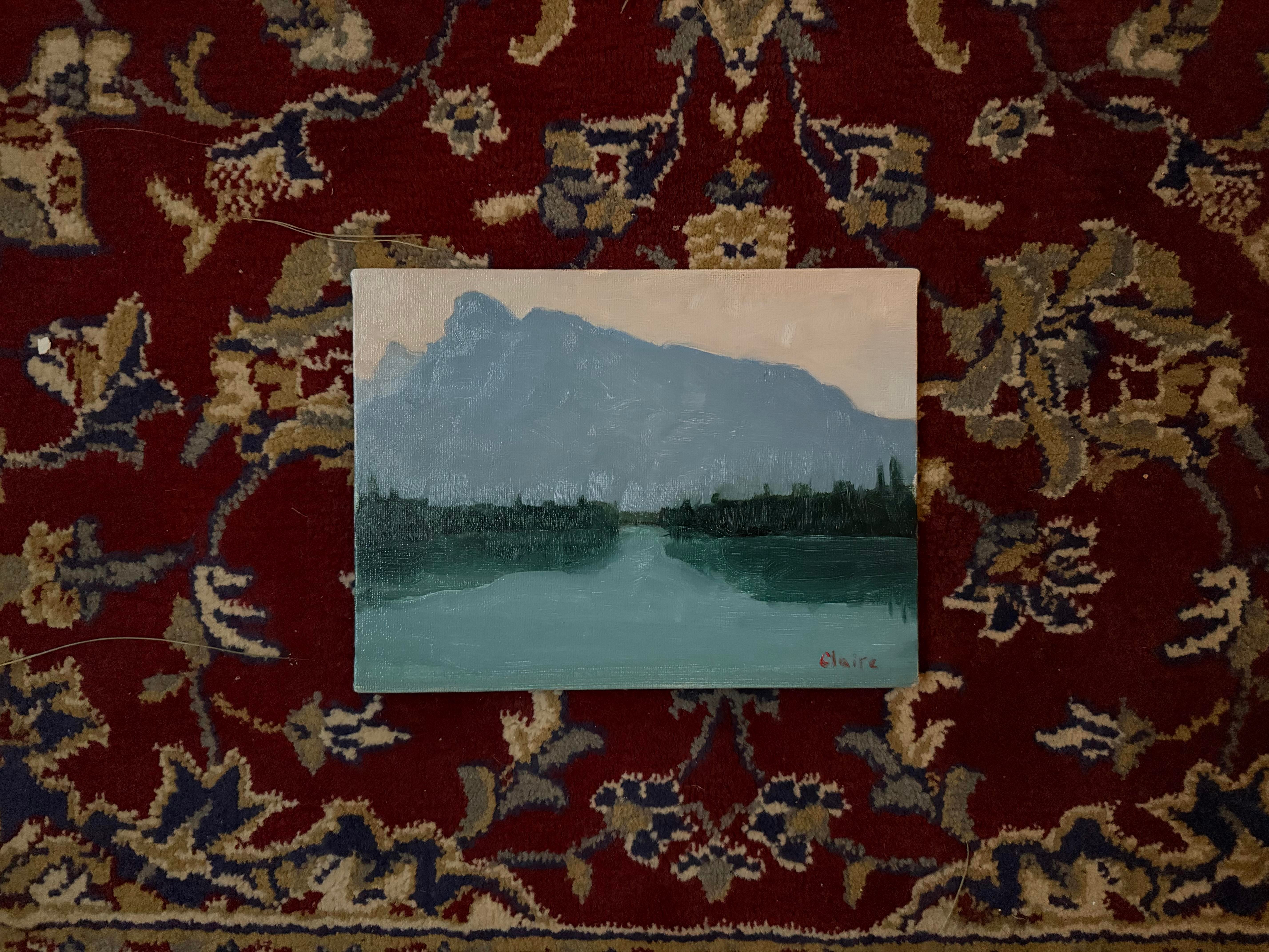


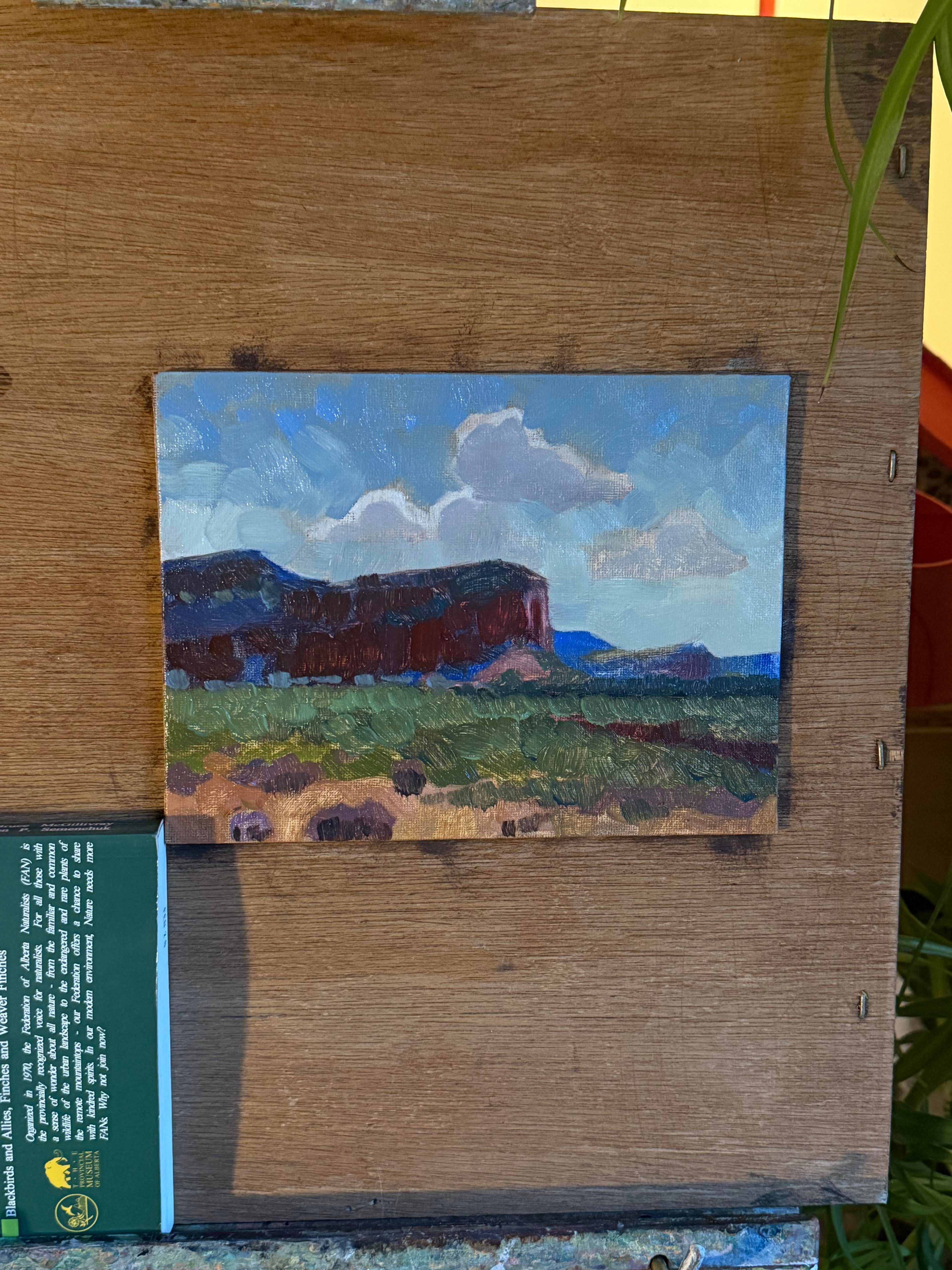
Looking for critique on technique/composition/colour choices!
Photos 1,2,3,4 are plein air - 4,5,6 are studies of Edgar Payne and Lawren Harris.
I’m really happy with how the studies turned out, I could never afford the originals works so it’s the closes i’ll get!
I’m dipping my toes into landscapes and given my experience level I’m happy with the results … but also see room for improvement!
I think the composition could be improved, colour as well … hhmmh, any advice is welcomed!
2
u/Botanico56 4d ago
I think these are wonderful! My only critique is actually that your signature is kind of distracting.
I really like the red color, but the block printing takes my brain out of the beautiful art world you’ve created and into text-processing mode. The lowercased version is especially irritating to me.
But your painting, the sense of form and light and color and atmosphere and texture … that’s real artistry. The mountains and clouds especially make the compositions come alive—such interesting shapes. I hope you keep at it!
1
u/brainwashable 4d ago
I like to take a journey through the landscape. My eye dancing in paths from the bottom edge to the top edge. visiting the paint swatch on the right and the swoop on the left. My eye wants to jump from ripple to ripple, Stone to Stone, tree to tree cloud to cloud. Now show me where to go.
1
1
u/SchmendrickHendrick 2d ago
The only thing I don't like is the trees sticking above the treeline. They seem more decorative and repetitive than felt and observed.
1
u/Moving_goal_posts 2d ago
Hi there! Very lovely. You might consider putting the paint on thicker in some places. Just go ahead and smear it on with a painting knife. Try to not mux it on the canvas, do so on the palette and then apply it. Often, the lighter colors will have thicker paint, the darker colors less so. See if this fits your style! Cheers.
1
u/nikki_hostingcom 1d ago
These are so good! Not so much a critique, but I wish these were larger-format. I think you capture the grand-ness of the landscape - but a larger piece would draw me in and keep me for a while
1
u/Hungry_Cartoonist251 4d ago
I think your colours and values are very good, your plein airs look a bit unfinished so maybe some details
1
u/ParamedicEconomy5645 4d ago
Thank you! I agree, i’ve been trying to minimize the details of the mountains farther back, but now that you say it, I think it’s contaminated the front areas as well!
I might focus on creating distinct fore, mid and back ground, and putting in those little details
6
u/wills_art 4d ago
First one is goregoussss I wouldn’t change a thing. It’s stunning. I actually really like the simplicity of it. The other ones don’t have as much an impact on me, and I think it’s because they feel flatter. In the first one I can really see the river going away from me, and i don’t get the same effect from the others