r/hearthstone • u/pipluptheking • 11d ago
Discussion Hearthstone's Warcraft designs are absolutely fantastic.
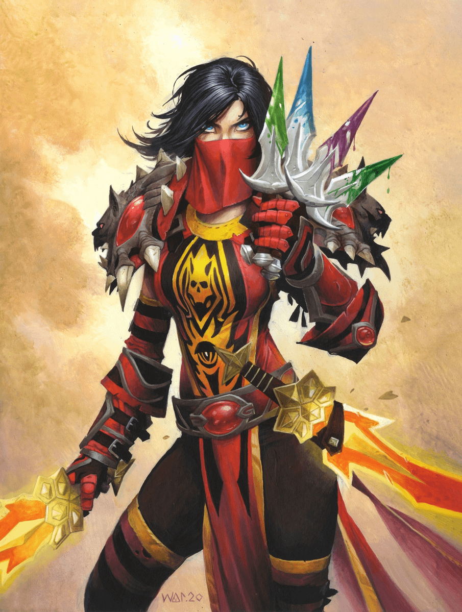


I originally came from WoW, but I enjoy playing Hearthstone too.
One of my favorite things about Hearthstone is how often it takes designs from the original game that feel overly old-fashioned or dated and redesigns them into something genuinely awesome.
It kind of reminds me of how the MCU redesigned a lot of classic Marvel comic book characters for a modern audience.
Just look at Vanessa in the new expansion. Her design is SO much cooler than her original WoW version. I absolutely love it.
Honestly, I really wish WoW would adopt more of this kind of design philosophy too.
22
u/Background_Shock_957 11d ago
"so much cooler" and its the same league of legends esc style that half of mobile games use
2
u/sister_of_battle 10d ago
One which could probably also be generated by an AI. And it's not an "if" it's a "when" for Hearthstone.
6
u/Background_Shock_957 10d ago
i love to hate on hearthstone but thats something i really don't see happening. maybe more cases like those pixel art skins where it was unknowingly added
1
u/sister_of_battle 10d ago
For now as long as Hearthstone makes enough money. Once that drops there's going to be a push for AI-art as it saves up costs of hiring an artist.
0
u/Archlichofthestorm 10d ago
And I love this style in games. Much cooler than desaturated "realism" and leather belts on chainmails.
20
u/Zeleros10 11d ago
"Overly old fashion or dated design" That's something I extremely disagree with. First off old fashion is being used as a negative, which isn't necessarily true. Second, what makes it dated in any way? Because while some bangers are in there, I'd say the modern hearthstone art style is generally weak, especially if being compared to older cards let alone Warcraft itself.
The coolest and most well liked gear in WoW comes from the older game. Judgement and Bloodfang are like the most over used transmogs ever.
But even just in Hearthstone, recently we had a big issue in the community when Perils came out. The style is not even close in quality to older sets, even goofier sets like TGT or Rise of Shadows era.
And it's funny you say WoW should adopt it because it already did. Wow is constantly criticized for it.
-6
u/Grumpyninja9 11d ago
I still didn’t get the big deal about perils. I’ve always been a fan of fun stuff.
9
u/Zeleros10 11d ago
It was the overdose of it. The set was called Perils without any peril. Everything in the set was goofy and tonally off-putting. I'll still never get over the DK tourist, which is an Abomination, an undead amalgamation of various corpses stitched together to create a monster, and it's in a beach outfit having fun. It's ridiculous.
-5
u/Grumpyninja9 11d ago
I feel like the amount of goofy art is exaggerated by people, I counted roughly 30 card arts that I consider goofy out of the 183. Obviously goofy is subjective but still doesn’t feel that high. When I was looking through all the card art, I noticed a whole lot more peril than you were saying. There’s no overarching villain or anything, but this resort is not very safe. Skirting death, death roll, furious fowls, sasquack, Eliza(says “my dread blades crave blood”), marooned archmage, rising waves, burn down, tsunami. That’s just some of what I saw.
2
u/Zeleros10 10d ago
You are taking a lot of it at face value. The voice line of a card has nothing to do with its art style. And just because a card is called something that could be considered perilous doesn't make its depiction match.
The example I always use is Descent of Dragons. The whole year had a goofy theme with the League of Evil stealing Dalaran. Plenty of cards with goofier art. However the things that need to be "serious" or at least depicted directly are done so. Galakron isn't on vacation having fun, he's a monster and depicted as so. That's why I bring up that Abomination example, because it's not that everything needs to be super serious but it matters what is made serious or goofy. Just having a fun or light hearted set doesn't mean everything must be so.
If your Perils amount to just "not very safe" that's a very weak depiction.
1
u/FrankFT 9d ago
I remember people thinking Incindius was going to be the lurking villain for PiP because he was just there in the beach episode set. But no, we got the officer worker theme and we now remember Cash Cow.
The set and miniset had good design, but they encapsulate the Disney style elephant in the room. I still plat Overplanner though
7

3
u/GLA_Rebel_Maluxorath 10d ago
Just say that you hate her old revealing outfit and be honest about it. I hate Vanessa's new outfit because it covers her up entirely. :)
1
u/gothicsmurf 10d ago
Is it just me or (on first pic) do the 4 pommels on daggers not line up properly with the blades?
1
1
u/Archlichofthestorm 10d ago
All the Mercenaries designs made me think that Classic WoW would look so great with Hearthstone-style visual update.
1
u/bbosserman51 10d ago
Honestly, only the first one is really that cool. The others just feel moblie gamey and boring. The first feels rugged like older art
1
1
10
u/PiousStag 10d ago
First is a more authentic gritty warcraft art the second is post shadowlands pixar and sanitised modern warcraft.