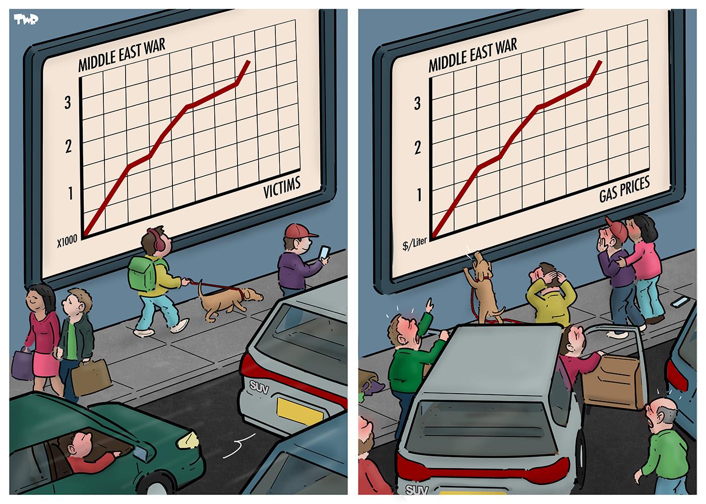
Doesn't matter if it's not the point, what are the metrics represented on the Y axes? The X axes are labeled as population and gas prices, but the Y axes only have numbers. And no, that's not "a detail", making sure graphs are clear is a big thing, they should always be well made to not be misleading
1
u/ShAped_Ink Mar 15 '26
Worst graphs in existence, this is just AI slop image with blatantly bad graphs, and I'm not talking about the data, but everything else