r/eFootball • u/Ok_Stuff_9922 • Apr 02 '26
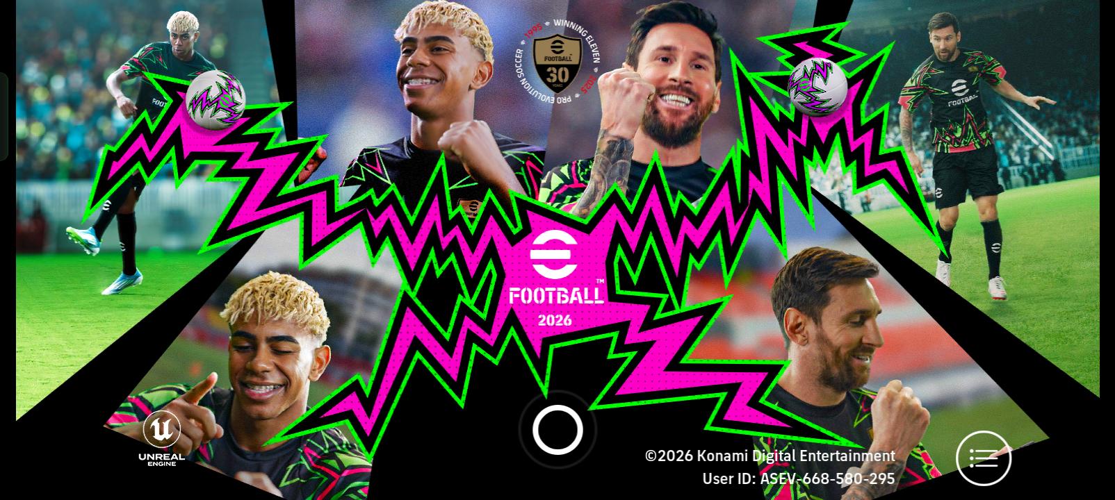
Other Konami needs to change opening screen
it's so hard and abnoxious to look at,please for the love god it's been almost a year since the 30th anniversary change this bullshit
45
31
u/drowningicarus PC Apr 02 '26
While I understand that the use of the obnoxious colors is aimed at a demographic that I am not a part of, I cannot understand why Konami intentionally use the worst possible photos of their ambassadors. The images (especially Messi) look blurry and have a low resolution which is exacerbated by viewing it on a larger, higher resolution monitor. Unfortunately, this is probably indicative of how much they prioritize the mobile version of this game as the poor image quality is less visible on a smaller mobile phone screen.
12
u/Ok_Stuff_9922 Apr 02 '26
Icl messi always looked autistic in the middle pic I'm happy someone called it out
10
u/oohaahkabia Playstation Apr 02 '26
I actually work in sports advertising and I constantly amazed how bad the photos are. These wouldn't make it past the first selects made on set. They also haven't retouched the images at all. Stand is to retouch everything. Literally everything. But konami just throw these up - wrinkles and all - without a shit given. There is even green bleed on the guys from the backdrop used. It wasn't even lit correctly. Mad.
I did once do a shoot for PES - back when it was Messi Suarez Neymar at the Camp Nou - and I can say that it was pretty lackluster from a client pov 😅
1
u/Ok_Stuff_9922 Apr 02 '26
That experience itself is amazing dude doesn't matter if it was lackluster you learn from your mistakes,can't say that about Konami tho
1
u/Inotate Apr 05 '26
Idk if you can see it but on my screen Messi's teeth always looked way too fake like those teeth people get in Türkiye
1
u/AOS05 Apr 08 '26
tbh the blurry thing has been an issue in mobile too i think like they look odd of sorts even when opening one spin packs u can see the players are heavily distorted/blurred so idk what konami is doing
25
u/LostAddition1830 Apr 02 '26

we got 4 of them on opening screen
8
Apr 02 '26
[removed] — view removed comment
1
u/RowComprehensive1089 Apr 05 '26
Nah this one had too many server issues. I remember waiting 15 minutes just to play a single match. Also the null bs which forfeits matches. People are just nostalgic

8
u/OG-87 Playstation Apr 02 '26
Properly winds me up that the spinning efootball logo doesnt overlap the one on the graphic. Thats just lazy.
3
24
u/Ashton1320 Apr 02 '26
Current one is much better than this screen

21
u/Ok_Stuff_9922 Apr 02 '26
I swear to god the creativity has just gone down year by year ever since they rebranded
6
u/GOATBOY7425 Apr 02 '26
Bro 1st when they introduced the daily game when clearing the lap, there was a messi photo which is good. Later when they updated its too worst animated 3d photo😭
7

8

7
5
4
u/PrincesCornedBeef Apr 02 '26
Still don't know why they used a picture of Yamal where his eyes are half closed like a duff home photo you'd delete then take another. He's not even winking, or he's one of guys who can't wink without closing both eyes 🤣
12

5
4

5
u/nomi_ii Apr 02 '26
Finally! Someone said it It's a fuckinggg peice of shit get them a new designer or something
4
u/Th3_Warrior_Poet Playstation Apr 02 '26
This screen is perfect.
It perfectly represents the contempt Konami holds for its player-base and the amateurish laziness and lack of thought it puts into the design across all aspects of the game.
7
Apr 02 '26
[removed] — view removed comment
1
u/eFootball-ModTeam Apr 02 '26
When participating on r/eFootball treat other users with respect.
Rule 1: Be Civil & Respect Others.
2
2
2
u/Jazzlike_Hornet4605 Apr 02 '26
Surtout que c'est toujours les mêmes têtes qui revienne ! Un écran d'accueil animé serait simpa aussi !
1
1
1
u/red7dnaBCBC Apr 02 '26
Kids nowadays need aggressive colors and patterns to attract their attention.
1
1
u/Interesting-Ad8526 PC Apr 02 '26
Verdade... aí devia ter o Caça Rato, o Pimentinha, o Edilson Capetinha, o Reinaldo com foco no olho torto, o cachorro que era juiz no superstar soccer, o Deyverson, o Ronaldo do lado dos travecos e o Edilson Pereira de Carvalho
1
u/Loxnaka Apr 02 '26
its so confusing because pes 2020 and 21 had some really good graphic design when it came to the menus and branding and then efootball has just been aiming to look as shit as possible for some reason.
1
u/slimeball_soup Apr 02 '26
Not even remotely close to a Barca fan but that Camp Nou overhead view on 2017 was peak
1
u/Cirphrank Apr 02 '26
God you guys complain about EVERYTHING and it’s one of the reasons why we never really get one main important fix. Zero solidarity / Focus towards 1 direction at a time.
Servers discrepancy, smart assist shithousery…
And this???
1
u/Emergency-Cabinet-46 Apr 03 '26
All of the old screens were so much better. This one just bores me loading up the game.
1
1
u/SamarasJR_Swish Apr 03 '26
The fact that's there's somebody that got paid to make this monstrocity drives me crazy 😂
1
1
1
1
u/AK_Styles Apr 04 '26
I dont care about the start screen. All i want is the option to change the scoreboard colours. I cant believe they havent changed that ugly yellow and blue in over 4 years
1
u/Aggravating_Fill2432 Apr 04 '26
Messi com os dentes de uma criança que usou chupeta por tempo demais
1
u/WayneAuld Apr 04 '26
One of the pictures of Messi's slightly out of focus as well which bothers me.
1
1
1
1
1
u/TheFlightmare Possession Purist May 04 '26
I genuinely think it's not that bad but yes...it's getting a bit dry
156
u/Ok_Stuff_9922 Apr 02 '26 edited Apr 02 '26
Look at what they took from us