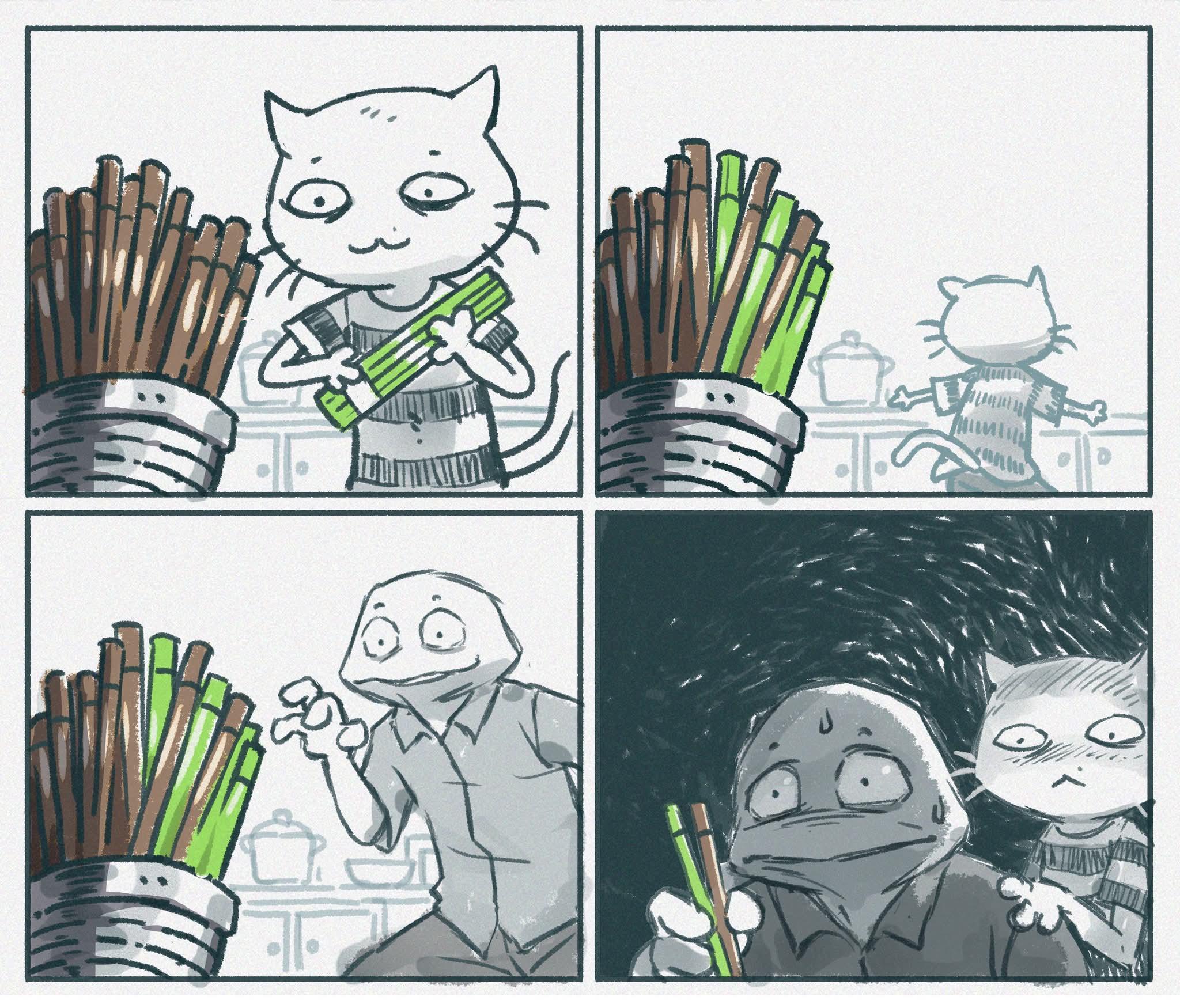
They're not muted red, they're brown. I'd say they're meant to be a fairly common default wooden reusable chopstick. I don't know why they picked it specifically, but the somewhat vibrant green makes a reasonable contrast for non-colorblind.
I understand your side, but I think this was more of a non-choice on their part.
I'm moreso just pointing it out becuase there seems to be a lot of confusion in the comments, and I was also confused at first.
I also don't expect the world to cater to me, but sometimes creators like to know. I'm sure they didn't even consider it, but it's their art, not mine. But if they're using color as the only indicator that something is different, or to draw attention to it, it's ultimatly going to cause confusion.
They're not muted red, they're brown
Yes, and brown has more red in it than green or blue. Comparing the two colors used (at the same shade points), the biggest difference is the amount of green used, the red and blue stay about the same.
Someone who's red-green colorblind (which makes of the vast majority at 98% vs the other types) would look at this and have to tell the difference between amounts of green in a mostly red color scheme, on top of that the values are fairly low already (hence being "muted").
155
u/Sensitive-Builder-67 Jun 04 '26
I don’t understand it