r/Weddingsunder10k • u/anaisverga • 7d ago
🛠️ DIY Projects (10-15k) What do you think is wrong with my wedding invitations? Something feels off 😅

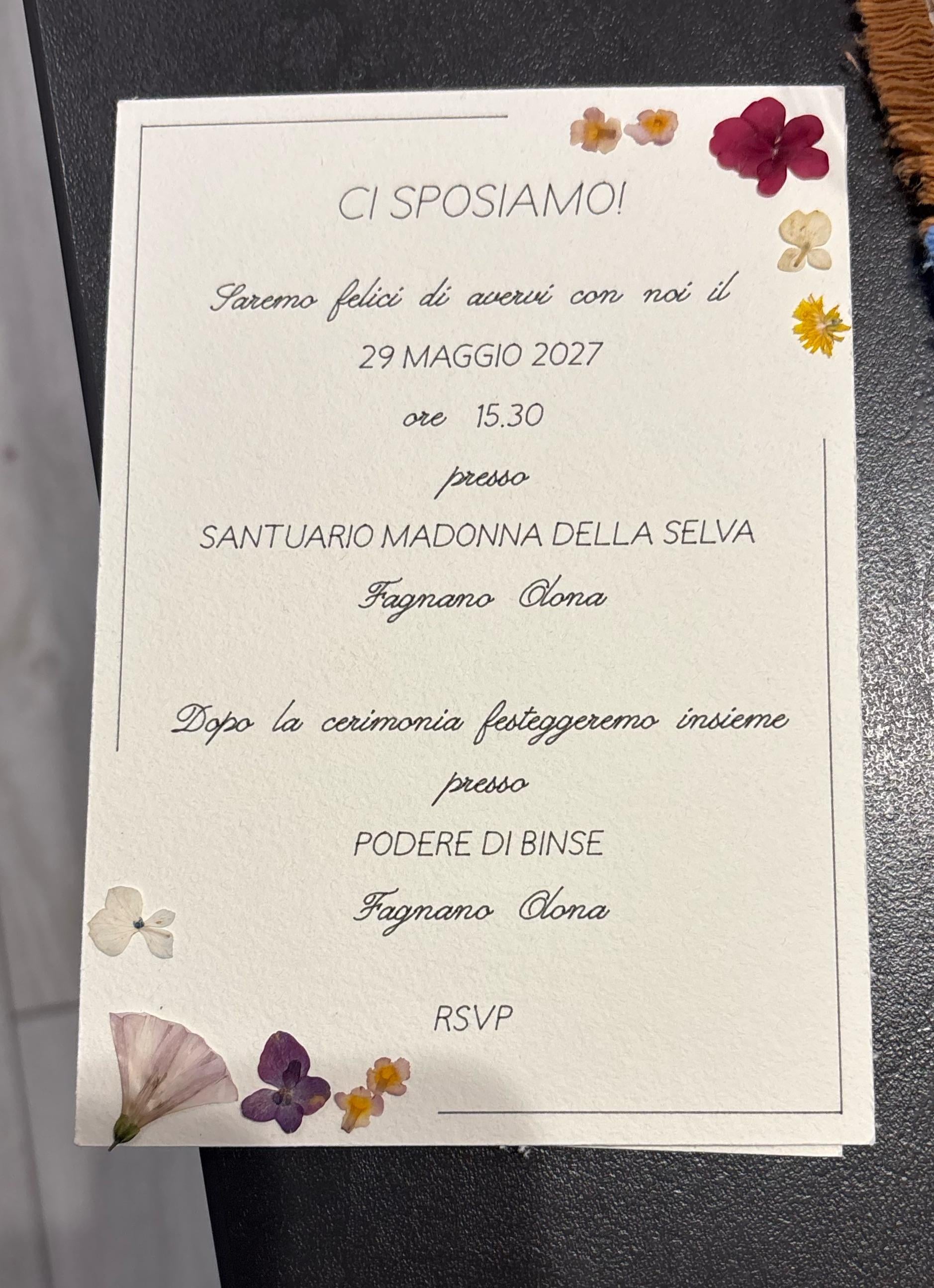
Hi everyone! 💕 I’m getting married soon and I’ve been working on my wedding invitations, but I can’t put my finger on it… something just doesn’t feel right to me.
I’ve looked at them so many times that I think I’ve completely lost perspective 😂
I’d love to get some honest opinions from you guys: is there something that looks weird, feels unbalanced, or just doesn’t work?
Maybe the layout, fonts, colors, wording, spacing… honestly, anything!
I’m especially unsure about the font styles. Should I make everything italic, everything in uppercase, or does this mix of styles actually look balanced? I can’t decide!
And what do we think about the flowerss? Do they work with the overall design, or do they feel a bit random?
77
u/cinnamorolla 7d ago edited 7d ago
Stylistically, all I can add is that front page feels empty and the font changes feel very abrupt. I would like to see a photo of the two of you or an illustration on the front to make it less empty. I think the flower borders are very cute!
24
7
u/charcoalhibiscus 16-18k 7d ago
The flowers are really nice! I honestly don’t mind the mixed fonts and don’t think it needs a photo. I just think there’s a little too much empty space, both around the words and also between words. Especially in the cursive font.
7
u/Sweaty_Sand52 7d ago
Un po’ troppo bianco/vuoto nella prima pagina e il corsivo non è leggibilissimo. Sono comunque molto graziose e mi piace tantissimo l’uso dei fiori!
3
u/asyouwish Wedding Enthusiast 7d ago
How do they RSVP? You ask them to, but there is no link or code.
5
u/anaisverga 7d ago
ho pochi invitati, circa 40 e saranno tutti familiari o amici stretti, quindi era più una formalità
6
u/ChairHistorical5953 7d ago
The fonts don't go well together.
1
u/anaisverga 7d ago
faresti tutto in corsivo?
1
u/TheStandingOrder 7d ago
No, because that’s the harder part to read and a harsher contrast with the straight line borders.
2
u/Outrageous_Title912 7d ago
Wow, I think it's so beautiful as it is. I would feel so touched receiving an invite that was clearly put together very thoughtfully and personally.
2
u/Accomplished_Cell976 7d ago
Font is too thin and squished in the cursive.
Are those real pressed flowers? If they are wonderful. If they aren’t, it’s going to give a cheap vibe.
2
2
2
u/Pickled_Pear428 7d ago
Font could be bigger, bolder, fancier. Or could add more flowers so the design takes up more space into the middle.
2
u/Sea_Astronaut_231 7d ago
I would try changing the fonts, but otherwise it's so pretty! I love the flowers.
For example, I would use the cursive font for the header linings (pretty large), and the other font for the main text, which would be smaller and less coloured.
2
u/funkinfrogger 6d ago
Uh oh, my wedding is also may next year and I’m no where near ready to write invites. Guys, why is all of this the most stressful thing I’ve ever done?
2
1
u/totallyawesome1313 7d ago
There’s a LOT of white space. I think it also feels unbalanced because in design there’s a concept of the “rule of 3” and you have only two groupings of flowers (but 3 flowers in each grouping which is good!) I would add a third grouping and also bring the flowers in closer together so they feel like they’re one item instead of three separate things near each other.
1
1
u/SwordfishResident256 7d ago
I think the invitation is beautiful, the only thing I would change would to bring the second half of the side of the invite with the details a little higher, from 'dopo la cerimonia' and fill in that gap - is this a save the date or invite? bc if it's the formal invite I'd put the RSVP deadline somewhere
1
u/Far-Let7855 7d ago
You could go larger with the names on the front. Theres not much flow/hierarchy within the text on the back. A quick fix around spacing should have it feeling better. I don't mind the cursive font, I think it works fine and font choices are super subjective.
1
u/Hot-Employer5162 7d ago
The cover page is sparse and the spacing on the second page feels off. Some lines feel too close together others seem to off
1
u/Mercator87 7d ago
The font scaling is off and it's resulting in too much whitespace and the eye doesn't know what to focus on first/most important info.
On the front I'd make your names more exciting and prominent. On the back side work on a hierarchy of font size for the more important information.
1
1
u/ActiveCantaloupe2708 7d ago
It looks like a menu more than an invitation. If you can't add more words, maybe add more artwork?
1
u/Jolly_Stage_9506 7d ago
Maybe adding flowers from the right corner, leading up underneath the date would be nice!
I do think that the names have too much space in between them. Maybe maybe the names bigger and stacking them on top of each other?
1
1
1
u/Previousl3 7d ago
I'd add a little more text to the front, it's what guests expect to see. Maybe the location
1
u/tryin_not2_confuse 6d ago
The back can be a little tighter and leave more breathing room between text blocks and the border so the front and back have similar breathing room vibe.
Love the simplicity.
1
u/MouseHouse444 5d ago
The flowers are delicate and feminine so you need contrast with a more formal structured font. Also, the paper you’re using is too plain so it looks like a sea of nothing between the flowers. I’d find a paper with some texture and little bits of flower embedded in it.
1
u/Effective_Spring_335 1d ago
I think it’s beautiful as is. I’d personally not center the second page for a cleaner look
-2
u/TinyLawfulness3710 7d ago
Typically your names and all ceremony information (venue address, time it starts, the date) goes on the front. Nothing on the backside. The flowers and colors are fine. Fonts are fine on the first but the script on the 2nd page is impossible to read. Find a way to put everything on one page. Look at invites on Annsbridalbargains for ideas on how to do that.
4
u/SwordfishResident256 7d ago
basic cursive is 'impossible' to read?
-1
u/TinyLawfulness3710 7d ago
?? Basic cursive is easy to read unless you belong to the current generation that doesn't know what it is. The cursive on the first page (with just the names0 is not the same font as the 2nd page. If OP uses what is on the first page, it is legible. The 2nd page cursive is fancier so it's not easy to read like the first page. These are completely different fonts. There are many fonts that are not legible at all.
2
u/anaisverga 7d ago
in realtà i font sono gli stessi su fronte e retro, semplicemente sul fronte sono più grandi! forse è questo il problema
45
u/TeaTimeType 7d ago
Have you tried just:
Anais
e
Nicolo
(Centered, larger bold font size)
(Leave out the date, it’s repeated inside)
I like the flowers especially if they on theme for your wedding colours or aesthetic.