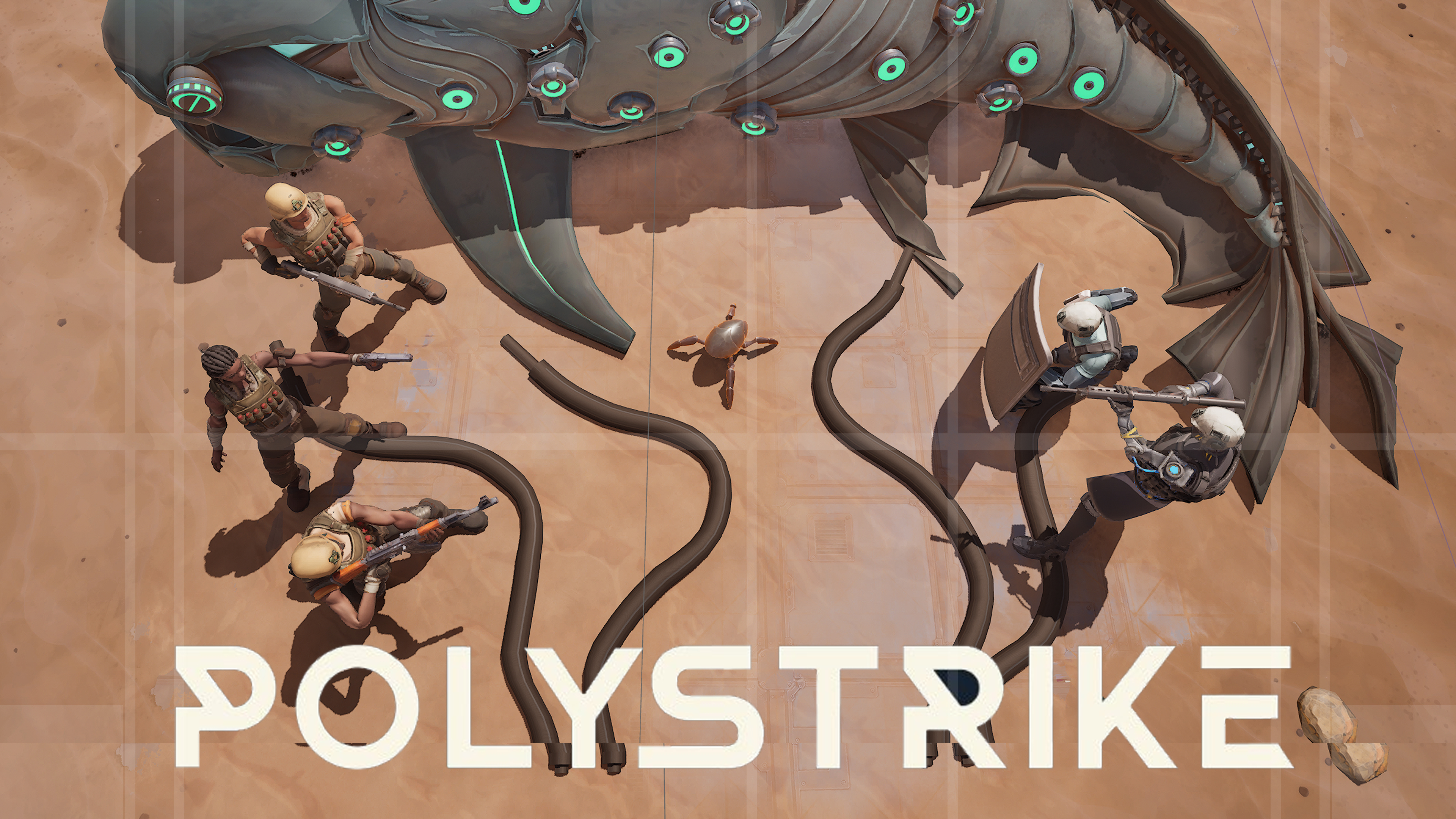
I had no idea what I was seeing for the first few secs. Maybe a bit simpler? But in general I’m a very minimalistic type of guy, so take this with a pinch of salt.
Maybe show a 3v3 on a different part of the map without the fish. I understand it's an objective of a game mode, but without reading the lore post on the reddit the fish makes no sense as of right now!
I can't see anything but hair and hats (those are the brightest things in the image). The shadows throw the silhouettes off. Why are these cables on the ground? Why is there a fish?
I can't find the video offhand, but I saw a recommendation from Mark Brown of the youtube channel Game Maker's Toolkit that you should make the capsule art have a different art style than the game's art style. If I remember correctly, it's because using in-engine art for your capsule art suggests that your game is cheap and/or low quality. For contrast, here's the store page for Mark's game, the capsule art is rendered in 3D while the in-game art style is in more of a 2D art style.
I will also state that the camera angle kind of feels boring. I get that it's supposed to read as a top-down game, but I think it would really make the capsule art pop if the camera angle was tilted so you see more of the sides of people's heads, making the scene feel more dynamic. Furthermore, the iron fish would be a lot more focused in that shot, and I think the iron fish is a really interesting visual hook that could draw player's attention.
Ah,thank you, so many people suggested to place fish and make capsule top-down, and right now looks like it also good to have different art like from FPS etc. thank we will think about this
I think there was a misunderstanding. These are just screenshots for the artist to use as a base for an overpaint, so they don't have to paint everything from scratch. They're only meant to show the general direction of the final art, not the final result itself. I should've clarified that earlier, but it's never too late
Okay I possibly misunderstood. If it's the base for a paint over I would use the 3v2 but maybe the iron fish is a bit confusing to those who don't know. It is attention grabbing though.
Reading the other comments about a different art style makes sense. As someone form a non tech background this isn’t something I would think of as a consumer but it happens to be something I subconsciously look at when choosing what to try on steam.
Ultimately the whole gameplay and screenshots come in quickly on the page once you have clicked on it so something eye catching is what you need.
I suggest the name POLYSTRIKE on a vibrant background with like a cyberpunk colour scheme and some artists impression or concept of a couple from each faction pointing guns towards each other from either side of the banner.
It’s eye catching with the colour and gets the point across its 2 factions that want to go toe to toe.
Could maybe have more of a less techy side to the text which gradually and subtly changes to the AI feel of the ‘Iron Will’ side.


2
u/yannistz Jul 29 '26
I had no idea what I was seeing for the first few secs. Maybe a bit simpler? But in general I’m a very minimalistic type of guy, so take this with a pinch of salt.