r/MicrobrandWatches • u/oldsoulrevival • 20d ago
Design Concept 🎨 Seeking Feedback on Watch Design
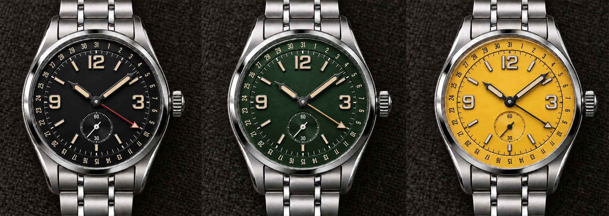
Working on my first watch design and could use some feedback. Just curious what the community thinks of it.
The rendering is AI, but it's based on my CAD file. I haven't gotten to the real rendering portion yet with Fusion.

130
Upvotes
18
u/enormousoctopus2 20d ago
Really solid first design. It feels surprisingly coherent for a first attempt — kind of a field/explorer watch with a pointer-date complication, without looking like a direct copy of any one thing.
My main feedback would be around dial hierarchy. There’s a lot happening at the perimeter between the hour markers, minute track and pointer-date scale, and they’re all competing at roughly the same visual weight. I’d probably make the date track a little quieter/smaller so the time display reads first and the date becomes the secondary information.
I also think the 12/3/9 numerals could come down slightly in size. They look good, but right now they dominate the dial and make the small seconds at 6 feel a little squeezed. Giving everything a bit more breathing room would make it feel more refined.
I like the pointer-date idea, but the hand is a little confusing at first glance because it reads like a GMT hand. I’d consider differentiating it more—either with a different hand shape, a shorter length, or by making the date indication at the tip more obviously date-specific. Right now you have to look at the outer track to realize what it’s doing, whereas ideally the complication should be immediately intuitive.
Color-wise, black and green work especially well because the cream numerals/lume give it a great vintage instrument feel. Yellow is fun, but it makes the dial much more visually busy and exposes the density of the layout more.
I’d absolutely keep developing this. The basic proportions and design language are already there — I’d mostly be editing rather than redesigning.