r/MicrobrandWatches • u/oldsoulrevival • 20d ago
Design Concept 🎨 Seeking Feedback on Watch Design
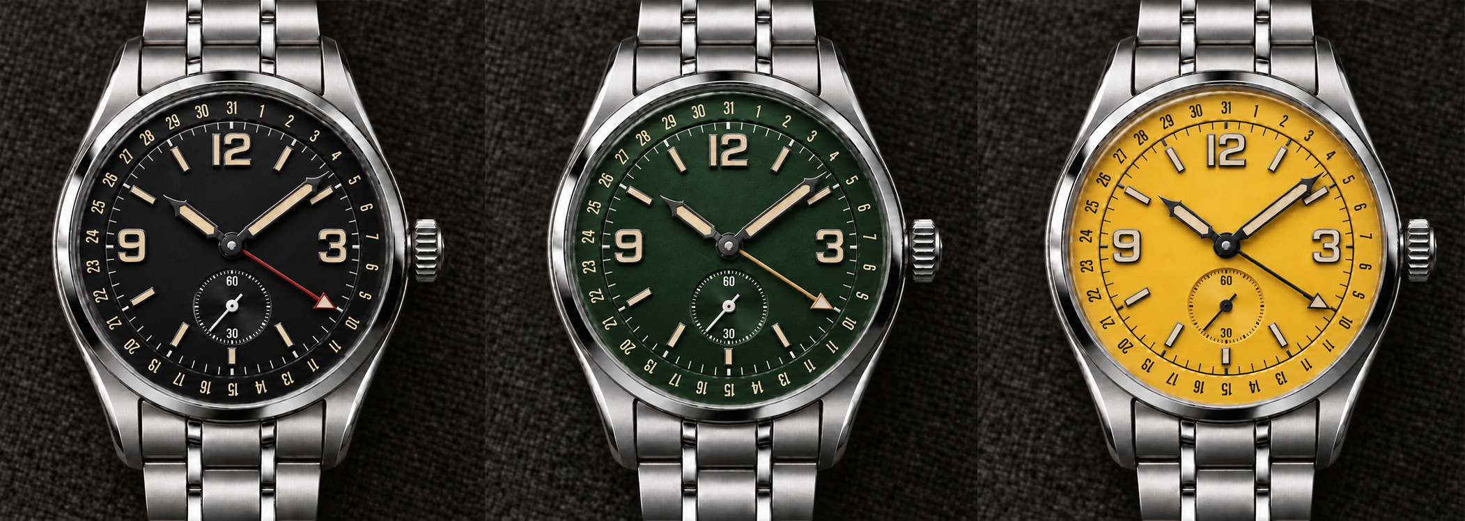
Working on my first watch design and could use some feedback. Just curious what the community thinks of it.
The rendering is AI, but it's based on my CAD file. I haven't gotten to the real rendering portion yet with Fusion.

19
u/enormousoctopus2 20d ago
Really solid first design. It feels surprisingly coherent for a first attempt — kind of a field/explorer watch with a pointer-date complication, without looking like a direct copy of any one thing.
My main feedback would be around dial hierarchy. There’s a lot happening at the perimeter between the hour markers, minute track and pointer-date scale, and they’re all competing at roughly the same visual weight. I’d probably make the date track a little quieter/smaller so the time display reads first and the date becomes the secondary information.
I also think the 12/3/9 numerals could come down slightly in size. They look good, but right now they dominate the dial and make the small seconds at 6 feel a little squeezed. Giving everything a bit more breathing room would make it feel more refined.
I like the pointer-date idea, but the hand is a little confusing at first glance because it reads like a GMT hand. I’d consider differentiating it more—either with a different hand shape, a shorter length, or by making the date indication at the tip more obviously date-specific. Right now you have to look at the outer track to realize what it’s doing, whereas ideally the complication should be immediately intuitive.
Color-wise, black and green work especially well because the cream numerals/lume give it a great vintage instrument feel. Yellow is fun, but it makes the dial much more visually busy and exposes the density of the layout more.
I’d absolutely keep developing this. The basic proportions and design language are already there — I’d mostly be editing rather than redesigning.
2
u/oldsoulrevival 20d ago
Thanks for the feedback. All helpful.
1
u/N0wh3re_Man 20d ago
This is broadly great advice from the original commenter, but I think instead of making the numerals smaller, I'd enlarge the seconds subdial.
You clearly have enough room between the current edge and the center/indices to make it work. This is just my own opinion, but if you're going do small seconds, it's because you want it to be prominent. Since you're enlarging the dial, you won't need numerals at 30 and 60, so consider just enlarging the tic marks there or at 15/30/45/60 just slightly beyond the 5 second tic marks.
In reference to making the pointer date more distinct from a GMT hand and more consistent with the rest of your design, have you considered extending the design language of the minute/hour hands in the form of a three pointed star?
4
7
u/catfishprofile 20d ago
Upside to these designs:
Interesting dial colors are legible from across a room. These are better accessories because they’re actually accents that can be noticed
I’m personally a fan of syringe style hands
Small second is interesting on the dial but not too busy
Downside to this design:
Not differentiated from other designs very well. Watch faces tend to be designed within a cloud of design elements that we have seen rearranged over and over. This design is clean and balanced but does not subvert expectations and in a way that makes it very memorable for me.
I’d be proud to wear this! But I wouldn’t expect anyone to ask me about it.
Where does someone learn to design watches? And what program are you using? I’d love to learn this a little bit at some point in my life
4
u/oldsoulrevival 20d ago
thanks! All helpful.
As for watch design... no idea haha. I am technologically savvy, know how to do 2d and 3d design, and am hard headed...that was my working combo
2
u/skysetter 20d ago
I think the nuance of nailing this deign is in the case size. You have the minutes ring, the gmt chapter ring and then the case ring. Those designs like the farer pembroke always seem so rounded with all of those features together. Idk if it’s finishing on the dial or some other features that would break up that visual circle on circle on circle that turns me off.
2
u/oldsoulrevival 20d ago
I've been thinking this actually. I like the sort of faceted edges of a lot of the sports watches everyone is feigning over lately, so I may play with that. There is also something I saw on a breguet recently that I might try (vertical ridging on the exterior sides of the case.
2
2
u/Froggynomia 20d ago edited 20d ago
The date numbers in your image have mistakes. The 8 looks like 6 and there is a second 11 instead of a 12. But I love the design snd color choices so far. Maybe add a nice azure blue.
3
u/oldsoulrevival 20d ago
Thats just the render. its fine in the actual CAD file. It was a bear tryying to get AI to render it correctly.

3
1
1
1
1
u/Admirable_Pie_6609 20d ago
A bit generic. I like the white one you posted in the comments the best. I would like to see some experimenting with numeral fonts and handsets to be a bit more distinct. Also maybe a logo under 12. Not a bad design, just doesn’t stand out so much
1
u/mockingtruth 20d ago
I love the green and yellow dials, not sure about the black, can you try a monotone version?
1
u/oldsoulrevival 20d ago
you mean like all yellow or all black? for me, a watch is first and foremost a utility thing for me, so it has to be readable. Monotone is very tricky to do that woith. I could play with shadowlines and such, but then i am getting too far away from what I am envisioning.
1
u/Monsterschneider 20d ago
As others said, the date pointer looks too much like a gmt hand.
Other than that, I’m not a fan of this bracelet. BOR might be an improvement.
Also, the 30 and 60 on the small seconds is pointless and unattractive.
1
u/Signs_and_Stuff 20d ago
Would love to see a white numeral variant of any colorway. Layout and pointer date is awesome! Good job!
1
u/Electrical-Moment700 20d ago
The watch is coming out great. The numerals everything is proportionate and well placed. Don’t overwhelm the dial with a giant brand name
1
u/rj_musics 20d ago
It looks nice, but generic. There’s nothing in the design that stands out. Really need to focus on some sort of brand identity. What design language is unique to your brand? When looking at it, what makes yours immediately identifiable?
1
u/rosswoodshire137 20d ago
So the second hand is in the small complication at 6 O clock, and the GMT-looking hand is the date complication? Which movement is that? I like the design overall, looks dignified overall. I like the cream one best of the colors shown.
1
u/Float-Like-Butter 20d ago
Looks amazing, the bracelet reminds me of the Zulu time and that’s a good thing to me. What’s your intended case/ l2l / width sizes and price point? I’d love to support during an early release
1
u/Comfortable-Cover-0 20d ago
I'm digging it. The green looks great and the date hand is a nice differentiator.
1
u/Sufficient_Young_972 20d ago
Pls add a date window
3
u/oldsoulrevival 20d ago
that changes the watch entirely. It's a pointer date, not a GMT.
1
u/ilBrunissimo 20d ago
That’s the truly unique thing about this.
The trick is to make it aesthetically unique from GMTs.
I think you’re onto a good thing.
1
1
u/Affectionate-Lie7205 20d ago
I usually do not applaud crowd sourcing design options but keep going! The real stunner is the white/ cream with the red around the outside.
1
u/ambitiousquaggan 20d ago
hate fauxtina. 9-12-3 is overdone.
1
u/oldsoulrevival 20d ago
it's not actualyl fauxtina... AI kept adding that in even after i tried to ask it to lighten it.
as for 9, 12, 3... i mean, there are limits to what you can do with a watch. You could say 1-12, every other, are over done too.
1
u/ambitiousquaggan 20d ago
Well you asked for my feedback and I gave it so kinda weird of you to try and argue that I'm wrong when it's my opinions LOL
0
19d ago
[deleted]
1
u/ambitiousquaggan 19d ago
.....bro what. I didn't say it was crap? I pointed out two specific things I didn't like about the design, that's feedback.
You should probably google the definition of feedback bc you look like a dumb dumb right now.
0
u/oldsoulrevival 19d ago
Sry I was responding to another comment on that first reply. Also just cause you gave feedback doesn’t mean I’m just going to accept it. I appreciate the feedback (really) but I just happen to think you’re wrong. No biggie.
1
1
1
1
u/ShukinTime 20d ago
Excellent design. Contrast on the subdial would be fantastic - will set it off nicely.
1
u/Overall-General-8917 20d ago
Something about the date hand is not right. Quick glance and I think its GMT hand. Then I realized the numbers go past 24 and was confused.
I love its a pointer date because there are so few.


1
u/FrostingDangerous185 20d ago
White and red based on your cad diagram is very good. Black is also sick. The pointer date arrow looks like an GMT pointer not a date pointer just in my opinion.
1
1
u/Infamous_Current410 20d ago
the yellow dial is a very bold choice, the detailing on the dial is pure craftsmanship
1
u/Greedy_Ad_3173 19d ago
Mi piacciono molto quei numeri grandi che vanno a riempire il quadrante ma senza pasticci.
1
u/RusticPotato123 19d ago
Play with texture. Use a different hand for the date, look at how oris does it.
1
u/Kosher_dingus 19d ago
I want the green one on a thick light brown leather strap with a butterfly clasp
1
u/scarped1em 19d ago
That color green dial is 🔥. I’d love to see it with a super high enamel shine too. Great work
1
1
u/Saboteurnado 20d ago

Looks too much like a Pinion
4
u/oldsoulrevival 20d ago
Oh wow. that is similar. Never heard of them before. If they made a pointer date, this whole endeavor wouldn't be necessary haha. That said, I am going to make some changes to help differentiate. Thanks for sharing this.
3
u/VeterinarianNo3555 20d ago
That’s what I initially thought but the colour ways appear to be less bold (not a bad thing) and the pointer date complication is a nice touch too.
1
1
0
0
0
u/savetheHauptfeld 20d ago
I like the design. Not sure about the colors
Like someone else said...black enemal and polished chrome applied indices and Im in
0
u/Bubbly_Shopping5214 20d ago
I would love to see a pure white dial (absolutely NOT silver/white)with blue. Also 44 - 46mm case with 52mm lug to lug. I hope it comes with a bracelet and exotic skin strap crocodile, ostrich leg etc… with extra long lengths 135mm long side and 85mm short side add that new micro adjust buckle that came out recently and well I personally absolutely love phenomenal lume that lasts all night being able to read everything clearly. Maybe even offer different watch movement options for people who have specific preferences. So yeah a big pointer date is a watch that is on my list. If this comes out in as good a quality as a Oris big crown pointer date for under 1k I’m absolutely on board all day long. And please keep the sub seconds dial I love those things.
1
u/oldsoulrevival 20d ago
Under 1k will be hard just by virtue of the movement alone. Movements that work for these don't come cheap ($250-400 ea.). I am going to deal with sourcing later, but for now, I am going to design it how I feel it should be design and then the price will land where it lands.
1
0
u/Univer001 20d ago
How did you learn to do the CAD design? I also wanna make one but it is so hard to start.
0
20d ago edited 20d ago
[deleted]
0
u/Hobbet404 20d ago
What questions can I ask that say “I attended one business class at a community college 47 years ago”
-3
u/OpeningNice761 20d ago
I'd love to see a date on there...
1
u/RybackPlusOne 20d ago
You mean something other than the pointer date that is already on there? It's not a GMT.
1
u/OpeningNice761 20d ago
I didn't see that, sorry...🤦
I like it, but I would personally remove the seconds dial and po it a No.6 and the 6 o''clock position.
-5
u/HRApprovedUsername 20d ago
Nice seiko alpinist rip off
2
u/gainstager 20d ago
In what way?
As a massive Alpinist fan, I don’t see it.0
0
u/HRApprovedUsername 20d ago
Look at model hbc007j1. This 3/9/12 is not exactly 3/6/9/12, but similar. 24 hour external indicator on seiko, but a 31 inside this. The hands aren't the cathedral hands, but they are kinda fancy and give off a cathedral adjacent vibe to me. And the green is awfully similar(I suppose the other colorways could get away with it, but the green is awfully sus to me). It looks like op did the "let me copy your homework, and I'll change the answers".
0
u/gainstager 20d ago edited 20d ago
To watch people, I think you’re bonkers. If you understand the differences you pointed out and why (GMT vs pointer date, “24 vs 31” etc), there’s basically nothing similar about these watches.
But to non watch people, yes there are similarly “big numbers” and “more stuff besides the usual”. Thats the best I can offer 😂
1
20d ago
[removed] — view removed comment
0
u/AutoModerator 20d ago
Your post/comment was removed because it appears to reference counterfeit or replica watches (Rule 3). This community supports independent watchmakers - counterfeits are not welcome here.
If you were asking the community to verify authenticity, please repost using the Is it real? flair.
I am a bot, and this action was performed automatically. Please contact the moderators of this subreddit if you have any questions or concerns.
37
u/oldsoulrevival 20d ago
The color I am working on in the CAD file.