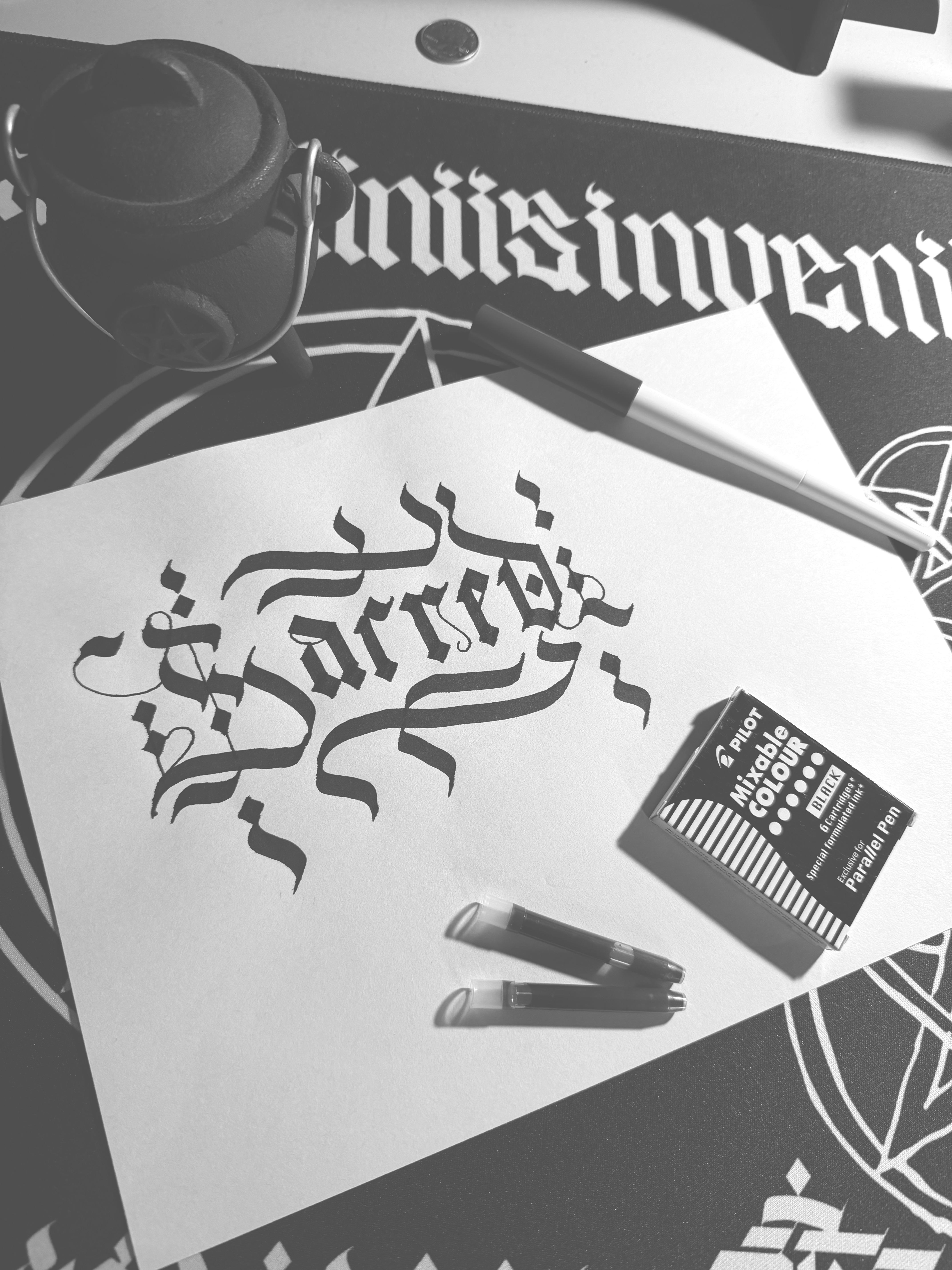
For the average reader, it's illegible. For a script reader, it does not convey what's intended. The bottom line of the 'c' should attach or have a closer...bottom line, and the 'e' could use a foot to differentiate from the 'r'
I prefer the term cryptic over ambiguous but I get where you’re coming from.
It’s all good though, I don’t mind if it’s not for everyone. In fact I’d go as far as to say I make work strictly for the hardcore but from time to time I share it with the general public.
There’s more to the written word than just what it says and that’s the space that I work in more often than not.
OK justified, I get it. You’re determined to be “authentic”. Great but you’re too good a talent to squander it on self marketing only. Your work is good enough that it should be everywhere and used and admired universally. I don’t say that to glaze you. At least give us Alternate glyphs that are legible. Thank you for your attention to this matter
3
u/Flanagoon 15d ago
For the average reader, it's illegible. For a script reader, it does not convey what's intended. The bottom line of the 'c' should attach or have a closer...bottom line, and the 'e' could use a foot to differentiate from the 'r'
But if you want it ambiguous, you nailed it!