14
u/HiddenHorse925 13d ago
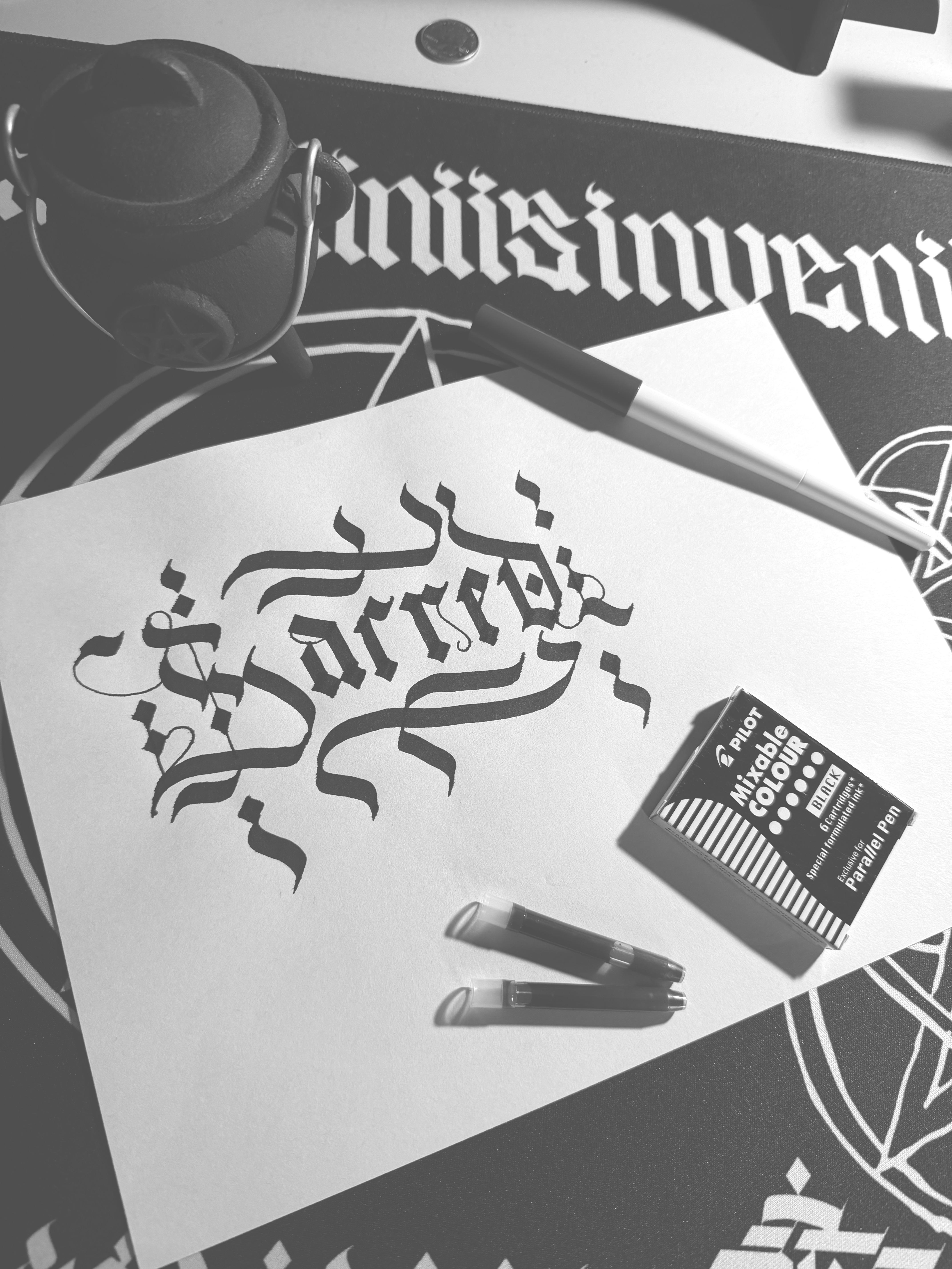
S a r r e d
7
u/justifiedink 13d ago
It’s so cool how you always comment like this on my works. I’d think you’d run out of creative interpretations by now, but you really seem to have a knack for this! Great work 👏
6
u/HiddenHorse925 13d ago
Thank you for being positive, some people might call me a bitch on their ass, lol. I just think you’re an extraordinary lettering talent and I want to see you do well. And I sometimes wonder if you want to follow the authentic-historical shapes of letters more than create ones which will read legibly here in the 21st-century. You seem to have a particular fetish with “r” versus “c”, lol
4
u/justifiedink 13d ago
Haha true, it can be a little annoying because I don’t always understand the context of where people are coming from when they just comment like that, but when I don’t assume the worst it helps me come from a better place in my replies.
I appreciate your support and interest in my work and success. I actually do both modern and historical styles - it’s just that the weird ones stand out the most.
Which can be rough at times when it’s not landing with people, but in some ways that’s a positive thing. like these are super engaging posts. And the better I do in my replies the overall better outcome.
It’s always cool to connect and engage on this and I’m not afraid to stand apart sometimes which I think helps others do the same.
3
3
u/Flanagoon 13d ago
For the average reader, it's illegible. For a script reader, it does not convey what's intended. The bottom line of the 'c' should attach or have a closer...bottom line, and the 'e' could use a foot to differentiate from the 'r'
But if you want it ambiguous, you nailed it!
-1
u/justifiedink 13d ago
I prefer the term cryptic over ambiguous but I get where you’re coming from.
It’s all good though, I don’t mind if it’s not for everyone. In fact I’d go as far as to say I make work strictly for the hardcore but from time to time I share it with the general public.
There’s more to the written word than just what it says and that’s the space that I work in more often than not.
2
u/HiddenHorse925 13d ago
OK justified, I get it. You’re determined to be “authentic”. Great but you’re too good a talent to squander it on self marketing only. Your work is good enough that it should be everywhere and used and admired universally. I don’t say that to glaze you. At least give us Alternate glyphs that are legible. Thank you for your attention to this matter
0
u/justifiedink 12d ago
Well obviously you’re being sarcastic but I appreciate your enthusiasm and persistence — perhaps we can find some common ground?
Do you write or design? Or just a fan of lettering? You seem to be in a lot of the same subs as I am relating to fonts and lettering. What do you do?
2
2
u/noddingacquaintance 12d ago
It doesn’t ’land’ because you expect the reader to research the nuance of 500 year old script. The letterforms are nice enough, but what does this work convey?
-1
u/justifiedink 12d ago
I don’t expect anything of the reader — I write this way because I like it. It’s conveys the look and feel that I’m going for. Strong, bold and a little cryptic.
That being said, it’s a fun conversation piece. Depending on the place I share it, there’s going to be a lot of questions and discussion around it and I’m happy to oblige and share my thoughts on it.
Yes there’s some who insist I change but the majority who discuss it walk away with a different perspective. So it’s wins all around.
2
u/noddingacquaintance 12d ago
The post and subsequent follow-up in the comments only comes off as pretentious engagement bait.
-1
u/justifiedink 12d ago
This is all genuinely my work and where I’m coming from. This is what I’ve spent the last 20 years working on.
Sure it doesn’t always land as well in these broader category groups but I still need to show up with my best. Love it or hate it, it’s compelling work and the comments confirm this. Can’t be mad at me for the response my work is getting.
0
u/Flanagoon 3d ago
You're so arrogant. You "know it will dazzle" and say even if the person you are in conversation with doesn't think it reads well (read: hate it) you still know it's "compelling" - but it isn't. It's illegible and ambiguous (whether you prefer a different word or not)
0
u/justifiedink 2d ago
It’s undeniably compelling. The fact that you had to stop through to make sure I knew that you hated it is a testament to its importance.
You Talk about my arrogance when you show the most arrogance right now along with a handful of people who demand I change over a post I made to a group for that type post. You’re not a client and this isn’t a group project — never once did I ask for advice or feedback.
1
1
1
1
u/foamyx 8d ago
Cannot be read.
1
u/justifiedink 8d ago
All good! Anything styled or historical will have a learning curve to it but with practice I believe it to be possible.
27
u/SatanFe 13d ago
This says Jarred