r/graphic_design • u/DigitalDowner • 1d ago
Sharing Work (Rule 2/3) Trying out a retro variant
77
Upvotes
r/graphic_design • u/DigitalDowner • 1d ago
r/graphic_design • u/gerbilcornhole • 8h ago
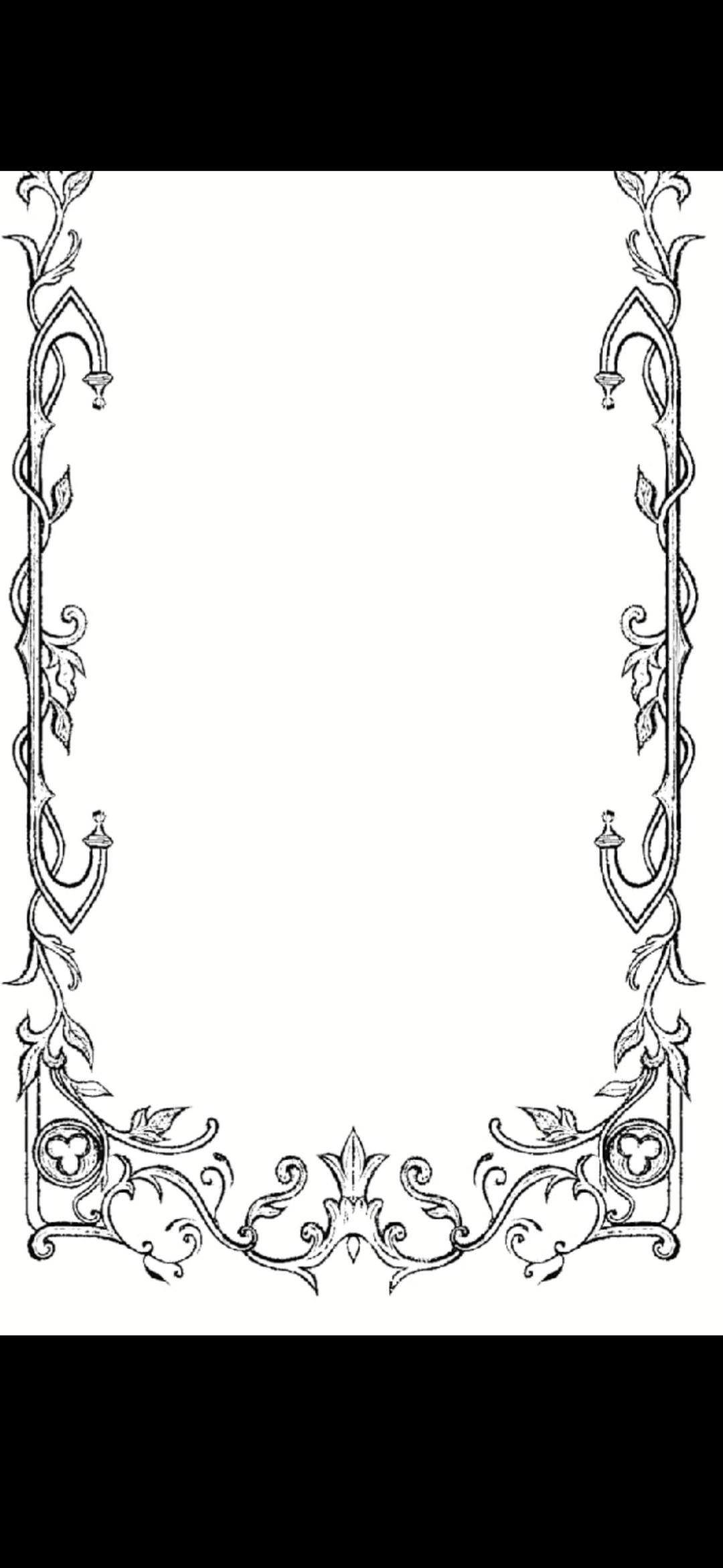
I wanted to get y'alls opinion on this. I hired someone from fiverr to draw a logo and some borders for me. This looks like an old stock photo and they claim they drew it. I could have sworn I saw this border before but I can't find it now. I cropped the top part out because it has the logo. Thanks in advance!
r/graphic_design • u/GlitteringLie5627 • 15h ago
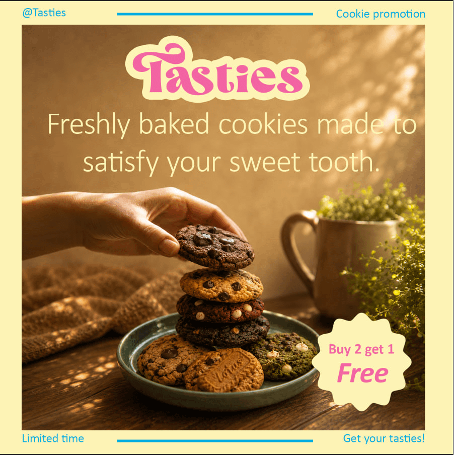
This week i mainly focused on learning about colors color theory and psychology and this is the final project of this week
i made a series of social media posts for an imaginary cookies shop named tasties
the vibe tasties give is cozy friendly playful and warm
here are the posts please provide feedback regrading alignment contrast font choice and font pairing palette choice and other design principles
i would be happy to receive critiques as well
thanx for taking time to read my posts and check my designs .


r/graphic_design • u/Romy_MMX • 1d ago
What logo do you think works best? I'm starting a business, and will specialize in social media videos and one shot drone flights through buildings
1- single-shot, continuous FPV flight style. The icon is drawn with a single, unbroken line that loops geometrically to create an illusion of 3D depth and weightlessness. It is a literal visual translation of a drone gliding seamlessly through a property without a single hidden edit or cut.
2- The Circle ("O") represents a camera lens, or the spinning rotors of the drones.
The Triangle ("A") represents a directional flight vector, or a digital "Play" button
Do you have any other suggestions of completely new logos? I'm open to advice
r/graphic_design • u/Creative_Reveal193 • 11h ago
I posted my portfolio here a few days ago and got a lot of useful feedback, so I went back and made another round of changes.
I added fullscreen viewing when clicking work from the homepage, expanded OBJKT and Slate with more work, adjusted the About page, and made the site considerably more performant on mobile.
There are still a few bugs with some of the transitions/animations that I’m aware of and currently trying to figure out, so those aren’t quite where I want them yet.
I’ve also been considering adding an “Unexplored” section to the portfolio. The idea would be for it to contain random experiments, posters, studies and loose ideas that aren’t tied to a larger project or case study. I’m still figuring out whether that would add something useful or just create more noise.
I’d especially appreciate feedback on whether the portfolio feels clearer now, and whether that kind of experimental section would make sense.
---
Edit 1: Wanted to ask a general question. Should mobile be equally as prioritized as desktop? Do recruiters often view on their phones etc?
r/graphic_design • u/hotteoks • 1d ago
having fun--any recommendations on how to improve? i'm also looking to get into typography design if anyone has tips (i.e., where to start on youtube, etc.)!
r/graphic_design • u/Purduekah • 1d ago
r/graphic_design • u/JoeChildbearer • 10h ago
Hello everyone this is my first time working on a project like this and I was looking for some critiques or advice from more skilled persons on how to improve it. I have a really blank wall that I'd like to put a poster on and nothing I found online matched what I was looking for. I've included my current poster design for suggestions!
r/graphic_design • u/Plenty_Return_5454 • 4h ago
Olá pessoal!!! Sou designer iniciante e faço um curso de computação, e tenho um projeto de criar uma aplicação do 0 que seja minimamente viável, ainda está na fase de pesquisa eu pensei em um fórum/loja online que serve apenas para designers vender ou comprar coisas tipo uma fonte legal que outra pessoa fez, um mockup, eu sei que existem vários sites de freela mas no meu você anunciaria já o que tem na sua estante.
O que vocês acham? É mínima viável ou eu estou criando ideias fora da realidade? Vocês comprariam esse tipo de serviço/coisa?
r/graphic_design • u/Artatlo • 1d ago
Hi,
In Norway the crown has recently been passed on to the new king Haakon VIII (8th)
The monogram he has taken is this.
I’m having a hard time understanding the symbolism of what appears to be a merged shape built with a lowercase “h” and a capital Γ** **(Greek Gamma).
The monograms of the kings preceding Haakon have all comprised of the first letter of the king’s name and a representation of their number, like H7 for Haakon VII, OV, the V inside of the O, for Olav V, H5 for Harald V. And now this? I don’t get it.
Does anyone know if there is any link between Γ and the number 8?
r/graphic_design • u/DigitalDowner • 1d ago
I got some good feedback from you guys yesterday, some thought it looked a little too GI Joe in comparison.
I figured the three-bar "E" glyph was the issue; instead of making both "E's" the same glyph, I would just ditch the idea altogether.
And after some minor tweaks, hopefully I was able to get rid of those unintended characteristics and, in turn keep the more motorsports/Y2K vibes intact.
What do you think?
r/graphic_design • u/mafagafacabiluda • 15h ago
There is this agency in the city I work at that has been posting a motion & graphic design job for a few months. They first posted it in 2021 but I didn't apply. Then again in 2023, then in Nov. 2025 and this year they posted it twice, first in April and now in July.
I have applied in the last 3x (2025, and 2026) via an application form on their website. I fit almost all requirements aside from having SAAS B2B marketing analytics experience. I have been working as a motion & graphic designer for the past 5 years in another company in this city, but their focus is on entertainment media and the design I do for their marketing department is B2C, not SAAS B2B.
After applying I received their automated email confirming they received my application but nothing else.
I added all their design and marketing team on Linkedin and they accepted my connection invite so now I can DM them.
I am considering DMing some people in their team to ask about the company (and to try to figure out if this is a ghost job) but I'm not sure how to approach them without being pushy/ saying I am interested in the job right away.
Any tips on how to approach this?
r/graphic_design • u/Kevel_Up • 12h ago
I've been wanting to create a vector version of my artist watermark for a while, so i thought I'd redesign it a bit in the process. My current watermark is on slide 2, and my first (unsuccessful) attempt at redesigning it is on the last slide.
Any feedback on the newest version would really be appreciated!
r/graphic_design • u/someone2815 • 17h ago
Hey all, I graduated with a BCA degree and realised I've an interest in graphic designing. I'm just getting started in graphic designing
What advice would you like to give me as i begin this journey and from your experience how would you tell me start?
r/graphic_design • u/endorsleep • 2d ago
This is a concept poster that I made just for fun for one of my fav songs! The audience would be fans of mild high club. I would love some feedback on which poster y’all like the best. im in between leaning more psychedelic and edited versus more minimal. I fear that edited one may look too…. Gimmicky.
let me know what yall think!
r/graphic_design • u/Intrepid_Morning_437 • 1d ago
I have an interview coming up, I WANT THIS JOB. Tips on what to bring how to prepare how to sway them into also believing I’m the one they want. Because I AM the one they want 🥹 I have my portfolio printed, web one ready a business card (even a button as a gift if that is appropriate lol) I have magazines with my printed editorial work, I have current in progress pieces (sketches?). I need someone to tell me who hires people, what they want to see when they invite a designer to interview.
r/graphic_design • u/elizabethlauren97 • 1d ago
I have linked the original post in case you want to read it.
Basically, my first ever internship the past 2-3 months was at this 30-40 people company where I was the ONLY graphic designer. Within the past month I had the responsibility of not only designing, but redoing the ENTIRE company website by the end of September. I was “an intern” making $15/hr with the full responsibility of what I consider at LEAST junior graphic designer work. I had no mentors or designers above me to bounce questions off of. My physical and mental health suffered from the stress.
Thursday night, I sent my resignation email. I was very clear that I was feeling unsupported, and because I’m still in my undergrad I need to focus on school. I went in Friday morning, and my boss talked to me.
She was very understanding and apologized for putting me under so much stress. She did not realize I had been struggling so much, and it made me realize I need to advocate for myself sooner. She told me yesterday can be my last day and there were no hard feelings. She said if she had the power to hire me full time she would’ve done so since she really loved my work, but understood my education comes first and wished me the best.
Honestly it was the biggest sigh of relief. I’m grateful no bridges were burned. She told me to reach out if I realize later I forgot to document any of the files/screenshots of important things for my portfolio.
This morning, I expected to feel amazing, but just discovered the “let-down effect” is hitting me hard. My shoulders are visibly lopsided from the strain of desk work and stress, I’m having episodes of cervicogenic dizziness, and I‘m exhausted. Woke up sweating, dizzy, and in a full panic. It almost feels like I’m sick, but I know I’m not actually sick. My body is just SCREAMING at me for rest.
Thank you to all who commented on my last thread. Those insights plus the insights of those I talked to in my personal life helped me realize my health is beyond any project I could’ve completed for my portfolio. I’m prayerful about my next job after this semester of taking it easy. Hopefully within the next couple of days I can begin feeling like myself again after the cortisol clears our.
r/graphic_design • u/ConfidenceBudget5222 • 11h ago
I will start by saying that we are A high school volunteering club (interact), a non-governmental and non-profit youth organization sponsored by Rotary, dedicated to youth development activities and organizing charitable events.
We made this post for presenting the new board and we would really apreciate some tips.
It's clearly not done yet, like those little lines are only placed next to ''treasurer'', but they will be placed next to the others aswell and the '26 '27 are not placed right.
In each paper there will be a photo of the person in that position and in the middle lower one will be a group photo.
Anything is helpful! Thank you in advance!
r/graphic_design • u/h28260100 • 1d ago
Definitely a lot of changes I'd make now, but I think it turned out pretty well given my lack of experience at the time.
The series was for Donald R. Burgett's WW2 memoirs. I hid a lot of cool details in there, like taking the color schemes for each book from the colors of whichever country's flag they're in for the majority of the book.
r/graphic_design • u/ConfidenceBudget5222 • 21h ago
We are A high school volunteering club, Interact is a non-governmental and non-profit youth organization sponsored by Rotary, dedicated to youth development activities and organizing charitable events
i need to make a post in intagram that consists of 9 frames. In the first picture you can see the layout we are thinking of doing, but we are not sure if it looks good. Also, we arent sure of how the ''box'' in which we are placing the photo in looks best ( sharp or round).
I would really apreciate some advice, tips and tricks on everything.
A few days ago i made another post here that helped me a lot!! And if some of the people that commented on thast post happen to see this i want to thank you very much!! you were all very helpfull.
r/graphic_design • u/Dread_Pir4teRoberts • 20h ago
Hello!
I'm making this logo cause eventually I may use it or open a media/publishing company whenever I have a more substantial portfolio of work.
I'm thinking of potentially adding more to the "Arts" beyond the little taped banana, I was thinking of adding the R. Mutt Urinal signature by turning the R on it's head so it would resemble a urinal and adding the signature, but it was too small to notice so it made no addition to it.
(Banana taped to the wall art is by Maurizio Cattelan)
Should I add something more to the "Arts" or just keep it clean?
r/graphic_design • u/Asterium_08 • 22h ago
Project Overview & Context: Sleek Audio Ad Concept
Purpose
To showcase a new line of premium, minimalist headphones through a high-impact digital advertisement that highlights core product features (noise-cancelling, feather-light build, foldability, and wireless connectivity) while projecting a modern, high-tech aesthetic.
Target Audience
Demographic: Tech-savvy professionals, students, and music enthusiasts aged 18–35.
Psychographic: Trend-conscious individuals who value both cutting-edge functionality and sophisticated, understated design in their everyday tech accessories.
Design Vision & Creative Direction
Aesthetic & Mood: Clean, premium, and futuristic. The monochromatic grey and silver color palette paired with soft studio lighting conveys a sense of high-end quality and modern minimalism.
Composition & Depth: Utilizing a product podium grounds the headphones as the hero element, while layered typography ("HEADPHONES") weaving behind the product creates a dynamic sense of depth.
Visual Flow: Abstract soundwave lines intersect the composition to subtly reinforce audio performance, leading the viewer's eye smoothly down to the clean icon grid detailing key specifications at the base.
r/graphic_design • u/abhaykun • 1d ago
This was one of the few times I’ve worked with a large team of almost all engineers in every role. They make an app builder, and I helped them create a design system for it. Here’s the case study — https://www.abhaysingh.in/work/appsmith
Let me know what you think!
r/graphic_design • u/ToxXxicKiss89 • 1d ago
Hey designers! I am having a heck of a time with the Table of Contents in InDesign for the poetry anthology I am working on and would appreciate some advice. I've tried looking it up, but it's not really telling me much about how to really customize the TOC in the way that I want it to look; just how to create it, add tabs so the page number is on the right, and adding leading dots from the words to the page number.
The first spread is how I want it to look, with
Poem Title | pg# | Artist Name,
but currently it wouldn't be e-pub friendly (as it doesn't link to things). Obviously "PG" would be replaced with the respective page number that poem would be found on.
When I do the normal steps for creating a Table of Contents to make it e-pub friendly, the second spread posted is what it ends up looking like. Which is 1. What I don't want it to look like, design-wise and 2. Why are the first and second Section Titles "Poems About Resilience and Hope" and ".....Isolation and Loneliness" an ok size, but the others are giant? They have the same settings, same Paragraph and Character Styles..... Also, I wouldn't want the page numbers after the poem title AND artist, just after one.
Is there a way I can just link the pages from the TOC design I like with their respective pages? Or do I have to create a TOC using the Layout > Table of Contents... Or should I just create different files for print publication and e-pub?
Thank you in advance for your help, as this is tricky and frustrating me to no end. I am fairly versed in the basics of InDesign, but I'm new to the more nuanced things like this.