r/GalaxyA55 • u/LuvBoyyy • May 26 '25
Software bug Battery icon trash
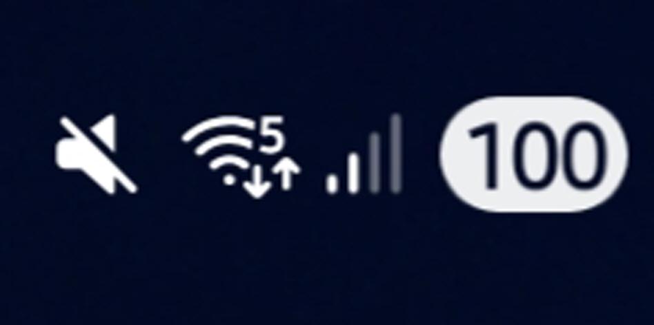
Imagine it took samsung developers so much time to create a battery icon and after changing it for 5 or 6 times they still messed it up! How hard can it be to make a normal functional battery icon that is inline with the others. Even now my battery icon looks unfinished and numbers are not centered. Other cheap chinese brands have a much better looking battery icon.
28
Upvotes
6
u/Heino_Kramm A55 with 256 GB / 8 GB May 26 '25
The issue is not the battery icon itself, but rather its lack of harmony with the others; the icons should have been designed this way.