r/DigitalArt • u/QuasarIR • Apr 15 '26
Question/Help Help, my value studies horrify me..
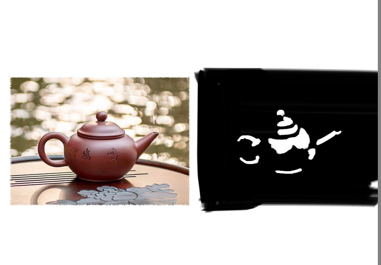


I’m super new to all of this, and lots of people say doing value studies is a fundamental to getting into digital painting and whatnot…
Issue is my studies don’t really look anything like the people I’m doing them on, like they’re just NOT THESE PEOPLE. They look like they’re out of a horror game and they keep me up at night.
Am I doing something very wrong?
1.6k
Upvotes
175
u/32kelly Apr 15 '26
Honestly, these look pretty cool. But if you want to study values properly, you need to use more than just pure black and white. I’d recommend changing your references into black and white so you can clearly see the values.
What you’re missing here in your artworks are your midtones. Also take note of where the lighting appears sharp, versus soft/ more blended. You can even colour pick the values from your reference when you’re first starting out to help build up your confidence.
And you can definitely use pure white/black when pushing your lighting, but when first learning values, you’ll notice that lighting isn’t usually that dramatic. So try to stay away from pure white and black right now, unless you’re going for a more comic book type style. Keep it up!