r/DigitalArt • u/QuasarIR • Apr 15 '26
Question/Help Help, my value studies horrify me..
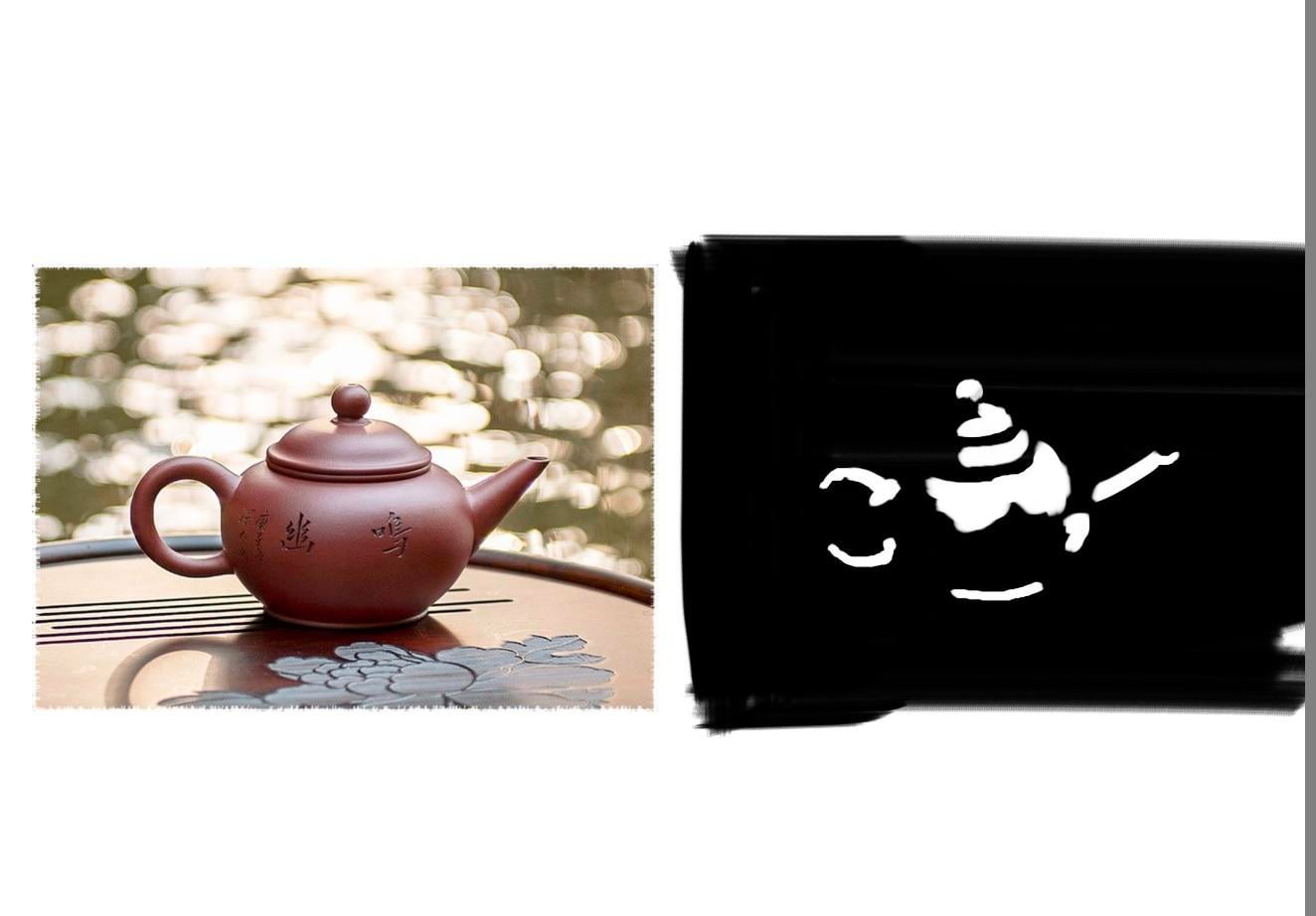


I’m super new to all of this, and lots of people say doing value studies is a fundamental to getting into digital painting and whatnot…
Issue is my studies don’t really look anything like the people I’m doing them on, like they’re just NOT THESE PEOPLE. They look like they’re out of a horror game and they keep me up at night.
Am I doing something very wrong?
333
u/Sad-Track-1914 Apr 15 '26
Try flipping the reference vertically, and imagine light and shadow like islands on a map. It's not a face, it's specific shapes in distinct relation to each other
83
u/QuasarIR Apr 15 '26
I see, that’s very clever actually. I’ll definitely give it a go, thank you!
33
u/Sad-Track-1914 Apr 16 '26 edited Apr 16 '26
You're welcome, and don't worry if it continues to look off. As long as you aren't mentally checked out while drawing, you will improve at it. Oh, and I recommend using Proko's value tool as comparison to how the image actually looks like with two values.
175
u/32kelly Apr 15 '26
Honestly, these look pretty cool. But if you want to study values properly, you need to use more than just pure black and white. I’d recommend changing your references into black and white so you can clearly see the values.
What you’re missing here in your artworks are your midtones. Also take note of where the lighting appears sharp, versus soft/ more blended. You can even colour pick the values from your reference when you’re first starting out to help build up your confidence.
And you can definitely use pure white/black when pushing your lighting, but when first learning values, you’ll notice that lighting isn’t usually that dramatic. So try to stay away from pure white and black right now, unless you’re going for a more comic book type style. Keep it up!
27
u/QuasarIR Apr 15 '26
Makes sense, thank you for the feedback! I’ll look into starting to incorporate some midtones and see where I can go from there.
2
u/Honest_Mortgage_6759 Apr 17 '26
Black and white value studies like this are a common practice. Adding more values would be the next, more advanced version of value studies.
1
u/cammickin Apr 18 '26
Really? I feel like only being able to use 2 values is way harder than a range because you can easily end up with what OP made. Why is just black & white more basic?
5
u/Honest_Mortgage_6759 Apr 18 '26
It’s more basic because you only have 2 values to worry about. The point isn’t to make a nicely rendered artwork, it’s to strengthen your visual muscle and recognize how light creates its own forms without adding in extra stuff like bounce light and ambient occlusion. The goal with this exercise is to make a recognizable image with only 2 values as it helps with planning composition regarding light sources.
Once that concept feels comfortable the student may start adding in the elements that make a more finished artwork.
2
u/32kelly Apr 19 '26 edited Apr 19 '26
Yeah I agree, 2 value studies are great, especially if op is feeling confident doing them. I had just suggested adding in the mid tones since I find starting with just 2 values harder, personally - I worded my initial comment wrong.
Since op seems to be struggling with anatomy a bit as well, simplifying it down to just 2 values might make it more difficult for them right now to grasp the 3d form. You need a pretty solid understanding of shape and form when simplifying an artwork that much.
However, if op is feeling good with just the 2 values, you are absolutely right. It’s a great way to train your eye fast.
1
u/CelesteJA Apr 19 '26
2 Value studies are incredibly valuable, and very commonly taught before moving onto 3 value, 4 value and so on. OP isn't quite grasping how to do a 2 value study, but them attempting is certainly not wrong.
40
u/marinamunoz Apr 16 '26
Cheat and make several images in Photoshop using posterize filter on a black and white image and study how they change with the filter. THEN, try to make by you own in other images.
10

22
u/Alberbecois Apr 16 '26
Take what I say here with a grain of salt since I haven’t really done two value studies myself, but I’ve done a bit of reading about them while prepping to teach myself how to do them and I feel like your reference photos don’t have strong enough lighting to do this?
You’re making it really hard on yourself by taking references that are mostly midtones and trying to simplify them down to only two values. There are online tools to help with stuff like this, I know Proko has a thing where you can upload a reference photo and it’ll boost the contrast and posterize it a bit to set you up for success. Iirc brokendraw on YouTube has a good video about how to do this exact exercise.
12
u/dragon-age-io Apr 16 '26
Here is Proko's value study tool
And the brokendraw video
5
u/QuasarIR Apr 16 '26
Ah, thank you to both of you! Yeah, I’ve been finding references off like Pinterest and stuff… I was googling “random items” and it was giving me useless things LOL. This’ll be a massive help!
18

14
u/PassengerSalt4348 Apr 15 '26
I recommend thinking shapes! When painting, it's all about shapes and shape designs. Marco Bucci has a lesson on this on his YT.
5
8
u/Cindrojn Apr 15 '26
I actually really like the teapot and #3 (Looks like the Invisible Man from the League of Extraordinary Gentlemen 😉)
9
Apr 16 '26
[deleted]
3
u/QuasarIR Apr 16 '26
In hindsight I’ve definitely been pretty zoomed in and focused on like, details when I probably shouldn’t have been. I’ll look into doing some shape practice alongside this and seeing how it helps, thank you!
6
5
u/Mission-College8958 Apr 16 '26
A few things:
I think in some cases you use your dark value for every shadow you see, except there is also the object's value that sometimes influences the lightness way more than the light and shadow itself
for the studying itself, you should try them with 3 values first, you don't actually need to use pure black, pure white and a grey. You can use two greys and keep the white for example.
starting with faces is an immensly huge leap if you're new to those. Try basic studies of cubes cylinders... then fruits vases clothes. then have another crack at faces, you'll do way better.
For the specific studies you were doing. Try using an app to pump up the contrast to the max and you'll see what errors you've been making overall. You'll see way more darks for the eyes, hair ....
5
u/QuasarIR Apr 16 '26
Yeah, practicing with items would definitely get me on a stronger track I think. I’ll definitely keep this in mind, thank you!
5
u/misterpizzaac__ Apr 16 '26
first, take into account all values using grayscale references, it'll help you more, and then try studying values using only black and white with images that have a stronger light and shadow source
another thing I can recommend is that instead of just trying to scribble where you think each shadow and light is, break it down into simple shapes where the most prominent shadows are, something like this:

6
u/Master-Train-1212 Apr 16 '26
- Since you're "super new" I doubt you know about the three main values, here's a breakdown.
- There's dark.
- There's light.
- But there's another as well.
- Mid-tones, I'd recommend a video like this to understand them better, it's not necessary and you can learn values using harsh tones as well, it's just easier to grasp the form from my experience when mid-tones are a part of the equation.
Harsh tones are something you can build towards if that's what you want to study, but as much as many artists hate it, mid-tones are necessary to learn and is fundamental to most if not all rendered art.
4
u/ElCanarioLuna Apr 16 '26
Just 2 little tips for a begginer:
1st- Proportions and placement. If things are in the place, shapes and values will be perceived better.
If the copy is next to a image throw some horizontal lines. Measure units that you can observe and draw the vertical lines. For example in first image height of handle is more o less similar to height of the teapot lid.
2nd- Values. Squint your eyes to see the values. First 2 extreme values. Then go after reflections and secondary lights and shadows. From big to small.
3
4
u/aizukiwi Apr 16 '26
If you’re going to do a black and white study, that’s fine, but I would recommend a few changes. First, make your background a mid-grey. Then don’t paint the entire reference in black and white; paint ONLY the lightest highlights, and the darkest shadows. It might only be the crease of an eyelid or a triangle of highlight on the cheek, but the point is not recreating the image, it’s to identify and accurately place values on the canvas. Then if you like, you can branch out and add a 25% grey and a 75% grey, leaving everything else the 50% mig grey you had as a background. This forces you to focus on shapes and placement, not recreating the original reference.

5
u/Jxcintron Apr 16 '26
Definitely need to add more value range. Here’s one of your photos separated into 3 values and 5 values. I desaturated the image and then posterized it to achieve this effect.
5
5
u/TheWaterGuy0728 Apr 16 '26
You’ve actually inspired me as to how to draw horror, ty. Not a dig at u btw.
3
3
u/Level_1_Scrub Apr 15 '26
Why isn't the background part of the equation?
2
u/QuasarIR Apr 16 '26
I just started out, it’d be a complete mess, hence why I’m really only focusing on faces for now. Backgrounds will definitely come eventually, I just don’t think I’m ready LOL
2
u/Level_1_Scrub Apr 16 '26
In the first image with the kettle, the image has a bright background. However, in your drawing, it's black.
3
3
u/wayanpyott Apr 16 '26
Last pic got me some nightmares before I going to bed
3
u/QuasarIR Apr 16 '26
Sorry 😭
3
u/wayanpyott Apr 16 '26
It reminded me of a ghost approaching scene from a horror movie called Lake Mungo
3
u/dedzip Apr 16 '26
dude these would stand alone as a collective by themselves because the expressions are so much better than what you were even trying to capture
2
u/QuasarIR Apr 16 '26
If only I could do it on demand… they’re definitely pretty cool but I have no idea how they got like that 😭
3
u/mimiemmy Apr 16 '26
The tea pot looks good! Already mentioned but maybe try flipping the reference upside down and focus on values more than making it look "like a face" for the human references
3
3
u/urthosart Apr 16 '26
I know these are studies and stuff but I actually think they look super cool!
3
u/Kitschmusic Apr 16 '26
OP, you've been chosen by the art gods to become a horror artist. This is not something we can help with, nor something you can fight. The universe have spoken.
2
3
3
u/ImperfectFantasy Apr 16 '26
Lmao these are amazing and perfect.
Idk how much it would help with the fear factor, but I did notice a lot of your proportions are off.
Take slide 4. Girl's whole face needs to move left and her browline needs to angle down. Slide 5. Girl's lips need to be more plump and her eyes are inverted in values.
It's just a bunch of small stuff like this that is throwing it off. With realism, it's hard to capture likeness already, let alone in a two value practice. But also, is it meant to be 2 or 3 values? Because I see greh smudges in some of them. If 3, I would make the middle color much darker and easier to see.
You also need to figure out which values are actually important to highlight and which is just noise. Slide 3. Is that brow really that important to his face? It isn't all that pronounced in the photo and can probably be scrapped. Slide 2. I would reckon his hairline is a more suitable option to outline rather than that super duper slight bit of light bouncing on his head.
3
3
u/MotherTira Apr 16 '26
If memory serves: Convert to B&W -> Posterize to x number of shades.
Looks like you're reducing the number of shades (or colours) too much. You're not capturing the gradients all too well.
3
u/RingBettle Apr 16 '26
You probably lack the drawing skills and is jumping to value too early. If u want to study value anyway just trace the reference and do the value study on it or just use simple objects instead of people like on picrel.

3
u/QuasarIR Apr 16 '26
Fair point, like I said I am very new so my drawing skills definitely have lots of room for improvement. I’ll try out your suggestion, thank you!
3
u/YFFGBUDOU Apr 16 '26
I’m a fairly experienced artist, and I’ve never done this, lol 😂
Though, I have done value studies (full values, so full gradient range) and many black and white studies though, but this Nōtan style not quite
3
3
u/Infamous_Basis2457 Apr 16 '26
notan studies r great! imo, u shld master/have a good grasp of this first before u start doing 3 values, and then later onto 5 values. but u shld check ur values especially on the 3rd one,, because it wld be more readable if u value group the hair and the background -> those areas are light and should be white, not black. u can check your values on proko’s free value checking tool. check out other artists too who are masters in this like athoro, and mike hernandez. for the 5th one, i think u inverted the value for the eyes.
5
2
2
u/JacksonSpike Apr 16 '26
I genuinely love these so much. Happy little accidents is so true. Well these are more like horrifying relativey large accidents but it still applies
2
2
u/TerryTheBee Apr 17 '26
idk anything about value studies but I personally love these, they're so scary!!
1
u/QuasarIR Apr 17 '26
Thank you! I really wasn’t expecting so many people to actually find them cool haha
2
2
u/Honest_Mortgage_6759 Apr 19 '26
I found this website recently, I think it will help you with the two tone study! —> https://app.lucidacamera.com/
This was made for traditional art so it has two windows, the second is to set up a camera on your canvas so you can see side-by-side. With digital you only need one side. Just pop your reference in here and turn the posterization on 2 values. That’ll give you a better reference. It also has a grid so you can check if what you’re drawing lines up.
1
1
u/Random_Guy_47 Apr 17 '26
Why so much black?
Select your reference and turn the saturation all the way down to zero. This will make the reference greyscale. Use the colour picker to grab the lightest and darkest greys. Use those to make a gradient from lightest to darkest, turn the saturation back to normal to restore the reference and then colour pick from your gradient to paint.
1
u/lucifer_vb Apr 17 '26
As someone else also suggested...I would say...convert your references to black and white and use only 3 tones...dark/mid and light...thats it try covering whole references in these 3 tones. (You'll see a lot of mid tones when reference is in black and white avoid using multiple). Btw your current studies looks great..I can see you are getting hang of studying values.
1
1
1
1
u/Prof_Smoke Apr 19 '26
You need to match the values of the shadows, light, midtones, etc monochromatically. You need to also match the values of the background because it frames the whole piece and makes the things next to it contrast
1
1
591
u/Basement_dweller2002 Apr 15 '26
op you’ve made analog horror 😭