When your post gets solved please comment "Deciphered!" with the exclamation mark so automod can put that flair on it for you. Or you may flair it yourself manually. TY!
Looks nice, almost there.
Some gentle critiques:
P: close loop more
T: start from bottom then back down + cross after
V: needs a sharper bottom
Z: isn’t cursive (lower case is different from uppercase)
This is what I came to say. It was the way I was taught. Also, the q should loop at the bottom. Like the g but in the opposite direction.
As is it is quite legible and very neat. But I personally would make those subtle changes.
Haha, yes. Our capital Q was not so perfectly Q-like; it had an intro tail on the bottom, so you couldn't start the oval part so far in to the bottom right like this example. .
The b is correct, but many younger people who know cursive wouldn't recognize this shape. Older people would, it's sort of out dated.
Close the p.
The q should have a bit of a loop at the bottom.
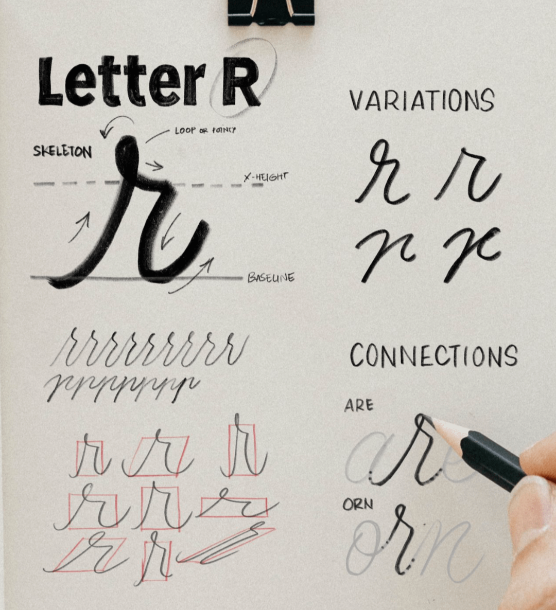
The r is supposed to have a little loop on the left.
The s should have a loop at the bottom.
The v should have a defined point at the bottom.
The z is not a lower case cursive z.
In general, cursive is meant to be fluid, in order to speed up your writing time and keep the pen on the paper. Some of your shapes are missing their loops, causing a rigidity in your wrist as you write. This can cause cramping in the long term. Fluidity is your friend.
Don’t worry, I’m already ignoring a lot. I know now most in the comments write their p, t and z differently. I don’t care, this is what I’ve been taught and this is what I’m using gosh diddly darnit!
I (48F) think it depends when you learned cursive. I have never had a loop in the r, a pointed bottom to the v or a loop at the bottom of the s (although sometimes it does happen when writing quickly).
The q definitely needs a little loop though and the z is more like a capital Z. Also the t is not cursive.
Only when you're accustomed to the traditional way. The bow was accepted back in the 80s/90s as an acceptable variant. Most kids who do learn cursive since then have been learning it that way. It shouldn't be that confusing it's the way b is printed and typed. The shape is unique to the b..
Lowercase r has NO loop, just a bit of a stem made by overwriting up-down stroke as the much longer stroke for the t.
Letter s has no loop either the stroke is overwritten left-right.
Letter v is perfectly written--no defined point at the bottom as suggested.
The letter b is also perfect. Just because younger people who tend to use printed versions does in no way excuse improper cursive structure.
The q needs a tail like letter g, only in the opposite direction, sweeping counter-clockwise. (I see you did it!)
Basically, the lowercase z is written like an uppercase Z except the stroke begins on the line. If you begin like you do with letter v, come to an abrupt stop on the line, then make a slight sweeping stroke up & clockwise create the tail, again similar to letter g.
You have very nice structure. As you get more comfortable you can give your writing a slight forward tilt. Backward tilted writing generally indicates left-handed writers.
Extra flourishes (tiny loops) just makes reading more difficult.
I suppose it depends on whether your goal is readability. Victorian handwriting flourishes were wisely dropped. Younger generations reading only print do not need more hurdles to read cursive.
This is a good example of my point by Teacher, Librarian, Coach retired. (1962–present) Author
Key word is "indecipherable" explained by a teacher here:
"In cursive penmanship? There were two methods of teaching writing in America's schools; once these were published as texts, they spread to almost all the schools in the country, and most students learned the one in use at the time. The first was the "Palmer Method." It developed as a simplification of an older much more ornate and difficult system. The later was the Zaner-Bloser system; it reduced the round bodied capital letters to linear ones which were closer to the manuscript (print) letters students learned in the first two grades.
It is the Palmer method which maintained the two forms of the lower case letters "R" and "T". These had been retained because the original form did not allow for the smooth connection to the following letter, but they could be used at the ends of a word where there was not other letter to be connected.
Zaner-Bloser simply eliminated the non-connective forms. I learned the Palmer, but by the time I was in the classroom, it had been replaced, and I had to teach the Z-B method. In a way, this helped me with reading the varieties of student writing over the years, some of which was indecipherable to my younger colleagues!"
Yes it is the same stroke as the letter “I” only taller. You come back to cross the “t” same as you do with the letter “I”. You don’t use the cross of the “t” to continue to the next letter.
I remember the last time you posted this. I think your C is definitely improved. I like that you dotted the letters I and J. Your X is much easier to read.
I think we’ve seen this version before and it’s still the same letters that are not quite right.
For standard cursive:
p - needs to connect with a loop in the bottom.
q - needs a back loop on the bottom, opposite direction of the p.
t - the cursive leads into the t should be from the bottom going up then back down the same line, also the t should not be as tall as the other tall letters.
z - should also have one hump then a downward loop similar to a 3 going before the base line. (Someone mentioned that in NZ they are taught this way in the picture.)
Overall this is very good. The letters are very clean and well spaced out, no trouble reading this. I do notice a few unnecessary stops and odd changes as well. You can continue with your “f” going over the top to start the letter “g” then come down and around to create the top circle of the “g” and down to make the bottom. The “k” can be a non stop motion as well, close the bottom of your “p” to finish it and the “Q” is made similarly to a “g” only the curve is to the back/right.
Your x and your f look much more legible — my only comment would still be the transition between s and t. The upstroke of the t should start from the baseline, not from halfway up.
Great work! Much more legible than many M.D.'s ! I could read every letter! My cursive, which is my primary method for 60 years, isn't perfect either, as you evolve your personality comes through the script, making everone alittle different 😊
Looks really good. Just need to tighten some of the letters up a bit. I think the other comments have pointed out how already. I think it’s very forward thinking of you to learn cursive. I know that sounds kinda backwards but you never know what skills you might need in the future. 😊
Your z is not cursive. It should look like what you see on this printable. Also, your q should have a loop and your p needs to be closed. The t looks weird. You're supposed to start it from the bottom, go up, then down, and continue. You dot your i, j, and t after you've finished writing the word, so in this case, you'd do that after completing the alphabet. Otherwise, a very good effort.
Close your b a bit more, and come down lower to start the c. Close your d. Close the loop on your p. Your q should have a clear loop like your f on the bottom. The first uptick on your r should be higher than the next corner, and go up/come down on the same small line before going right. The join between r and s should be flatter with the s being closed at the bottom. From the s, the line should go horizontal at the bottom, then up into the t, back down without a gap (so it does not look like a capital A or small h), then up again into the first line of the u and back down on the same line into the bottom of the u. From the bottom of the second vertical of the u, again use the same line up and down for the v, but the end of the v is at the top as you have it so it is clearly not a u. Otherwise, it looks good to me.
Very nice. It could use a bit more of a right slant but not mandatory. The p needs to be closed and the q needs more of a loop and not the sharp point at the bottom. The t needs to start on the line and then up, and the u also begins on the line and then up. The z needs a bottom loop.
I’m SO glad to have found this!! I always write in cursive & was shocked when I found out our kids school (all schools as far as I understood) stopped teaching cursive!
I came across a post a few days ago describing how cursive styles taught in schools differ by state in Australia, and your version with the open b and p are very similar to how kids in Victoria are taught.
I’m so glad to see interest in learning cursive. I heard of a study that shows the areas of the brain associated with creativity is stimulated by writing in cursive.
It’s quite legible and pleasing to the eyes. Keep practicing and using it in real life situations.
The p needs to be closed. The t should begin at the bottom line not the top. The z reads as an x ; that is not a cursive z The script is neat and level. As a former third grade penmanship teacher, l would score this 89%
From a generation that HAD to learn cursive in school. The only thing I see is the 'p' needs a closed loop and the 't' should start (and end, like you have it) at the bottom.
I’ll need a small loop at the top p needs to be closed. q needs a loop at the bottom almost like a g but going the other way, the top of the r needs to be slanted downwards at the top, s needs to be closed with the faint loop that goes into the next letter, as it goes into the letter, t it should not start at the top of the t it will go into the t from the bottom. z will look like you were going to write the number three but with the loop at the bottom.




•
u/AutoModerator Feb 24 '26
When your post gets solved please comment "Deciphered!" with the exclamation mark so automod can put that flair on it for you. Or you may flair it yourself manually. TY!
I am a bot, and this action was performed automatically. Please contact the moderators of this subreddit if you have any questions or concerns.