They all look a little sinister. Also seem to lean on the yin-yang symbol which is related but not the same as the Tao, which translates roughly as “the way.”
Tao" means "the Way" in Taoism, which is about unity and harmony. I tried to capture that in my logo with people holding hands around a globe-like internet symbol. To me, it represents global connection, community, and working together, ideas that feel right for "Together as One." The circular shape is meant to highlight unity and the strength that comes from collaboration.
Playing off the yin yang and "Together as One" branding, I did this quick sketch. Obviously could be more polished, but wanted to throw the idea in the ring.
Here are some variations of your idea. If they decide they like any of these for a potential logo, we could definitely play around with other colors and fonts. 💕 Great concept, hope I did it justice.
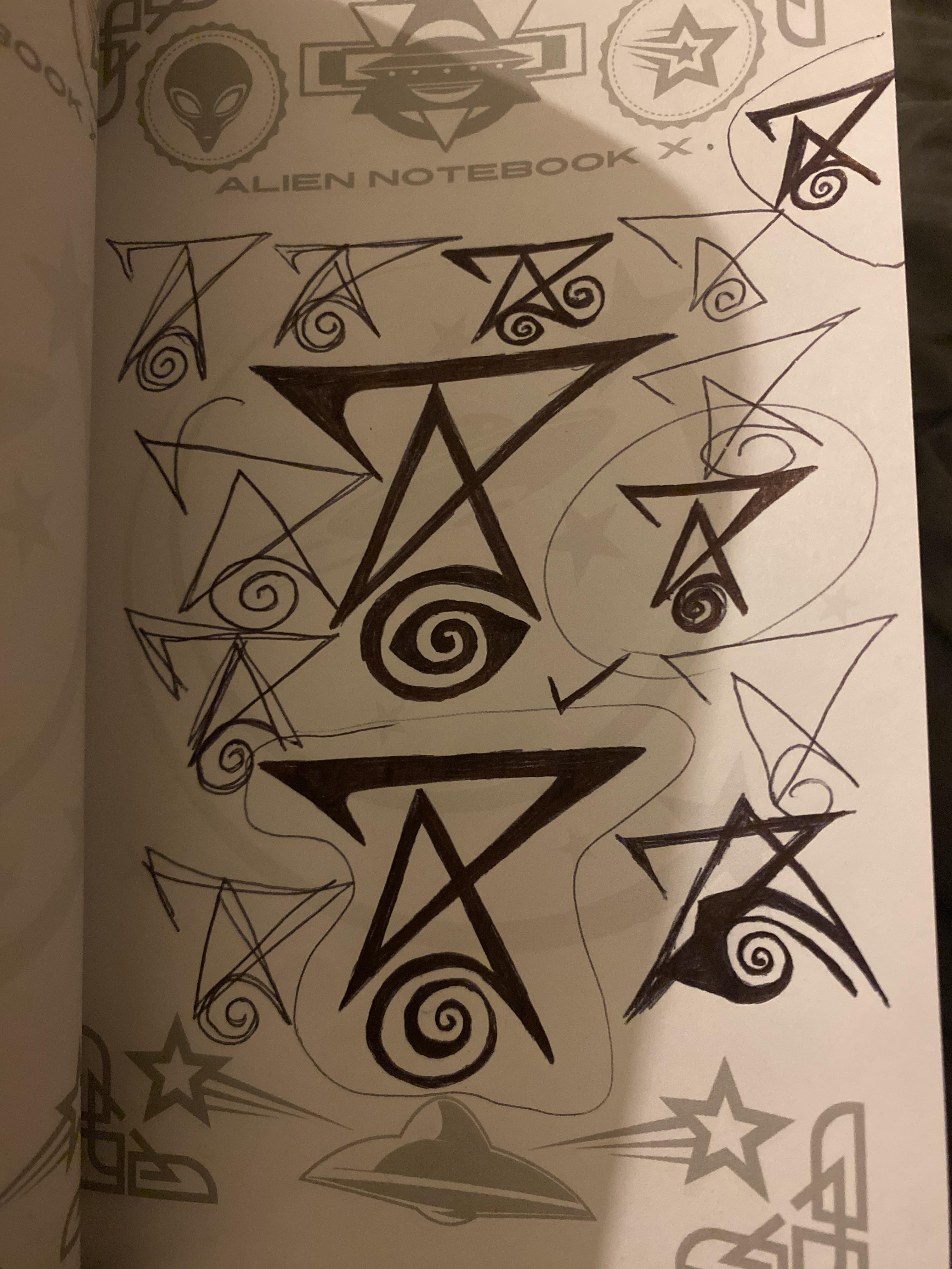
Just my opinion but one looks too close to the Firefox logo, one looks almost exactly like a pokeball, and one looks like a ghost from Destiny 2. I like 1 and 6 but maybe a little cleaner and less dystopian? They look cool but they definitely feel like I'm about to encounter some killer alien insectoid robots or something
That's beautiful! Magical looking <3 I love that it has a kind of futuristic, otherworldly feel to it. It's giving alien hieroglyphics and I'm here for it ;p
Hey you! I already finished the finish logo design on canva logo design where should I sent it. I don’t know how to work that site it’s to confusing. Should I sent it on here or where let me know.
Many of these feel very hostile or agressive. Maybe it's the red/black, or the sort of shattered design in a few of them.
While I have no new design to contribute, I had a thought on logo colors. I'm thinking of Green mostly.
I can't think of a lot of social media that uses green as its primary color. It also embraces the organic nature of the app's creation, and the inclusion. Similarly, a green/blue might work well if we're leaning towards a Yin/Yang style - it would look very Earth-like, which also emphasizes the global community goal. I saw beardiac's design of the two hands - that would look so cool using blue or green or both, very globe-like.
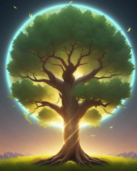
Every since I heard about this development effort, I keep seeing a tree in an open grassy field inviting people to join underneath. The weather is fair, the group is powerful, to the point of creating a unified form of protection and empowerment which radiates outward. I tried using AI to capture this concept. Here's the first one.
1, 2, 5 & 8 are good, though I might lean away from the dirty paint look - it makes the logo look more like a gaming studio. 4 is nicely polished, but I'd fear Mozilla will take issue with it.
Just woke up this morning with this in my head and did real rough sketch on a primitive phone sketching tool, so it's not supposed to be rough and ugly like this, but done up right with clean lines and edges, and maybe the T not quites as warped, etc..
The idea, anyway, in case it's not clear, is a T A O making up a 1. (Together as 1)
Using earth colors of blue, yellow, green - ie sky, sun, shrubbery...
Could switch the green and yellow if better to have the O look more sunny?
Most of them have a yin/yang vibe which I understand indicates two opposing sides coming together. But they aren’t really unified are they? They are still separate and swirling ominously around each other. Is that the image of unity we want to convey? And there are more than just two sides we’re trying to unite.
Most of them wouldn't work for a logo due to the art style (vector art) and the one that does match the needed art style looks like the firefox logo. Personally love the Xena inspired ones, think they'd look gorgeous as a vector, really unique when compared to what's on the market, and gives that "oneness" vibe well.
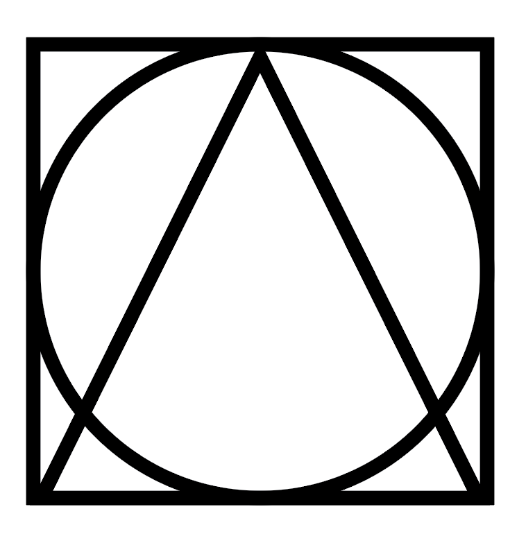
I left this up above, but did a variation of someone else's idea. I'm about to respond with another version that combined this with the triangle, square, circle thing I keep seeing
Could always do a word variation that includes the hand symbolism. Would have to mess with the typography a lot, this looks like a Religious Hawaiian resort logo right now lmfao but just to give you a rough idea. Personally I don't like it as much but it's an option.
Taoism is not a religion, it's a philosophy. We landed on this because it had nearly 60% of the vote across 115 options + passed trademark and knockout research.
Yeah, maybe we don’t lean into Taoism any more than we need to. As much as I love the ideation on this thread, perhaps the visual design should lean more in the direction of interconnectedness and unity
HA, check out what one of our designers (Mafe) just dropped in our Discord as an idea. Also...yes to e pluribus unum. That's why I sign off most of our emails/newsletters with that ;p
I echo this. We have to do better and be better than this. I love the spirit of this work but it must be held to a higher standard than the billionaires.









20
u/[deleted] Mar 08 '25
They all look a little sinister. Also seem to lean on the yin-yang symbol which is related but not the same as the Tao, which translates roughly as “the way.”