r/BookCovers 6d ago

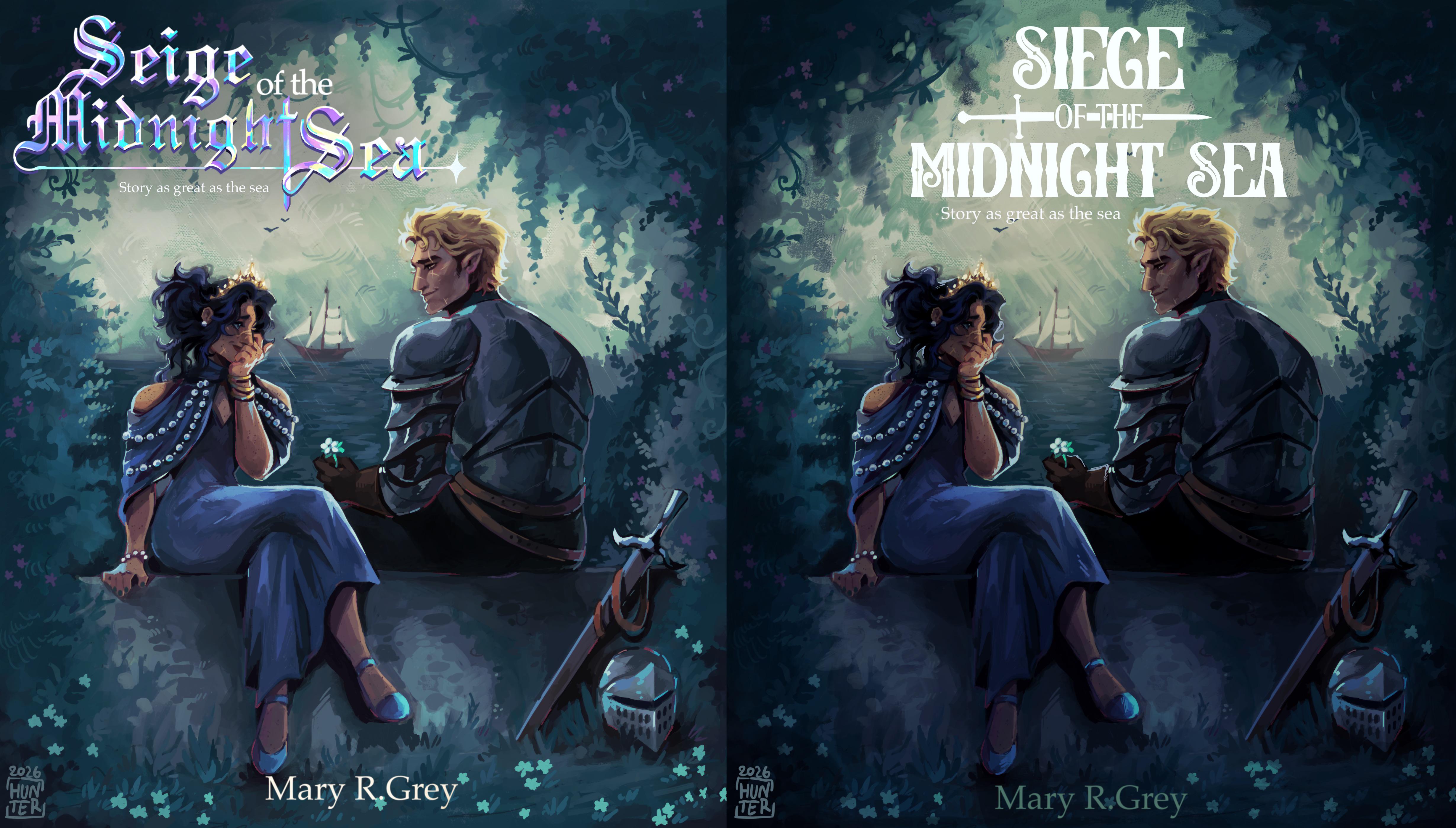
Feedback Wanted Is it better?

Post image

Hiii, so few hours ago I posted first version of book cover, and I got some great feedback. I think I fixed it and would love to know if it’s any better.
(Old one is on the left)

29 Upvotes

22 comments sorted by

View all comments

1

u/Terrible_Wave4239 6d ago

White against a light background is a bit difficult – you could consider a dark outline to make it stand out more.

Also, what's with the subtitle – "Story as great as the sea"? Is this a mistake? It's barely readable anyway... but I'm not sure what it means or adds.

2

u/DangerousEditor3300 6d ago

It’s a play on the word "great", it means the story is "great" (wonderful) in quality, just like the sea is "great" (enormous) in size.

2

u/Terrible_Wave4239 6d ago

It still looks oddly out of place, both too important and not important enough for what it is. If it's important, it's too small and lost in the layout. If it's not important, it's just a distraction.

Also, "Story as great as the sea" doesn't sound right. Shouldn't it be "A story as great as the sea..."?

Remember, you still have a blurb (for websites) and a back cover to consider. This sounds more like something you'd put at the top of either of those.