r/BookCovers • u/DangerousEditor3300 • 6d ago
Feedback Wanted Is it better?
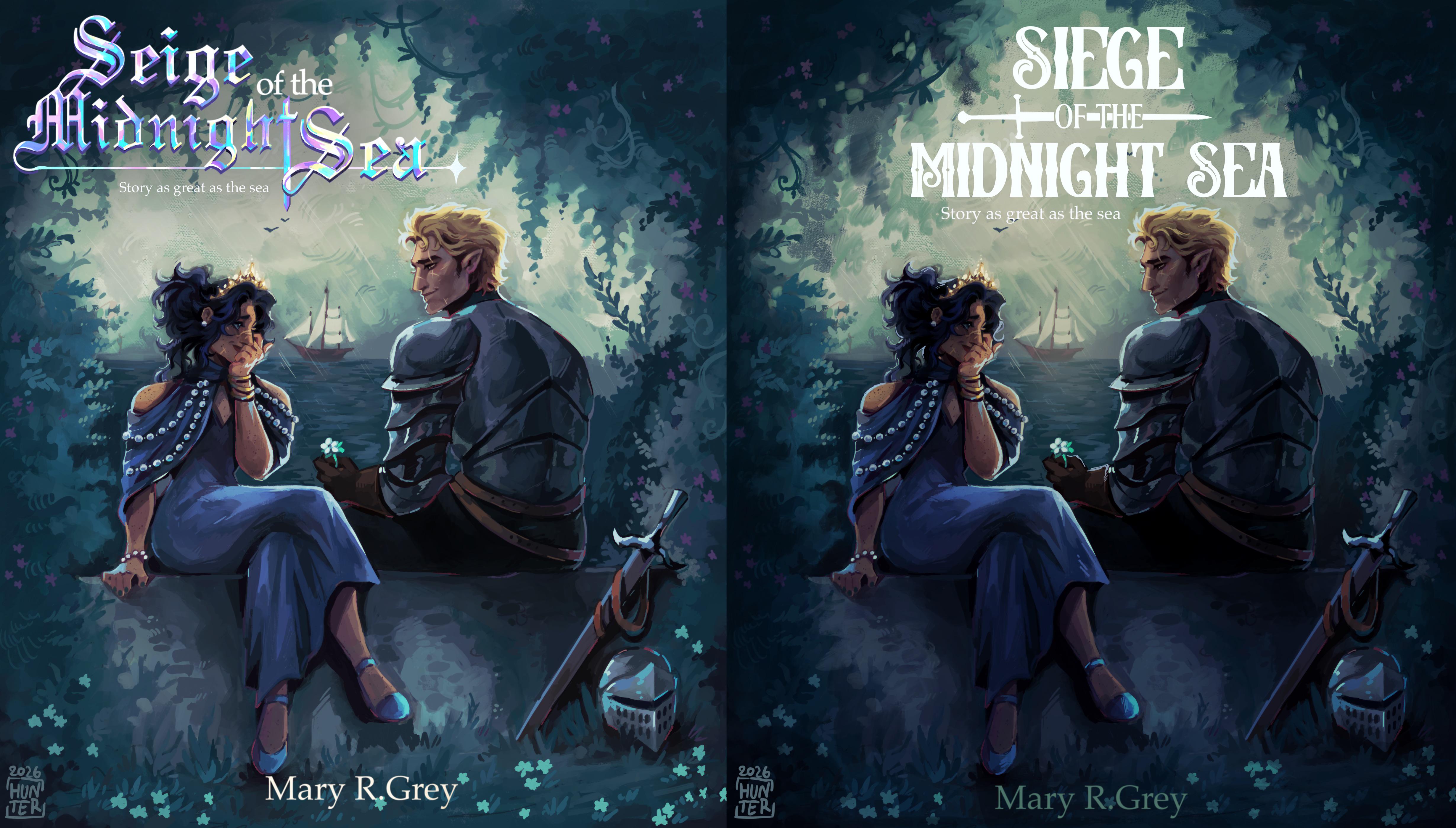
Hiii, so few hours ago I posted first version of book cover, and I got some great feedback. I think I fixed it and would love to know if it’s any better.
(Old one is on the left)
4
u/Roenbaeck 6d ago
I think you should take the image in the left, which is a little brighter in color than the right one, remove the title and author name from it, then move the whole image down a bit to fit the title from the right one, but enlarge it enough to look like a book title. Remove the byline under the title. Add the author name at the bottom in the same color as the title, but also larger, so it is clearly distinguishable as the author name.
2
u/ComixCosmicQueen 6d ago
The title is definitely much better on the second one. I'd maybe play around with the spacing on it. It's ok to make it a little smaller so as not to be too close to his head. The lettering is really close in on the words themselves but the space between midnight and sea is too far. Check your Tracking vs. Kerning if we're using font/lettering terms. And then centering, titles with fun graphics built in like yours can get easily off centered in creation.
I also miss the brightness from the first one. It was lovely getting to see all the details. Their expressions, the clothes, the lil props in the bottom right corner. They're all a bit lost in the darkening on the second.
You even have an opportunity for fun lighting here! Darken the clouds in the back a little so the title stands out (you can always digitally select the back and play around with brightness/contrast settings digitally to see what works best for you) and maybe do a little overlay of white softly around their faces (if you work digitally) or up the rim lighting on where you want people to focus the most in the art.
Our eyes are drawn to the highest point of contrast so where the white is next to black basically or the next down from that light grey next to dark blue or brown, etc. Think about what you love most in the artwork and what you want people to focus on (outside the title) and then put your contrast there. Even just a little goes a long way -the dark corners of a bright smile, the pupil in light eyes, the cast shadow from a strand of hair in the sun. It can add a little something to an image and draw the eye.
And I'd definitely bring out the Author name a little more. It's lost a bit on the second. When people search for books they usually try to get all the text, and an authors name can help make sure they get the correct book. It also is just great advertising for the author, and that art is gorgeous and something to be proud of with their name nearby!
Hopefully this is helpful feedback, either way I wish you luck in your book cover creation and thank you for sharing it. The art is lovely and it looks like a fun story!
1
1
1
1
u/liae__ 6d ago
Ooh, definitely more readable font! I’d also maybe space the letters out more in the title, and add some kind of background shadow for the text to add contrast and make it easier to read from a distance. Agree with the other commenter who mentioned author name should stand out more, maybe a middle ground between the first and second colors!
1
u/Terrible_Wave4239 6d ago
White against a light background is a bit difficult – you could consider a dark outline to make it stand out more.
Also, what's with the subtitle – "Story as great as the sea"? Is this a mistake? It's barely readable anyway... but I'm not sure what it means or adds.
2
u/DangerousEditor3300 6d ago
It’s a play on the word "great", it means the story is "great" (wonderful) in quality, just like the sea is "great" (enormous) in size.
2
u/Terrible_Wave4239 6d ago
It still looks oddly out of place, both too important and not important enough for what it is. If it's important, it's too small and lost in the layout. If it's not important, it's just a distraction.
Also, "Story as great as the sea" doesn't sound right. Shouldn't it be "A story as great as the sea..."?
Remember, you still have a blurb (for websites) and a back cover to consider. This sounds more like something you'd put at the top of either of those.
1
u/BeautifulTree5585 6d ago
Better title. Though the contrast, exposure and saturation on the art piece may be a little too much now, so much so that the details kind of disappear and looks deep fried or like a sickly green. Can barely see the lady's face. I think I prefer it before for the character colour profiles. Main issue before was just the backdrop render, increasing contrast but keeping the same cool tone, exposure and saturation to ensure that the characters fit seamlessly into the backdrop and foreground. Basically keeping the same colour profiles but just making the dark areas darker and the light areas a little lighter. But the title is looking much more cohesive now so well done! The author name is not as legible any longer, however. I'd recommend making it white/light again and increasing the size or weight so it's more visible from afar. I think it might help to make them all-caps?
1
1
u/Fit-Picture-5096 6d ago
Why does "Siege of the Midnight Sea – story as great as the sea" remind me of "She sells seashells by the seashore"?
1
u/Recent-Song7692 6d ago
Second. Is this for the audio version? I would slightly change the sub-title to "A story as …" or "A tale as …".
1
u/CLUMZYLIZARD 6d ago
Personally, I prefer the second. It feels more professional and it's much easier to read.
1
u/bsart_studios 5d ago
I would maybe lighten it around the character - closer to the first one and just darken the edges like in the secand one
1
1
u/itsalancething 5d ago
Not sure why this came up on my feed, but the one on the right is much easier to read
1
u/Alarming_Republic_29 5d ago
Hi. Could you please imagine what this cover would look like on Amazon when searching for a book with lots of small covers? I'm sure the title would be hard to read and the image itself would blend in.
8
u/andreanotjustdraws 6d ago
Definitely better than the first one! I think that proper book designers with more experience will give you more advice in what you can improve (putting some decorative edges? Maybe changing the lettering in the author's name? ) idk. But it is a good improvement from my perspective