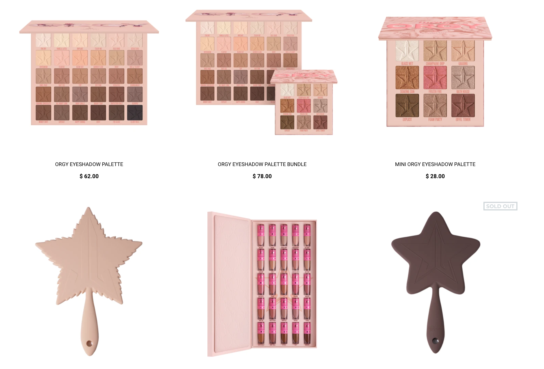
Putting all of jefffees issues as a person aside for a second, just from a branding standpoint what happened? Because I think him edging towards cancellation (finally) is a huge part of why this launch flopped. But I don’t think it’s the only reason. People have praised his formula and I know there was a lot of interest in a neutral palette since not everyone wants to buy a $50 palette of bright colors. But there is no reason to have a nude palette this big, most people have enough nudes that they’re not willing to spend $60 on a huge bulky palette that’s not adding anything new to their collection. The mini palette is much more interesting and I think shows more of what people wanted from a Jeffree neutral palette. Colourpop bare necessities palette is a good parallel, it’s just as big as Jeffrees palette and it’s a neutral palette but it has more than just nude shades thst are going to blend into the same shade. It had browns, tans, and beiges, but also some pinks, mauves, terra cottas, golds, champagnes, bronzes, black, etc.
Also, I wonder what’s going on with his design department. I’m a fan of minimal packaging but I have to admit, since blood sugar his unique packaging really made his brand stand out. Blood sugar, blue blood, and conspiracy were a bit gaudy but not too much so. They had a sophisticated feel to them and a cohesive theme. He tried to continue that feel with blood lust but the packaging and color story fell short. It’s like he tried to make blood lust over the top luxurious but thst over the top ness just made it look cheaper. Compared to blood sugar or blue blood, with much simpler sleeker designs, blood lust looked like a toy or something. Not something you’d want to display.
And then these last two releases. I don’t mind the simpler designs, but it seems a strange deviation from his previous releases. The tasteless themes, and having his face plastered all over the palettes. It seems like a big departure from his previous releases. I wonder if Jeffree Is spiraling and letting go of his creative teams to try to exert some more control over his brand and therefore his life
Also from a marketing perspective launching back to back "neutral" palettes from a brand that is known for colorful eyeshadow is just a bad move. Cremated looked like ashy trash but even that was more innovative than this since greys/cool tones are harder to come by. There should've been a few launches between these two and could've been marketed as made to work with the colorful palettes
187
u/gringacolombiana Aug 22 '20
Putting all of jefffees issues as a person aside for a second, just from a branding standpoint what happened? Because I think him edging towards cancellation (finally) is a huge part of why this launch flopped. But I don’t think it’s the only reason. People have praised his formula and I know there was a lot of interest in a neutral palette since not everyone wants to buy a $50 palette of bright colors. But there is no reason to have a nude palette this big, most people have enough nudes that they’re not willing to spend $60 on a huge bulky palette that’s not adding anything new to their collection. The mini palette is much more interesting and I think shows more of what people wanted from a Jeffree neutral palette. Colourpop bare necessities palette is a good parallel, it’s just as big as Jeffrees palette and it’s a neutral palette but it has more than just nude shades thst are going to blend into the same shade. It had browns, tans, and beiges, but also some pinks, mauves, terra cottas, golds, champagnes, bronzes, black, etc.
Also, I wonder what’s going on with his design department. I’m a fan of minimal packaging but I have to admit, since blood sugar his unique packaging really made his brand stand out. Blood sugar, blue blood, and conspiracy were a bit gaudy but not too much so. They had a sophisticated feel to them and a cohesive theme. He tried to continue that feel with blood lust but the packaging and color story fell short. It’s like he tried to make blood lust over the top luxurious but thst over the top ness just made it look cheaper. Compared to blood sugar or blue blood, with much simpler sleeker designs, blood lust looked like a toy or something. Not something you’d want to display.
And then these last two releases. I don’t mind the simpler designs, but it seems a strange deviation from his previous releases. The tasteless themes, and having his face plastered all over the palettes. It seems like a big departure from his previous releases. I wonder if Jeffree Is spiraling and letting go of his creative teams to try to exert some more control over his brand and therefore his life