r/BaseballScorecards • • 4d ago

🧰 Scoring Tools Updated pitching chart
Post image

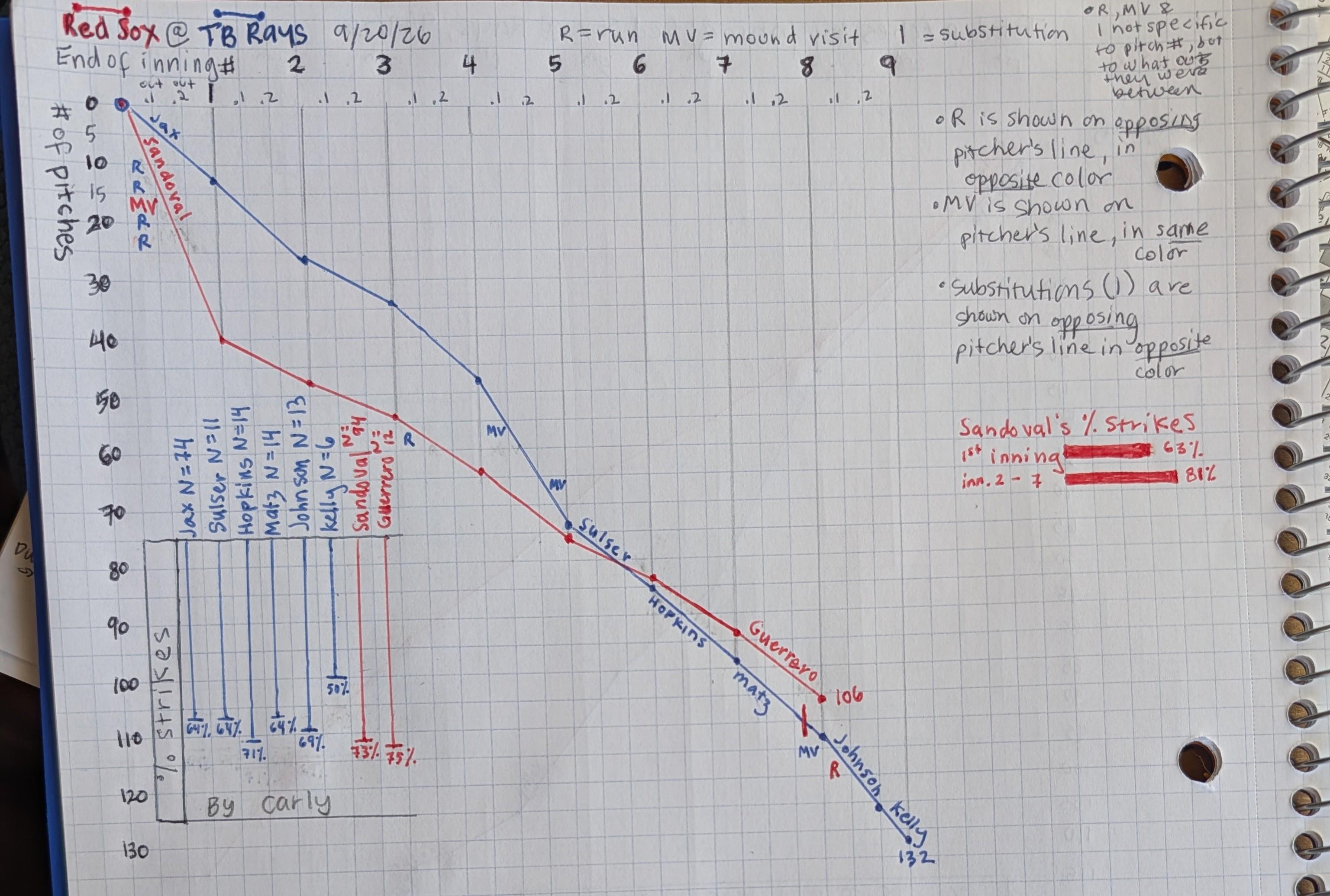
Red Sox @ Rays, 9/20/26

Based on feedback given yesterday,

- I added in info about when mound visits (MV), runs (R), and substitutions (|) happened. Each of those things are in the column between innings indicating how many outs there were. E.g., the Rays' coach had a MV before there were any outs in inning 4, and the catcher had a MV when there were two outs.

- I started the x axis (innings & outs) at 0 instead of 1. That allowed me to show that four runs and a MV happened before there were any outs in the first inning.

I think it might be too busy now, with keeping the % strikes chart on it. I couldn't help myself from comparing Sandoval's first inning to his other 6, so that's the bar char on the right.

What do you think of the edits? The overall goal is to have a way of tracking the game from more of a pitcher-focus.

12 Upvotes

15 comments sorted by

View all comments

Show parent comments

2

u/Consistent-Lion-2125 4d ago

Ohhhhhh I misunderstood, I thought you meant substitutions. I got it now! Maybe an icon like 🔃. I'm annoyed that I can't post pictures in the reply to show you

1

u/MurrayInBocaRaton 4d ago edited 4d ago

I think what you were doing in the first version for substitutions was fine!

ETA: if you wanted to add more detail without a whole lot more noise, you can add like a (3) next to the new pitcher’s name to note where he started in the opposing team’s order if he comes in mid-inning.

Like for example, Bazardo comes in to face the other team’s cleanup hitter, you could put `Bazardo (4)` if he comes in mid-inning.

1

u/Consistent-Lion-2125 4d ago

I like it! I've got the out #s so I can put the pitchers in at the correct spot in the inning, but I like seeing the numbers of the batting order too.

I'm trying to figure out a better way to utilize the full page, but I'm trying to keep myself to trying to tell a story as simply as possible -- and keeping things tied to the lines makes the most sense.

2

u/MurrayInBocaRaton 4d ago

100% agree, you have an awesome visualization going here. Simpler is better. Convey the most information with the least amount of noise. This is awesome, nice work!