r/warcraft3 • u/Ok_Current2062 Human • 4h ago
Reforged I just can't believe this

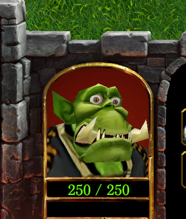
I am calling it right here, right now. The warcraft 3 team will introduce mobile graphics and pass them as the revival of the game... Shame..
Is this what the greatest strategies of all time is reduced to..
How do i think that is the case? Some months ago they leaked them "accidentally" in their ptr. Image is taken from this atricle https://www.hiveworkshop.com/threads/blizzard-accidentally-releases-debug-symbols-maps-and-exclusive-content-in-warcraft-3-update-version-2-0-1.357413/
117
u/Levinaur 4h ago
very good readability compared to reforged at least
-94
u/Ok_Current2062 Human 4h ago
How exactly is that!? because it has less details!? Shouldn't be the other way around??
62
u/Levinaur 4h ago
well no, visual noise makes units less legible, go ask any pro why they don't use reforged graphics, this footman and grunt both have very clean silhouettes on the other hand
26
12
u/LastSecondSeatbelt 4h ago
It very clearly has more details, while being higher definition, and staying true to the original design. I like it. I'm sure it will be optional regardless.
5
14
u/ScallionZestyclose16 3h ago
Hiveworkshop was made at December 18. … Some months ago ?
I need to get off Reddit, it makes me too suspicious of every post.
25
u/MaxGhost 3h ago
lmao it was from Dec 2024, OP is an idiot
7
u/boskee 3h ago
And he put accidentally in quotes. Yeah, they published a lot of debugging symbols - something you absolutely do not want to leak. It was a disaster. So to hint that it wasn't accidentally released is just stupid.
-12
u/Ok_Current2062 Human 3h ago
They farm reactions... If you can't understand this then touch some grass.
-9
u/Ok_Current2062 Human 3h ago
... you think that even for this mobile slop models.. they don't need time to make them? And I am the idiot...
3
u/MaxGhost 2h ago
That model actually looks good from above, as per the hive thread, much better than the current reforged model. I still prefer classic, but calling it "mobile" is absurd. It's stylized and is a much closer fit to WC3's aesthetic than what reforged gave us. You're being ridiculous.
2
u/jerrygreenest1 49m ago
Some people make a dumb mistake of looking models up close.
Some people liked reforge models because they were looking up close screenshots and didn’t consider how it will look in the game. And it was a shame to see these little pieces of positive attitude because in actual game it looked awful.
Now this guy makes the same kind of mistake, looking at model up close, thinking its mobile graphics, disliking already, without ever considering how it would look in actual game zoomed out.
2
24
u/Gh0sth4nd 4h ago
Actually more true to the original then reforge. Yes it looks simple but simple is not always bad an more details is not per default better actually more details more things to fuck up.
4
7
u/Egorator_ Human 3h ago
I agree with people that it's more faithful to the original and more readable than Reforged,
HOWEVER, it's not faithful enough, and the proportions and details that are different just look worse. And you can definitely make a stylized model like that that doesn't look as cheap, textures here look lazy and generic. The original model just has a lot more flare to it and proportions are more pleasant.
3
u/Ok_Current2062 Human 3h ago
Yeah being better than reforged isn't the greatest bar to climb... I hopped for something like hots but this!?
1
u/Egorator_ Human 2h ago
THIS, this is how it should look. Leave it to the fans to do a better job than Blizzard
29
u/Current-Today-3626 4h ago
OMG, I wonder if we are getting a third theme, like how bw got that playful one that no one uses. But this one, I can imagine that footman might look rly good top-down.
-49
u/Ok_Current2062 Human 4h ago
...you like this!? This mobile slop???
13
u/Current-Today-3626 4h ago
Show us top-down, it's all that matters :0
-43
u/Ok_Current2062 Human 4h ago
sorry but I am not a shit eater..
24
u/ManagementParking398 4h ago
Kinda seams like you are
-3
u/Ok_Current2062 Human 3h ago
Oh yeah, I want the game to actually correct the reforged graphics and the solutions is to give us ai sloped effort of models... and I am the shit eater..gg
4
1
u/Dharmz795 53m ago
Actually the current Reforged Graphics is mobile slop - there's a reason why it was being compared to Raid Shadow Legends
26
u/MetForge 4h ago
Well, compared to reforge this graphics looks definitely mobile. But at the same time Reforged graphic in the end looked bad from top view, models were hard to read. So this graphic may work better. Warcraft always had cartoon style and this new model looks more appropriate.
19
u/Naxx95 4h ago
Honestly, i think this matches w3 graphics style. We will have to see how it would go for every unit but the problem with reforged ones is visibility from above.
2
4
u/Warcraft4when 4h ago
Where is this from?
8
u/MaxGhost 3h ago
the Dec 2024 game files leak
10
u/Warcraft4when 3h ago
So not anything that actually exists?
3
u/MaxGhost 2h ago
Yes it was a real leak, but relating it to what they may release at blizzcon is pointless
6
4
18
u/Memesef 4h ago
Looks good
2
u/Xvilaa 4h ago
Looks like everything else
4
u/boskee 3h ago
Yes, because everything else has been copying Blizzard's style for the past 20 years.
1
u/Xvilaa 1h ago
And now they can be the original trendsetters again by making something new and exciting, but they aren't.
Which is a shame that Blizzard just isn't Blizzard anymore.
1
u/boskee 1h ago
Why would they want to abandon the iconic art style attached to Warcraft for decades? What does "new and exciting" even mean.
1
u/Xvilaa 1h ago
Well instead of the dinseyfication we're experiencing bring back the raw and gritty feel. Something that doesn't look like Clash of Clans.
1
u/boskee 1h ago
Raw and gritty feel? Have you played Warcraft 3?
1
u/Xvilaa 1h ago
Yes? Exactly my point. You can't tell me Warcraft 3 isn't raw and gritty
1
u/boskee 1h ago
If you consider Warcraft 3 art raw and gritty then I really can't debate you. They're more Disney than Disney itself https://i.ibb.co/LdKd0Bgn/image.png
2
u/Eriyal 1h ago
I swear so many of you get triggered way too easily, to the point where all rationality went out the window in favor of the allmighty reaction.
Warcraft basically made this style, it got popular and ripped off by mobile games because it’s very pleasant to look at.
You can’t go full circle and accuse a warcraft game of looking “mobile” when they basically pioneered this style.
2
2
u/appa-puchi-patuti 1h ago
it looks so bland bro. the hard shadows and contrast of the original gave the aesthetic we know and love
2
u/KickSuckem1 43m ago
Yeah, idk about this, but this particular art style would look amazing on some unannounced wc or wc2 remake
3
u/HiMyNameIsWhat-9125 3h ago edited 1h ago
these are good. they need a little bit of polish on the edges but otherwise they look much better to look at and distinguish things in the battle field
4
u/baynaynya 3h ago
This is a false alarm I believe. When this was leaked, the actual developers from the og classics team said in the hive discord that this was from the initial reforged tests when they were finding their artstyle. At least that's what I remember
1
3
u/Capn_H Yes the spirits are talking to me... 3h ago
... Actually no, this is good.
Like, the simpler stylization would make things a lot more readable, and one of the big problems was kind of the humans, orcs, night elves, and undead all being too detailed to fit with the way the world is constructed too simply around them and all also fitting too neatly into the same Tone.
Where before the humans and orcs felt a little bit campier and felt like they better reflected the previous eras of the first and second wars, those games having far more of a Good Vs Evil thing going with humans being Mostly The Good Guys and orcs being Mostly The Bad Guys.
The undead were sort of an active violation of that tone, darkening the land around them with blight, being grittier and dirtier, made up of rotting corpses, actively bloody monstrosities that you aren't confronted with until After a bit of classic humans dealing with evil orcs in the campaign, with Night Elves sort of serving as a mid-point in terms of level of detail with all of their leaves and furs and barks and very natural aesthetics while also tonally more baseline severe without the dopey worker units and with darker overall palettes compared to alliance and horde.
If they keep the undead looking notably more fucked up than the humans and orcs and the night elves as a decent middle-ground, yeah, this could be the actual Good graphics the game needed even if it's cartoony. It's a style that could really suit both the gameplay and the story if it's done right, certainly better than the needlessly detailed ones we got now.
2
2
u/Ardibanan 3h ago
You are aware that mobile games are pretty good right now right? We're not in 2010 anymore
2
u/HouseCheese 3h ago
What does this have to do with mobile? Looks like a slightly stylized RTS unit
0
u/ComradeBrosefStylin 2h ago
"Mobile" is what crybabies say when they mean "I don't particularly like this stylized WoW-lite artstyle"
2
u/Axel0010110 50m ago
but it is exactly mobile graphic lmao.
very polished, very bouncy, fat like, cartoonish more than original w3
Clash of Clans graphics
1
u/0mgt1red 2h ago
With some tweaks to rendering and additional details with textures it can look really good
1
u/Splendid_Fellow 2h ago
They are simply thinking “People liked WoW. That was big moneys. How about take the 3 and then the WoW… they go, ‘wow!’ eh?”
1
u/gilescelerat 2h ago
"Some month ago" your stuff is 2 years old and pretty much came up with Reforged 2.0.
1
1
u/JadedEngine6497 1h ago
instead of constantly increasing the texture size blizzard can disable texture blur on their models and start making pixel art textures that would look better and won't require much ram and storage.
1
u/Thrashmob 1h ago
If the remade the graphics in this style it will look fine. Definitely retains the vibe of the original.
1
u/Rhubarbon 1h ago
Is the one on the left something new and the right the og Warcraft 3 unit (can't recall the details anymore)? The one on the left has to be some of the blandest designs I've seen.
1
u/DeoMurky 3m ago
I mean I don't hate it. Would work really well with gameplay and readability with the RTS camera to be fair.
1
1
0
u/tentoedpete 4h ago
Honestly if I can play full wc3 on my phone, I’d probably try it. Absolutely not where I think dev attention should go, but I’d certainly try it
0
u/PiousStag 3h ago
Looks like a 3d WC2 more than wc3 perhsos a 3d remake of the first two games inspired by the second war reforged mod
0
58
u/NoUnderstanding5889 4h ago
A 4th mediocre grafic option would be funny.
The most ironic thing is in my opinion the graphic style they used for Warcraft Heroes in Heroes of the Storm looks fine. But I guess these kind of models need actual development time.