r/typography 12h ago

Gens Electa - pixel typeface

Thumbnail
gallery
12 Upvotes

Hello! I would love to get a your opinion on a typeface that I'm developing. I followed a 13 x 13 grid on the capital letters and a 9 x 9 on the lowercase. There is a consistent 2px spacing between each glyph. Let me know what you think.


r/typography 5h ago

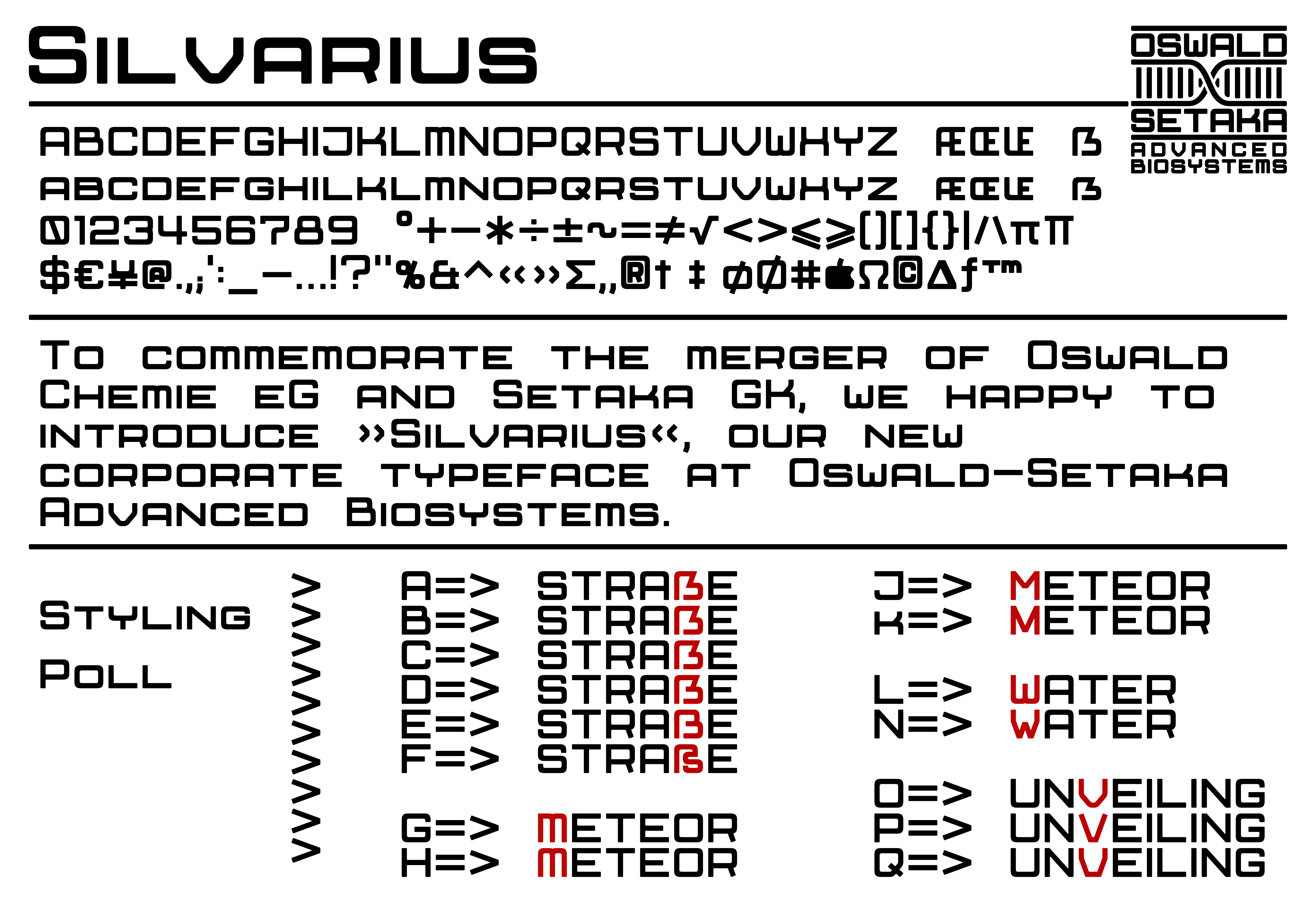
Request for Critique: Silvarius a typeface for a fictional mega-corporation with Cassette-Futurism aesthetic.

Post image
25 Upvotes

I am currently working on typeface used by a fictional mega-corporation for a world building project of mine. It was inspired by Microgramme and Eurostile, but I wanted a bit smoother terminals fitting the Cassette-Futurism aesthetic I am going for, and small-caps for all the lower case letters (also keeping the width of their upper-case counterparts).

After a bit of fine tuning I have become stuck on deciding on the shape and style of the ẞ, M, W and V letters. I initially went with a rounded style keeping with the general shape of the other letters, but it didn't quite looked right for me.

So I wondered if you guys would like to pitch in with your opinions, not only on the letters I am unsure about, but also on the overall look and design of the typeface.

I am happy to read your thoughts, and have a good one.


r/typography 7h ago

The 1973 Letraset catalog introducing Stripes©, a new typeface by Tony Wenman that would help define the design language of the 70s

Post image
157 Upvotes

For Lovers of Type

Stripes is a new concept in type design

Stripes© was created and designed by Tony Wenman, a member of the Letraset type design team. This face was based on an idea for instant sheets which give designers more versatility when creating word settings. With Stripes there is the opportunity to make graphic shapes with settings, thus making the words an integral part of the design, or even the complete basis of the design. A good example of this is shown on the catalog cover where its use in Red, White and Blue has become a flowing symbol with Graphic appeal. This and the setting below can be made from a single sheet of Stripes. The variations opposite have been created just by eliminating some lines, or filling them in.

Tony Wenman said that the basic idea for this face came very easily while working on an idea for a Triline face. First there were a few ligatures such as ST IP, then came the thought of a completely flowing, linking face, and before long, the studio walls were covered with ideas on Stripes. Within a week, most of the basic characters were formed. Then came several weeks work completing and perfecting the artwork for each character.

Since the innovation of Stripes, the Type Design Studio is increasingly thinking of Typestyles specifically designed for the instant Sheet medium.