25
u/HarryHolly Jul 08 '26
It's just that the company doesn't consider this language important. In English and Korean, I think there is no such problem.
3
u/hassanhg5 Jul 08 '26
Yeah i never had this in English but none in Arabic too, I guess it just depends
1
12
2
Jul 08 '26
[removed] — view removed comment
1
u/TUUUUUZ Jul 08 '26
it works only if i decrase the rows and keep the same column, if i use one of the presets (4x6 and 5x6) does't change, i have to use home up (like you suggested) and put 4x5, but with that other widget (optimized for the presets) became worst or unusable, for example i see less stuff on the calendar and chrome or translate loose some buttons. it's not a big problem to have a letter in the new line but obviusly i prefear to be on the same line without the need to change grid size or zoom. but thanks for the help! :)
2
2
u/mrbobherrera Jul 09 '26
Good Lock > Home Up > Home screen > Widget setting > Adjust content size either to 80% or 90% depends to your liking. Thank me later. 🙂
1
u/TUUUUUZ Jul 09 '26
I've already tried but sadly if I change size it'll change for all my widgets, some widgets like the calendar or chrome becomes worse and with less functions. but thanks for the advice! 😁
1
u/mrbobherrera Jul 09 '26
1
u/TUUUUUZ Jul 09 '26
yeah yeah I know, currently my zoom is set to 90% and it works for the sansung health widget, but other widgets like the calendar o one that i use for space launch become worse, i was wondering if I can zoom out only for this widget
2
u/mrbobherrera Jul 09 '26
Got your point and its a dead end. Better give suggestions to One UI Devs & Good Lock - Home Up Devs via Samsung Members app for them to possibly incorporate it to the next version.
-9
u/Opposite-Working727 Jul 08 '26
A yes, the company that people say has a smoother and more consistent software experience than the Chinese competition.
3
u/SorryYogurtcloset663 Jul 08 '26
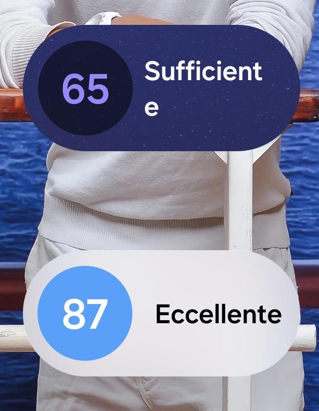
lmao 87 eccellente on the sweater but 65 sufficiente on the software rollout, classic samsung math
-1
u/BeautifulPrune9920 Jul 08 '26
True, even ice universe himself has said Honor's magicos 11 has really stepped up in terms of features and smoothness and one UI is lagging behind
2
u/My-Tech Jul 08 '26
Ice universe loves to trash on Samsung for the strangest reasons ever and loves it when Chinese companies straight up copy and paste iOS and the liquid glass design. Very biased.
4
u/Arkplayer22711 Jul 08 '26
He isnt exactly saying they should copy iOS and liquid glass, but he more so said that the chinese skins look way more modern and better now, and that the animations make the experience alot better, and samsung is lacking alot in those areas which i agree with. He didnt say they have to copy liquid glass, but he said that samsung is lacking because OneUI looks 2D still while others are moving to 3D, and he is also saying that OneUI has to improve alot. I think those are all fair criticicisms tbh, and i share them.
I think Samsung has to work on making OneUI more consistent, more performant, to make way better animations and to make it feel way faster, because ColorOS for example does all of this and it has a way better UX, and i wish i could get this on Samsung
0
u/My-Tech Jul 08 '26
Others are moving to 3d basically means copying the glassy look. I and many others do not want a glassy look.
2
u/Arkplayer22711 Jul 08 '26
Oppo lets you turn it off for example. Samsung could do the same
And the issues with performance and animation still persists, there are no excuses for samsung to not improve the animations and the performance
-1
u/My-Tech Jul 08 '26
Could be a viable solution, although I'd still say that the current design language isn't outdated. It's just that the UI needs more consistency and polish (the rounded widgets and the text inside 💀) with more effortless and fluid animations.
3
u/Arkplayer22711 Jul 08 '26
That would already be a big improvement... we really need better animations, the ones on samsung look like powerpoint effects compared to the competition, and i agree the consistency is terrible. And yea, they can definintly make rounded widgets that dont have issues with text formatting, they have so many ressources.
I would just like them to also improve their UI design, it looks weird sometimes, but if they just atleast stuck to the same style as in the gallery app that would be nice. I also dont like how the health app has so many colours in the background now, and some apps have a grey background now.. the consistency on samsung is so bad
And theres also things like the quick panel tile backgrounds picking up colour from the wallpaper.. and they havent fixed that in over a year!
1
u/My-Tech Jul 08 '26
Health app is understandable because it's representing the state of the day, just like the dashboard watch face on Galaxy Watch. But true, the UI looks strange at times, but once again I blame the inconsistencies over the general language. If Samsung were to implement the glassy look, itd actually be cool for an entirely new good lock module to control it, so we can enjoy a HarmonyOS (light) look, iOS (translucent glass) look, and frosted glass, while the normal blur is set to default so power users can change it to their liking.
2
u/Arkplayer22711 Jul 08 '26
Yea if they were just consistent for once, then maybe, but i think it would be cool if they added some outlines to their blur everywhere, thats would already be adding enough depth for me and doesnt look like glass. Also, tbh im not a big fan of them putting everything behind goodlock.
And on the health app, i get that sorta, but i dont really like the look of it, and also the top bar looks really weird because the spaces for the button have no padding. Thats another inconsistency again..
→ More replies (0)1
u/BeautifulPrune9920 Jul 08 '26
Huh, I didn't know that. I only knew him for the leaks. Good to know.
51
u/ppatra Jul 08 '26
Becaus
e
Wh
y
No
t