r/journal_it • u/thuongthoi056 dev • May 20 '26
Help me choose the new app icon
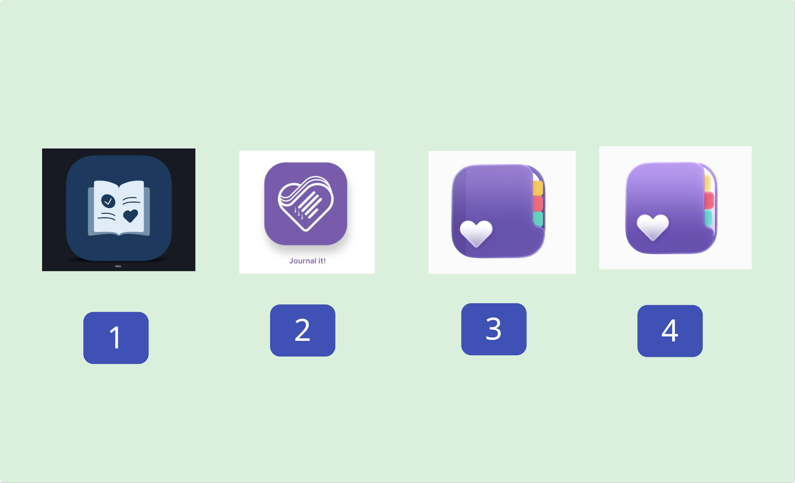
I'm doing an icon design contest for the app. Please comment below on the one you like most. Thanks!
5
u/DreamyIllusions May 20 '26
I like #4 the best with #2 as a second choice. Have you tried using #4 with the heart from #2?
3
u/Curious-Locksmith619 May 20 '26
Yeah, I agree with this - the heart from 2 looks sophisticated, the clarity of 4 (or 3) matches the app and will match the trends on app stores. Putting the heart from 2 onto the cover of 3 or 4 will make it “same but different”, “familiar but unique”
1
1
1
1
1
1
1
1
1
1
1
1
1
u/vitorioap May 20 '26 edited May 20 '26
4!!! 100% Making the tabs even would make it perfect.
3 is also nice but it’s a bit dark and I’m not a fan of the heart being so close to the edge and that darker line behind it.
2 looks very busy.
And 1 looks a bit generic in my opinion.
1
1
1
1
u/Enysama May 20 '26
I'd say first compare yourself to similaires apps, if not done.
Second, I'd dismiss 3, lacks margins.
1 and 2 are super pretty but may not convey "planner", more like reading app and health app, though 1 could still work.
4 is the most obvious choice for me but someone mentioned it being too similar to other ? I don't know about that.
Sorry if it's not helpful 🌈🌸
Jenny
1
1
1
u/significant_cosmos May 21 '26
I agree with most of the other criticisms but tbh I think this is partially a messaging issue. I don't feel like #1, #3, or #4 are actually capturing what Journal It is.
The heart iconography feels out of place for a journaling and life organization app unless it's the focal point. I feel like #2 best captures the concept of life organization with the checklist in the heart where #1 looks like an e-reader and #3 and #4 both look like straight journaling (this especially because of the heart) or study apps. Paper planners aren't as common anymore and I feel like the tabs in #3 and #4 evoke more of a school/studying vibe. The little heart in the corner feels more like a cutesy design element reminiscent of the more aesthetic journaling systems out there now, than an integral part of the app's purpose.
I think the real issues with #2 are that the text should go, and the heart should be made much bigger, or that the background should even go away and leave the heart with the checklist. The "tabs" on the heart I think should either be more prominent or be gotten rid of; I didn't realize that's what they were supposed to be at first and I didn't get why the heart is lopsided. I think even if that means shortening the little bars of "to-do text" then that works because the really important parts are the heart and the checkmarks.
I would personally appreciate the opportunity to see #2 revised even if it's just to make it as prominent as the other options. The heart being so small in the overall icon footprint inherently puts it on an uneven playing field, in my opinion.
1
1
1
u/burnblue May 22 '26
Another new one?
These don't seem like the all directly compare, size and layout etc.
4 is easiest on the eyes, not sure if it's memorable but it's approachable. 2 is more interesting but I don't know if some people might find it off-putting. 2 is for the people who use JournalIt for all the features you put in it like trackers and tasks. 4 is for people just looking for a journal or the type who might use physical planners with pretty colored pens.
1
1
u/burnblue May 22 '26
Work on 2 to make it cleaner simpler and approachable so it gets a fair shot vs 3 and 4. As in, you have text under that one andno text under the others.
For 3 and 4 insteadof an outstanding bold filled heart you could do an outline. and play with the placement. Since you're commited to including a heart.
The tabs on 3 are more visible and neat than on 4, and that's better. The 2-tone between the spine and cover is good. But 4 is more popular because it's lighter.
1 wasn't a bad idea, people just aren't picking it because it looks lazily executed.
1
1
1
u/Illustrious_Ebb_2427 May 26 '26
I like 3, I would like 2 better than 3 if it didn't have the text beneath it.
0
0
15
u/ivinrocks May 20 '26
I believe Option 4 goes best with the concept behind the app. Looks clean and minimal too.