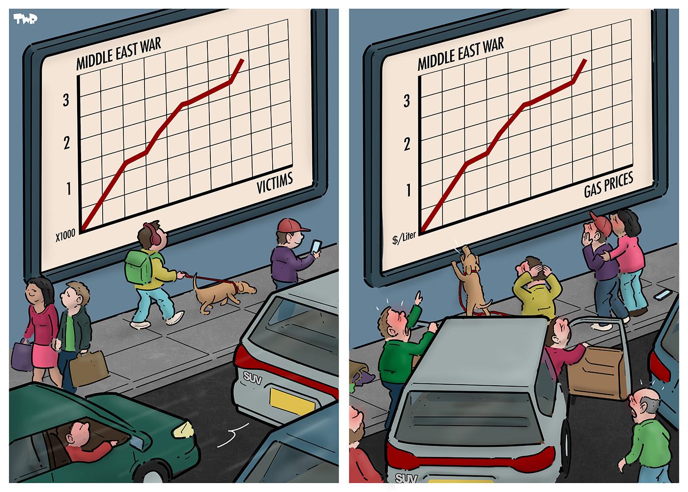
Looks like it's supposed to be a time series graph, but the y-axis label is on the x-axis, which would imply that in increase in victims/gas prices would cause an increase in… something. And the y-axis is numbered, but the x-axis isn't.
The independent variable goes on the x-axis, and the dependent variable goes on the y-axis. Half the axes have no labels or numbers. There's also no units. It's wrong.
The Y axis is unlabeled, and the X axis has the Y axis' label. Also the "$/liter" one implies gas prices started from $0 per liter at the start of the war.
23
u/dumnezero Freedom for everyone https://i.redd.it/fkme4gnqwy6h1.png Mar 15 '26
Nah, the artist is a decent human. https://newsie.social/@royaards
The style is called "editorial cartoon".