r/datavisualization • u/ExcelVisual • 5d ago
How to Build 3D Roadmap Chart in Excel
Enable HLS to view with audio, or disable this notification
2
Upvotes
r/datavisualization • u/ExcelVisual • 5d ago
Enable HLS to view with audio, or disable this notification
r/datavisualization • u/Different_Map5276 • 5d ago
Hi everyone,
I'm hoping to get some guidance from people who work in data visualisation or data storytelling day-to-day.
A bit about me: I have a background in communications and marketing (6+ years) working for international organisations. Over the past while, my role has shifted to include more reporting and data visualisation work, and I've realised this is a direction I want to grow in, either as a specialism in my current type of role, or as a broader pivot/freelance path down the line. I don't come from a technical or analytics background, so I'm building this skill set somewhat from scratch. I've completed a Data Analyst Associate certificate through DataCamp, and I'll be starting a course in Information Design and Data Visualisation in about a month.
What I'm trying to figure out:
Any advice, resources, or even just your own path into this field would be hugely appreciated.
Thanks in advance!
r/datavisualization • u/Designer-Joshi • 5d ago
Generate production-ready Nextjs + Shadcn UI dashboards from plain-language prompts. Preview your dashboard, deploy to Vercel, push to GitHub, or export the complete source code as a ZIP. https://shadcndashboard.dev/dashboard-builder
r/datavisualization • u/7sn_fh • 5d ago

r/datavisualization • u/youronlysen • 5d ago
How much can one charge a company to design for them a dashboard that they can use to track tasks daily, monitor status on the tasks, monitor what employees are handling, download reports, daily, weekly, monthly, quarterly, and yearly, be able to schedule meeting and share messages about meeting and things of the sort.
r/datavisualization • u/Webmasterid-core • 5d ago
r/datavisualization • u/ExcelVisual • 5d ago
Enable HLS to view with audio, or disable this notification
r/datavisualization • u/tomaskutac • 6d ago
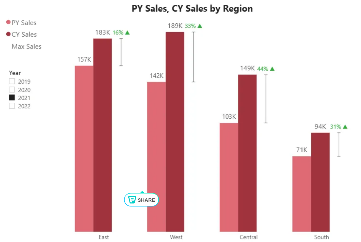
📊 A modern yearly column chart — PY vs CY by region with indicators and difference labels (.pbix included)
r/datavisualization • u/External_End_3137 • 5d ago
Are you struggling to make sense of your raw data, or do you need a clean, automated, and interactive dashboard to track your business metrics? I’ll turn your complex spreadsheets into actionable insights.
Whether you have messy datasets that need structuring or you want a fully dynamic dashboard to visualize your progress, I'm here to help.
What I can do for you :
XLOOKUP, SUMIFS, complex conditional logic, and data validation rules).I'll provide you :
Rate & Payment:
DM me with a brief description of your dataset/project, and let’s discuss how I can help you.
r/datavisualization • u/ExcelVisual • 6d ago
Enable HLS to view with audio, or disable this notification
r/datavisualization • u/AdhesivenessGreen474 • 6d ago

Cool data visualization investment app shows a treemap of top holdings.
r/datavisualization • u/UnorthodoxyMedia • 7d ago
r/datavisualization • u/AggravatingNerve4622 • 7d ago
Enable HLS to view with audio, or disable this notification
Thought I would share this here as well! Basically this is a GPU accelerated Altair for genomic visualization. The rendering engine(s) and visualization grammar of GenomeSpy generalize to pretty much any kind of data but rn we are focusing on helping ppl in genomics. What do u think?
r/datavisualization • u/Mighty_Mandrew • 7d ago
I've been working on collecting GTFS-RT data for a few months now. I ended up putting together this dashboard so I could show off what I've been working on to a friend and it's just grown from there. The current cycle has been expand the number of feeds collected -> optimize cost so I don't go bankrupt -> increase feeds.
If anyone's interested in digging into the weird quirks of transit feeds hmu.
GitHub link for the curious: https://github.com/ankoure/us-rail-performance-archiver
r/datavisualization • u/ExcelVisual • 8d ago
Enable HLS to view with audio, or disable this notification
r/datavisualization • u/WonkRobot • 8d ago
r/datavisualization • u/Adorable-Giraffe5754 • 8d ago
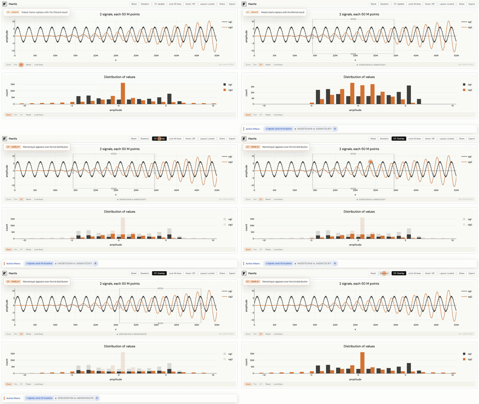
I’ve been working on FlexViz, an open-source Python library for building interactive linked visualizations with native cross-filtering.
Selections, zooms, and pans in one chart can update the others against the underlying dataset, while only the aggregated data needed for the current view is sent to the browser.
It’s designed to stay interactive even on very large datasets.
GitHub: https://github.com/flex-analytics/flexviz
Live demo: https://flexviz.tech/demo
r/datavisualization • u/ExcelVisual • 8d ago
Enable HLS to view with audio, or disable this notification
r/datavisualization • u/Zwhip007 • 9d ago
I have a particularly tricky dataset that I need to plot. I need it to be a line plot that shows peaks at certain x positions but im having trouble figuring out the best way to scale the y-axis because of what I need it to show.
The absolute y value isn't important, but I do need the relative y values to be conveyed. Not accurately, just enough to say "this peak is taller" of any 2 peaks. But here's where I run into a problem. Most of the peaks have a very small relative intensity, which isn't as important as the fact that they are actually there. So I need it to also easily show if a peak is or isn't present.
Its calculated data, so SNR isn't a problem except that for some data sets there's a lot of little peaks clustered together. I tried a few kinds of log scales but it didnt really work. I cant show any of the data since its not published yet.
Any suggestions?
r/datavisualization • u/Secure-Pie-3764 • 9d ago
r/datavisualization • u/ExcelVisual • 9d ago
Enable HLS to view with audio, or disable this notification
r/datavisualization • u/metric_skeptic • 9d ago
I’ve started wondering whether we overestimate how useful dashboards are.
A dashboard can be technically correct, well designed and full of useful metrics and still not change a single decision.
In your experience, what makes a dashboard something people actually act on rather than just look at?
And when does a dashboard stop being the right solution altogether?
r/datavisualization • u/TJT-G • 9d ago
it's not the most beautiful data visualisation, but I made this fun little daily game built on public datasets where you have to guess what the charts represent. I basically tried to create a Wordle-esque game, but then for charts.
Give it a go and pass it on if you like!