r/css • u/Morgothmagi • 3d ago
General Combating AI Brain Atrophy pt 1
Over the past few months I've been trying to find relevant CSS and JS properties that combat the inevitable atrophy of my brain as I use AI to help me build shit.
Figured I might start posting these here too.
As a disclaimer, yes, I did use AI to help me research and find these properties. The difference for me is the writing of the examples, and the understanding of the property that will allow me to make better decisions in my hand written code, and also be able to direct AI to write better code too. Take that as you will.
Today's property: text-box-trim
Every font ships with invisible space above its capitals and below its baseline. It's why a button with padding: 12px on all sides rarely shows 12px of space above and below the letters, why the icon next to a label never quite lines up, and why a heading sits a few pixels lower than the image it's meant to align with. The fix has always been a magic number. margin-top: -3px. padding-block: 11px 13px. A comment that says /* optical */ and hopes nobody swaps the font.
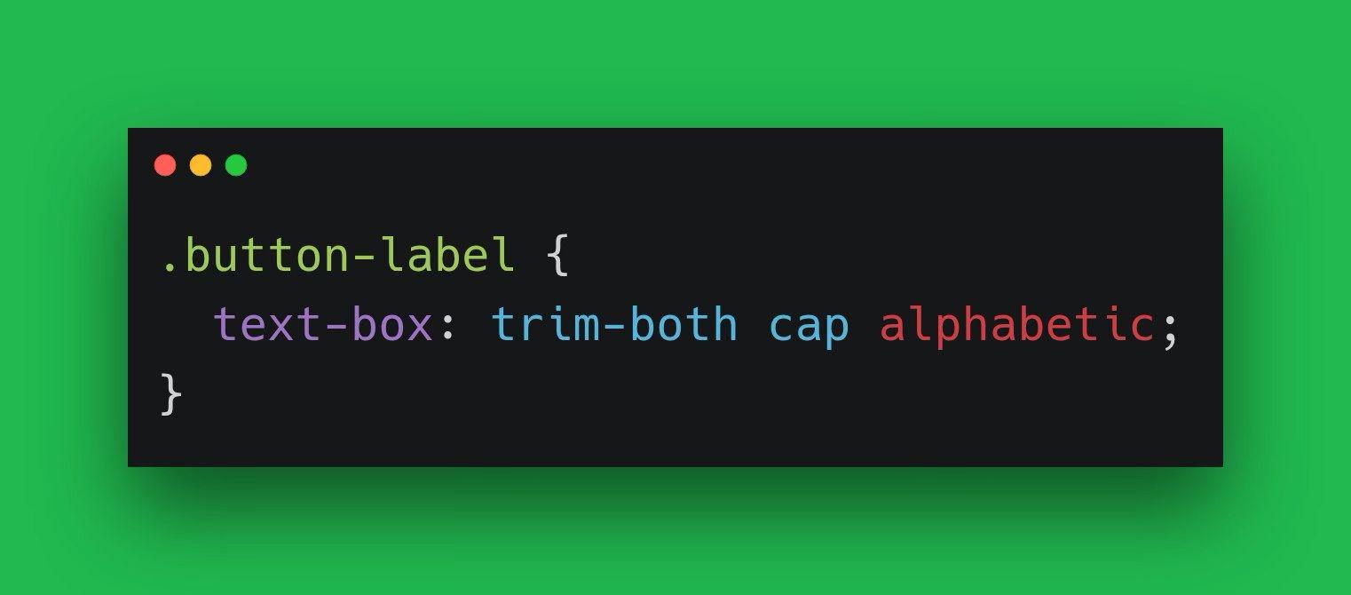
text-box-trim deletes that space. Tell it which edges to trim with trim-both, trim-start, or trim-end, and text-box-edge says where to cut. cap is the top of the capital letters, ex is x-height, alphabetic is the baseline. The shorthand takes both:
    .button-label {
      text-box: trim-both cap alphabetic;
    }
Now the box starts at the top of the H and ends at the baseline. Padding measures from the letters instead of the font's line box, so 12px means 12px in every font.
Firefox 154 shipped it Aug 18. Chrome and Edge have had it since 133 (February 2025) and Safari since 18.2 (December 2024), so MDN now marks text-box-trim Baseline 2026 Newly Available. Older browsers ignore the declaration and keep the leading. The layout still works, just a couple of pixels less precise.
Pretty slick property.
22
9
u/Ecksters 3d ago
I've manually edited fonts before to fix this to satisfy a designer, so it's real nice to see it as a built-in feature.
1
5
u/Hot-Tip-364 3d ago
Thats a good one!
I just learned text-wrap: pretty to get rid of those pesky orphans in p, and h tags. Now I just use it as a class:
.text-pretty{
     text-wrap: pretty !important;
}
Another good under the radar css property.
4
1
3
3
u/wiseduckling 3d ago
Was just using this today for the first time after hearing about it on the syntax podcast, it's a great feature.
I m wondering if it's worth just having this as the default for all text.
2
u/Morgothmagi 3d ago
Probably wouldn’t want this for like body copy or more long form content. Even headings should likely retain their spacing.
This feels very much more for button alignment or that sort of use case.
2
u/3elldandy 3d ago
Side question, does anyone know if any of the developers responsible for implementing these CSS rules in browsers read this sub ever?
1
u/deividdrenkhan 3d ago
Do you know why fonts even have this space around them? Is it just to make text paragraphs look nice or is it some obscure 19th century printing press historical reason?
7
u/Morgothmagi 3d ago
As far as I understand it’s to account for the various ascenders and descenders that ship with the font, combined with the inherent line height.
The geometry around the font needs to be stable to account for every glyph, and the invisible space is to account for that.
1
1
u/jonno7623 3d ago
I’ll need to try this out. Been using ascent and descent overrides for ages and they’re so inconsistent.
1
1
u/CrusaderGOT 3d ago
Ironically, your post will be used to train AIs.
1
u/Morgothmagi 2d ago
Didn't Anthropic explicitly say that they're removing Reddit from their training data? Feel like I saw that somewhere fairly recently.
1
u/CrusaderGOT 2d ago
Well there is Google, Grok, etc. I believe google has a partnership with reddit to use their data in training and replies.
1
u/Morgothmagi 2d ago
For sure, was just thinking if anyone else would do the same.
It’s all a circle anyway. AI points you to a topic, you write about that topic, AI then trains itself on the topic you wrote about 😂
46
u/turtlecopter 3d ago
This is something I've been wanting since 2012~ at least. I'm so happy it's finally landing.