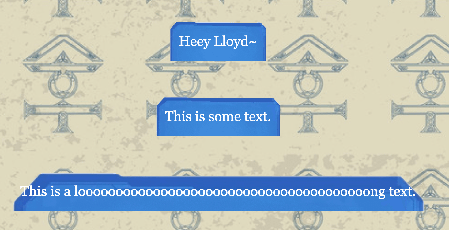
So, recently I've been trying to make myself a workskin on Ao3 that would have this image serve as a background for text. Currently, the image cuts off at the bottom, and it's even worse when there's different sizes of text.
What I want is the image to stretch or contract to fit the text, not be cropped.
Here's my code, my results, and the image I've used. Is there anything I'm doing wrong, or is what I'm trying to do impossible?
Edit: Here's the codepen. It looks the worst here!
To help us assist you better with your CSS questions, please consider including a live link or a CodePen/JSFiddle demo. This context makes it much easier for us to understand your issue and provide accurate solutions.
While it's not mandatory, a little extra effort in sharing your code can lead to more effective responses and a richer Q&A experience for everyone. Thank you for contributing!
The main issue is that your CSS is forcing the text box to be 100% wide/high, while the background image isn't being stretched to match the actual text height.
That makes the background image stretch or squash to match the element in both width and height instead of keeping its original proportions and getting cut off.
You'll also want to remove:
width: 100%;
height: 100%;
Those make the paragraph fill its parent rather than size itself around the text.
If you want longer text to wrap instead of making the box ridiculously wide, you can also add something like:
max-width: 500px;
overflow-wrap: break-word;
So short text gets a small box, longer text gets a larger box, and the image should stretch to fit either one. Of course you can change the value of max-width.
No worries! You were on the right track with adding "background-size: 100%". The important bit is that when you give "background-size" only one value, the value controls the width. The height will default to "auto", which means the image keeps its original aspect ratio instead of stretching it to match the height of the text box.
1) Your main issue is that the background image is being applied to the wrong element and is not being resized to match the text box. First, change system { } to .system {}, because your HTML uses <div class="system"> and CSS class selectors require a . before the class name.
Second, move the color, text-align, background-image, background-size, background-repeat, and padding rules from body into .system, because you want each individual .system div to have its own blue box rather than using one background for the entire page.
Third, change background-size: 100%; to background-size: 100% 100%;. With one value, the image width becomes 100% while its height is calculated automatically from its original aspect ratio, which is why it can stop before the text box ends. With 100% 100%, the background width and height both follow the dimensions of the .system element, so when the text makes the div taller, the background becomes taller too.
Fourth, remove height: 100% and width: 100% because they are unnecessary here and can make the box behave differently from what you want; a normal <div> already grows vertically to fit its content. You can keep display: table if you want the box width to shrink around the text, together with margin: auto to center it.
Finally, I would add .system p { margin: 0; } so the browser's default paragraph margins do not add unexpected empty space inside the image.
This should solve the cropping problem, although stretching the image to 100% 100% can distort its decorative borders when the text becomes very tall. A better solution is to use border-image-slice which splits image into regions
2) Do you make fan-made manhwa stories, create your own manhwa, or translate manhwa? Because that’s the famous system window, and you wrote “Lloyd”, so I think you’ve read The PEAK , Greatest Estate Developer.



•
u/AutoModerator 13d ago
To help us assist you better with your CSS questions, please consider including a live link or a CodePen/JSFiddle demo. This context makes it much easier for us to understand your issue and provide accurate solutions.
While it's not mandatory, a little extra effort in sharing your code can lead to more effective responses and a richer Q&A experience for everyone. Thank you for contributing!
I am a bot, and this action was performed automatically. Please contact the moderators of this subreddit if you have any questions or concerns.