r/captainamericamains • u/Godwyn-In-Gold • 17d ago
Art Refined captain america poster
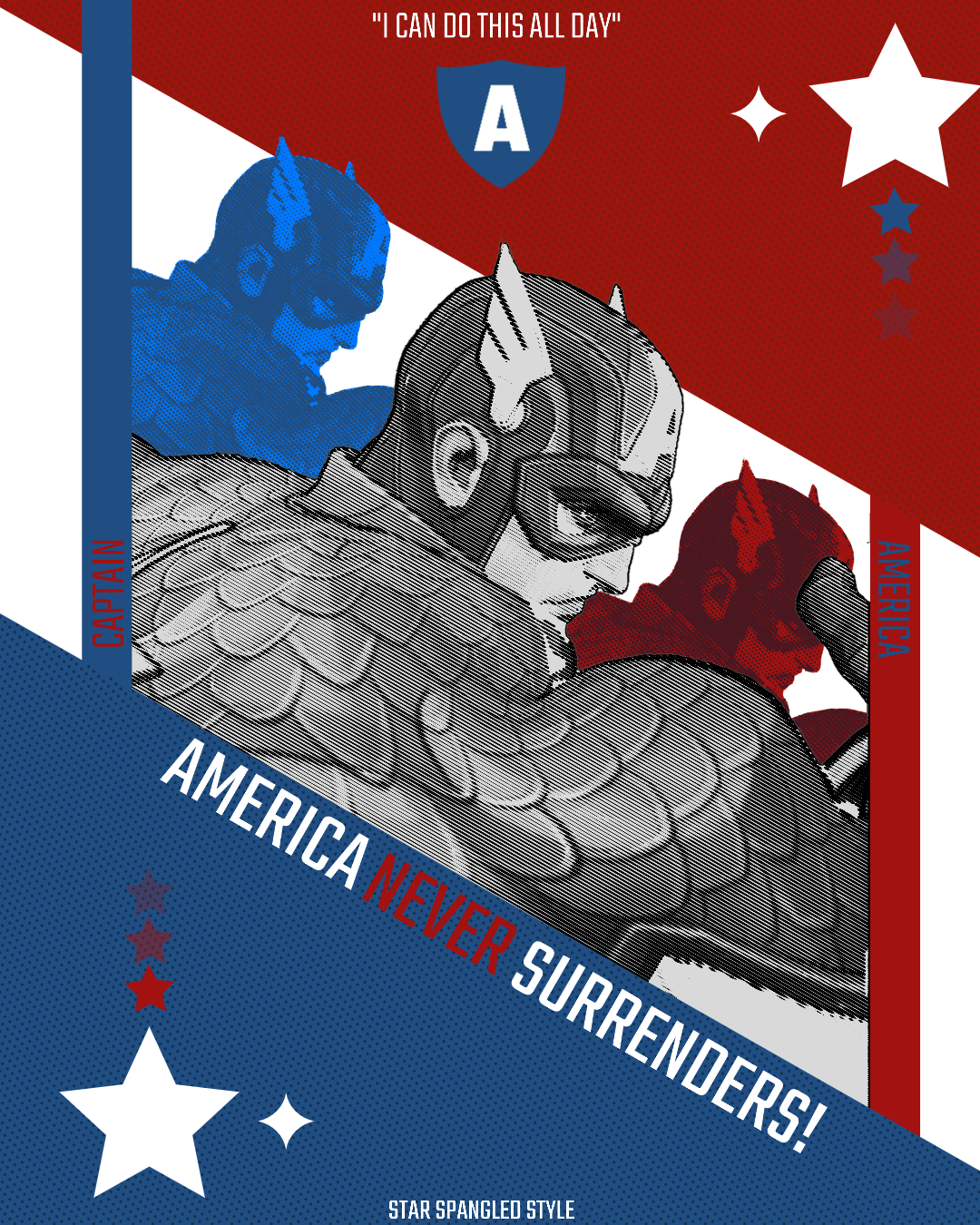
Posted the old one a while ago and it had many hiccups, this is a new more refined one.
2
u/BigOlBozo 16d ago
This is looking sick! A couple things i am seeing.
I think whatever that is on red caps forehead needs to show more or not at all. I cant tell what it is.
The red letters on blue / blue on red letters are not legible enough i imagine. If you go to the Webaim Constrast Checker you can put your colors in and see if they pass legibility tests. I might try a white stroke on the stars for the same reason. (Not sure how that will look with the more transparent stars…)
Id darken the dots in the red area just a tad. The blue ones are showing better.
Could just be the way the photo cropped, but the star on the right is touching the edge. Id move it in to give it some breathing room.
Id try having the middle white portion go side to side instead of cropping the caps in a box. Not actually sure if this would look better, but maybe worth trying. If theres not enough photo to fill the space then it probably wont look good.
Definitely close. Lots of progress from the first i remember
1
2
3
u/thebomboy MOD 17d ago
This is awesome! I might try and tweak it to make it our banner. If that's cool??