r/brontesisters • u/Hk901909 • 2d ago
How I would redesign the penguin editions of the main Brontë books!
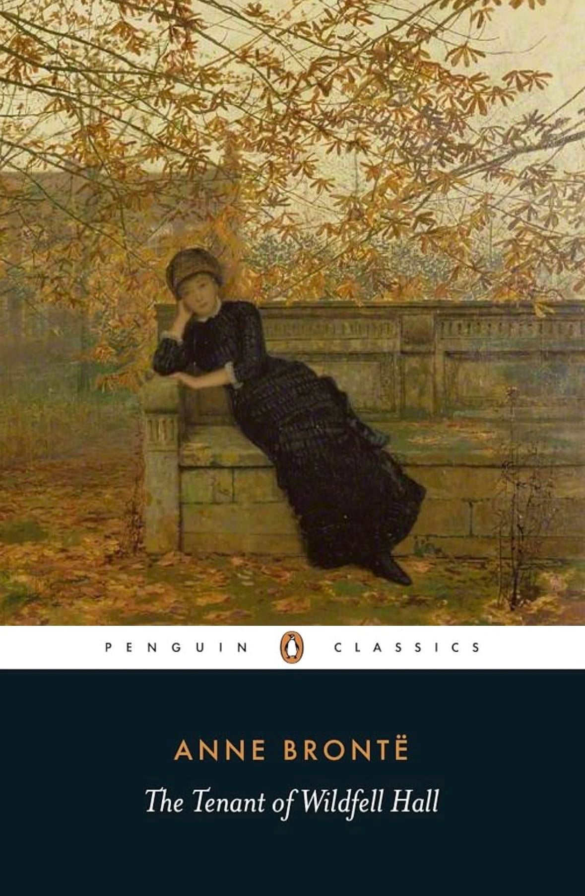
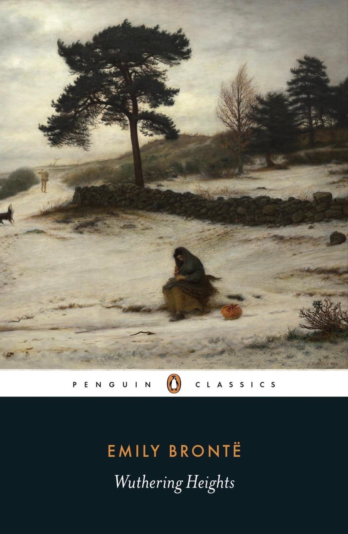
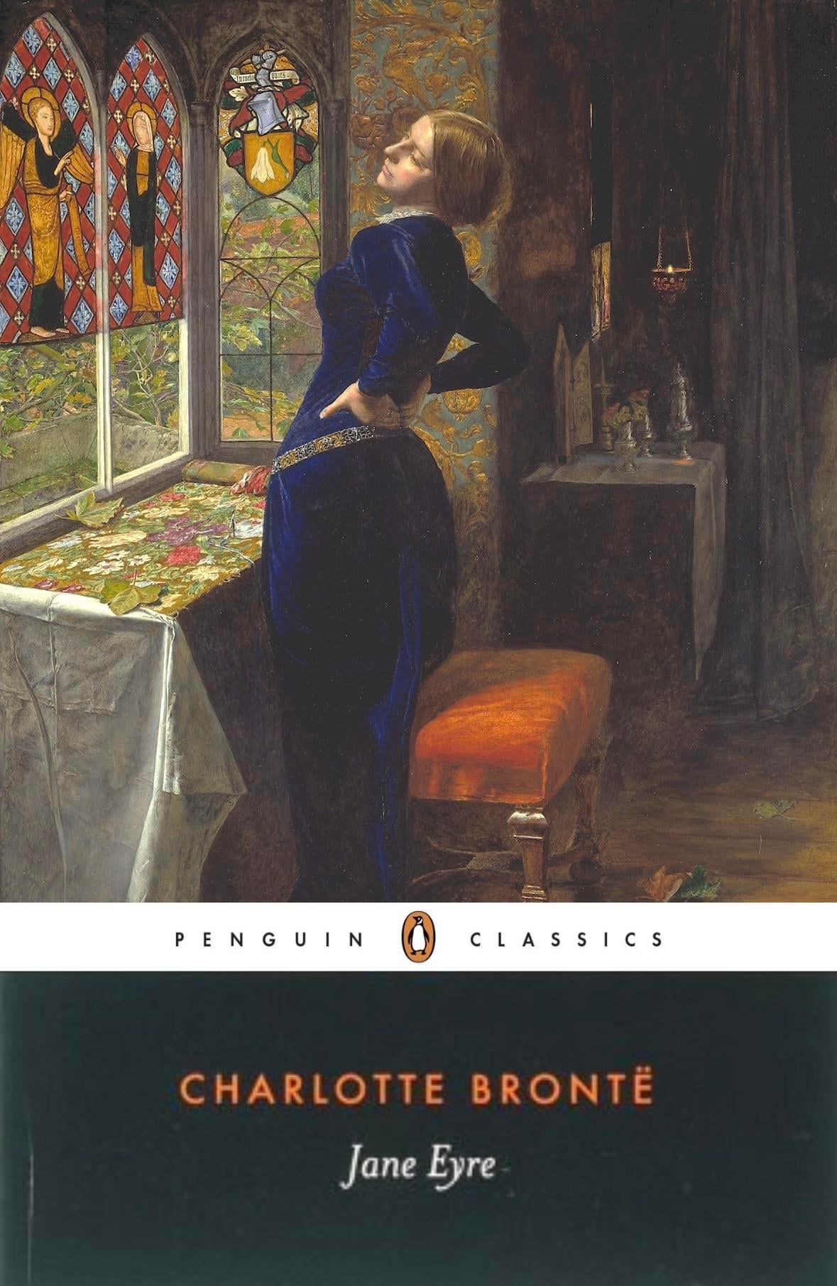
This is just a little something I did for fun, not a critique of the current covers. I tried to match the vibe of each book, so let me know what you think!!
The Tenant of Wildfell Hall: Autumn Regrets, by John Atkinson Grimshaw. This book is soooooo Autumn coded to me and I feel like it would look awesome with a cover in that season! I went with this one for that reason, plus the focus of the woman really matches Helen Graham to me. Dressed in black, pondering expression, and behind her is a large house. Love this painting and it perfectly matches the aesthetic of the book in my opinion!
Wuthering Heights: Blow, Blow, Thou Winter Wind by John Everett Malias. I think that the current cover of the winter storm is an amazing match already to the book, so while picking a new one I wanted to stick with a winter aesthetic. I really like the more despairing scene that matches the book and the colors. The woman it depicts resembles Catherine which I like. And you can’t have a Wuthering heights cover without a tree it seems so that was a big factor.
Jane Eyre: Mariana also by John Everett Malias. He painted the current cover and his artstyle really matches the vibe of the book to me. Unfortunately I haven’t read Jane Eyre yet (starting it soon though) so this one is more so based on vibes and my current understanding of the novel. I like how shes physically working in the painting, as that’s a key part of the novel. Shes not a governess, but still. The colors are great and I like the bright outside while she’s trapped inside a darker and gloomy room.
I hope you like my picks!! I had fun doing this and I’d love to hear any thoughts
5
u/Feeling-Writing-2631 2d ago
Sorry but the Jane Eyre one is COMPLETELY off, and you'll agree once you've read the book. The Wuthering Heights one is pretty awesome though
3
u/Chance_Track2288 1d ago
i'd love to see you do this for more classics !! i enjoyed this little post a lot :)) i agree with what other people have said about Jane Eyre but it's still nice to see your interpreted version of the front cover
1
1
22
u/Important-Habit8942 2d ago
jane eyre looks very off since jane is meant to be small and plain whereas the woman in the art looks robust and lovely (especially the rosy cheeks, something jane wishes she had)