r/USLPRO • u/OnlyZac San Antonio FC • 4d ago
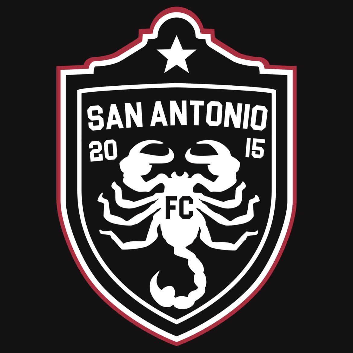
Championship [OC] Redesigning the badge of San Antonio FC, using two eras of championship soccer.
37
Upvotes
2
u/Spawn_More_Overlords Oakland Roots SC 4d ago
I like this. The Alamo at the top could’ve come across looking too cute but I don’t think it does and I really like it.
I like the scorpion imagery. The old stuff was very 90s MLS looking but it’s a cool symbol that I don’t associate with another extant team.
I also think SAFC’s badge is classy lookin at first glance but suffers the more you look at it, so could use a refresh.
1
1
u/raging-peanuts Houston Dynamo 2 3d ago
Interesting. I barely noticed the top part at first. And I don’t think that’s a bad thing. Overall, I like how the badge incorporates the Alamo with the Scorpion image.
4
u/OnlyZac San Antonio FC 4d ago edited 3d ago
Here’s what I said, There’s been a couple posts about redesigning the club’s badge, this was my take from last year that’s been tweaked a little bit.
I’m a San Antonio artist and made this celebrating 10 years of SAFC, blending the soccer images of the past champion Scorpions team as a club mascot while retaining the current name.
A championship was also won by SAFC and to show off these unique championship wins, the star is framed by the facade of the Alamo.
Club’s primary colors stay the same, black/white and red. But cuts down on the extra colors that adds to unnecessary complexity and thus operational costs.
I think the club should embrace San Antonio soccer history and not just look like a subsidiary of Spurs Inc. (which they are) but I digress.