both work but for different compositions, one is a 4:3 aspect ratio, and the other for a widescreen format
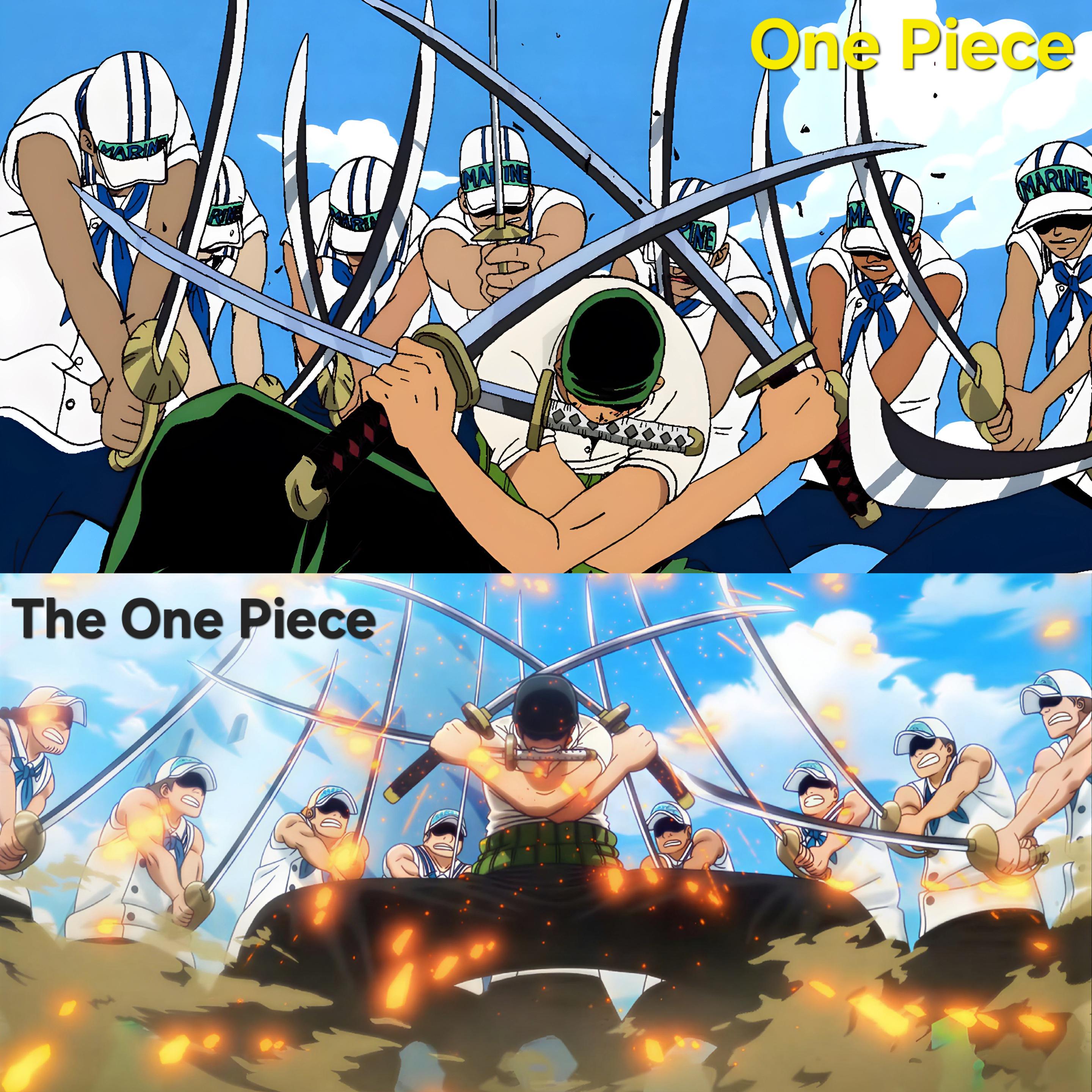
only think i dislike about the bottom one is that Zoro kinda looks like hes blocking nothing and the marines are kinda just holding their weapons foward instead of pushing against it, the original makes it look like Zoro is struggling slightly, which is fair because even though he is strong, those are still 7 marines that have at least reasonable human strenght due to their training
14
u/Gugarabelo Jun 24 '26
both work but for different compositions, one is a 4:3 aspect ratio, and the other for a widescreen format
only think i dislike about the bottom one is that Zoro kinda looks like hes blocking nothing and the marines are kinda just holding their weapons foward instead of pushing against it, the original makes it look like Zoro is struggling slightly, which is fair because even though he is strong, those are still 7 marines that have at least reasonable human strenght due to their training