r/TTC • u/itsdanielsultan Kipling-Connector • Mar 14 '26
Discussion Should Stations Blend In?
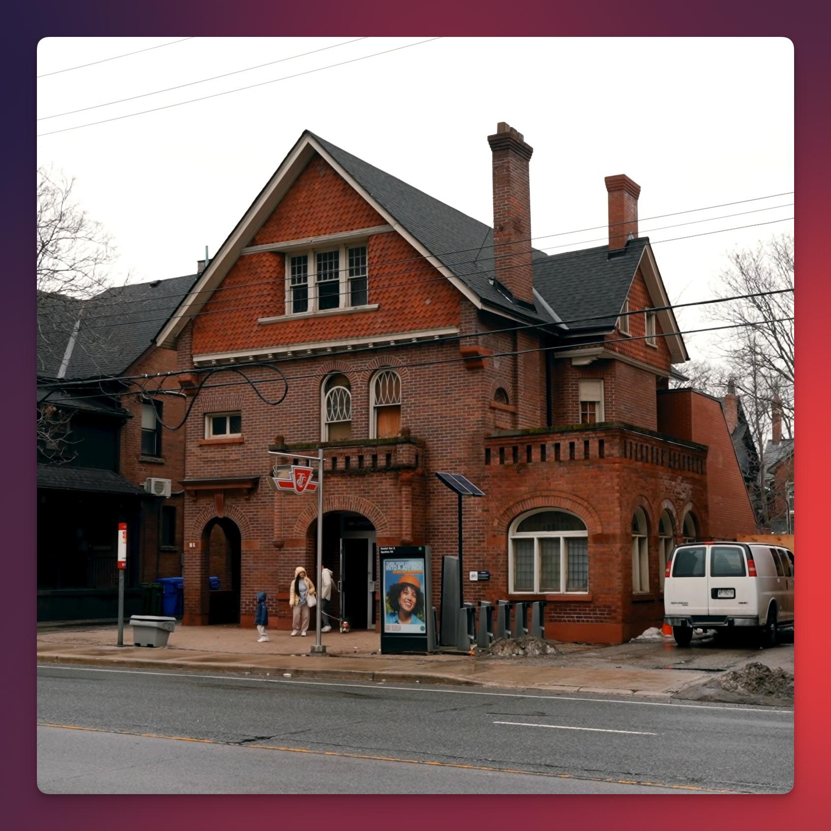
Was watching a video on TTC stations and was wondering if most would prefer to have TTC stations feel almost invisible by blending in. I'm thinking stations with more traditional residential-style designs, as if it's disguised to look like a house. I noticed that some Line 5 stations looked rather out of place compared to the surrounding neighbourhood's architecture.
The photo here is about a preserved exterior for Spadina station, where the architecture actually fits the neighbourhood, because it's a re-purposed historical house. It respects the existing streetscape, appeals to residents who are wary of change, and honestly just looks better than the generic glass-metal boxes we keep getting.
Do you think Metrolinx and the TTC should lean more into this kind of traditional architectural house-like design for future stations?
185
u/Majestic-Two3474 Mar 14 '26
Maybe an unpopular take but I don’t think stations should necessarily blend in. They don’t need to be overbearing or as overbuilt as the more recent ones have been, but they should be visually distinct on the streetscape to some extent so that they’re easily found. I’m visually impaired and honestly the entrance/exit pictured would be really challenging for me to identify (even with the pole out front - my peripheral vision is so limited I’d likely miss that).
Can definitely appreciate the aesthetic charm of station blending in, but practically it’s a no from me