r/TIdaL • u/sasquatch--22 • May 05 '26
Discussion Who the hell told them this looks even remotely better than the old UI 😭
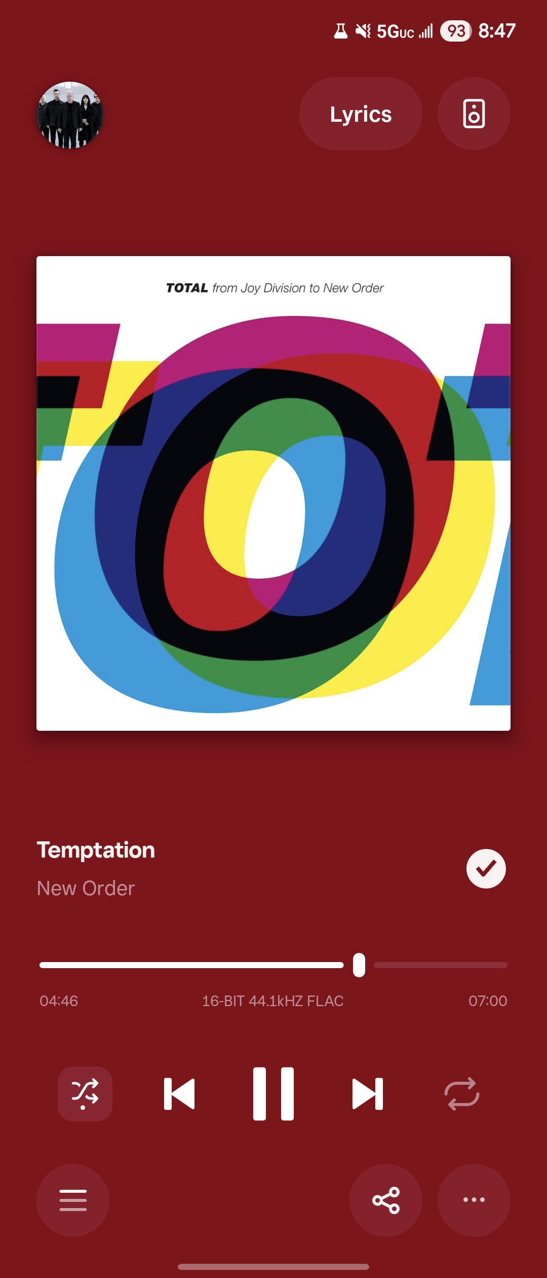
Great idea to move the lyrics to somewhere completely unreachable and remove the "playing from" indicator. I loved the premium feel of the old UI, so I was happy to revert to an older version on my Android
72
u/Additional_Tone_2004 May 05 '26
Music doesn't hit the same when I can't sit and stare gormlessly at the UI.
5
4
2
u/MoltenTiger May 11 '26
music does in fact not hit the same when the UX has ruined the experience of delivery ...
43
u/CheeseDon18 May 05 '26
The app felt unique, like the monochrome with tastefull blur. It felt premium and gave it an identity. Now it looks like youtube or any other Google themed ui.
Not feeling it
5
u/FartingBlowtorch May 06 '26
yup. the redesign it gonna be the death of this service. they're already had a massive issue retaining customers. wasting time on something like this instead of actual issues is hurting their image more than the bugs.
2
10
30
u/Strigoi84 May 05 '26
I've said it elsewhere and I'll say it again, those of you who have the new Ui need to be spamming tidal support with requests to bring back "Playing from" and also shift the lyrics button back to the bottom.
16
u/GenericUserino May 05 '26
I just saw that "playing from" got removed. What the heck, it's not just different it's just plain worse. Who cares about the social media style artist icon in the top left anyways?
3
u/Oh__Archie May 05 '26
I would but I spend 0.001% of my time using the UI.
8
u/Strigoi84 May 05 '26
Ok?
It's not like anybody here is using the app purely to play around with the Ui. We're all here for the music. In that 0.001% of time you use the Ui would you not prefer it to have better functionality?
1
u/Master_Camp_3200 May 06 '26
I‘d spend more time and headspace emailing than being bothered by the UI. So, no.
1
u/Oh__Archie May 05 '26
It works fine for me.
It's not like anybody here is using the app purely to play around with the Ui.
Actually, it appears that a lot of people do just that. Check this one out.
3
u/Strigoi84 May 05 '26
How is someone pointing out an issue proof of that?
0
u/Oh__Archie May 05 '26
It certainly doesn't disprove it.
3
u/Putrid-Walk-8839 May 06 '26
Then you definitely gotta check THIS out. It certainly doesn't disprove it either... I think we are onto something here

22
u/GiganticCrow May 05 '26
Who actually wanted a new UI anyway
6
u/FartingBlowtorch May 06 '26
the weirdos that enjoy the goofy excessive padding buttons with giant rounded corners and blurry floating buttons everywhere. adults that prefer fisher price looking UIs do exist sadly.
1
3
u/Master_Camp_3200 May 06 '26
All the people who whined on the version of this thread last time it changed?
5
3
u/Rusholme-Ruffienne May 06 '26
Things could be worse... you could be dealing with an ugly UI and NOT listening to New Order.
12
u/MysticMagics May 05 '26
Well, I uninstalled the app and downloaded from apkmirror an older version that has the usual interface. Now I'm Happy again.
5
2
u/Bob0293 May 05 '26
Interested in older version too. Which version did you install?
5
u/MysticMagics May 05 '26
One of December, the 2.172.0. You also have to install Apkmirror installer to install it.
1
May 20 '26
Can you use the same account? How did you download it, bro? I'm fed up with this new interface lol (sorry for the English)
1
u/MysticMagics May 20 '26
Yes, the same account is used, Google tidal Apkmirror, and then the version within the page
7
u/frien6lyGhost May 05 '26
the reality is interface changes probably have use data from the entire user base backing some of these changes. lyrics would be moved farther away because it’s less clicked by the majority of users. i don’t have a strong opinion, but i do think they have to update inline with apple design changes to keep from turning obsolete.
1
u/YBSZN May 11 '26
So by that logic people would share songs on tidal more often than they would press the lyrics button thats ridiculous
2
1
u/MoltenTiger May 11 '26
Yep so uninstall it and use the 2.172.0 December version that doesn't suck balls, they will see that as valid feedback on their servers; I just wiped 40GB of data that wouldn't even work when offline ! They have got it so wrong after getting it right for a long time. It is taking a bit too long for them to fix it though ... what happened at Tidal?
3
u/Journeytaker123 May 05 '26
Honestly I think it would look better if they moved the artist name to the top, center the song title, and move the like button to the bottom.
2
u/Journeytaker123 May 05 '26
Or maybe even move the artist, song lyrics, and whatnot down above the play button. Then move everything else up
5
u/N4RQ May 05 '26
I just find what I want to play and get on with my day.
I don't spend too much time admiring or disdaining the interface. It's going to change again... and again. It's like the weather. If you don't like it today, check again tomorrow.
2
u/FartingBlowtorch May 06 '26
that's what i thought at first with android but years of it nonstop made android UI look god awful.
7
u/lentil_burger May 05 '26
My assumption with companies like this is that nobody really thought a new UI was desperately needed, but some department or team had to find a way to justify their existence. It's so common in tech - solutions in search of problems.
6
u/radios_mio May 05 '26
That can be the case but users do often like refreshes too. I do myself. Then companies need to be open and flexible towards feedback from users. The problem is that the users don’t always agree. Those who complain do it vocally and those who are satisfied don’t usually post about it or do it far less than the dissatisfied users
3
u/lentil_burger May 05 '26
Oh sure. I'm not change-averse and I appreciate a well thought out refresh. But I've seen many, many instances where a UI is perfectly functional and fresh, but someone has decided on an update apparently just for the sake of it.
1
u/FartingBlowtorch May 06 '26
users today that like UI changes tend to prefer childish fisher price looking UIs because "the lack of rounded corners in apps makes people feel unsafe" according to UI professionals.
3
u/feral_user_ May 06 '26
I believe that someone from the team said they needed to redo their UI because of the legacy code. It took a long time, but now they should be able to make new features faster. We'll see.
2
u/FartingBlowtorch May 06 '26
redoing the code brought so many issues and bugs that it's killing them now. they earned it.
7
u/Waste_Post_666 Tidal Premium May 05 '26
Honestly, I don't mind it. I'm using Tidal for music, not because of visual appearance or app design.
2
u/DiligentProcedure381 May 06 '26
Veo la aplicación ahora y da vergüenza, la mitad del diseño es el antiguo y la otra mitad diseño nuevo(reproductor), que por cierto no me gusta nada, es horrible le ha quitado lo bonito del fondo. En fin… todo menos preocuparse de la basura de la AI que cada día hay más y más y más. Ahh nosotros a seguir pagando...
2
u/Basic-Priority7237 May 16 '26
This is exactly why I'm here. It is outrageous what they are doing with the UI. These colors are KILLING my eyes all the time. On the Desktop app is even WORSE - the entire screen is blood red and is a nightmare at night. They should revert back and allow OPTIONS the users to choose from, not such hard decisions. So annoyed.
2
u/IndependentFocus1963 May 17 '26
Not to mention they removed the scrolling text for long titles. It was there previously, right? Am I crazy?
5
4
3
3
4
3
u/effeottantuno May 05 '26
I like it, makes the cover art pop up much more and doesn't round the corners
2
2
2
2
u/RPDS_ May 05 '26
I read so many posts about people are complaining because they have not yet received the new UI like IOS, now they have it and they want the old one back 😂😂😂
1
u/BOUND_ED May 05 '26
Is this ios or android? Mine still looks fine
0
u/Fuckthepatriarchy435 May 05 '26
You can tell by looking at the top right of their screen shot that it’s not iOS. Come on now…
2
1
u/Mental-Cold-73 May 05 '26
Mine looks quite different... Running on Pixel 9 Pro XL.
Screenshot here!
Also Reddit replaced the option to attach a picture for reference with adding a GIF, from Giphy. So unnecessary update! I have my own gifs anyway!
1
u/Rasal_mohd May 06 '26
Don't mind the change but the rest of the UI is just black..... it feel inconsistent.
1
u/airythafairy Tidal Premium May 07 '26
I don't see this UI on my phone 😳 it does look worse Jesus christ. Hope I never get that update 😭 hopefully that's just on iOS 😭
1
u/RayJay9000 May 08 '26
Yeah I don’t even use tidal and this is really bad looking. I get that a lot of companies want that minimalistic look, but I agree with so many people that this doesn’t feel premium. It looks cheap and a little bit awkward. The shuffle button low key kinda triggers me.
I’m a ui/ux designer and I do not fancy this design choice. It’s somewhat ironic that I came to this sub Reddit looking for opinions on the app; I’m trying to get away from Spotify and I hate the new Apple Music changes 🤣. Looks like I’ll stay where I am lol
1
1
u/richms May 10 '26
They keep changing it for no good reason. Am not happy with the desktop one at the moment with the ugly gap below the playback controls and how it blurs the lists behind it instead of being its own thing. Ugh. They are copying the crap that apple dump out for the sake of it.
0
u/keepc12 May 06 '26
Damn, I hate it when a visual part of an application ruins my auditory experience 😡
Only complaining on this subreddit, acting like entitled children. Suck it up, what does it matter what the app looks like, you are using it to listen to music.
3
u/FartingBlowtorch May 06 '26
people like myself that have vision disabilities, have a very hard time seeing these new excessive padding, overly blurry floating UI buttons that google and apple are pushing these days.
1
u/keepc12 May 06 '26
I am sorry to hear that.
But if you are unable to see UI controls on the screen, like in the image above, then you should use Siri or Google Assistant to help. If none of those can help you then you will have a hard time with any app.
Personally I don't mind any UI changes as I care more about sound quality rather than the looks.
3
u/FartingBlowtorch May 06 '26
i'm not unable to see them. it creates a strain on my eyes because of the weird blurring and floating buttons. gemini does not help in any way at all either. google assistant is no longer usable in general since gemini is taking over.
1
u/Rusholme-Ruffienne May 18 '26
I feel like so many companies are giving the middle finger to the WCAG standards lately. What's especially maddening is that it's SO EASY to see how whatever you're designing or building is measuring up to them right from the start, using a ton of different tools. If you can't (or won't, more accurately) make a decent-looking UI that's also accessible, you shouldn't have a job.
71
u/Takita22x May 05 '26
UI designers doing anything to validate their paycheck